grab our FREE
‘Do’s & Don’ts of what to add to your website’ Guide.
‘Do’s & Don’ts of what to add to your website’ Guide.
emails with additional helpful content.
Hi, we're so glad you found us.
We love helping creatives like you finally have the website you’ve always wanted.
few simple steps
Follow us
3 Ways to Create Client Testimonials in Showit
Our favourite way to create Client Testimonials in Showit has to be with the power of Site Canvases. Once created, each testimonial has a different image along with individual text, accompanying it.
But, before we dive into our favourite ways to Create Client Testimonials and share a step-by-step tutorial on to create them in Showit, let’s take a closer look at what Client Testimonials exactly are and how they can help your business grow.
Before we start – missed a part of our Ultimate Showit Series? Catch up below.
- What is Showit & how does it work?
- Your Top 10 Showit Q&As
- 15 Showit Shortcuts (you need to know!)
- 8 Ways to Personalise your Showit Template
- Showit Step-by-Step Template Training Series
- How to have a Stress-Free Launch with our Showit Website Audit

Index
What is a Client Testimonial?
What a Testimonial should (& shouldn’t) include
Headings for your Testimonials
How to Design & Layout Your Testimonials
3 Ways to Create Your Testimonials
Step-by-Step Tutorial
How to use Showit Site Canvases to Create Your Client Testimonials
What is a Client Testimonial?
Think of a client testimonial as a mini personal reference.
Given by past clients (or requested by you) they help build trust for potential ones.
When used effectively, they also build confidence and reassurance in what you claim on your website is 100% true, which leads to more work and building solid relationships with new clients.
After all, it’s always better for someone else to toot your horn, rather than you! And this is exactly what a testimonial does.
What a Testimonial should (& shouldn’t) include
1. The Before & After Scenario.
2. Always make it about your client, not you!
3. Squashing a fear, they may have.
The Before & After Scenario
This type of testimonial explains where the client WAS. And it ends with where they are NOW. (Thanks to you!)
We recommended this idea to a school readiness teacher with spectacular success. At the end of each year, she would ask parents for a testimonial. To make it easier for busy parents to know what to write (and to guarantee a faster response), she offered this before and after scenario idea.
Now her testimonials went from generic wordy paragraphs to clear before and after scenarios.
Where they were “My child couldn’t write or recognise their name, struggled with letter recognition and socialising before starting.
Where they are now “Now she is so prepared and confident as she has all the tools and can’t wait to start school thanks to you”.
When a potential client reads this, they too may resonate with the before situation. And after reading this, they feel like it’s speaking directly to them. And book in!
Always make it about the client, not you!
Testimonials should show a potential client how you can solve their problem.
When we write dummy testimonials for our template designs, we often use this idea.
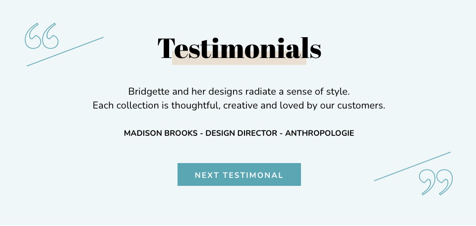
Here is an example from our Artwork & Design Template.
Squashing a fear, they may have.
What does your potential client worry about when it comes to your product or service?
Is it what your personality, work ethic or ability to get along with others is? Whatever the fear is, use your testimonial to address it here, and put their mind at rest that they won’t have to worry about it if they work with you.
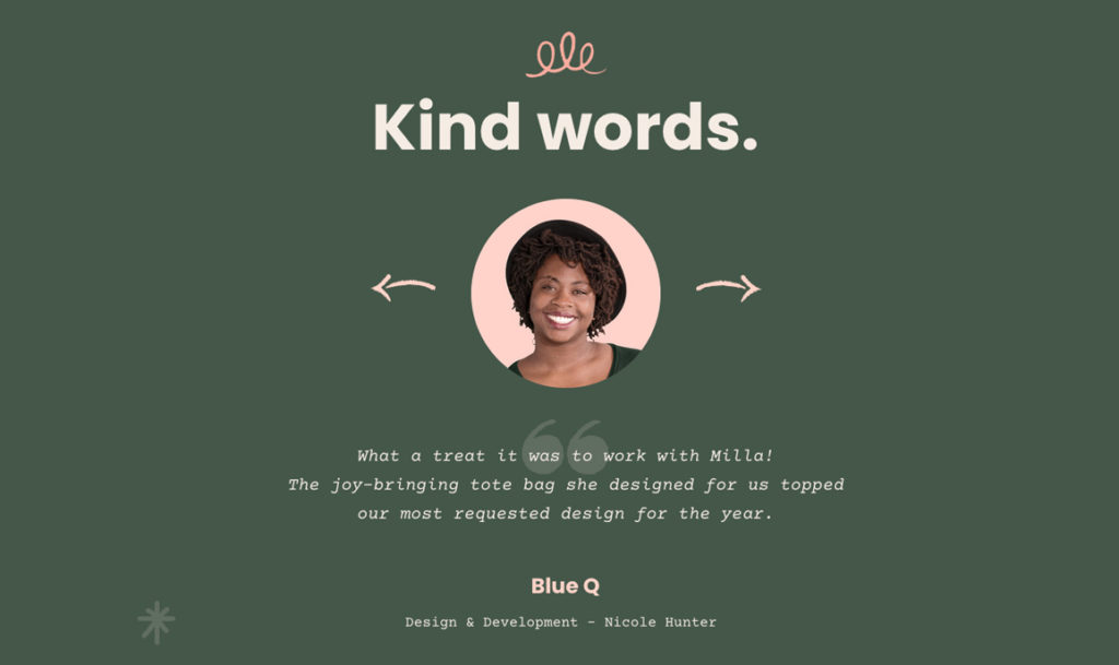
We used this idea in our Elegant Weddings and Milla Template Designs.

These testimonials would make any potential client want to hire you!
Headings for your Testimonials
In the testimonial section of your Showit website, you may want to include a heading that introduces this section. Here are a few versions of what we have used.
- Kind Words
This heading sums up how you feel about your clients. It incorporates the kind words they have said about you and how you want to share them to put potential clients’ minds at ease. - Testimonials
This heading tells you precisely what you can expect to get when you read this section. It may not be clever or cute, like Love Letters but it is clear and, that is much more important. - No Name
Depending on your design, you may not need a heading. We used this style in our Wanderlust Weddings testimonial section. The background image and quote, clearly defined that this was a testimonial.
How to Design & Layout Your Testimonials
Pull-out Quotes
Pull-out quotes highlight a particular excerpt or phrase. You may have seen them used in magazine or newspaper articles in both print and online.
As we did in our Elegant Weddings testimonial below.

We often combine oversized, quotation marks in the design, to make it easier for the viewer to know this is a quote and to add to the overall aesthetic appeal.
Headshot & Pull-out Quote
Including a photo of the person giving the testimonial helps build trust with the viewer knowing that there is a real person behind this statement.
Our Milla testimonial below is a perfect example of this style.

In this design, the photo would take centre stage and, the quotation marks would blend more into the quote. Adding the name of the person in caps creates a sign-off and looks and feels professional.
Parallax Background Image & Quote
A parallax scrolling background can help elevate the look and feel of your website.
A favourite amongst photographers and Surface Pattern Designers, this parallax background acts as the perfect backdrop to highlight a piece of work. Combing the parallax image with a quote creates a beautiful testimonial that is sure to stand out.
Our Elegant Weddings testimonial shows a parallax background style in action.
3 Ways to Create Your Testimonials
Sliding Gallery
Below is an example from the Milla template which slides between three frames.
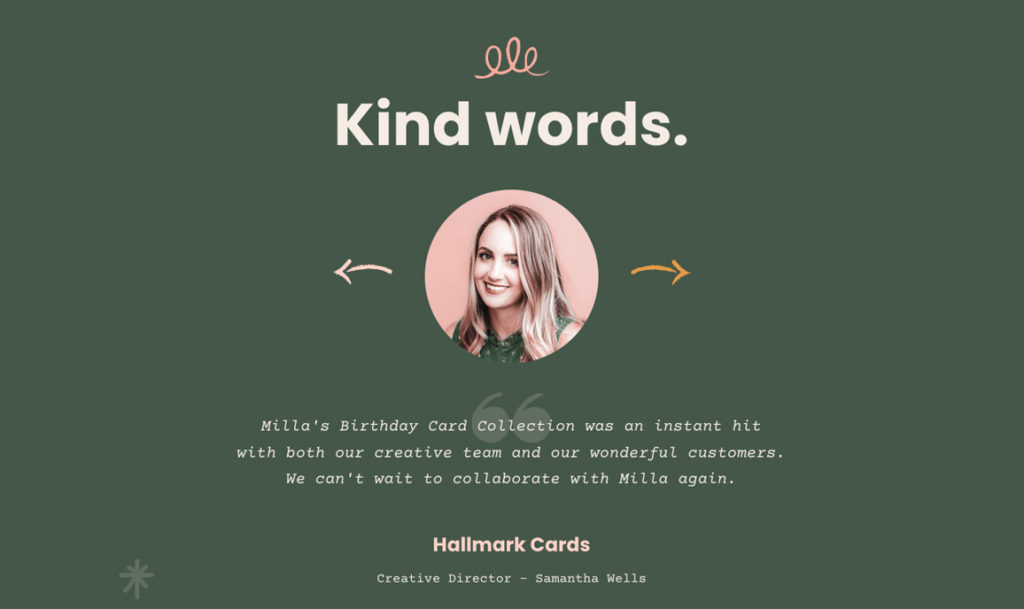
Each frame includes a client headshot, testimonial and client name.
By clicking on the arrow highlighted, your viewer can see the next frame. When stationary, the testimonial frame will rotate between each other.
Click through Gallery
In our Artwork & Design template, we used this style. The viewer manually presses the NEXT TESTIMONIAL button to view the next slide.
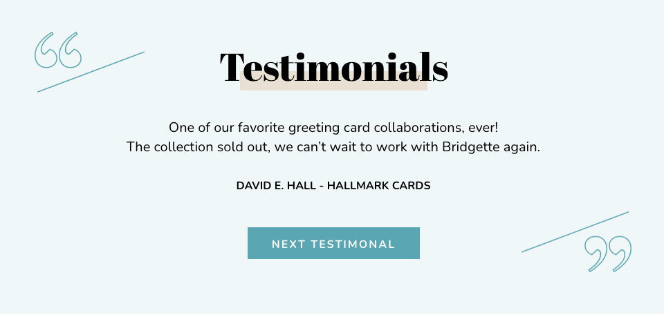
This style is also useful if the testimonial quote needs more time to read.
Updating Gallery
Our Wanderlust testimonial below is a perfect example of this where the background is an entire parallax scrolling image and slowly and smoothly automatically updates to the next slide.

BONUS – Client Testimonials Overview
How to use Showit Site Canvases to Create Your Client Testimonials
Below is an example of how to update a testimonial inside our Showit Template Emporium template Milla.
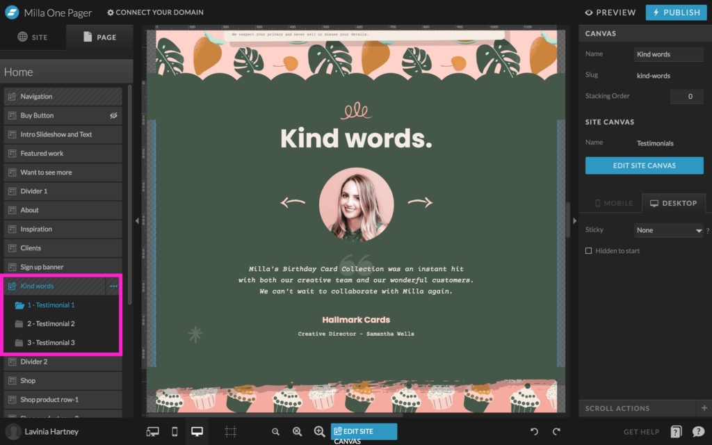
Step One
To create a testimonial, we use Site Canvases, which allow us to use them across other pages on the website.
Step Two
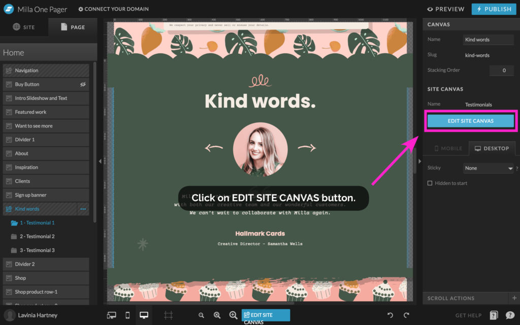
To edit a site canvas click on the EDIT SITE CANVAS Button, as shown in the example below.
Step Three
Once you are inside the site canvas, view the structure of how the testimonials are set up.
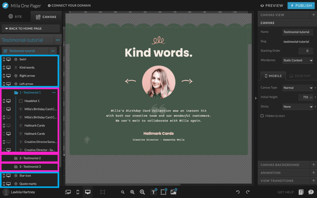
ITEMS highlighted in the BLUE BOXES are things that stay the same as we cycle through the testimonials.
In this example, they are things like the Swirl Graphic up the top, the Title ‘Kind Words’ and the navigation arrows + a few background elements such as the Star and hand-drawn icons and the faded quotation marks.
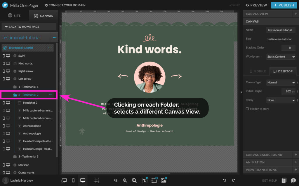
Items highlighted in the MAGENTA Boxes are things that DO change – those being the 3 Testimonials and their headshots, quote text, author and place of work. You will find them in the Folders. Each folder is a ‘CANVAS VIEW’ in Showit.
Step Four
Click through the different folders to see the different CANVAS VIEW.
Step Five
To edit a testimonial, select a folder.
The folder will expand to show you the contents.
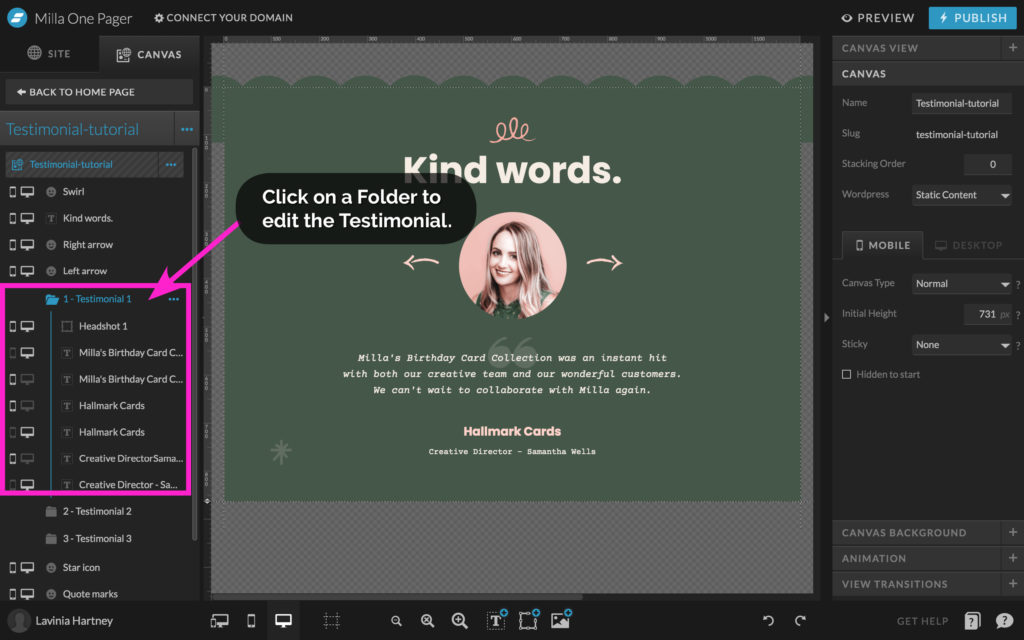
Step Six
‘Double-Click’ on the text you want to change and enter your new text.
Alternatively, you can also select it in the left column.
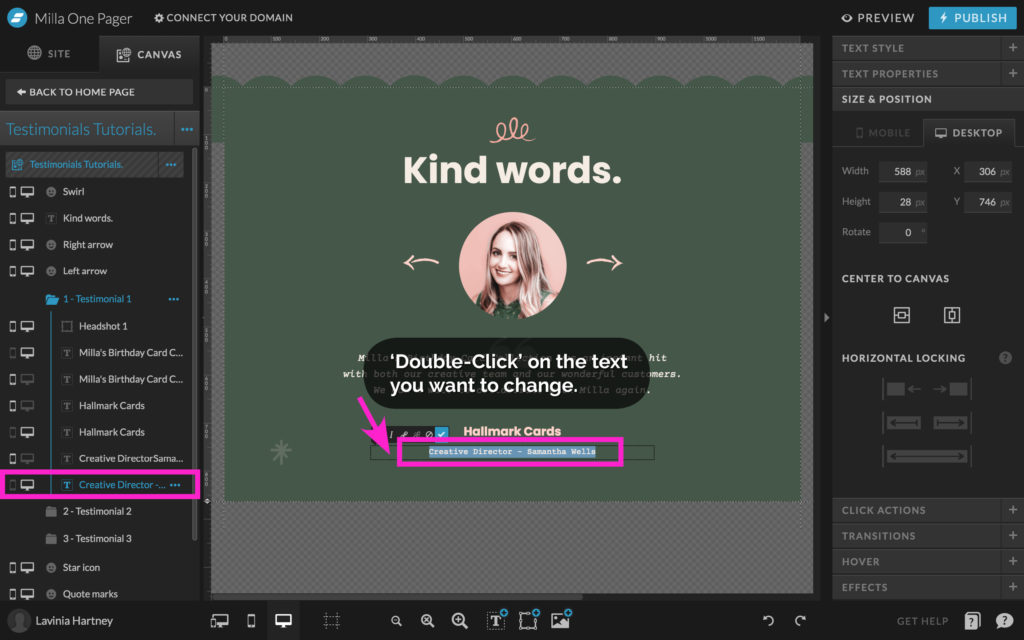
Step Seven
You may also need to update the Mobile version of the text as well.
On Mobile Phones, the layout is different. Due to the space restrictions on a mobile, the client’s name and position will be on separate lines.
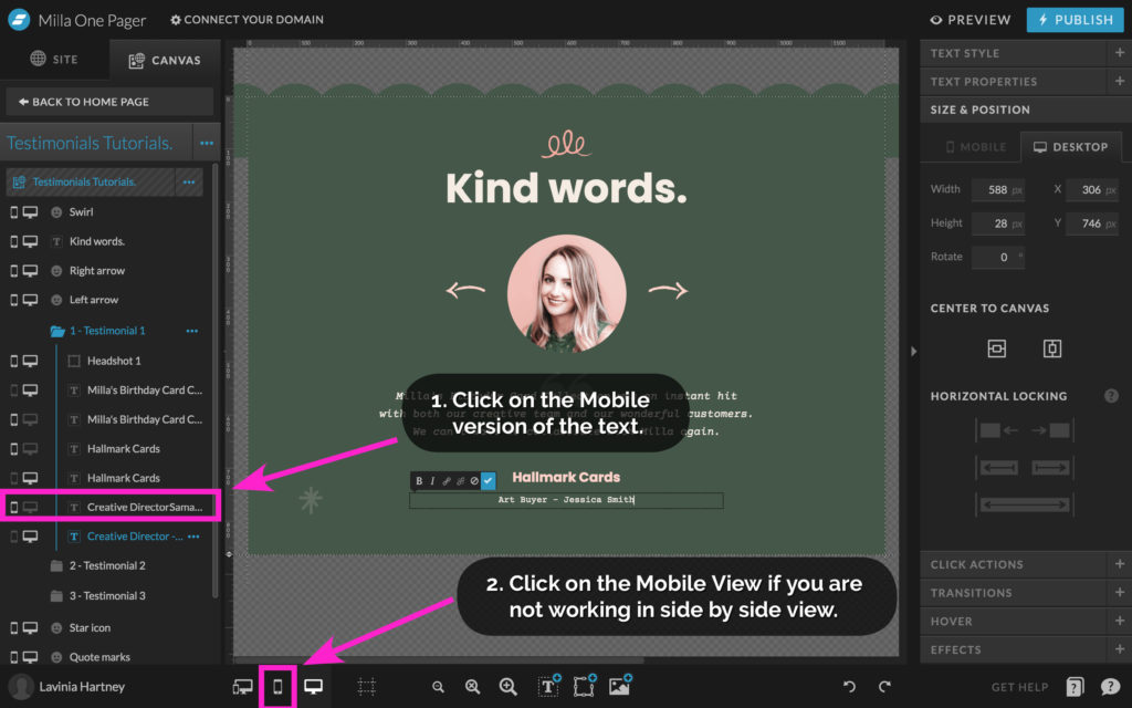
- Select the Mobile version of the text in the left column.
- Change your view to Mobile, if you are not using the side-by-side edit option.
Step Eight
Update the text in the mobile view, by adding the line break unique to the mobile layout.
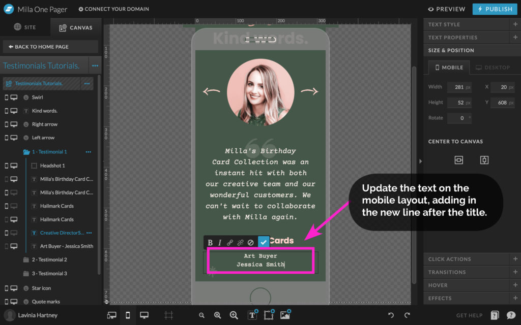
Insider Tip
All our Showit Template Emporium designs come with client testimonials already set up and fully functioning.
You can update them by dropping in your text and images. See the range of our other Testimonial examples here.
Your Action Steps
- Using our tips, ask clients for a testimonial for your website.
- Decide on the heading for your testimonial section.
- Pick from our three favourite options on how to create it.
- Prefer a “done for you” version? Shop our Templates.
Where to now?
- Want more info on Showit Site Canvases? This blog will help.
- Need some inspiration to create your Testimonial? View our Shop.
- Want more Showit help? Try our 12-part Showit series.
Want more Showit Tips?
Grab our cheat sheet – 15 Showit Shortcuts
Save time and frustration building your website by using our 15 Showit Shortcuts. We’ve included both keyboard and icon shortcuts to make the process smooth and easy. Get it Free Here!

Like this Blog Post?
PIN IT FOR LATER. And for more helpful tips follow us on PINTEREST.

Search
Create & launch your website in a
few simple steps
FREE GUIDE
While you’re here,
grab our FREE
‘Do’s & Don’ts of what to add to your website’ Guide.
‘Do’s & Don’ts of what to add to your website’ Guide.
When you sign up, we’ll send you
emails with additional helpful content.
About Lavinia & Tom
Hi, we're so glad you found us.
We love helping creatives like you finally have the website you’ve always wanted.
Blog Categories
Follow us