grab our FREE
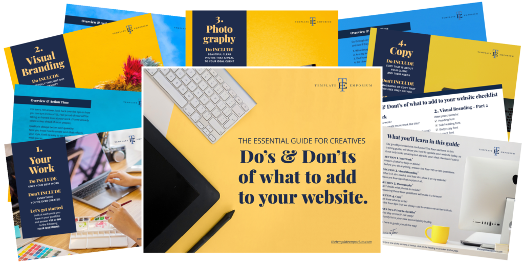
‘Do’s & Don’ts of what to add to your website’ Guide.
‘Do’s & Don’ts of what to add to your website’ Guide.
emails with additional helpful content.
Hi, we're so glad you found us.
We love helping creatives like you finally have the website you’ve always wanted.
few simple steps
Follow us
Top Website Mistakes creative professionals make (& how to avoid them)
Are you a creative professional struggling to build a website that truly showcases your unique skills and talents? You’re not alone. Many creatives make common website mistakes when building their online presence, hindering their ability to attract clients and grow their careers.
In this blog post, we’ll explore the top website mistakes that creative professionals make, from using generic templates to neglecting important SEO considerations. We’ll also provide expert advice on how to avoid these pitfalls and create a website that truly showcases your unique skills, talents and personality.
By the end of this blog, you’ll have the knowledge you need to create a website that truly stands out and propels your creative career forward. So let’s dive in!
Before we start – check out our Website Series below.
- What is a One-Pager Website? (& why do I need one?)
- 3 Reasons why not adding your favicon is hurting your website
- Is your website breaking the law?
- Why do I need a Domain name? (and what do I do with it?)
- Do’s & Don’ts of What to Add to Your Website

Before we start, grab our FREE Guide
Our FREE Essential Guide for Creatives. “Do’s & Don’ts of what to add to your website” will give you a simple plan to follow so that you’ll never have to question what to show online again.

INDEX
Using Generic Website Templates
Neglecting SEO considerations
Failing to showcase your unique style and personality
Not optimizing for mobile devices
Ignoring website analytics
Using Generic Website Templates
While it may be tempting to use a generic website template to save time and money, this approach can hinder your ability to truly showcase your skills and talents as a creative professional.
These types of templates may be convenient, but they also lack uniqueness and creativity, which can be a turn-off for potential clients.
Always ignore the free templates and look for a thoughtfully designed one specifically created for your industry. One that includes everything you need and leaves out anything you don’t. This also means your website will be easier for visitors to navigate and engage with your content.
Remember, your website is often the first impression potential clients will have of you and your work. By taking the time to choose a premium website template (that reflects your skills and personality), you can set yourself apart in a crowded market and attract the clients you deserve.
So, resist the temptation to take shortcuts with generic templates and invest in your online presence – it’s an investment that will pay off in the long run.
Insider Tip
All our premium website templates have a custom-built look and feel because we’ve done our research and asked creatives such as Surface Pattern Designers, Artists and Illustrators (as well as Art Directors) what would their dream website consist of.
And that’s why a Template Emporium website reflects your individuality and showcases your portfolio in the best possible light.

We also only offer a limited number of premium templates, so you don’t feel overwhelmed trying to make a choice.
Instead, you pick the design that aligns with your brand and style. Next, update it with your visual branding and images so that way you can create a website that truly reflects your personality and helps you stand out from the competition.
And best of all, our website templates are simple to update as they are created on the user-friendly Showit platform.
Neglecting SEO considerations
Another mistake that creative professionals often make when designing their websites is neglecting SEO considerations.
While having a visually appealing and user-friendly website is important, it won’t do you much good if potential clients can’t find it through search engines.
To ensure that your website ranks well in search engine results, you need to incorporate relevant keywords throughout your content and metadata.
This includes your websites:
- Page Titles
- Descriptions
- Headings
- Image alt tags
By optimizing your website for search engines, you increase your chances of being discovered by clients who are actively searching for services like yours.
Neglecting SEO considerations can result in missed opportunities for attracting new clients and growing your business. So, take the time to incorporate relevant keywords and optimize your website for search engines – it can make all the difference in increasing your online visibility and attracting the right clients.
Insider Tip
It’s important to avoid keyword stuffing and focus on creating high-quality, informative content that provides value to your audience. Search engines prioritize websites that offer valuable and relevant information to users.
Failing to showcase your unique style and personality
Your website is an extension of your brand and should reflect your unique style and personality.
And as a creative professional, your work is often a reflection of your aesthetic and values. Failing to showcase your individuality can make your website feel generic and forgettable, which can turn potential clients away.
Then turn your visual branding into your Brand Style Guide. We explain more about how to do that here.

Incorporating personal touches, such as a bio or behind-the-scenes photos, can also help build a connection with visitors.
However, it’s important to strike a balance between showcasing your individuality and ensuring your website is user-friendly and easy to navigate.
Insider Tip
The design of your website should complement your content and enhance the user experience, not distract or confuse visitors.
By incorporating elements of your unique style and personality into your website, you can create a memorable and engaging online presence that attracts the right clients. But remember to also prioritize usability and functionality, as these are essential components for a successful website.
Not optimizing for mobile devices
The majority of internet users access websites through their mobile devices. Therefore your website must be designed and optimized for mobile viewing. Failure to do so can result in a clunky, unresponsive website that frustrates your visitors and drives them away.
But optimizing for mobile devices isn’t just about making your website responsive. It’s also about ensuring your website’s content is easily accessible on a smaller screen.
Neglecting to optimize your website for mobile devices means you risk losing potential clients seeking a user-friendly and hassle-free online experience. And this brings us to our last mistake.
Insider Tip
Just because your logo or image looks crisp and clear on a desktop doesn’t mean the viewer will see it the same way on a mobile device.

If your logo is detailed, test how it will look reduced in size on a mobile. We always recommend creating a simplified version or a monogram style for mobile that works at any size. As we have in our Artwork and Design Website Template above.
That’s why we love using Showit, as it allows you to upload different logos and images for desktop and mobile.
Ignoring website analytics
To most creative professionals, website analytics appears complicated and scary. But ignoring them on your website is one of the most significant mistakes you can make, yet it is also one of the most easily avoidable.
Through the use of website analytics tools, you can:
- Measure your website’s performance
- Track user behaviour
- Gather valuable data that can help you make informed decisions about your website’s design and content
- Identify which pages on your website are most visited
- How long users are staying on each page
- Where visitors are coming from
Armed with this information, you can make adjustments to your website to better serve your audience and ultimately drive more conversions.
By ignoring website analytics, you are essentially flying blind.
You may create content and design elements that you think are effective, but without data to back up your assumptions, you could be missing the mark entirely.
Website Data
If you regularly review your website’s data, you can identify patterns and trends that can help you optimize your website’s performance. You can also monitor the effectiveness of any changes you make to your website and adjust accordingly.
By paying attention to your website’s data, you can make informed decisions about your website’s design and content, ultimately leading to better user experiences and increased conversions.
Insider Tip
It’s so much easier now to understand your website analytics. We use Google Analytics and the Free version of Hot Jar to do exactly that. Check them out and see how they can help you.
You Did it!
That’s a wrap on The Top Website Mistakes Creative Professionals Make (& how to avoid them).
As a creative professional having a strong online presence is essential for showcasing your skills and talents. By avoiding the common website mistakes we discussed, such as using generic templates (check out our premium showit templates here) and neglecting SEO, you can create a website that truly represents your unique style and personality.
And remember to optimize for mobile devices and pay attention to website analytics to keep your site up-to-date and relevant.
Now you know what mistakes to avoid. You can start building your website today and watch your creative career flourish. After all, your website reflects who you are and what you do. We can’t wait to see what you create.
Before you go, did you get our FREE Guide?
Grab our FREE Essential Guide for Creatives. “Do’s & Don’ts of what to add to your website”. We give you a simple plan to follow so that you’ll never have to question what to show online again.

Where to now?
Want more Website tips? Check out the below.
- Which Template Emporium Website is Right for You?
- Why do I need a Website if I have an Instagram account?
- Your Top 10 Showit Questions & Answers
Like the Blog Post?
PIN IT FOR LATER. And for more helpful tips follow us on PINTEREST.

Search
Create & launch your website in a
few simple steps
FREE GUIDE
While you’re here,
grab our FREE
‘Do’s & Don’ts of what to add to your website’ Guide.
‘Do’s & Don’ts of what to add to your website’ Guide.
When you sign up, we’ll send you
emails with additional helpful content.
About Lavinia & Tom
Hi, we're so glad you found us.
We love helping creatives like you finally have the website you’ve always wanted.
Blog Categories
Follow us