grab our FREE
‘Do’s & Don’ts of what to add to your website’ Guide.
‘Do’s & Don’ts of what to add to your website’ Guide.
emails with additional helpful content.
Hi, we're so glad you found us.
We love helping creatives like you finally have the website you’ve always wanted.
few simple steps
Follow us
Should you use Yellow as your Branding Colour?
Yellow is the brightest of all the colours, which means it can make us feel both happy and energised while having too much of it can feel overwhelming. So how do you know whether you Should use Yellow as your Branding Colour? We’ll answer all your questions below.
We have developed a three-part system that, takes a deep dive into Yellow’s meaning, varieties and how to use this information in your branding.
Mellow Yellow is waiting for you, are you ready?
Before we start – missed a part of our Branding Colour Series? Catch up below.
- 1. Should you use Blue as your Branding Colour?
- 2. Should you use Red as your Branding Colour?
- 3. Should you use Yellow as your Branding Colour? (this is the blog you’re reading)
- 4. Should you use Green as your Branding Colour?
- 5. Should you use Pink as your Branding Colour?
- 6. Should you use Orange as your Branding Colour?
- 7. Should you use Purple as your Branding Colour?
- 8. Should you use Grey as your Branding Colour?
- 9. Should you use White as your Branding Colour?
- 10. Should you use Black as your Branding Colour?
- 11. Should you use Beige as your Branding Colour?
- 12. Should you use Brown as your Branding Colour?
Want to start using Yellow as your Branding Colour now?
Download our FREE Guide
Here’s What We’ll Cover
MEANING OF YELLOW
The Psychological Meaning of Yellow
Meaning of Yellow to you
Yellow in Business
VARIETIES OF YELLOW
Amber to Canary Yellow, we share our favourite Yellows
Yellow & The Colour Wheel
Colours that go with Yellow
YELLOW IN BRANDING
Matching to the Tone of your Business
Picking the Perfect Palette with Yellow
When not to use Yellow in your Branding
Should you use Yellow as your Branding Colour?
1. Meaning of Yellow
The Psychological Meaning
Yellow is known as the “happy” colour. And being the brightest of all the colours, it always stands out. Not in a demanding way like Red, but rather, in a way to make you feel good about yourself and your surroundings. Think of a field of sunflowers or daffodils with the rays of the sun falling on them.
“How wonderful yellow is. It stands for the sun.” – Vincent van Gogh.
But like most colours, there are also conflicting meanings of what Yellow represents. It varies from feelings of positivity and joy to sickness and cowardly.
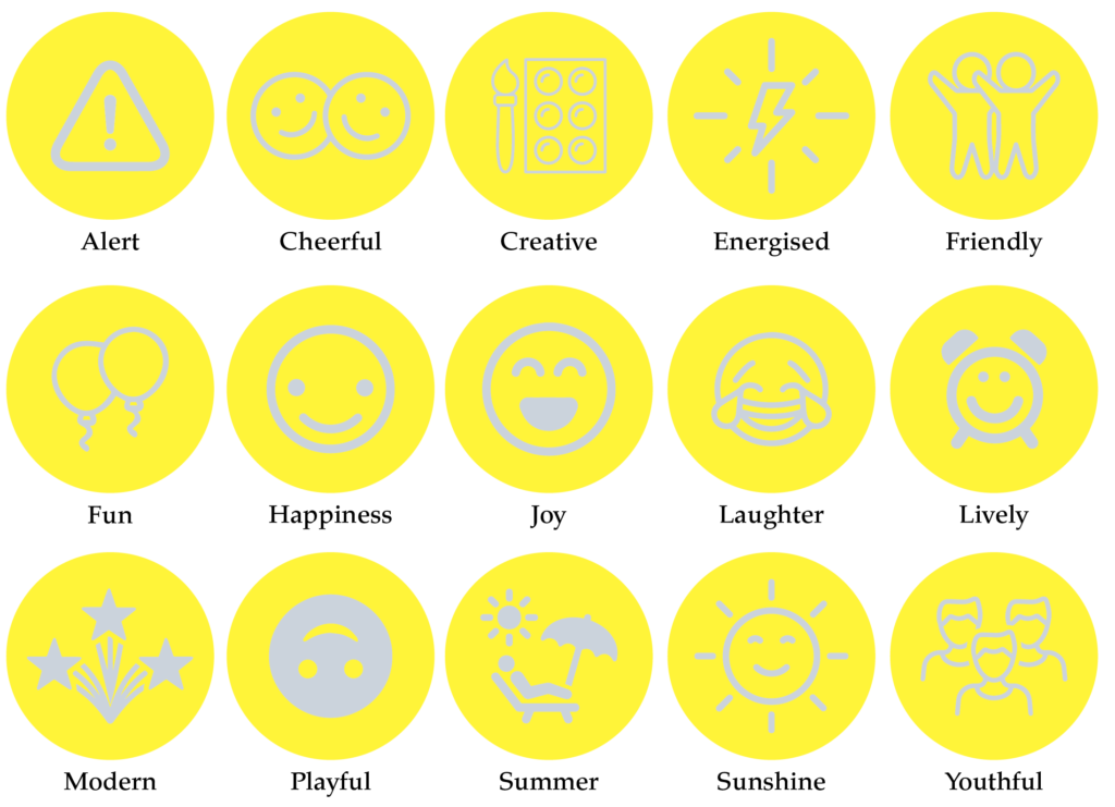
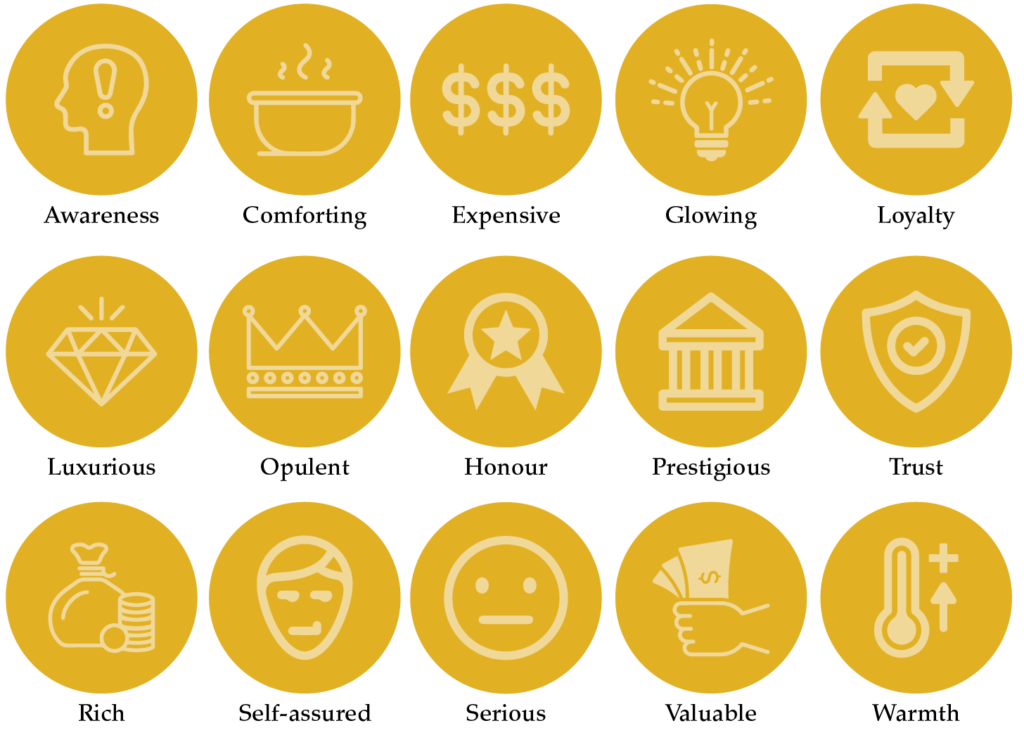
We believe it is based more on the shade of yellow rather than the colour itself. And to make it a little easier, we’ve created an icon guide below and broken it into Light, Bright and Dark Yellow.
Original unedited icons from the Noun Project
Light Yellow Meaning

Bright Yellow Meaning
Dark Yellow Meaning
Want a Yellow Branded Website?
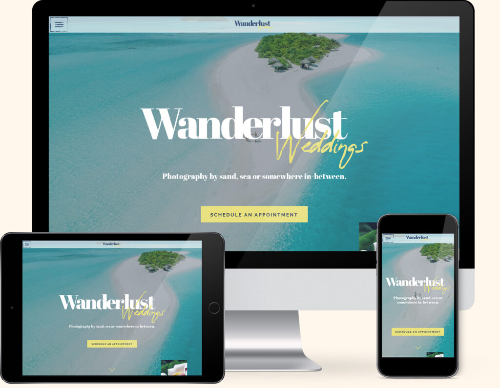
If you love Yellow, we have the perfect website template for you. Our Wanderlust Weddings Template combines everyone’s favourite pairing of Yellow and Blue to create the ultimate Yellow lover’s website.
Created exclusively for the Showit platform, now you can showcase your collection of photography alongside your favourite colour.
Meaning of Yellow to You
How do you feel about Yellow? Is it a colour you would like to incorporate into your branding, or are you scared it’s too bright for you?
Any experiences or memories you’ve had with Yellow will help determine how you feel about it.
Maybe it reminds you of childhood memories of following the yellow brick road in The Wizard of Oz or the yellow submarine ride at Disneyland.
If you’re a personal brand, the key is to find a balance between the colours you like and the ones that will attract your ideal client.
Look at the icons above and pick which words sum up the way you feel about Yellow or the way you want your business to be perceived. This will be a great indication of the shade of Yellow that’s right for you.
Colour Clues
Every colour makes us feel a certain way. Once you learn how to use the Indoor Clues, it will open your eyes to new options and feelings about colour.
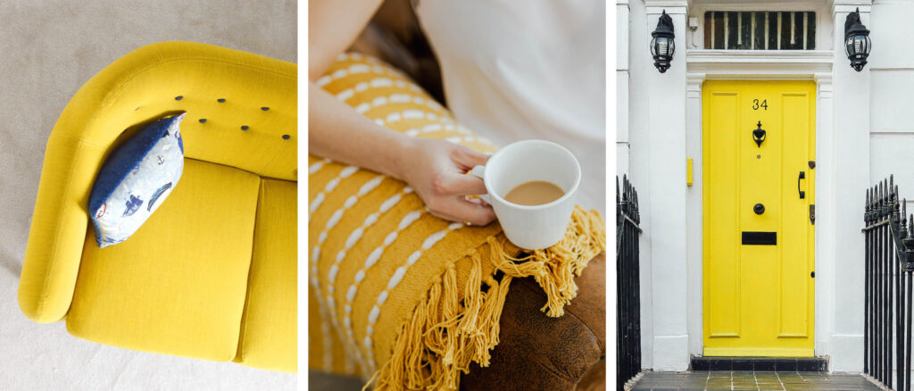
We have introduced yellow into our home decorating, using it as a pop of colour with cushions, vases and artwork. Maybe you have a piece of clothing in yellow or a favourite notebook, these, are all Colour Clues to determine how you feel about colour.
Would your ideal client like Yellow, how would it make them feel?
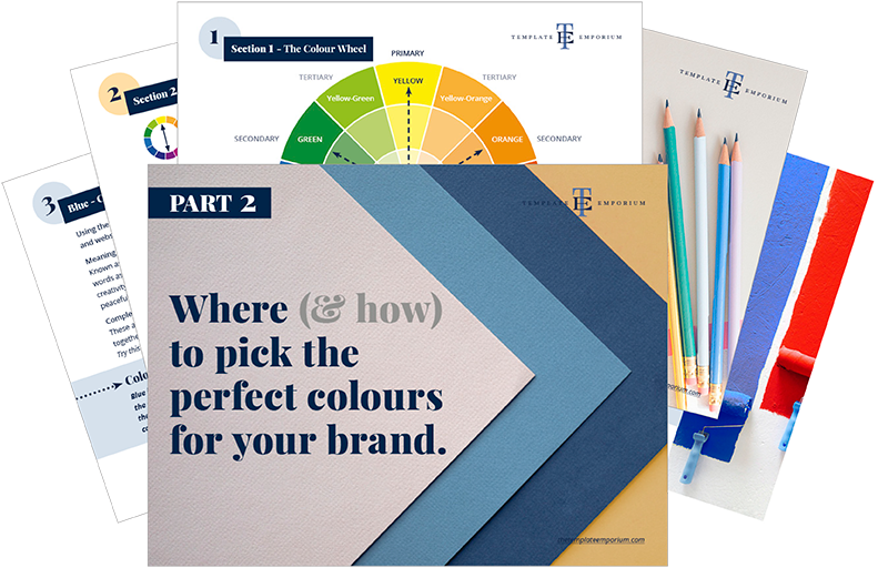
In Part 1 of our Colour Guide series “How (& where) to pick the perfect colours for your brand.” we explain everything about Colour Clues. Click here to download it – it will be super helpful.
Yellow in Business
Along with Ultimate Gray, Pantone named Illuminating one of the colours of the year. This bright but not too overpowering Yellow represents “A message of happiness supported by fortitude.”
And 13% of the world’s top 100 brands believe in that happiness as they incorporate Yellow in their branding. When used well, it makes the brand stand out yet feel approachable, friendly and optimistic.
Disney even incorporated it in their Disney Parks Colour Trends with Dapper Yellow, a sunny, cheerful hue available in limited quantities.
And following the approachable and friendly path, that’s why food and beverage companies and many discount chains use it.
Food and Beverage Companies
Favoured across various fast-food and snack foods, using yellow stimulates hunger and makes their customers feel like they want to keep moving quickly yet still bring us a feeling of joy and happiness.
Whether the yellow is used boldly as the golden M with McDonald’s or subtly as with the Schweppes examples below, they both incorporate yellow perfectly into their branding.
Photos below from Unsplash
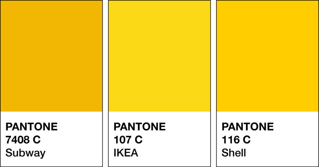
Here are a few yellow foods and beverage branding examples.
McDonald’s
Subway
Schweppes
Lays
Lifestyle and Discount Brands
Here yellow quickly grabs the attention of the buyer. It makes what they are selling feel accessible, fun and affordable spurring, them to take immediate action.
Walmart
Ikea
Jb Hi-Fi

Should you use Yellow as your Branding Colour?
2. Varieties of Yellow
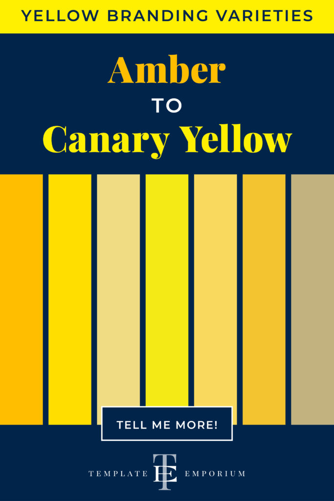
Amber to Canary Yellow, we share our favourite Yellows
Yellow is both a WARM & Primary colour. Along with the other two primary colours, (Blue & Red), they make up every available colour. Other colours, however, can’t be mixed to make Yellow.
Many varieties of Yellow may look similar to each other but have different names. From light to dark Yellow we’ve compiled a cheat sheet of our favourites below (and included a few you may have never heard of!).
And to make it easy, we added the hex numbers. So you can start using them in your branding today.
Press play on the image below or get all the colour breakdowns in our FREE Guide.
Insider Tips
Tints of Yellow = Lighter varieties reflect the fun and youthful audience. It feels more approachable and friendly. Such as Custard and Pastel Yellow.
Shades of Yellow = Darker varieties attract a more mature audience. If your business is more traditional, a deeper yellow such as Gold or Sand is a safer option.
Yellow & The Colour Wheel
One of the questions we often get asked is What colours go together? And the best way to ensure you always get it right is to use the Colour Wheel.
There are 12 hues (colours) on the wheel and consist of:
1. Primary
2. Secondary
3. Tertiary
In this post, we’re focussing on Yellow which, is a Primary Colour.
Want Your Own Colour Wheel? Get it now in our FREE Guide
Yellow & Monochromatic
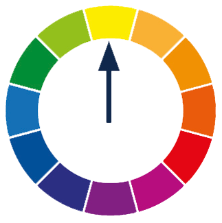
- Monochromatic refers to using one colour only.
- Take your one MAIN colour Yellow and add in light and dark variations.
Using one hue (Yellow) and adding increasing amounts of:
1. White creates a tint of Yellow. E.g. Vanilla.
2. Grey creates a tone of Yellow. E.g. Olive
3. Black creates a shade of Yellow. E.g. Mustard.
Yellow & Complimentary Colours
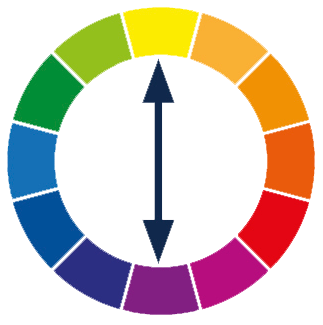
- Complimentary refers to the use of two colours.
- These are colours that are opposite each other on the colour wheel.
- When used together, they bring out the best in each other.
Using your MAIN colour Yellow, with its opposite Purple, will create contrast and make the colours look brighter and more vibrant.
Insider Tip
Use the Complimentary Colour Purple in small amounts, making it more of a pop of added colour or an accent.
To avoid them overpowering each other, mix in tints, tones and shades.
To avoid them overpowering each other, mix in tints, tones and shades. Using a lighter shade of Purple means it will fade back. Allowing the Yellow to come forward.
Yellow & Analogous Colours
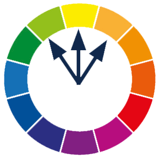
- Analogous refers to the use of three colours.
- These are any three colours that are side-by-side on the colour wheel. Think of them as colour neighbours.
Using your MAIN colour Yellow, find the two similar supporting colours sitting next to each other.
The undertones of these colours, Yellow-Green + Yellow-Orange, are similar. Which helps convey a low-contrast, friendly, harmonious mood and will appear easier on the eye.
Yellow & Split Complimentary Colours
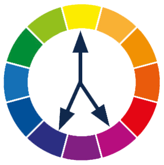
- Split Complimentary is the use of two colours.
- This is using a base colour and the two colours on each side of its complement.
When your MAIN colour is Yellow, its complementary colour is Purple. The two colours on each side of the green are Blue-Purple and Red-Purple.
A combination like this creates a low-contrast palette of Analogous colours. And the opposite colour gives a pop of colour.
Insider Tip
This time, we’re going to do the opposite of what we did with the complementary colour palette. Now the MAIN colour Yellow is used as the Accent.
Colours that go with Yellow
From the moment we wake up, we are greeted with yellow as the sun demands our attention, as do the yellow markings on the roads that the school buses and taxis travel on.
For a colour that demands so much attention, how do we make it work well with other colours?
Blending Yellows

As discussed earlier, a monochromatic palette refers to using one colour.
We love combining Yellow with Yellow because not only does it elevate the look, but the multiple shades of Yellow create harmony together.
Try adding Light and Dark variations together.
The lighter shade will soften, while the darker one will be the highlight.
Yellow Colour Combinations

Yellow & Blue
Complementary colours, that bring out the best in each other and give a modern feel.
Golden Yellow + Baby Blue
Vibrant Yellow + Blue
Rust Yellow + Powder Blue
Gold + Navy
Mustard Yellow + Blue-Grey
Yellow & Purple
These complementary colours always look great together as they create contrast.
Taxicab Yellow + strong purple
Pastel Yellow + Lavender
Mustard Yellow + Lavender
Goldenrod Yellow + Plum Purple
Gold + Thistle
Yellow & Green
Another part of the Analogous Colour combination.
Yellow + Kelly Green
Bright Yellow + Moss Green
Pastel Yellow + Pastel Green
Maize Yellow + Moss Green
Buttercream + Vintage Green
Yellow & Pink
Want a Striking colour combination? Try this.
Canary Yellow + Pastel Pink
Acid Yellow + Cotton Candy Pink
Gold + Pink
Vanilla + Pink
Mustard + Hot Pink
Yellow & Grey
Pantone declared this combination as its
2021 Colours of the Year.
Illuminating (Yellow) + Ultimate Grey
Electric Yellow + Dove Grey
Mellow Yellow + Charcoal Grey
Primrose Yellow + Cool Grey
Yellow + Grey + Black
Yellow & Red
Pale Yellow + Classic Red
Gold Yellow + Ruby + Turquoise
Pastel Yellow + Red-Orange
Golden Yellow + Scarlet
Mustard Yellow + Red
Yellow & Neutrals
Brown – Daffodil + Cocoa
Beige – Bright Yellow + Creamy Beige
White – Mustard + White
Want more Yellow Colour Combination ideas? Click on the image below.
Should you use Yellow as your Branding Colour?
3. Yellow in Branding

Matching to the Tone of Your Business
As discussed earlier, we break Yellow into three options, light, bright and dark. Use this as a guide to help you pick the right shade of Yellow for your branding.
Here’s a visual reference of the list below.
Light Yellow
Calm, clear, delicate, gender-neutral, gentle, happy, hopeful, intellect optimism, positive, relaxing, soft, stimulating, sweet and uplifting.
Bright Yellow
Alert, cheerful, creative, energised, friendly, fun, happy, joy, laughter, lively, modern, playful, summer, sunshine and youthful.
Dark Yellow
Awareness, comforting, expensive, glowing, loyal, luxurious, opulent, positive, prestigious, trust, rich, self-assured, serious, valuable and warmth.
Picking the Perfect Palette with Yellow
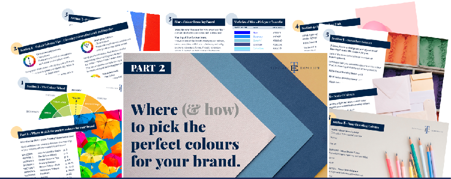
Our 5-step Perfect Palette Process
When choosing a Branding Colour Palette, we always follow this process.
Prefer a download version? Find it in our free guide.
Step 1
Pick the Main Brand Colour
This is the type of Yellow you have chosen, is it light, bright or dark?
Step 2
Pick a Support Brand Colour
This colour creates harmony with the MAIN. Use the tips from Yellow & The Colour Wheel and the Colours that go with Yellow to help you decide.
Step 3
Pick a Light Neutral Brand Colour
This is for balance.
Not sure which one to pick? Download our guide below and go to page 16.
Step 4
Pick a Dark Neutral Brand Colour
Again this helps create balance.
Our guide will explain how to do this, download and head to page 16.
Step 5
Pick an Accent Colour
Used this sparingly to make something on your website pop.
This time head to page 22 of our free guide.
Web and Print Branding
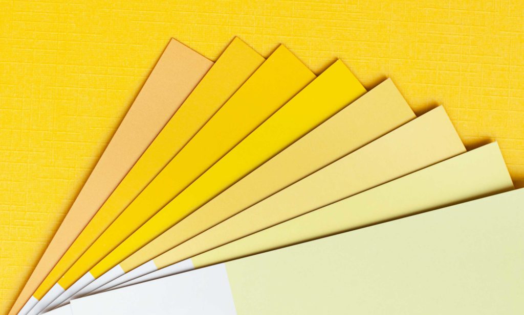
Once you have picked the right Yellow for your business, add the hex code to your website.
View how it looks on both desktop and mobile. To create consistency only, use the one hex code number to ensure the Yellow you chose is always the correct shade.
For print, instead of a hex code, you will need the CMYK (Cyan, Magenta, Yellow & Black) or Pantone, colour breakdown to ensure the Yellow will print out the way you want.
When not to use Yellow in your Branding
What’s your industry?
If you are selling to a high-end market, you should avoid using a bright yellow as this is often associated with cheapness or feelings of discount. Instead, opt for a darker yellow such as gold. Using this shade of yellow will reflect a more luxurious, expensive and exclusive look and feel.
Yellow Branding and your website
Avoid using yellow as your body text, as it will be almost impossible to read.
Even as a headline on a white background, you will strain to read it. Instead, use your shade of yellow on a dark or navy background (as we do with our visual branding)
Or reverse it and use a light shade of yellow as the background colour and choose a darker colour for the text.
You Did it!
That’s a wrap on Should you use Yellow as your Branding Colour?
How do you feel about Yellow now? Have we changed your mind and you’re ready to join Team Yellow? Let us know. And in the meantime, follow us on Pinterest for more blog posts like this.
Where to now?
- Is Branding with Blue more for you? Find out here.
- Want to go bold and try Red in your Branding? This blog will help.
- Prefer a selection of colours to pick from? Download our guide.
Don’t forget to Download our FREE Colour Guide

Like the Blog Post?
PIN IT FOR LATER. And for more helpful tips follow us on PINTEREST.
Search
Create & launch your website in a
few simple steps
FREE GUIDE
While you’re here,
grab our FREE
‘Do’s & Don’ts of what to add to your website’ Guide.
‘Do’s & Don’ts of what to add to your website’ Guide.
When you sign up, we’ll send you
emails with additional helpful content.
About Lavinia & Tom
Hi, we're so glad you found us.
We love helping creatives like you finally have the website you’ve always wanted.
Blog Categories
Follow us
