grab our FREE
‘Do’s & Don’ts of what to add to your website’ Guide.
‘Do’s & Don’ts of what to add to your website’ Guide.
emails with additional helpful content.
Hi, we're so glad you found us.
We love helping creatives like you finally have the website you’ve always wanted.
few simple steps
Follow us
Should you use Black as your Branding Colour?
Are you a fan of how Black looks sophisticated and professional? Or do you find it too depressing and ominous to use in your branding? We have an insider secret on using this traditional colour to your advantage, and in this blog, you will finally know whether you should use Black for your branding.
We have developed a three-part system that takes a deep dive into Black’s meaning, varieties and how to use this information in your branding. After that, you’ll know for sure whether Black could be the perfect addition to your branding.
Ready to dive into the stylish world of Black? Let’s go!
Before we start – missed a part of our Branding Colour Series? Catch up below.
- 1. Should you use Blue as your Branding Colour?
- 2. Should you use Red as your Branding Colour?
- 3. Should you use Yellow as your Branding Colour?
- 4. Should you use Green as your Branding Colour?
- 5. Should you use Pink as your Branding Colour?
- 6. Should you use Orange as your Branding Colour?
- 7. Should you use Purple as your Branding Colour?
- 8. Should you use Grey as your Branding Colour?
- 9. Should you use White as your Branding Colour?
- 10. Should you use Black as your Branding Colour? (this is the blog you’re reading)
- 11. Should you use Beige as your Branding Colour?
- 12. Should you use Brown as your Branding Colour?
Want to start using Black as your Branding Colour now?
Download our FREE Guide
Here’s what we cover
MEANING OF BLACK
The psychological meaning of Black
Meaning of Black to you
Black in Business
VARIETIES OF BLACK
Jet Black to Onyx, we share our favourite Blacks
Black & The Colour Wheel
Colours that go with Black
BLACK IN BRANDING
Matching to the Tone of Your Business
Picking the Perfect Palette with Black
When not to use Black in your Branding
Should you use Black as your Branding Colour?
1. Meaning of Black
The Psychological Meaning
Black is an elegant, fashionable and timeless colour that always feels in – (no matter what the latest colour trend is). And being a neutral colour means it acts as a blank canvas for you to either make a statement or blend in with the crowd. The varied meanings, however, can sometimes feel conflicting.
We believe it is based more on the Tint of Black rather than the colour itself. And to make it a little easier, we’ve created an icon guide below and broken it into Light, Medium and Dark Black.
Original unedited icons from the Noun Project
Light Black Meaning

Medium Black Meaning

Dark Black Meaning

Want a Black Branded Website?
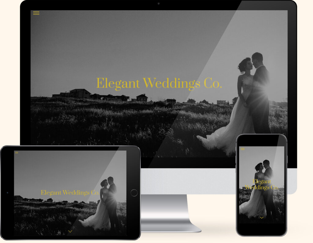
If you love Black, we have the perfect website template for you. Our Elegant Weddings Template combines the sophistication of Black and White Photography with a subtle pop of gold, creating the website of your dreams.
Created exclusively for the Showit platform, now you can showcase your collection of photography alongside your favourite colour.
Meaning of Black to You
The meaning of Black varies from being lucky to bad luck. Scary to sophisticated through to elegance to moody, so where do you stand? Firstly, Black can be a polarising colour, with some people loving it and others keeping as far away from it as possible. Secondly, it often steems back to your first encounter with the colour.
And finally, for more guidance answer these three questions.
- How were you introduced to Black?
- Was it a positive or negative experience?
- Have your feelings for Black changed over the years?
What type of business do you have?
If you’re a personal brand the key is to find a balance between the colours you like and the ones that will attract your ideal client.
In conclusion, look at the icons above and pick which words sum up the way you feel about Black.
Or even consider the way you want your business to be perceived. Doing this will be a great way to determine the shade of Black that’s right for you.
Colour Clues
Every colour makes us feel a certain way. Once you learn how to use the Indoor Clues, it will open your eyes to new options and feelings about colour.

A great place to start is in your home or office. More than likely, Black makes a strong presence. From electrical equipment to cabinets to throw pillows, Black acts as an anchor to an array of colours bringing everything together in perfect harmony. And this is another way how you can use Black in your visual branding.
Would your ideal client like Black, how would it make them feel?
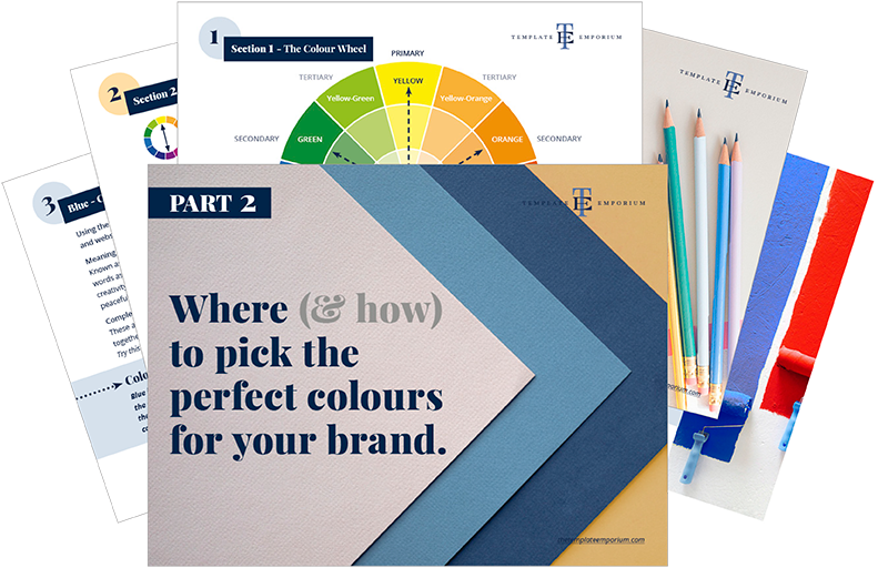
In Part 1 of our Colour Guide series “How (& where) to pick the perfect colours for your brand.” we explain everything about Colour Clues. Click here to download it – it will be super helpful.
Black in Business
Black is a popular choice in visual branding, especially in high-end brands that want to express a feeling of prestige and glamour. It also shouts quality and a higher price.
This traditional, timeless colour is also perfect for brands that want to display trust and reliability.

Some companies that use Black as their branding colour include the following below:

Even more companies within the Fashion, Technology & Beauty arena can be found below.
Beauty Products
L’Oréal
Lancôme
Estee Lauder
Should you use Black as your Branding Colour?
2. Varieties of Black
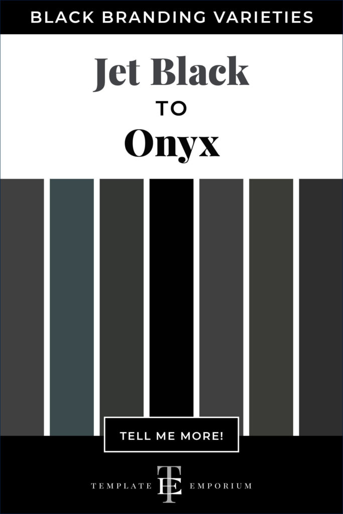
Jet Black to Onyx, we share our favourite Blacks
Many varieties of Black may look similar but have different names. From light to dark Black we’ve compiled a cheat sheet of our favourites below (and included a few you may have never heard of!).
And to make it easy, we added the hex numbers. So you can start using them in your branding today. Check out the below.
Press play on the image below or get all the colour breakdowns in our FREE Guide.
Black & The Colour Wheel
Unlike most colours in our Branding Colour Series, Black is neutral, and neutrals don’t appear on the colour wheel.
It is also the darkest colour in this series and has a total absence of light.
Insider Tip
If you want to make any colour darker, simply add black.
Colours that go with Black
Blending Blacks
Black with Black is always a stylish combination. It is also known as a monochromatic palette due to using only one colour. You could also try mixing in different shades of Black to create harmony and balance.

Black Colour Combinations
Let’s start with the ultimate classic pairing – Black and White. After that, we’ll show you how to combine Black and Red, then Black and Yellow, followed by Black and Blue, Black and Green and finally ending with Black and Purple.

Black & White
Opposite colour pairings form the perfect match.
Ebony + Ivory
Charcoal + White
Black + Chalk
Light Grey + Bone
Jet Black + Pure White
Black & Red
A powerful colour pair that is sure to stand out.
Black + Scarlet
Charcoal + Cardinal
Rich Black + Cherry
Onyx + Maroon
Black + Crismon
Black & Yellow
Joy starts here with these bold colour combos.
Bold Black + Daffodil
Cosmos Black + Gold
Black + Citron
Blue-Black + Taxicab
Ink Black + Corn Yellow
Black & Blue
Try dark-shade pairings for a sophisticated look.
Black + Blue Denim
Onyx + Cobalt
Ebony + Navy
Charcoal + Bright Blue
Black + Powder Blue
Black & Green
These striking combos have a fresh colour feel.
Black + Bottle Green
Charcoal + Spruce
Deep Black + Khaki
Jet Black + Celery
Black + Kelly Green
Black & Purple
Another way to add dark shades for impact.
Black + Plum
Coal + Lilac
Licorice + Ultra Violet
Eerie Black + Very Peri
Rich Black + Lavender
Want more Black Colour Combination ideas? Click on the image below.
Should you use Black as your Branding Colour?

Matching to the Tone of Your Business
As discussed earlier, we break Black into three options, light, medium and dark. You can use the breakdown as a guide to help you pick the right tint of Black for your branding.
Firstly, Light Black
Balanced, conservative, dignified, graceful, loyal, mature, neutral, pure, responsible, secure, solid, simple, stable strength and trustworthy.
Secondly, Medium Black
Authoritative, classy, committed, composure, dependable, dominant, forceful, modest, moody, mysterious, professional, sassy, serious, uncompromising and weighty.
Finally, Dark Black
Chic, classic, elegance, expensive, fashionable, high-quality, luxury, powerful, prestigious, social status, sophistication, style, timelessness, tradition and wealth.
Picking the Perfect Palette with Black
Our 5-step Perfect Palette Process
Need help to choose your Brand Colour Palette? We’ve created a simple step-by-step process. Grab our free guide as a handy download.

Step 1
Pick the Main Brand Colour
So you’ve picked Black. Now you have to decide on the type of Black, is it light, medium or dark?
Step 2
Pick a Support Brand Colour
If you feel stuck at this stage, just remember this colour creates harmony with the MAIN. Refer back to our tips earlier on Colours that go with Black to help you decide.
Step 3
Pick a Light Neutral Brand Colour
Why do you need neutrals in your brand colour palette? Because it creates balance.
Not sure which neutrals to pick? Go to page 16 of our free guide.
Step 4
Pick a Dark Neutral Brand Colour
Your light neutral colour needs a partner. So now it’s time to pick a dark neutral colour for even more balance. Our guide on page 16 explains everything.
Step 5
Pick an Accent Colour
This colour is used to make something on your website pop. Therefore it’s only used sparingly. Page 22 of our free guide will explain more.
Web and Print Branding

Once you have picked the right Black for your business, add the hex code to your website.
View how it looks on both desktop and mobile. To create consistency only, use the one hex code number to ensure the Black you chose is always the correct shade.
For print, instead of a hex code, you will need the CMYK (Cyan, Magenta, Yellow & Black) or Pantone, colour breakdown to ensure the Black will print out the way you want.
Insider Tip
A way to avoid getting a washed-out CMYK Black when printing, use a Rich Black.
In a graphics program such as Indesign, use this breakdown – 100% K (Black) and 60% C (Cyan). to create a rich black.
When not to use Black in your Branding
If your brand has a light and airy look and feel, Black may not be your best option. And combining too much Black can have the opposite effect and make everything feel heavy, depressing and even dark and gloomy.
Brands that have children as their target market may need to let Black take the back seat and act as a secondary colour and instead incorporate other playful colours into their brand to inject some fun back into their branding.
You Did it!
That’s a wrap on Should you use Black as your Branding Colour?
How do you feel about Black now? Would it suit you and your branding? Let us know. And in the meantime, follow us on Pinterest for more blog posts like this.
Where to now?
- How to choose your brand colours – Find out here
- 3 Tips for picking your perfect brand colours – Check it out here
- Website Branding: How to use your Brand Colours to make your site Pop!
Like the Blog Post?
PIN IT FOR LATER. And for more helpful tips follow us on PINTEREST.
Search
Create & launch your website in a
few simple steps
FREE GUIDE
While you’re here,
grab our FREE
‘Do’s & Don’ts of what to add to your website’ Guide.
‘Do’s & Don’ts of what to add to your website’ Guide.
When you sign up, we’ll send you
emails with additional helpful content.
About Lavinia & Tom
Hi, we're so glad you found us.
We love helping creatives like you finally have the website you’ve always wanted.
Blog Categories
Follow us
