grab our FREE
‘Do’s & Don’ts of what to add to your website’ Guide.
‘Do’s & Don’ts of what to add to your website’ Guide.
emails with additional helpful content.
Hi, we're so glad you found us.
We love helping creatives like you finally have the website you’ve always wanted.
few simple steps
Follow us
3 Tips for Picking your Perfect Brand Colours
Do you struggle when it comes to choosing a colour palette for your business? (Most creatives do!). And one of the most common questions we get asked is How to pick the perfect colours for your brand.
With personal brands (meaning your name is in the title of your business or the face behind your brand), it’s often a fine line between what you like and what will resonate with your ideal client.
In this 2-Part series, you will learn How & Where to pick the perfect colours.
- Part 1 – 3 Tips for Picking Your Perfect Branding Colours (this is the blog you’re reading)
- Part 2 – How to Choose Your Brand Colours
Firstly, we’ll discover the three tips for using Colour Clues (that are already around you). These “how” tips ensure the palette you pick is perfect every time.
Prefer this blog as an interactive PDF guide download? We’ve got you covered! Find it here.
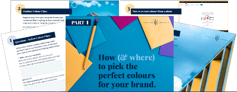
Index
Welcome to Colour Clues
1: Indoor Colour Clues
2: Outdoor Colour Clues
3: How to Extract Colours from a Photo
Bringing all the Clues together
Welcome to Colour Clues
Our insider secret to how to pick the perfect colours for your brand is using Colour Clues. In this blog, we will look at both Indoor and Outdoor Colour Clues. We will then show you how to bring them together to create a colour palette unique to you.
Indoor Colour Clues
Questions
Every colour makes us feel a certain way. Once you learn how to use the Indoor Clues, it will open your eyes to new options and feelings about colour.

1. Walk into your wardrobe.
What one or two colours stand out to you?
If you’re a personal brand, picking colours you love to wear helps enforce the personal connection.
BONUS TIP
No colours jumping out? Look beyond your clothes and check, out your shoes, bags or accessories.
2. Next, look for light and dark Neutral Colours.
What one or two colours stand out to you?
This includes black, brown, grey, white, cream or beige.
Neutrals help create balance in your branding palette.
3. Go for a walk around your home.
What one or two colours stand out to you?
What colours have you used in decorating? Look in your bedroom, office or any other room you love.
BONUS TIP
Would your ideal client like these colours? How would it make them feel? E.g. Happy, relaxed, confident. How do you want your client to feel about your brand?
Next Up
We’ll combine these answers with your Outdoor Colour Clues to create the perfect brand palette.
Outdoor Colour Clues
Stepping away from your computer breaks your routine and feels inspiring. And an inspired mind helps you to look at things (& colours) in a new way.
Everywhere you go, take your phone or camera to capture Outdoor Colour Clues.
Colour combos are everywhere from flowers, animals, architecture, art and fashion. (Also paint sample chips!)
Thinking about how you want your client to feel about your brand, look at your photos and pick the ones that reflect those feelings.
Insider Pro Tip
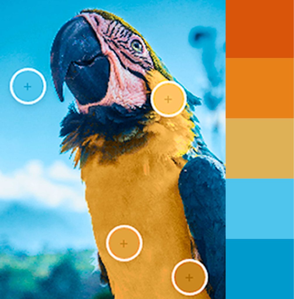
To create a unique colour palette, extract the colours out of the photos you take and incorporate this into your visual branding. We do this by using our favourite tool by Adobe. We’ll show you the steps below.
How to Extract Colours from a Photo
Follow the red circle numbers to help you guide through our step-by-step process.
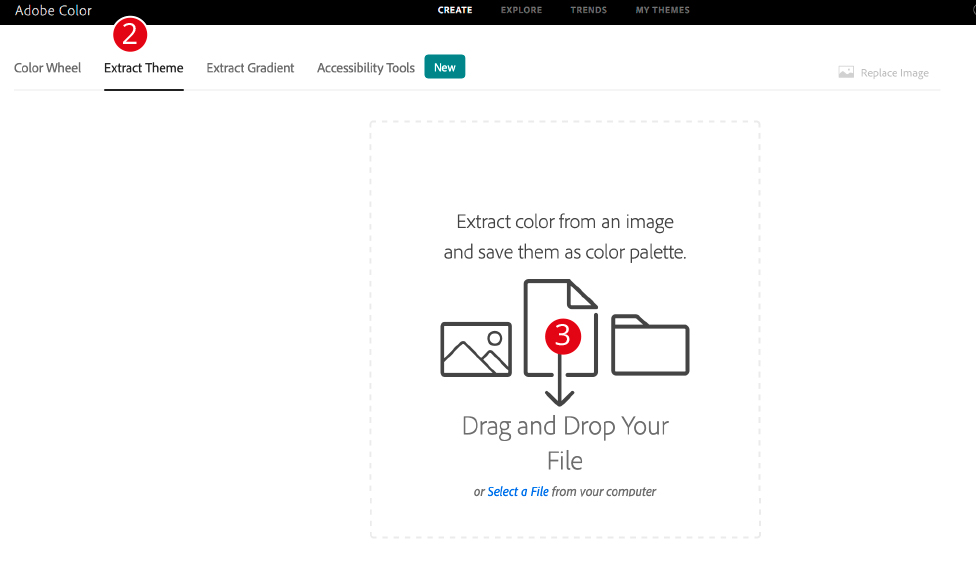
1. Go to Adobe Colour.
2. Click on Extract Theme.
3. Drop your photo directly on the Drag & Drop icon.
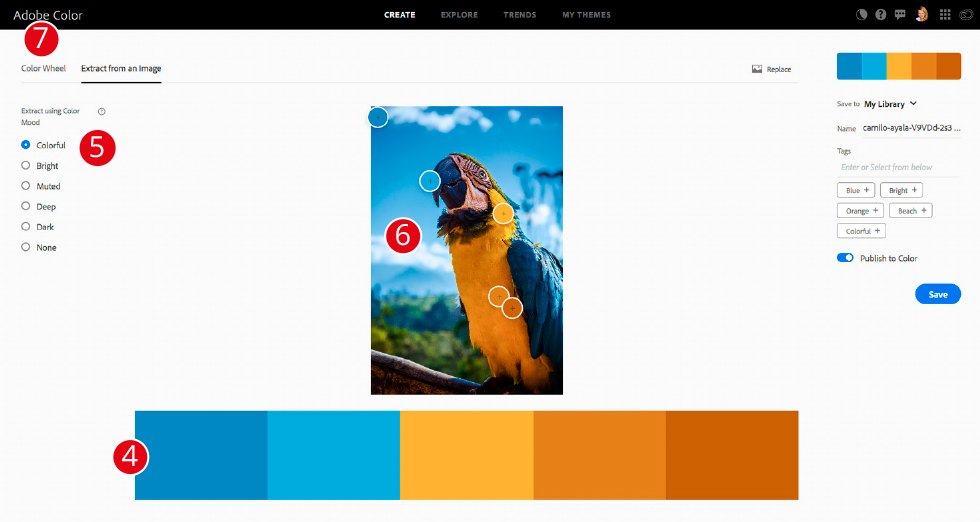
4. Below the image you have uploaded, a colour palette will appear.
5. On the left-hand side panel, you can change the Colour Mood by toggling between the radio buttons.
6. On the photo, drag the circle with the + to pick another colour from it.
7. Happy with your colour palette?
On the left-hand side panel, click on Colour Wheel.
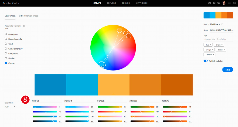
8. Write down the hex (#) numbers of each colour.
Now, every time you want to use this colour on your website, type in the hex (#) numbers. Using the exact number every time will create a consistent and professional look.
Bringing all the Clues together
You’ll now have 3 to 4 colours that could be part of your Visual Branding palette.
One-colour will act as the MAIN.
This colour stands out over everything else.
Next are Neutrals.
Pick a light and dark version.
The final colours will be SUPPORT and ACCENT.
They make the MAIN colour look even better and create balance.
After we completed these exercises, we wanted to incorporate, Blue, Yellow and White in our branding.
But we soon discovered there’s more than just one variety of these colours. And each colour has certain meanings associated with it.
Plus there are certain colours that compliment (and ones that don’t!).
How do you find all the answers to this? Next week in Part 2:
“Where” to pick the perfect colours for your brand.
Where to now?
- Download How to pick the perfect colours for your brand.
- Confused about file types? What are Vector & Raster Files explains all.
- Ideas are the most important part of a Video Pin – Find out why here!
Don’t forget to download our FREE Colour Guide – Find it here.

Like the Blog Post?
PIN IT FOR LATER. And for more helpful tips follow us on PINTEREST.
Search
Create & launch your website in a
few simple steps
FREE GUIDE
While you’re here,
grab our FREE
‘Do’s & Don’ts of what to add to your website’ Guide.
‘Do’s & Don’ts of what to add to your website’ Guide.
When you sign up, we’ll send you
emails with additional helpful content.
About Lavinia & Tom
Hi, we're so glad you found us.
We love helping creatives like you finally have the website you’ve always wanted.
Blog Categories
Follow us