grab our FREE
‘Do’s & Don’ts of what to add to your website’ Guide.
‘Do’s & Don’ts of what to add to your website’ Guide.
emails with additional helpful content.
Hi, we're so glad you found us.
We love helping creatives like you finally have the website you’ve always wanted.
few simple steps
Follow us
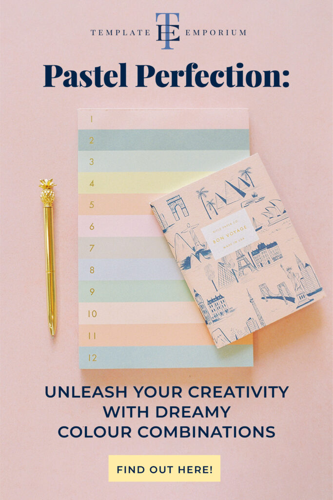
Pastel Perfect: Infuse your Visual Branding with a touch of Pastel Magic
Pastel colours are like a breath of fresh air, bringing a touch of softness and tranquillity to any Visual Branding. From delicate pinks to soothing blues, these gentle shades are a delightful way to evoke a sense of calm and elegance.
Another reason we love using Pastel colours in branding is that they can’t clash, so anything goes.
In this blog, we’ll share our colour-pairing tips to show you how to use pastels in your Visual Branding. Are you ready to dive into a world of gentle hues and sweet serenity?
Before we start – missed a part of our Colour Branding Tips Series? Catchup up below.
- What’s the difference between Primary & Secondary colours (+ which one is best for my brand)?
- Which Colour should you use for your Branding?

What are Pastel Colours?
Pastel colours are light, soft shades of colours, typically characterized by their muted and toned-down appearance.

They are often associated with a gentle and calming effect. Some examples of pastel colours include soft pinks, lavender, mint green, baby blue, and light yellow.
These colours can bring a soothing and delicate touch to your Visual Branding.

Pastel Colour Combos that’ll make your Visual Branding Pop
Cotton Candy Delight
Combine soft pink with baby blue and mint green for a sweet and refreshing palette that exudes a whimsical charm.

Lavender Serenade
Pair delicate lavender with pale yellow and dusty rose for a soft and sophisticated palette that’s both calming and elegant.

Sunset Dreams
Blend warm peach with soft coral and pale goldenrod for a dreamy and romantic palette that mimics the colours of a breathtaking sunset.

Minty Freshness
Mix pale mint green with light grey and ivory for a fresh and clean palette that feels tranquil and serene.

Sorbet Splash
Invoke a playful vibe by combining pastel orange with lemon yellow and light aqua blue for a vibrant and energetic palette that’s full of zest.

How to use Pastel Colours in your Visual Branding
When it comes to pairing pastel colours, the key is to create a cohesive and harmonious palette that delights the senses.

Know your audience
Here are some essential tips to help you achieve a stunning and unified look.
Who are you trying to attract with your Visual Branding, and would they be attracted to pastel colours?
If you answered yes and you believe they would resonate with this colour palette, let’s decide which pastel colours to choose.
Pastel Pop: Pair soft pink, lemon yellow and a soft grey for a vibrant and playful look.

Limit your palette
Select a few pastel colours that complement each other and stick to them. Too many colours can overwhelm the visual appeal of your Visual Branding. Aim for simplicity and let the pastels shine.

Consider the contrast
As you choose your pastel colours, think about contrast. Mix light and dark pastels to create depth and visual interest. Balance warmer tones with cooler tones for a well-rounded palette.

Play with shades and tints
Experiment with various shades and tints of your chosen pastel colours. Lighten or darken them to add dimension and versatility to your Visual Branding.

Test your palette
Before finalizing your palette, test it across different types of mediums. Ensure that the colours harmonise and complement each other seamlessly.
Pretty in Pastel: Combine blush pink, mint green, and light yellow for a delicate and feminine vibe.

Embrace Neutrals
Pair your pastels with neutral tones like soft grey, beige, or ivory. Neutrals act as the foundation, allowing your pastel colours to truly shine.
Or try Nature’s Pastels: Blend sage green, pale peach, and sky blue for an earthy and calming tone.

Find Balance
Remember, creating a cohesive pastel Branding colour palette is about finding a balance between unity and creativity.

Insider Tips
Don’t want an entire pastel branding palette? Try using them with warm beige or deep moody greys.

Or if you find sorbet shades too sweet, offset them with neutral accents such as Blacks, Nudes or Khaki.


You Did it!
That’s a wrap on Pastel Perfect: Infuse your Visual Branding with a touch of Pastel Magic. Will you be using a Pastel palette in your Visual Branding? Below are a few more examples to get your creative juices flowing. Feel free to experiment and let your artistic flair shine!


Where to now?
Want more Visual Branding Colour tips? Check out the below.
- What’s the difference between Primary & Secondary colours (+ which one is best for my brand)?
- Which Colour should you use for your Branding?
- 3 Tips for Picking Your Perfect Brand Colours
Want more Visual Branding Tips?
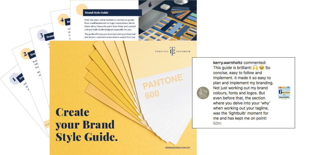
Now you’ve picked your Branding Colours you’ll want them to look consistent across everything you create. We’ll show you how with our FREE Create Your Brand Style Guide.
Here’s what Surface Pattern Designer – Kerry Warnholtz said about our style guide on Instagram.

Like the Blog Post?
PIN IT FOR LATER. And for more helpful tips follow us on PINTEREST.

Search
Create & launch your website in a
few simple steps
FREE GUIDE
While you’re here,
grab our FREE
‘Do’s & Don’ts of what to add to your website’ Guide.
‘Do’s & Don’ts of what to add to your website’ Guide.
When you sign up, we’ll send you
emails with additional helpful content.
About Lavinia & Tom
Hi, we're so glad you found us.
We love helping creatives like you finally have the website you’ve always wanted.
Blog Categories
Follow us