grab our FREE
‘Do’s & Don’ts of what to add to your website’ Guide.
‘Do’s & Don’ts of what to add to your website’ Guide.
emails with additional helpful content.
Hi, we're so glad you found us.
We love helping creatives like you finally have the website you’ve always wanted.
few simple steps
Follow us
How to Choose Your Brand Colours
In Part one of this series, we introduced you to Colour Clues to help you decide on the perfect colour combination. Next, we’ll show you how to use the Colour Wheel to discover different varieties, what colours go together and more. Are you ready to dive into How to Choose Your Brand Colours?
Before we start, missed a part of this How & Where to pick the perfect colours Series?
- Part 1 – 3 Tips of Picking your Perfect Brand Colours
- Part 2 – How to Choose Your Brand Colours – (this is the blog you’re reading)
Prefer this blog as a handy PDF guide download? Find it here.
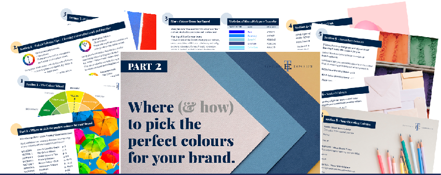
Index
- Learn the Lingo Pro Tips
- 5-Step Colour Wheel Process
- The Colour Wheel
- Colour Scheme Tips
- Primary Colours Blue – Yellow – Red
- Bonus Colour – Pink
- Secondary Colours – Green – Purple – Orange
- Neutrals – Light & Dark – Beige – White – Brown – Black – Grey
- Accent Colours
- Your Chosen Brand Colours
Learn the Lingo Pro Tips
Understanding what these four colour terms mean will help you feel like a Colour Pro by the end of this post!
Hue = The name of a PURE COLOUR. E.g. Red
Tint = Adding WHITE to the hue – making it lighter
Tone = When you add Grey to the hue
Shade = Adding BLACK to the hue – making it darker
5-Step Colour Wheel Process
We love using the Colour Wheel to help us choose Brand colours for all our Template Emporium Showit Websites. And, using our 5-step process now, you can too!
Step 1 – Pick a Main Brand Colour
This colour is throughout your website.
Check out the Colour Wheel below and pick one colour that will act as your Main.
Head to either the Primary, Pink or Secondary Colours section and discover its meaning and the different varieties.
Step 2 – Pick a Support Brand Colour
This colour creates harmony with the MAIN.
To help you pick a support colour:
• Use the Insider Pro Tips on the Colour Branding Board of your choice.
• Go to Colour Scheme Tips for further help.
Step 3 – Pick a Light Neutral Brand Colour
This is for balance.
Head to Neutrals and choose a Light Neutral.
Step 4 – Pick a Dark Neutral Brand Colour
This too is for balance.
Neutrals will also help you choose a Dark Neutral.
Step 5 – Pick an Accent Colour
Used sparingly to make something on your website pop.
Lastly, choose your Accent Colour.
The Colour Wheel
In this blog, we will be concentrating on the Primary and Secondary Colours of the Wheel.
Want your own Colour Wheel as a download? Click here.
Colour Scheme Tips
When choosing your brand colour palette, the aim is to choose colours that work well together. Using the Colour Wheel as our guide, here are four tips for the perfect colour scheme.
Complimentary Colours – Two Colours
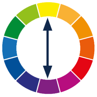
- These are colours that are opposite each other on the colour wheel.
- To avoid them overpowering each other, mix in tints, tones and shades.
Using your MAIN colour with its opposite will make the colours look brighter and vibrant. E.g. Yellow & Purple, Blue & Orange, Red & Green.
Split Complementary Colours – Three Colours

- This is using a base colour and the two colours on each side of its complement.
- To create an interesting contrast, mix in tints, tones & shades.
If your MAIN colour is Yellow, its complementary colour is Purple. The two colours on each side of Purple are Blue-Purple and Red-Purple.
Analogous Colours – Three Colours

- These are any three colours that are side-by-side on the colour wheel.
- This colour scheme will help convey a friendly, harmonious mood and will appear easier on the eye.
Using your MAIN colour, find the two similar supporting colours sitting next to each other. E.g. Yellow + Yellow-Green + Yellow-Orange.
Monochromatic – One Colour

- Take your one MAIN colour and add in light and dark variations.
- This simple colour scheme will keep your palette looking clean and fresh.
Using the one hue and adding white, black or grey to it creates tints, tones and shades.
Primary Colours
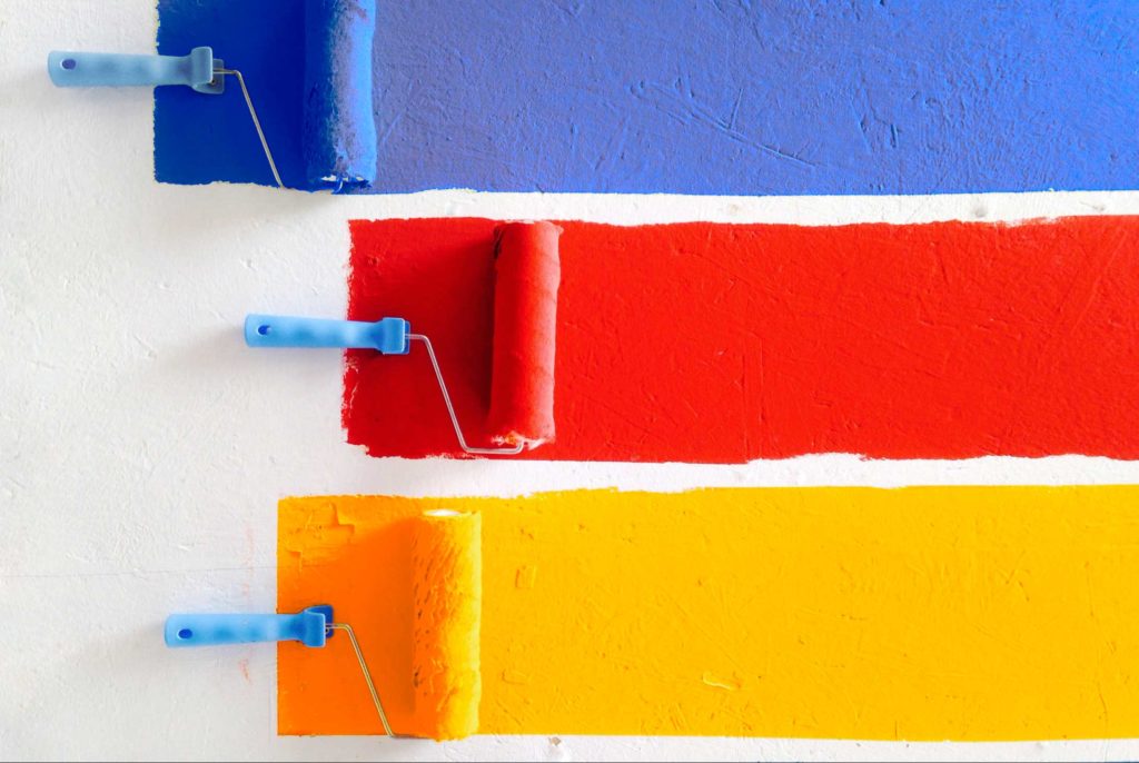
If Blue, Yellow or Red is part of your Visual Branding Colours, this section is for you.
Each of these three colours has its own Colour Branding Board.
Each board below tells you where the colour is on the Colour Wheel, its meaning, and the colours that complement it.
BLUE Colour Branding Board -can be found HERE.
YELLOW Colour Branding Board – can be found HERE.
RED Colour Branding Board – can be found HERE.
Insider Pro Tip
The Primary Colours Blue, Yellow and Red, are spaced out equally on the colour wheel. When mixed in different amounts, they create every other colour you can see.
Blue – Colour Branding Board
Pick your favourite from the Blues below. Using the exact hex number ensures your colour and website looks consistent and professional.
Want to keep this handy guide as a reference? Find it here.
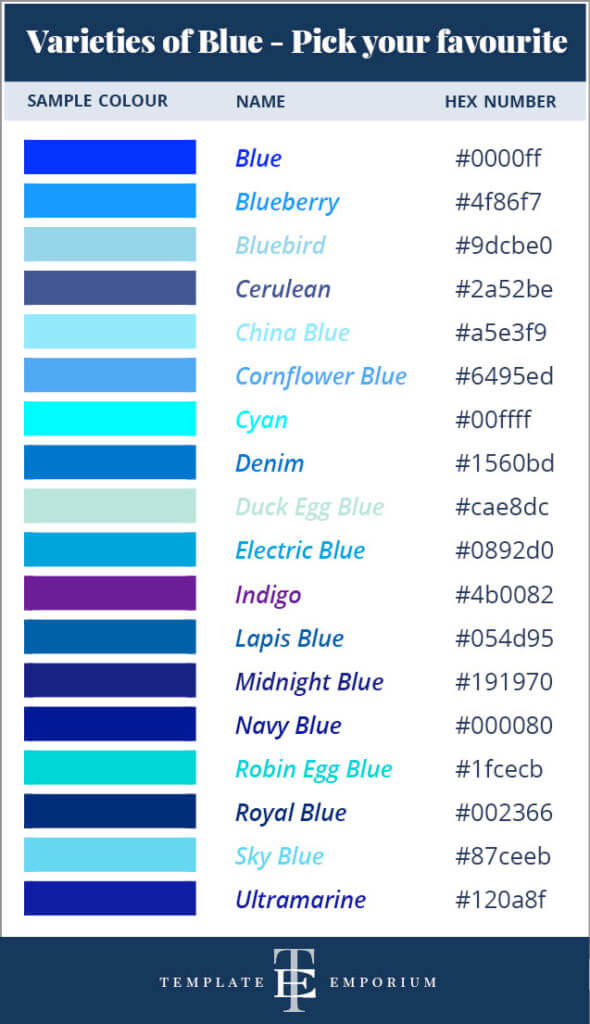
Meaning of Blue for your brand
Known as one of the world’s most popular colours, words associated with it are – alertness, authority, creativity, educated, formal, friendly, openness, peaceful, protective, technical and trustworthy.
Complementary Colours – Blue & Orange
These are opposites on the colour wheel. When used together, they bring out the best in each other. Try this tip to create harmony with your brand colours.
Colour Wheel Tips – Blue
Blue is both a COOL & Primary colour.
Along with the other two primary colours (Red & Yellow), they make up every available colour. Other colours, however, can’t be mixed to make Blue.
Related Blog Post | Should You Use Blue as your Branding Colour?
Yellow – Colour Branding Board
Pick your favourite from the Yellows below. Using the exact hex number ensures your colour and website looks consistent and professional.
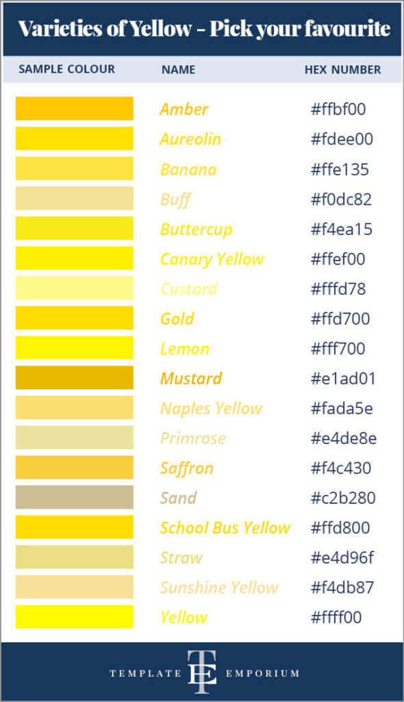
Meaning of Yellow for your Brand
Known as the most vibrant colour in the spectrum, words associated with it are – alert, bright, cheerful, creative, curious, happiness, joy, nutritious, playful, visible, and young.
Complementary Colours – Yellow & Purple
These are opposites on the colour wheel. When used together, they bring out the best in each other. Try this tip to create harmony with your brand colours.
Colour Wheel Tips – Yellow
Yellow is both a WARM & primary colour.
Along with the other two primary colours (Blue & Red), they make up every available colour. Other colours, however, can’t be mixed to make Yellow.
Red – Colour Branding Board
Pick your favourite from the Reds below. Using the exact hex number ensures your colour and website looks consistent and professional.
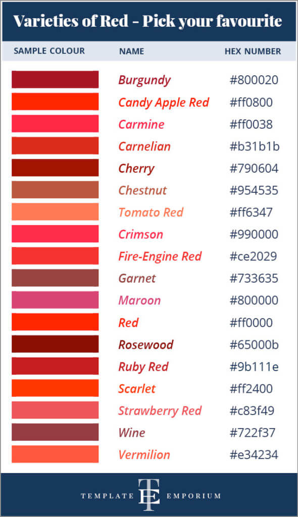
Meaning of Red for your brand
Red holds a unique role in the animal and human worlds. Words associated with it are – alert, beauty, commanding, danger, dominance, dynamic, fun, passion, rebellious, romantic, status, and strength.
Complementary Colours – Red & Green
These are opposites on the colour wheel. When used together, they bring out the best in each other. Try this tip to create harmony with your brand colours.
Colour Wheel Tips – Red
Red is both a WARM & primary colour.
Along with the other two primary colours (Yellow & Blue), they make up every available colour. Other colours, however, can’t be mixed to make Red.
Related Blog Post | Should You Use Red as your Branding Colour?
Bonus Colour Pink – Branding Board
What’s the correct name for Dark Pink? Not everyone agrees, but we believe it will always be Magenta. Also, the table below introduces you to “Fairy Floss Pink”. For our non-Aussie friends, this is the Australian version of Cotton Candy.
Pick your favourite from the Pinks below. Using the exact hex number ensures your colour and website looks consistent and professional.
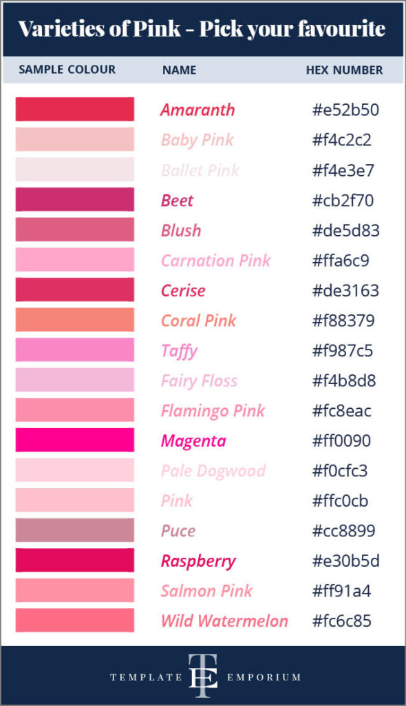
Meaning of Pink for your Brand
Viewed as the softer side of red, words associated with it are – calming, comforting, feminine, friendship, fun, hope, inspiring, love, playfulness, romance, softness and youthfulness.
Complementary Colours – Pink & Green
Absent from the Colour Wheel, Pink instead follows the rules of its base colour Red. Just as Red and Green are complementary, so are Pink and Green.
Colour Wheel Tips – Pink
Most Colour Wheels won’t show Pink, due to it being a TINT of Red and not a HUE. It’s made by using the base colour Red & combining it with white, resulting in a lighter shade of Red.
5. Secondary Colours
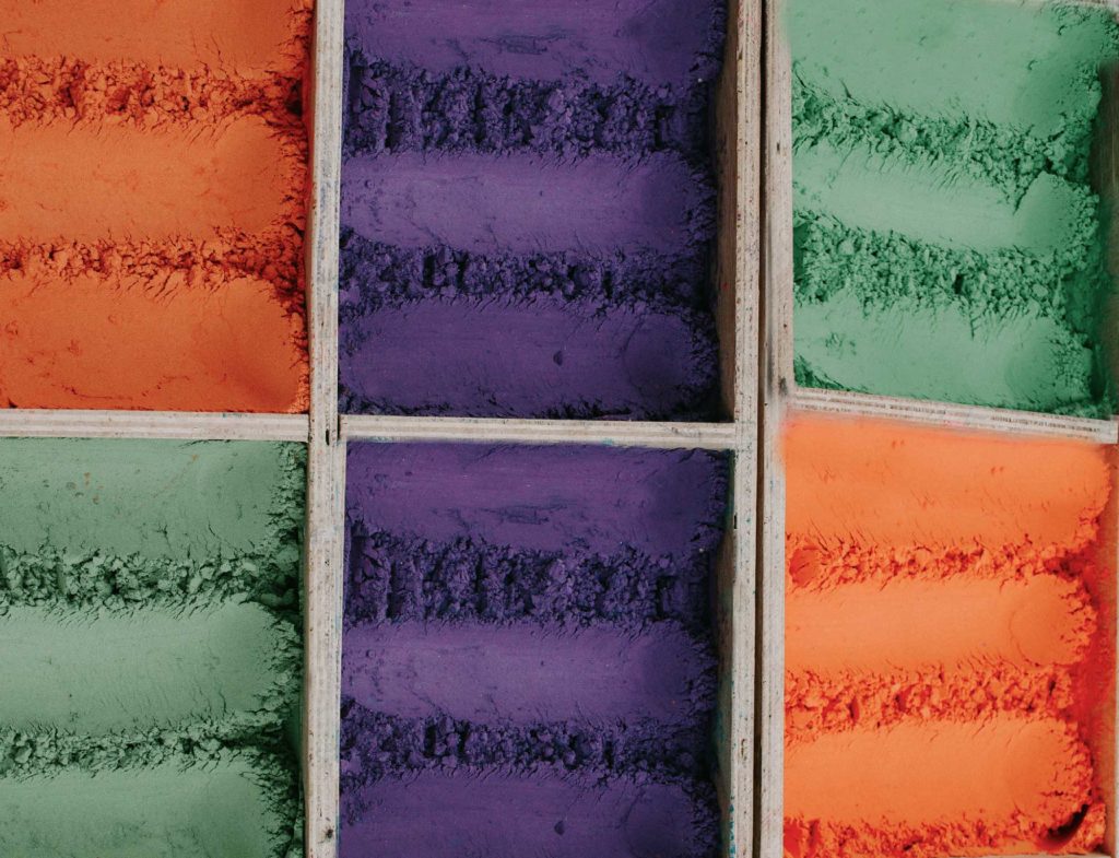
If Green, Purple or Orange are part of your Visual Branding Colours, this section is for you.
And just like the Primary Colours each of the three Secondary colours has its own Colour Branding Board as well.
Each board below tells you where the colour is on the Colour Wheel, its meaning, and the colours that complement it.
GREEN Colour Branding Board -can be found HERE.
PURPLE Colour Branding Board – can be found HERE.
ORANGE Colour Branding Board – can be found HERE.
Insider Pro Tip
Colours on the wheel = Primary, Secondary & Tertiary.
Secondary colours fit in-between the Primary colours.
Mixing 2 Primary Colours = A Secondary Colour.
Mixing a Secondary + the Primary next to it = Tertiary.
Green – Colour Branding Board
Pick your favourite from the Greens below. Using the exact hex number ensures your colour and website looks consistent and professional.
Want to keep this handy guide as a reference? Find it here.
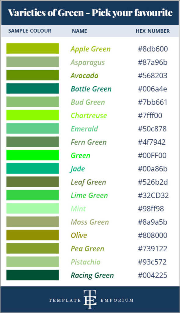
Meaning of Green for your Brand
Connected to many emotions and concepts of life, words associated with it are – adventurous, athletic, balanced, lucky, nature, patient, peaceful, refreshing, relaxed, safe, sharing, success and tranquillity.
Complementary Colours – Green & Red
These are opposites on the colour wheel. When used together, they bring out the best in each other. Try this tip to create harmony with your brand colours.
Colour Wheel Tips – Green
Green is both a COOL & secondary colour.
It’s made by mixing two primary colours (Blue + Yellow) together. These primaries (Blue & Yellow) appear on either side of Green on the colour wheel.
Purple – Colour Branding Board
Pick your favourite from the Purples below. Using the exact hex number ensures your colour and website looks consistent and professional.
Want to keep this handy guide as a reference? Find it here.
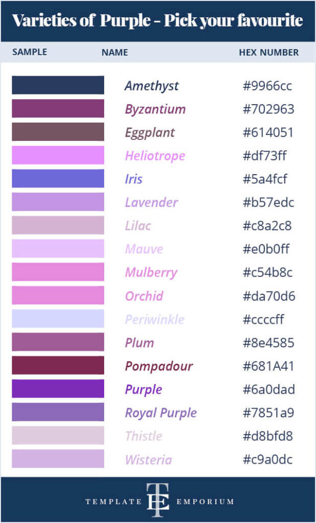
Meaning of Purple for your Brand
Tied to regal associations across the world, words associated with it are – artistic, fantasy, feminine, fragrant, intelligent, inspiring, luxurious, melancholic, royal, spiritual, and wealth.
Complimentary Colours – Purple & Yellow
These are opposites on the colour wheel. When used together, they bring out the best in each other. Try this tip to create harmony with your brand colours.
Colour Wheel Tips – Purple
Purple is both a COOL & secondary colour.
It’s made by mixing two primary colours (Blue + Red) together. These primaries (Blue & Red) appear on either side of Purple on the colour wheel.
Orange – Colour Branding Board
Pick your favourite from the Oranges below. Using the exact hex number ensures your colour and website looks consistent and professional.
Want to keep this handy guide as a reference? Find it here.
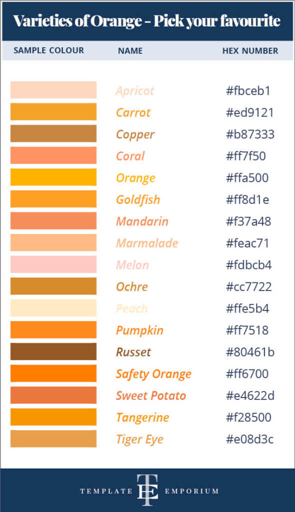
Meaning of Orange for your Brand
Viewed as an uplifting and optimistic colour, words associated with it are – abundant, active, burning, communicative, cosy, excited, festive, flavorful, helpful, inspiring and warning.
Complementary Colours – Orange & Blue
These are opposites on the colour wheel. When used together, they bring out the best in each other. Try this tip to create harmony with your brand colours.
Colour Wheel Tips – Orange
Orange is both a WARM & secondary colour.
It’s made by mixing two primary colours (Yellow + Red) together. These primaries (Yellow & Red) appear on either side of Orange on the colour wheel.
Neutrals – Light & Dark

Next up is picking a light and dark neutral colour to work alongside your main visual branding colours.
Each board below tells you where the colour is on the Colour Wheel, its meaning, and the colours that complement it.
BEIGE Colour Branding Board -can be found HERE.
WHITE Colour Branding Board – can be found HERE.
BROWN Colour Branding Board – can be found HERE.
BLACK Colour Branding Board – can be found HERE.
GREY Colour Branding Board – can be found HERE.
Insider Pro Tip
Using Neutral Colours in your Visual Branding creates balance. Because of their subtle features, they don’t demand attention and help the other branding colours be the star of the show.
Beige – Colour Branding Board
Pick your favourite from the Beiges below. Using the exact hex number ensures your colour and website looks consistent and professional.
Want to keep this handy guide as a reference? Find it here.
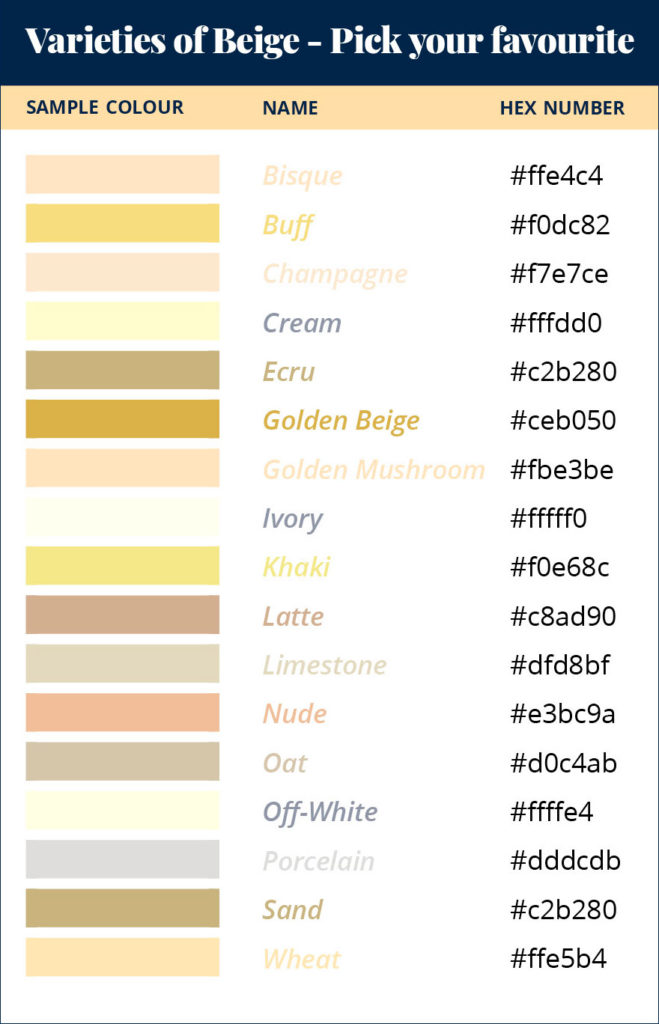
Meaning of Beige for your Brand
A French word that originally meant non-dyed natural wool. Words associated with it are – approachability, calmness, conservative, dependable, friendly, neatness, openness, quality and relaxing.
Complementary Colours
Look at the neutrals undertone to find its compliment.
A red warm beige’s compliment = Green
A yellow warm beige’s compliment = Purple
A blue cool beige’s compliment = Orange
Colour Wheel Tips – Neutrals
Neutrals don’t appear on the colour wheel. Beige is known as an Earth Tone. It’s made by:
• Mixing White + Brown = Light Brown hue
• Mixing all three primaries = Brown + White = Beige
White – Colour Branding Board
Pick your favourite from the Whites below. Using the exact hex number ensures your colour and website looks consistent and professional.
Want to keep this handy guide as a reference? Find it here.
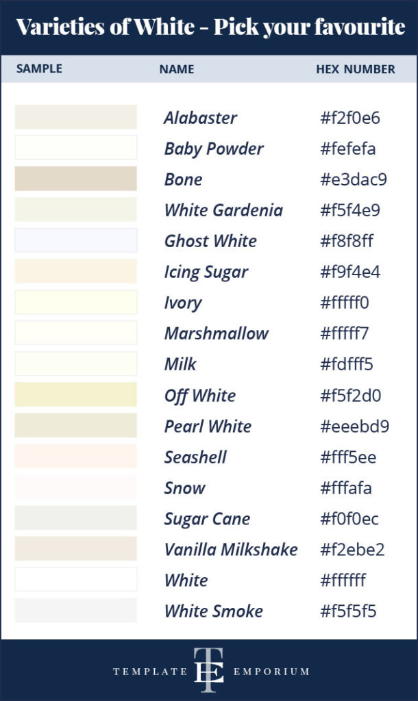
Meaning of White for your Brand
Determining the lightness of all other colours has a more perceived value than brighter colours. Words associated with it are – clean, sparse, goodness, trustworthy, timeless, simplicity.
White isn’t technically a colour, instead, it’s a mix of all colour light.
Colour Wheel Tips – Neutrals
Neutrals don’t appear on the colour wheel.
White is a COOL, NEUTRAL colour. It is the lightest colour and has no HUE. It cannot be made by mixing any colours on the colour wheel.
Brown Colour Branding Board
Pick your favourite from the Browns below. Using the exact hex number ensures your colour and website looks consistent and professional.
Want to keep this handy guide as a reference? Find it here.
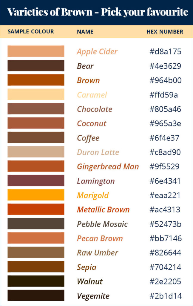
Meaning of Brown for your Brand
An earthy toned colour linked to nature. Words associated with it are – comfort, homely, maturity, natural, practical, reliability, security, solidarity, strength, traditional, trustworthy and wholesome.
Complementary Colours
Look at the neutrals undertone to find it’s a compliment.
Orange (undertone) Brown compliment = Blue.
Red (undertone) Brown compliment = Green.
Purple (undertone) Brown compliment = Yellow.
Colour Wheel Tips – Neutrals
Neutrals don’t appear on the colour wheel. Brown is a composite colour made by mixing all three primaries equally together. Or by mixing a primary colour with its complementary colour.
Black Colour Branding Board
Pick your favourite from the Blacks below. Using the exact hex number ensures your colour and website looks consistent and professional.
Want to keep this handy guide as a reference? Find it here.
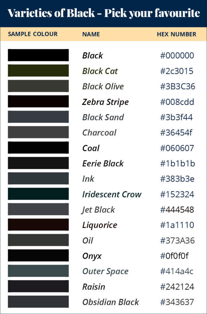
Meaning of Black for your Brand
Determining the darkness of all other colours, Black has a more perceived value than brighter colours. Words associated with it are – authority, competitive, elegance, formality, power, prestige, professional, quality, status, strength, timeless.
Black isn’t technically a colour, it’s a mere absence of light.
Colour Wheel Tips – Neutrals
Neutrals don’t appear on the colour wheel. To create Black you’ll need to do one of the following:
- Equally, mix primary colours Blue+Red+Yellow.
- Blend complementary colours – E.g. Blue + Orange.
- Mixing Blue + Brown for a Rich Black.
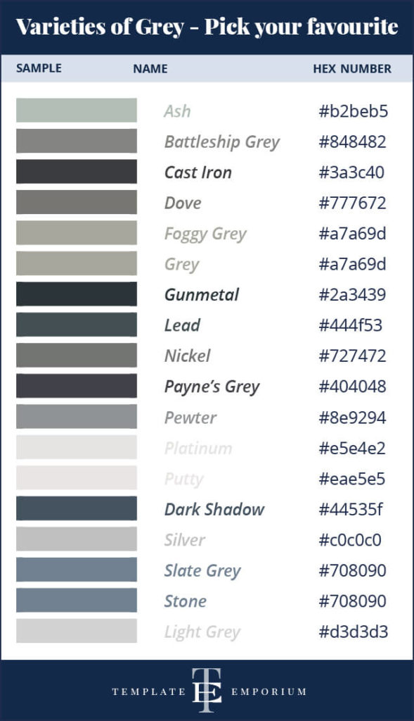
Grey Colour Branding Board
Pick your favourite from the Greys below. Using the exact hex number ensures your colour and website looks consistent and professional.
Want to keep this handy guide as a reference? Find it here.
Meaning of Grey for your Brand
As a neutral, this timeless colour doesn’t demand attention. Words associated with it are – classic, conservative, intelligent, maturity, professional, reliability, subtle and wisdom.
Insider Pro Tip
Acting as a bridge between colours on your website, use grey (rather than black) for your body copy. This subtle difference will make your headings pop out and help create a hierarchy between the two.
Colour Wheel Tips – Neutrals
Neutrals don’t appear on the colour wheel. Grey is a COOL NEUTRAL colour between black and white.
Created by mixing Black + White = Neutral Grey.
Or blending three primary colours = Primary Grey.
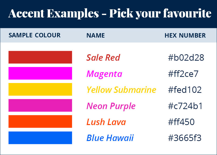
Accent Colours
Pick your favourite from the Accent Colours below. Using the exact hex number ensures your colour and website looks consistent and professional.
Want to keep this handy guide as a reference? Find it here.
What is an Accent Colour?
Think of it as a highlighter. This pop of bold colour acts as a guide for your website visitor.
It immediately demands their attention by showing them what to look at.
How often should I use an Accent Colour?
Use it sparingly to create emphasis when you want something important to stand out.
Where to use an Accent Colour?
Never used an accent colour on your website before? Here are some examples.
- Having a sale? Place it on the BUY NOW button.
- Want a link to stand out? Add it there.
- Do you have an important section that you want your visitors to read? Try it there.
- Tell your customer what to do next, with an accent colour on your
Call to Action (CTA).
Insider Pro Tip
This contrasting colour doesn’t have to be part of your other branding colours. The idea is to make it pop out from everything else on the website page.
Your Chosen Brand Colours
Using the Colour Wheel as our guide, you should now have all your colours chosen. Follow the steps below to fill in the details to create your finalised branding colours.
Or Head to the last page of our free guide and fill in all your branding colour details.
MAIN – Visual Brand Colour
This colour is throughout your site.
Name:
Hex #:
SUPPORT – Visual Brand Colour
This colour creates harmony with the MAIN.
Name:
Hex #:
NEUTRAL – Visual Brand Colour
Pick a light and dark neutral for balance.
Name & Hex #:
Name & Hex #:
ACCENT – Visual Brand Colour
This colour is used for emphasis (buttons & links).
Name:
Hex #:
You Did it!
That’s a wrap on How to Choose Your Brand Colours and the end of our 2-Part Series.
Did you miss Part 1? – 3 Tips for Picking your Perfect Brand Colours.
Catch up on it here.
Now you know all our tips and tricks to pick the perfect branding colour palette every time!
Where to now?
- Want more branding colour tips? Here’s a blog all about Red.
- Is Blue more for you? Check out this blog all about Blue.
- Want to update Master Colours in Showit? Here’s How.
Prefer this blog as a handy PDF guide download? Find it here.

Like this Blog Post?
PIN IT FOR LATER. And for more helpful tips follow us on PINTEREST.
Search
Create & launch your website in a
few simple steps
FREE GUIDE
While you’re here,
grab our FREE
‘Do’s & Don’ts of what to add to your website’ Guide.
‘Do’s & Don’ts of what to add to your website’ Guide.
When you sign up, we’ll send you
emails with additional helpful content.
About Lavinia & Tom
Hi, we're so glad you found us.
We love helping creatives like you finally have the website you’ve always wanted.
Blog Categories
Follow us