grab our FREE
‘Do’s & Don’ts of what to add to your website’ Guide.
‘Do’s & Don’ts of what to add to your website’ Guide.
emails with additional helpful content.
Hi, we're so glad you found us.
We love helping creatives like you finally have the website you’ve always wanted.
few simple steps
Follow us
Have You Ever Experimented with Neon Colours in Your Branding?
In a world where brands constantly vie for attention, using neon colours in your branding can be a daring yet rewarding choice.
Neon colours are not just a throwback to the ’80s; they are a powerful tool that, when used correctly, can set your work apart in the crowded digital landscape.
This blog will explore why and how you can incorporate these vibrant hues into your branding to capture attention, evoke emotions, and create a memorable identity.
Wait, what (actually) are Neon Colours?
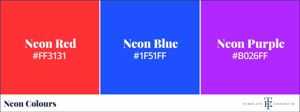
Neon colours are primary and secondary colours in disguise.
Take the primary colours Red, Blue and Green and the Secondary colours Yellow, Orange and Purple (and Red’s cousin Pink) – turn their brightness to the extreme level, and you have a set of Neon colours.
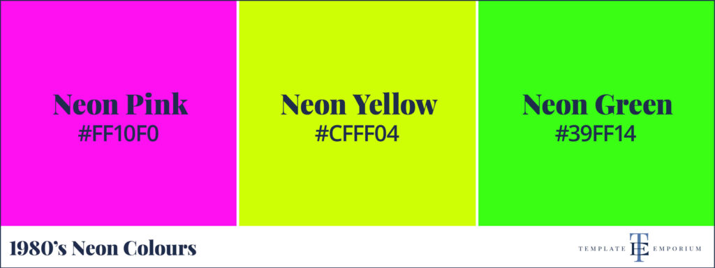
These bright, fun neon colours are a flashback to the wonderful era of the 1980s and 1990s.
Insider Tip
They are called neon because they emit light, making them luminescent.
Why use Neon Colours in your Branding?

Also known as fluorescent or fluro, neon colours are bold, bright, unconventional and impossible to ignore.
They convey a sense of innovation, radiating energy and when used correctly can invigorate your brand image by giving it a fresh and modern look.
Incorporating neon into your branding can communicate:
- Creativity
- Uniqueness
- Forward-thinking attitude
It’s a daring move that tells your audience you’re not afraid to stand out and break from tradition.
The Psychology of Neon Colours
Colours significantly influence consumer perception and behaviour.

Neon colours, in particular, have a unique psychological impact. They are often associated with energy, excitement, and enthusiasm.
For artists, illustrators, and surface pattern designers, neon can signify originality, vibrancy, and a touch of whimsy.
Incorporating these colours into your branding can spark creativity and inspire your audience.
Tips for Incorporating Neon into Your Branding
1. Balance Is Key
Neon colours are powerful, so use them sparingly to avoid overwhelming your audience.

Consider using neon as an accent to highlight important elements or add a pop of colour to your visual branding or website.
Buttons, headlines, or hover effects are perfect candidates for a neon touch.
On your website, these vibrant and eye-catching colours can:
- Guide your audience’s gaze to where you want it most.
- Highlight important information.
- Create a cohesive brand aesthetic.
Insider Tip
Incorporating neon colours in your packaging is a creative way to make a lasting impression on your customers.
Whether it’s the box your product comes in or the label on your merchandise, neon colours can add excitement and urgency to your brand.
Imagine receiving a package in a vibrant neon colour – it would stand out among the sea of plain brown boxes and create a memorable unboxing experience for your customers, making your brand more recognisable.
2. Choose the Right Shades
Not all neon colours convey the same message.
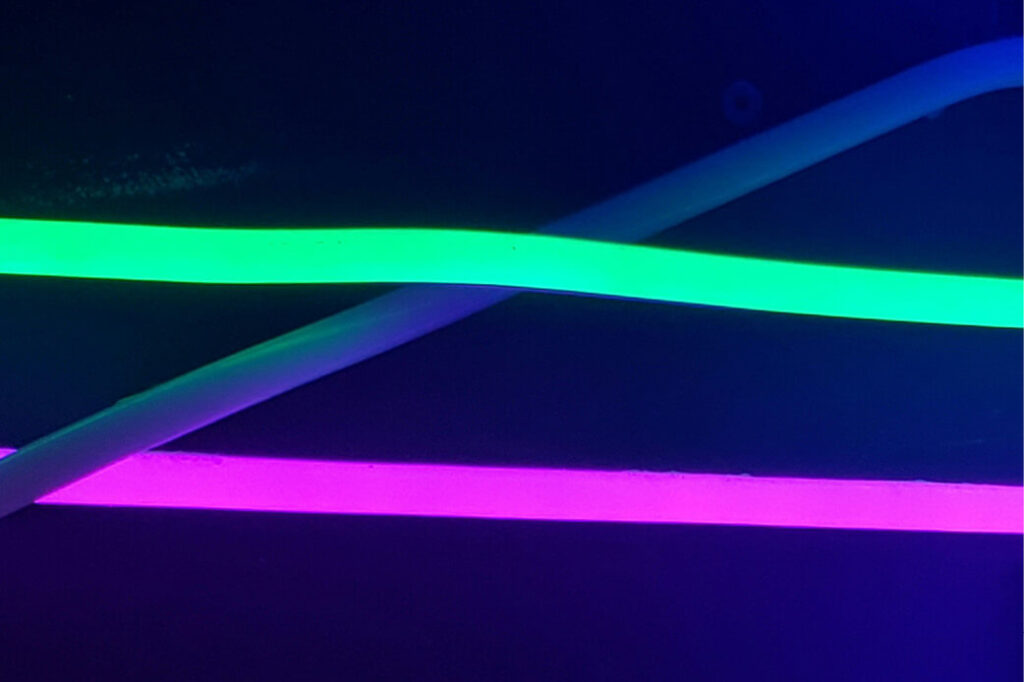
Each colour tells a different story, evoking unique emotions and responses from your audience.
Pink Neon = fun, femininity and warmth.
Green Neon = fresh, innovative and energising.
Blue Neon = electric vibrancy.
Insider Tip
Look beyond the neon colour’s hue and select the tint, tone and shade that best aligns with your brand personality.
Learn more about the difference in hues, tints, tones & shades here.
3. Consider your Audience
While neon colours can be appealing, it’s essential to consider your target audience’s preferences and perceptions.
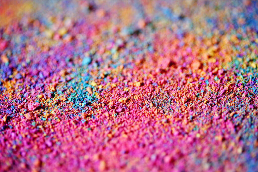
The vibrant hues should complement your brand identity and resonate with your audience.
If you have a more mature audience would these colours appeal to them?
4. Test and Iterate
Test how your audience responds before fully committing to neon in your branding.

Use A/B testing on your website, and email marketing and do a poll on Instagram stories comparing colours you want to use to see what works best.
5. Keep it Consistent
Consistency is crucial in your visual branding.

Once you incorporate neon colours, ensure they are consistently used across all your branding materials to build a cohesive brand identity.
Insider Tip
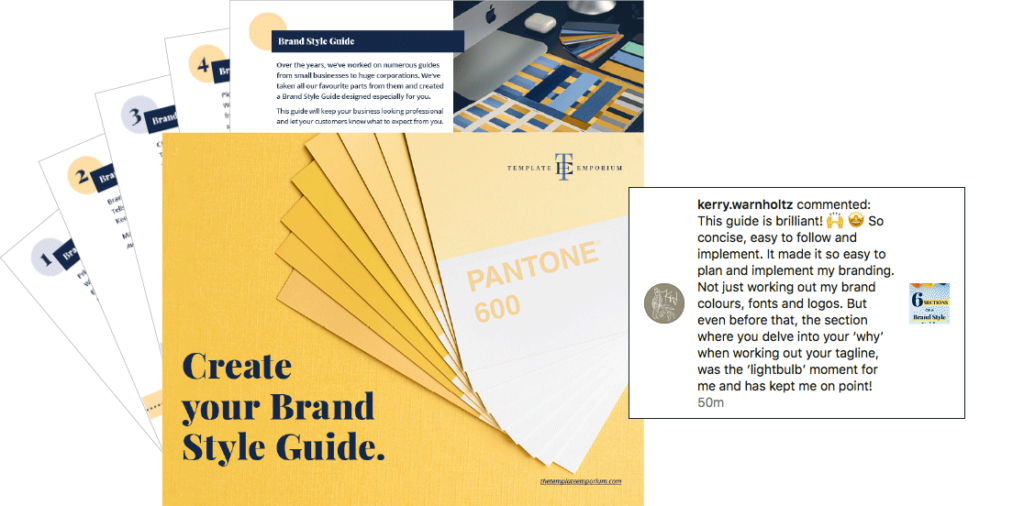
To ensure you consistently use the correct neon colour, create a brand style guide noting the hex code and CMYK breakdown of your chosen neon colours.
Once you’ve picked your neon Branding Colours you’ll want them to look consistent across everything you create. We’ll show you how with our FREE Create Your Brand Style Guide.
Here’s what Surface Pattern Designer – Kerry Warnholtz said about our style guide on Instagram.
You Did it!
That’s a wrap on Have You Ever Experimented with Neon Colours in Your Branding?
Do you feel inspired to experiment with neon colours in your branding? Use our insider tips to discover whether this bold and powerful colour choice could be exactly what your brand needs. In the meantime, Follow us on Pinterest for more blog posts like this.
Where to Now?
Want more branding colour tips? Check out the blogs below.
- How to Choose Your Brand Colours
- 3 Tips for Picking your Perfect Brand Colours
- Pastel Perfect: Infuse your Visual Branding with a touch of Pastel Magic
Like the Blog Post?
PIN IT FOR LATER. And for more helpful tips follow us on PINTEREST.
Search
Create & launch your website in a
few simple steps
FREE GUIDE
While you’re here,
grab our FREE
‘Do’s & Don’ts of what to add to your website’ Guide.
‘Do’s & Don’ts of what to add to your website’ Guide.
When you sign up, we’ll send you
emails with additional helpful content.
About Lavinia & Tom
Hi, we're so glad you found us.
We love helping creatives like you finally have the website you’ve always wanted.
Blog Categories
Follow us