Want to avoid these common mistakes when DIY-ing your website? (Here’s How).
Have you ever felt the excitement of creating your website, only to be frustrated by common mistakes that could have easily been avoided?
Whether you’re a small business owner, freelancer, or blogger, DIY-ing your website can be a rewarding endeavour, but only if done correctly.
In this blog, we’ll explore key common website mistakes to avoid when building your online presence. From selecting the best website builder to optimising for SEO and ensuring mobile responsiveness, we’ll cover essential tips to help you navigate potential pitfalls and pave the way for a successful website.
So, let’s dive in and learn how to enhance your online presence with a website that attracts and retains visitors.

1. Not choosing the right website builder
Choosing the right website builder is crucial for establishing a successful online presence.
With a multitude of options available, it’s essential to select a platform that aligns with your goals and technical capabilities.
Making the right choice at this initial stage will make the rest of the website creation process smoother and more efficient, ultimately setting the foundation for a user-friendly design that enhances the overall user experience.
Consider your needs and preferences
What type of website do you want?
Do you require a portfolio-style website? Showit is perfect for that, and our one-pager website templates were created for that purpose.
Or is a shop on your website your main priority? Shopify might be your go-to.
Do you want your products on your site to link to POD (Print-on-demand) sites? Try our fully featured shop template.
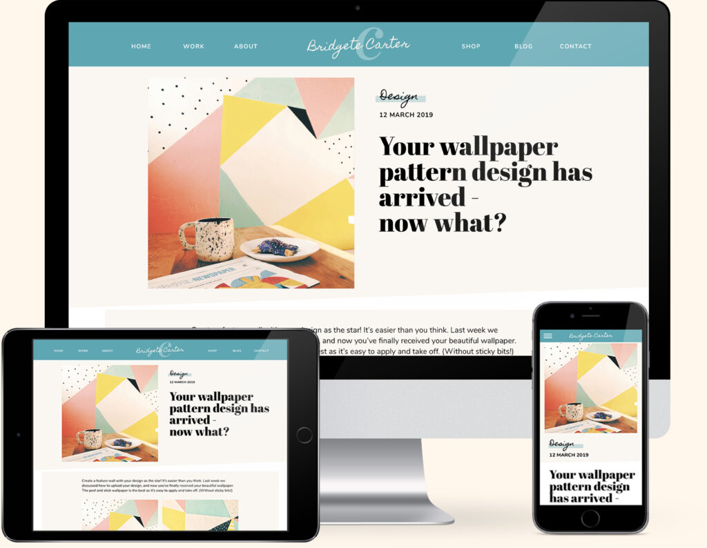
If you want to include a blog on your site, WordPress is your answer. It also works seamlessly alongside Showit. (That’s the combo we use on our website).
Focus on user-friendly interfaces
Other platforms may seem great at the start (we’re talking to you, Squarespace), but you soon hit roadblocks and limitations when you try to break away from the standard layout or functionality.
Always pick a platform that gives you complete creative layout and styling freedom. (Including visual drag-and-drop editing).
You want to be able to move, rotate and scale any element anywhere, and your website should display just as you see it in the website builder.
Finally, check whether the platform includes training. All our templates include comprehensive Showit PDF step-by-step training.
Pick customisable templates
All our premium Website Templates are tailored to your industry. Choose from a one-pager to a fully featured website with a blog and a fully featured shop to promote and sell your work.
Insider Tips

We highly recommend Showit as our favourite website builder. These blogs explain why!
What is Showit & how does it work?
Why Showit is the platform we use to create websites for Creatives
Your Top 10 Showit Questions & Answers
2. Not creating a user-friendly design
When designing your website, prioritise user-friendliness.
Are your visitors getting lost on your site? Keep it clean and simple! A cluttered website can overwhelm visitors.
Ensure your navigation is intuitive, making it easy for them to find what they’re looking for.
Stick to a few main categories, and make it easy for them to find what they’re looking for. Clear and concise navigation leads to a better user experience!
Think about your visitors and how they’ll interact with your content.
This involves creating design elements that are:
- Easy to navigate
- Visually appealing
- Responsive across different devices
- Logically organised content
- Clear calls to action
Also consider:
- Site speed
- Mobile-friendliness
- Accessibility
Did you know that 40% of people abandon a website that takes more than 3 seconds to load?
Don’t let a slow loading speed turn your visitors away! Optimise images, limit the use of heavy plugins, and ensure your site is fast and efficient.
By ensuring that your website loads quickly, is optimised for mobile devices, and meets accessibility standards, you provide a seamless experience for all users and a much more diverse audience.
Insider Tips

A cluttered or confusing layout can deter visitors.
By creating a user-friendly design, you enhance the overall user experience. This helps increase the likelihood that visitors will stay on your site longer and engage with your content.
3. Not optimising for SEO
Ignoring SEO is a common DIY mistake.
If you want to be found, optimising your site for search engines is crucial.
Optimising your website for SEO is essential for attracting the right audience and improving your online visibility.
You do this by incorporating relevant:
- Keywords
- Meta tags and descriptions
- Alt texts
- Quality content
This can help increase your site’s visibility and chances of ranking higher in search engine results.
Doing so helps drive organic traffic to your site and ensures that your website is easily discoverable by more visitors, which helps grow your audience.
Insider Tips

Creating and building your Showit website on your own is hard work.
But what happens if, after all the hours, months (or even years) you’ve spent putting it together to make it look good, you’re not even sure if it’s optimised for SEO?
Our secret to getting it right every time is our Showit Website Audit.
4. Not ensuring mobile responsiveness
When designing your website, it’s critical to ensure mobile responsiveness.
With an increasing number of users browsing the internet on their phones, it’s paramount to optimise your site for smaller screens.

A mobile-responsive design allows your website to adapt and provide a seamless user experience across various devices, from smartphones to tablets.
By prioritising mobile responsiveness, you can reach a wider audience and enhance user engagement on your site.
5. Not testing and fine-tuning
Once you have implemented a mobile-responsive design, it’s important to thoroughly test your website on different devices to ensure everything functions smoothly.
This includes identifying areas for improvement, such as:
- Typos and grammatical mistakes (Take the time to proofread before publishing!)
- Checking for any layout issues
- Broken links
- Slow loading times
- Technical glitches that could hinder the user experience
Regularly monitoring and fine-tuning your website is an ongoing process that will help you stay ahead of the curve and provide an excellent user experience.
By dedicating time to test and fine-tune your site, you can ensure it continues to meet the needs of your audience and drives your online success.
Mark it in your planner to regularly test its performance, links, and functionalities.
Insider Tips

Pay attention to user feedback and analytics.
By analysing visitor behaviour, you can gain valuable insights into what works well on your site and what needs adjustment.
This data-driven approach allows you to make informed decisions about optimising your website for better performance and engagement.
BONUS
6. Not having Consistent Branding
Your brand is your identity. Make sure your colours, fonts, and imagery align with your brand’s identity throughout the website.
Making everything look consistent builds trust! And trust leads to buyers and loyalty.
Download our FREE Create Your Brand Style Guide to find out how.

You did it!
That’s a wrap on Avoid these common mistakes when DIY-ing your website. Creating a successful website involves careful planning, user-focused design, SEO optimisation, mobile responsiveness, and ongoing testing and improvements.
By avoiding common mistakes and following these guidelines, you can build a strong online presence that effectively engages and retains your audience.
Where to now?
If DIY-ing your website on your own feels too much, let us do it for you! Try our Helping Hand website template update.
Like the Blog Post?
PIN IT FOR LATER. And for more helpful tips, follow us on PINTEREST.