grab our FREE
‘Do’s & Don’ts of what to add to your website’ Guide.
‘Do’s & Don’ts of what to add to your website’ Guide.
emails with additional helpful content.
Hi, we're so glad you found us.
We love helping creatives like you finally have the website you’ve always wanted.
few simple steps
Follow us
Should you use Beige as your Branding Colour?
Beige has made a big splash lately and is becoming the number one brand colour fan favourite! Could this classic creamy brown colour be the subtle touch your brand needs? Or do you find it too soft and boring? Sit back as we help you decide whether you should use Beige as your branding colour.
We have developed a three-part system that takes a deep dive into Beige’s meaning, varieties and how to use this information in your branding.
Are you on the Beige train? Get onboard our blog to find out.
Before we start – missed a part of our Branding Colour Series? Catch up below.
- 1. Should you use Blue as your Branding Colour?
- 2. Should you use Red as your Branding Colour?
- 3. Should you use Yellow as your Branding Colour?
- 4. Should you use Green as your Branding Colour?
- 5. Should you use Pink as your Branding Colour?
- 6. Should you use Orange as your Branding Colour?
- 7. Should you use Purple as your Branding Colour?
- 8. Should you use Grey as your Branding Colour?
- 9. Should you use White as your Branding Colour?
- 10. Should you use Black as your Branding Colour?
- 11. Should you use Beige as your Branding Colour? (this is the blog you’re reading)
- 12. Should you use Brown as your Branding Colour?
Want to start using Beige as your Branding Colour now?
Download our FREE Guide
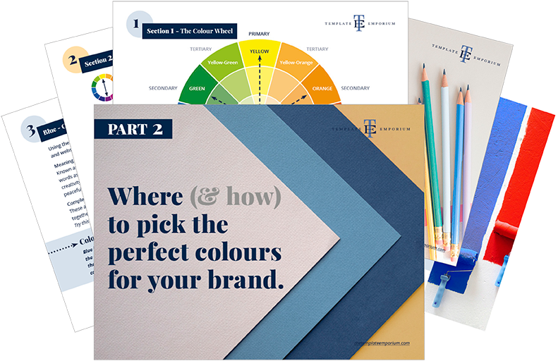
Here’s what we cover
MEANING OF BEIGE
The psychological meaning of Beige
Meaning of Beige to you
Beige in Business
VARIETIES OF BEIGE
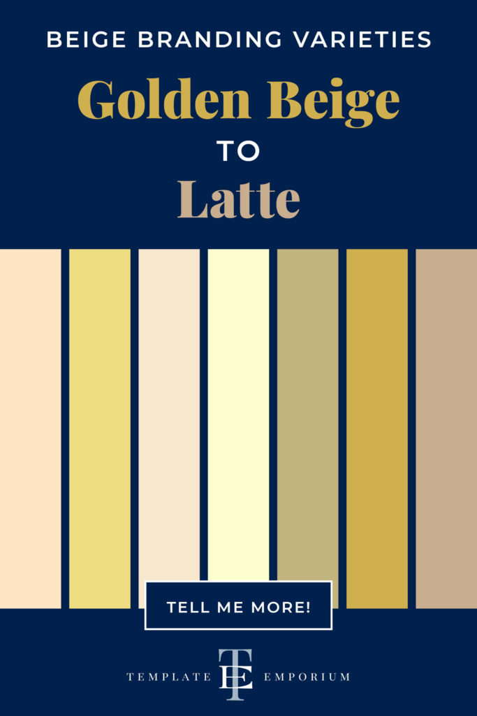
Golden Beige to Latte, we share our favourite Beiges
Beige & The Colour Wheel
Colours that go with Beige
BEIGE IN BRANDING
Matching to the Tone of your Business
Picking the Perfect Palette with Beige
When not to use Beige in your Branding
Should you use Beige as your Branding Colour?
1. Meaning of Beige
The Psychological Meaning
Beige is a classic, non-confronting colour that gives off a feeling of softness and warmth. It oozes smoothness and prefers to stand in the background rather than be centre stage. Not only is it a neutral colour but a subtle one as well. Being such a natural colour it can also be interpreted as boring. With such a variety of meanings, how do you know which one is correct?
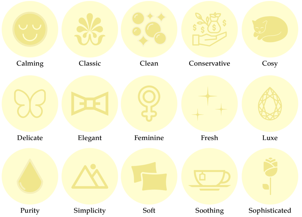
We believe it is based more on the shade of Beige rather than the colour itself. And to make it a little easier, we’ve created an icon guide below and broken it into Light, Medium and Dark Beige.
Original unedited icons from the Noun Project
Light Beige Meaning
Medium Beige Meaning

Dark Beige Meaning

Want a Beige Branded Website?
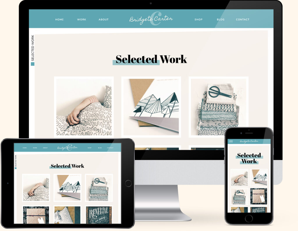
If you love Beige, we have the perfect website template for you. Our Artwork & Designs Template combines a stunning Cream with pairings of Teal Blue and Black combinations.
Created exclusively for the Showit platform, now you can showcase your collection of designs alongside your favourite colour.
Meaning of Beige to You
Whether you refer to Beige as Off-white, Ivory, Bone, Cream or Ecru, this neutral, calming colour might feel too plain and boring for you. Or you may love its warmth and how it can feel safe yet sophisticated at the same time.
If you’re still unsure, answer the following questions.
- How were you introduced to Beige?
- Was it a positive or negative experience?
- Have your feelings for Beige changed over the years?
What type of business do you have?
If you’re a personal brand the key is to find a balance between the colours you like and those that will attract your ideal client.
Beige has made a major comeback in the world of branding lately. Many solopreneurs are using it to express what their brand stands for, from stability and environmentally conscious to a relaxed non-hustling approach to business.
Just be careful not to fall into the trap of using it because it’s trendy and instead, be sure it’s a good fit for your brand and customers.
In conclusion, look at the icons above and pick which words sum up how you feel about Beige and what words describe how you want your ideal customer to feel about your business.
Colour Clues
Every colour makes us feel a certain way. Once you learn how to use the Indoor Clues, it will open your eyes to new options and feelings about colour.

Have a look around your home and see where Beige fits in. It’s often popular in decorating as it creates a cosy, peaceful and relaxing atmosphere. Check your wardrobe as well. I love wearing Beige as it feels comforting yet elevated and modern.
Would your ideal client like Beige, how would it make them feel?
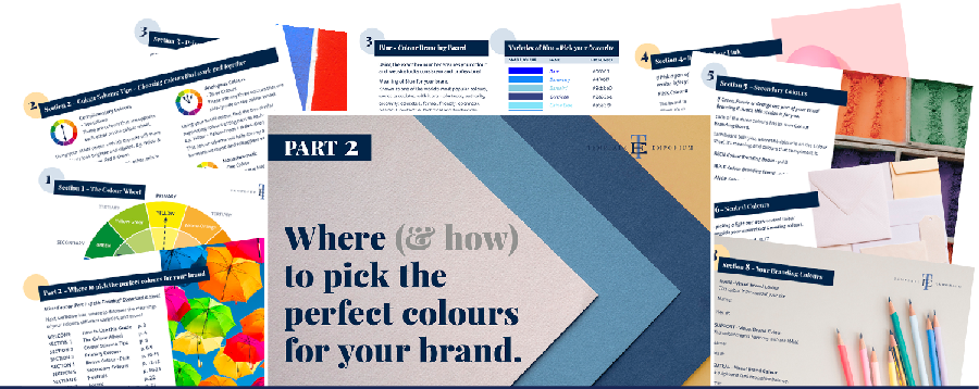
In Part 1 of our Colour Guide series “How (& where) to pick the perfect colours for your brand.” we explain everything about Colour Clues. Click here to download it – it will be super helpful.
Beige in Business
Vogue Business described Beige as – The once bland and boring neutral is now big business – and retailers are stocking up.
Although Beige isn’t a universally popular colour for branding, you could use this to your advantage and stand out from all the other black, grey and ever-popular blue logos that flood the market.
And when used well alongside other colours, you can create a dramatic effect that puts you in a class of your own.
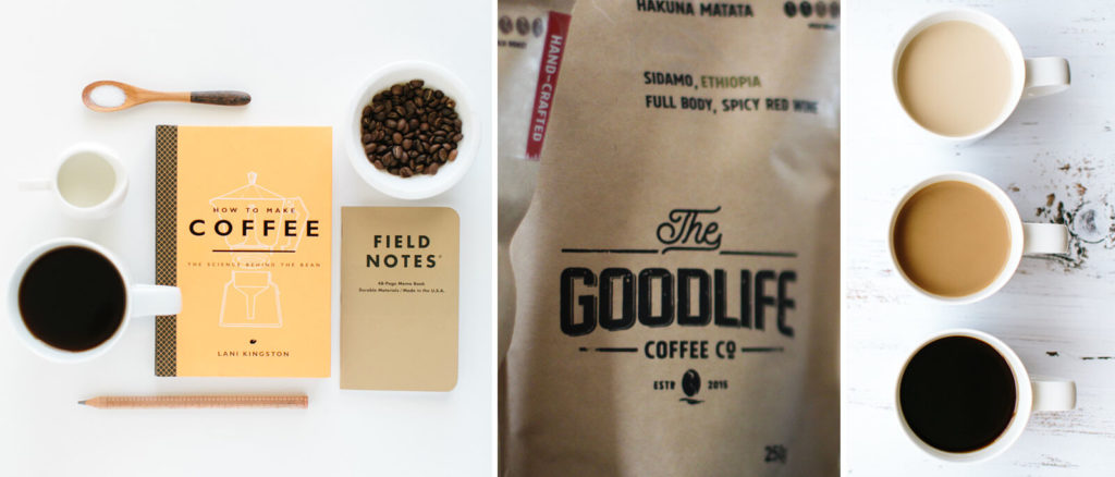
Coffee companies
The warmth and reliability of beige are perfect for this industry and are often
incorporated with Brown tones to conquer up feelings of the perfect cup of coffee.
Gloria Jeans
Keurig
Canyon Coffee
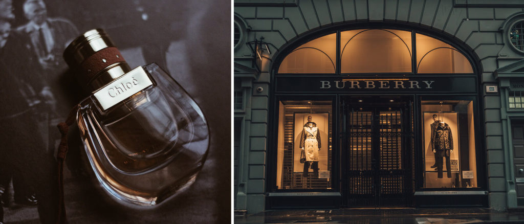
Luxury Brands
The feminine, sophisticated and fresh feelings that Beige evoke can be seen in the branding of following luxury brands.
Chloé
Burberry
Should you use Beige as your Branding Colour?
2. Varieties of Beige
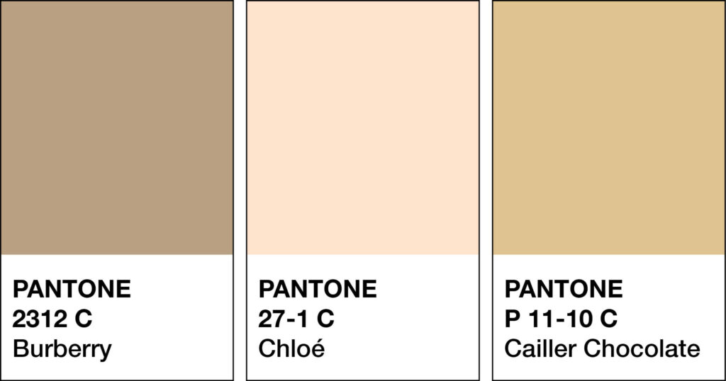
Golden Beige to Latte, we share our favourite Beiges
Many varieties of Beige may look similar to each other but have different names. From light to dark Beige we’ve compiled a cheat sheet of our favourites below (and included a few you may have never heard of!).
And to make it easy, we added the hex numbers. So you can start using them in your branding today.
Press play on the image below or get all the colour breakdowns in our FREE Guide.
Beige & The Colour Wheel
Unlike most colours in our Branding Colour Series, Beige is neutral, and neutrals don’t appear on the colour wheel.
Insider Tip
Beige is known as an Earth Tone. It’s made by:
Mixing White + Brown = Light Brown hue
Mixing all three primaries = Brown + White = Beige
Colours that go with Beige
Look at the neutral’s undertone to find its compliment.
A red warm beige complement = Green
A yellow warm beige complement = Purple
A blue cool beige complement = Orange
Beige Colour Combinations
We’ll begin with Beige & Yellow. From there, we’ll move to Beige & Green, then Beige & Red. Next, it’s the classic pairing of Beige & Brown. We’ll then have fun with Beige & Pink and Beige & Orange. Finally, ending with Beige & Blue.

Beige & Yellow
Cream + Pale Yellow
Ivory + Buttercream
Ecru + Gold
Cream + Marigold
Sand + Butter
Beige & Green
Cream + Mint
Bone + Olive
Ivory + Forest Green
Cream + Moss
Sand + Bottle Green
Beige & Red
Ivory + Ruby
Cream + Scarlet
Buff + Merlot
Sand + Aurora Red
Ivory + Candy Apple Red
Beige & Brown
Ivory + Espresso
Cream + Cinnamon
Beige + Almond
Cream + Nut Brown
Sand + Camel
Beige & Pink
Cream + Powder Pink
Sand + Coral
Cream + Blush
Ecru + Magenta
Cream + Bubblegum
Beige & Orange
Cream + Saffron
Champagne + Peach
Sand + Clementine
Cream + Tangerine
Sand + Apricot
Beige & Blue
Eggshell + Sapphire
Ivory + Cornflower Blue
Sand + Indigo
Ecru + Pool Blue
Beige + Azure Blue
Beige & Purple
Ivory + Grape
Ecru + Wisteria
Cream + Middle Blue Purple
Beige + Periwinkle
Off-White + Lavender
Beige & Black
Medium Beige + Black
Beige + Soft Grey
Golden Beige + Sleek Black
Sand + Charcoal
Champagne + Tuxedo Black
Should you use Beige as your Branding Colour?

Matching to the Tone of Your Business
As discussed earlier, we break Beige into three options, light, medium and dark. You can use the breakdown as a guide to help you pick the right tint of Beige for your branding.
Light Beige
Calming, classic, clarity, conservative, cosy, delicate, elegant, feminine, fresh, luxe, purity, simplicity, soft, soothing and sophisticated.
Medium Beige
Balanced, clear, good taste, inviting, light, modern, natural, optimistic, passive, romantic, safe, subtle, tranquillity, trendy and upscale.
Dark Beige
Approachable, comforting, constant, honest, humble, loyal, minimalist, neutral, practical, relaxing, reliable, smooth, trustworthy, versatile and warming.
Picking the Perfect Palette with Beige
Our 5-step Perfect Palette Process
Need help choosing your Brand Colour Palette? We’ve created a simple step-by-step process. Grab our free guide as a handy download.
Step 1
Pick the Main Brand Colour
So you’ve picked Beige. Now you have to decide on the type of Beige, is it light, medium or dark?
Step 2
Pick a Support Brand Colour
If you feel stuck at this stage, just remember this colour creates harmony with the MAIN. Refer back to our tips earlier on Colours that go with Beige to help you decide.
Step 3
Pick a Light Neutral Brand Colour
Why do you need neutrals in your brand colour palette? Because it creates balance.
Not sure which neutrals to pick? Go to page 16 of our free guide.
Step 4
Pick a Dark Neutral Brand Colour
Your light neutral colour needs a partner. So now it’s time to pick a dark neutral colour for even more balance. Our guide on page 16 explains everything.
Step 5
Pick an Accent Colour
This colour is used to make something on your website pop. Therefore it’s only used sparingly. Page 22 of our free guide will explain more.
Web and Print Branding

Once you have picked the right Beige for your business, add the hex code to your website.
View how it looks on both desktop and mobile. To create consistency only, use the one hex code number to ensure the Beige you chose is always the correct shade.
For print, instead of a hex code, you will need the CMYK (Cyan, Magenta, Yellow & Black) or Pantone, colour breakdown to ensure the Beige will print out the way you want.
When not to use Beige in your Branding
If you opt for a light Beige for your branding, this works best as a background colour. Try it on your website and in your visual branding rather than uniquely for your brand’s logo.
When the beige used for a logo is too light, this will result in it being too difficult to read and losing all impact. Perhaps opt for a deeper shade instead.
If the Beige you picked feels too plain on its own, try a shade with more warmth. Doing so will also help prevent it from looking dirty and dull.
You Did it!
That’s a wrap on Should you use Beige as your Branding Colour?
How do you feel about Beige now? Would it suit you and your branding? Let us know. And in the meantime, follow us on Pinterest for more blog posts like this.
Where to now?
If you enjoyed this blog, be sure to check out the following:
- Which Colour should you use for your Branding?
- Which Template Emporium Website is right for you?
- All Seasons Colour Combinations
Like the Blog Post?
PIN IT FOR LATER. And for more helpful tips follow us on PINTEREST.
Search
Create & launch your website in a
few simple steps
FREE GUIDE
While you’re here,
grab our FREE
‘Do’s & Don’ts of what to add to your website’ Guide.
‘Do’s & Don’ts of what to add to your website’ Guide.
When you sign up, we’ll send you
emails with additional helpful content.
About Lavinia & Tom
Hi, we're so glad you found us.
We love helping creatives like you finally have the website you’ve always wanted.
Blog Categories
Follow us