grab our FREE
‘Do’s & Don’ts of what to add to your website’ Guide.
‘Do’s & Don’ts of what to add to your website’ Guide.
emails with additional helpful content.
Hi, we're so glad you found us.
We love helping creatives like you finally have the website you’ve always wanted.
few simple steps
Follow us
Get Your Brand Colour Balance Right (every time) with this Simple Rule.
Using colour correctly on your website is hard! Even the best designers need help with getting their colour balance to work. That’s why we’re sharing an Insider Secret Rule. This simple (yet highly effective) Colour Balance Rule makes applying colours to your website easy!
In part one of this two-part series, we’ll introduce you to the 60/30/10 Colour Rule.
And when you follow the guidelines of this simple rule, you’ll discover how to get your colours working in the right proportions, giving your website both a balanced and professional result.
Index
Get Colour Balance Right (every time) with this Simple Rule.
PART 1
The 60/30/10 Colour Rule
What’s the Rule?
Using Your 3 Brand Colours with the Rule
How Do I Use the Colour Rule on My Website?
What if I have more than 3 Brand Colours?
How to Group Colours?
Insider Tip 1
Insider Tip 2
Adapting the new Brand Colour Groups with – the 60/30/10 Rule
The 60/30/10 Colour Rule
Whether you’re only starting out using colour or have been a designer for a while, the 60/30/10 rule acts as a guideline to give you the best possible result every time. Let’s break it down.
What’s the Rule?
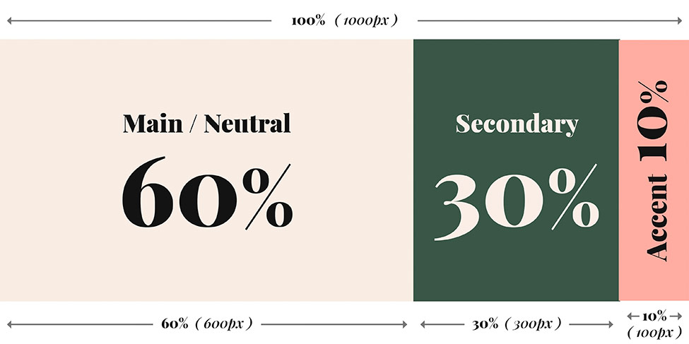
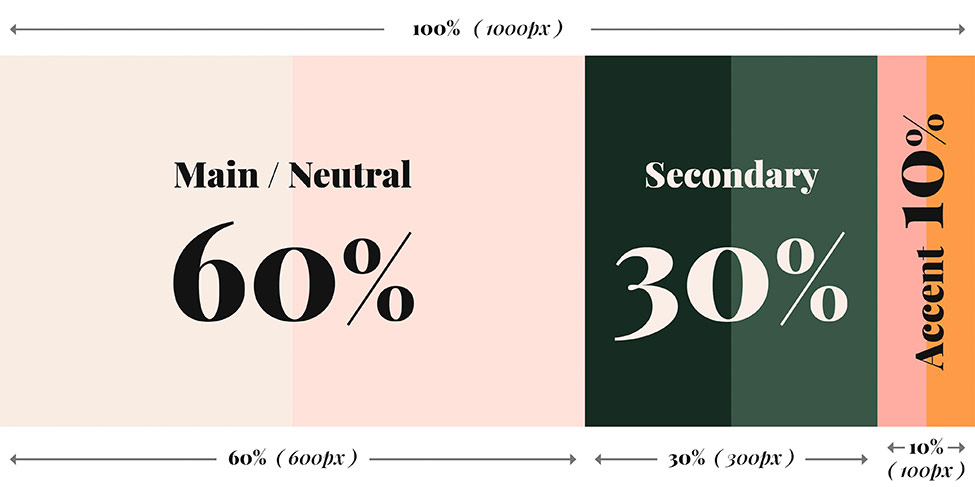
60% Colour
Firstly, 60% of the colour on your website should be your Main or Neutral Colour.
30% Colour
Next, your Secondary Colour should take up 30%.
10% Colour
And finally, your Accent Colour should take up 10%.
Need Help choosing your Brand Colours? Check out this blog.
Using Your 3 Brand Colours with the Rule
In this example, we use the three website brand colours, Cream, Green and Pink from our Milla Showit Website Template.
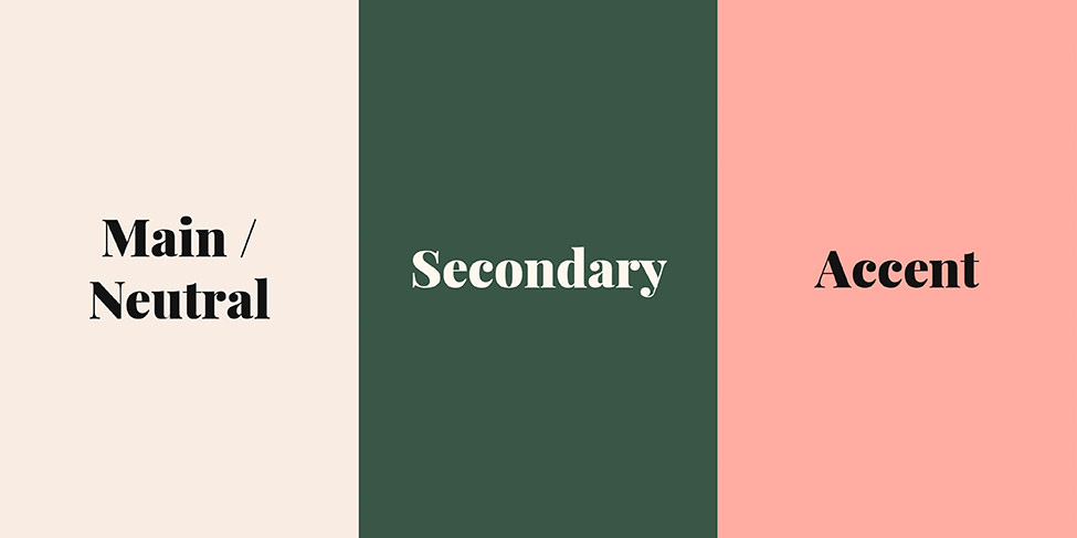
See the 60/30/10 Colour Rule in Action below.
How do I use the Colour Rule on my Website?
In your graphics program of choice (Canva, Illustrator, Photoshop or InDesign) work in pixels to make the following.
- Make your document 1000px wide (having it set to this will make the maths easy!).
You can make the height approximately 300-400 px. - Add your colour blocks to your design and fill them with your brand colours.
Arrange these by your Main / Neutrals, Secondary colours, and your Saturated or Bright Accent Colours like in the image above. - Now select your Main / Neutral colour.
Drag this box out so it is 600px wide (this is equal to 60%). - Now select your Secondary colour.
Drag this box out so it is 300px wide (this is equal to 30%).
Align this box to the right side of your Main/neutral colour box. - Finally, select your Accent colour.
Drag this box out so it is 100px wide (this is equal to 10%).
Align this box to the right side of your Secondary colour box.
The image below shows how your design should look when you are done.
What if I have more than 3 Brand Colours?
The rule works just as well if you have more than three colours.
The only extra step you need to do is to place your Brand Colours into groups first.
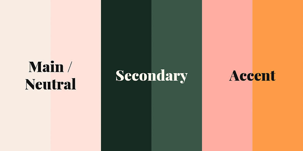
We are using the Milla Showit template expanded Branding colours as an example below.

How to Group Colours
Start by looking at your colour palette, and group the colours that are related to each other.
Related colours could mean grouping all the warm colours together, or grouping all the cool colours together, the neutrals, or the bright vibrant colours.
See if you can form 3 groups of colours – these 3 groups will then form the Main / Neutral colours, the Secondary Colours & The Accent Colours.
Follow along with our example below to see how we grouped the Milla expanded palette.
Main/Neutral Colours.
You should arrange your colours into these groups by how they fit together. In our example below, we ended up grouping the Light Pink and the Cream Colour as they both work nicely as Neutral background colours.
Although Light Pink could also be in the group with its more saturated Pink sister, it does not work well as an accent colour.
Secondary Colours
As the Greens are already related, we can group them to form the Secondary Colour group.
Accent Colours.
A good tip is to place all your bright, saturated colours in this group.
In this case, the Orange colour works best as an accent, so we have grouped that with our Pink to be part of the accent group.
Insider Tip 1
You can arrange your Main, Secondary and Accent colours in multiple ways.
If you had no neutrals but instead had Warm and Cool colours, assign the warm colours to your Main Colour group, and then the Cool Colours to your Secondary colour group. Then add your brightest, most saturated colours to the accent group.
Insider Tip 2
Don’t have any Saturated Accent Colours?
If you have a more muted colour palette, that’s ok! The Accent colour is mainly for Buttons and other ‘Call to Action’ sections of your website.
In this situation, you can create a one-off additional colour for these accents. It is often good to use a complementary colour (opposite on the colour wheel) as one of your muted colours, then increase its saturation to make it pop and stand out.
You can use a tool like Adobe Colours or grab your own colour wheel in our FREE guide “Where (& How) to pick the perfect colours for your brand.
Adapting the new Brand Colour Groups with – the 60/20/10 Rule
- Start by ‘Grouping’ the colours in each set together in your Design application. (This makes selecting each Colour Group a lot easier!)
The Shortcut for most apps is ‘COMMAND + G’ (if you are on a Mac), or Control + G, if you are on a Windows machine. - Now select your Main / Neutral Colour Group.
Drag this group out so it is 600px wide (this is equal to 60%). - Now select your Secondary Colour Group.
Drag this box out so it is 300px wide (this is equal to 30%).
Align this box to the right side of your Main/neutral colour box. - Finally, select your Accent Colour Group.
Drag this box out so it is 100px wide (this is equal to 10%).
Align this box to the right side of your Secondary colour box. - Below is the final result.
You Did it!
That’s a wrap on Part 1 – Get Your Brand Colour Balance Right (every time) with this Simple Rule.
Now you know what the 60/30/10 Colour Rule is and how to use it with your Branding Colours, next, we’ll show you how to apply this colour balance rule to your website. (Be prepared for some amazing results!)
Where to now?
- Part 2 – The Simple Colour Rule to make your website look amazing!
- 3 Tips for Picking Your Perfect Brand Colours Find them out here.
- Should you use Pink as your Branding Colour? Find out here.
Want more Colour Tips?
Grab our FREE GUIDE – Where (& how) to pick the perfect colours for your brand.
Discover the meanings of your favourite colours (including colour varieties you may have never heard of). Also, learn our insider tips on what colours work well together to ensure your branding colours look amazing.

Like this Blog Post?
PIN IT FOR LATER. And for more helpful tips follow us on PINTEREST.

Search
Create & launch your website in a
few simple steps
FREE GUIDE
While you’re here,
grab our FREE
‘Do’s & Don’ts of what to add to your website’ Guide.
‘Do’s & Don’ts of what to add to your website’ Guide.
When you sign up, we’ll send you
emails with additional helpful content.
About Lavinia & Tom
Hi, we're so glad you found us.
We love helping creatives like you finally have the website you’ve always wanted.
Blog Categories
Follow us