grab our FREE
‘Do’s & Don’ts of what to add to your website’ Guide.
‘Do’s & Don’ts of what to add to your website’ Guide.
emails with additional helpful content.
Hi, we're so glad you found us.
We love helping creatives like you finally have the website you’ve always wanted.
few simple steps
Follow us
8 Ways to Personalise your Showit Template
Congratulations, you’ve found the perfect Showit Website Template. But, you hesitate to buy it because you’re not sure if it (really) suits your business. The colours are different to your branding, the wording and photos don’t match your style and, you can’t imagine it any other way.
Help is here! We will show you 8 Ways to Personalise your Showit Template to make it feel exactly like you and your brand.
Before we start – missed a part of our Ultimate Showit Series? Catch up below.
- What is Showit & how does it work?
- Your Top 10 Showit Q&As
- 15 Showit Shortcuts (you need to know!)
- 3 Ways to Create Client Testimonials in Showit
- Showit Step-by-Step Template Training Series
- How to have a Stress-Free Launch with our Showit Website Audit

Index
1. Update Text
2. Import & Revise your Images
3. Add your Logo
4. Include your Brand Fonts
5. Use your Brand Colours
6. Amend the Footer
7. Link your Instagram Feed
8. Connect your Social Media Accounts
BONUS – After your 14-day free Showit trial –
use our affiliate link to get your first paid month for free!
Ways to Personalise your Showit Template
1. Update Text

We always recommend starting with your text.
Text is also known as “copy”. Or as the words on the pages of your website.
Updating this first will turn the page into your voice. Adding your words, your sayings, the way, you address people to the way you sign off, will make the template feel more like you.
Insider Pro Tip
Not sure how to Update your Text in Showit? This blog will show you.
Ways to Personalise Your Showit Template
2. Import & Revise Your Images

Now the text feels more like you, next up is adding images of you, your ideal client, lifestyle images, or even products for your shop.
But before you start, this checklist will ensure your images will look their best.
1. Always use high-resolution images.
Showit will look after the file size. And scale down the size of your image to fit the device.
2. Include Bright & Light images
Use a program such as Photoshop or Lightroom or an app on your phone to turn dark and dull photos into ones your clients would love.
3. Happy Client images
Using positive images is our secret to ensuring your client feels the same way about you.
Insider Pro Tip
To get started on importing images into your Showit Template. Click Here.
Wait, what about the images in Galleries & Canvas Views?
All our Template Emporium website designs are of premium quality and contain pre-made versions of Galleries & Canvas Views. Update them with your images by following this blog post.
Ways to Personalise Your Showit Template
3. Add your Logo
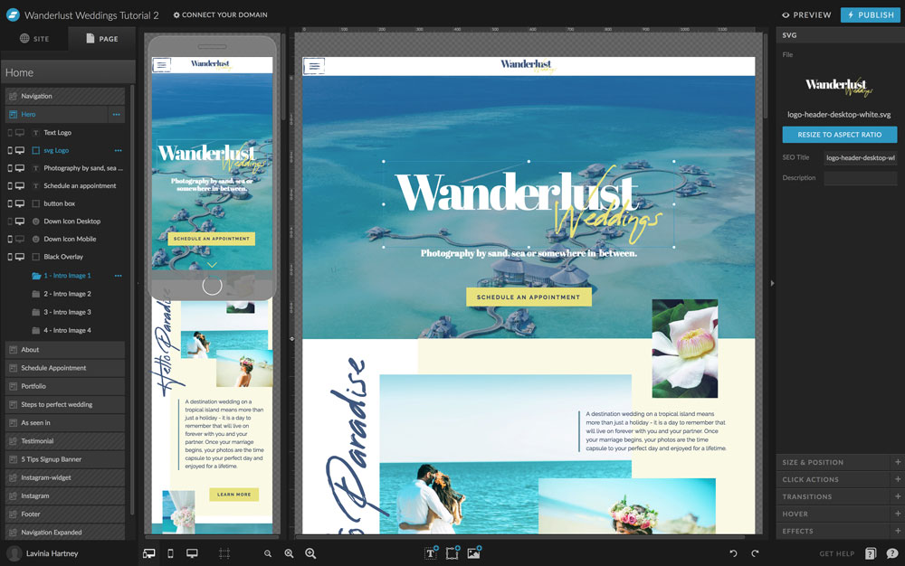
Copy? Checked!
Images? Checked!
Now it’s logo time!
Whether your logo is a Signature style, Typography or Typography & Graphic, adding this mark to your website acts as a visual reminder of who you are and what your business does.
We always recommend you save and upload your logo in one of the three ways.
1. SVG – Best Version
Known as the web version of an eps it stands for Scalable Vector Graphic. Being a vector it is scalable without becoming blurry or pixelated, yet it is still low in file size. We have used an SVG logo version in the image above.
You can create an SVG in any of the free or paid programs below. Or we can create one for you when you purchase our logo package.
Free Program
Adobe XD
Paid Programs
Adobe Illustrator, Sketch or Inkscape.
2. PNG – Ok Version
Short for Portable Graphics Format when scaled up in size, a PNG can become pixelated and blurry.
Instead, create it at two times the size so that high-resolution screens like Apple Retina, will display it sharply.
Take the enlarged PNG and scale it to 50% in Showit. This enlarged version will now display sharply on Retina Screen Devices (such as mobile phones and Mac laptops).
You can create a PNG in any of the free or paid programs below. Or we can create one for you when you purchase our logo package.
Free Program
Gimp
Paid Programs
Adobe Photoshop, Canva, CorelDraw
3. JPEG – Restricted Version
JPEG stands for Joint Photographic Experts Group.
This file type is only useable for logos that have a coloured background. If it doesn’t, a white box will appear around the logo and instead, you’ll have to use one of the other options above.
Use Photoshop or Canva to create a JPEG and again save this version at two times the size to allow for Retina Screen Devices.
Insider Pro Tip
This blog will walk you through all the steps to adding your logo to your Showit Template.
Ways to Personalise Your Showit Template
4. Include Your Brand Fonts

Your Showit Template is starting to take form. Text, images and your logo are on and, next are your fonts. Doing this will help convey the style and personality of your business.
The key is not to add too many fonts. We recommend around three and combining a serif, sans serif and an accent font. Haven’t decided on your branding fonts? Google Fonts is a great place to start.
You can learn more about brand fonts in this blog post.
In your Showit Template, you’ll want to update your Master Fonts using Site Styles. You can find them in the Design Settings.
Using this method will allow you to make font changes across the entire template.
Insider Pro Tip
We created this blog post that takes you step-by-step showing you exactly How to update Master Fonts in Showit.
Ways to Personalise Your Showit Template
5. Use your Brand Colours
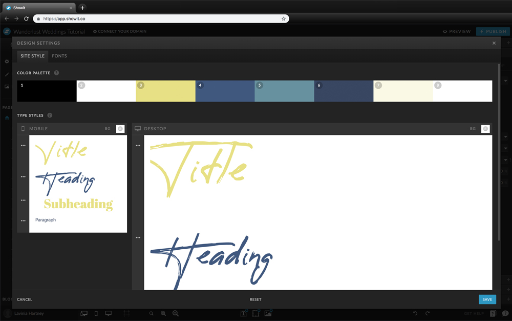
We have covered the top 4 ways to personalise your Showit Template. They include updating your text, images, logo and fonts. Now it’s time to set the mood and tone of your Showit Template and, the best way to achieve that is via colour.
Need help deciding what colours to include? This free guide we created will help you. Download it here.
If you already have your Brand colours, break them up into 4 sections.
1. Main Colour
You will find this colour everywhere on your website.
But, before you add it, you’ll need to find out its hex code and use this same number across all pages to ensure consistency.
2. Support Colour
This colour creates harmony with the Main Colour.
It can be used together or on its own in different shades. Again, use the correct hex code across all of the template pages.
2. Neutral Colour/s
For balance, we always recommend using both a light and dark neutral.
Don’t forget to use the same hex code when updating it on your template.
4. Accent Colour
When you want something to stand out such, as a button or link try an accent colour. Pick the hex code that works best for you.
Insider Pro Tip
Need help updating your Brand Colours in Showit? We’ve got you covered. This blog explains everything you need to know.
Ways to Personalise Your Showit Template
6. Amend the Footer
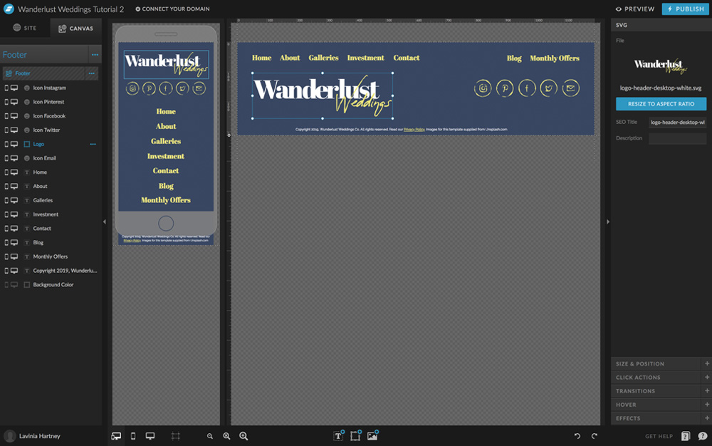
Now we have updated all the visual branding on your template your website should be a true reflection of you and your brand.
Next, is a part of the website that many people neglect (or just forget about!). Yet, it still needs your logo and, social media icons amended to reflect your brand.
If you scroll to the bottom of your website page, you’ll reach the footer. To update this in Showit, you will need to do this through Site Canvases.
Think of Site Canvases as pieces of content that appear on every page. To update the footer, we, however, only need to update it in one master spot.
Insider Pro Tip
Not sure how to amend the footer using Site Canvases? We’ve got you covered, follow the steps in this blog.
Ways to Personalise Your Showit Template
7. Link your Instagram Feed

We are almost done in personalising your Showit Template, and if you love using Instagram to connect with your audience we know you will definitely want to do this step.
To add Instagram to your website you will need a widget. Which is similar to a program that performs a specified task.
The Widget will pull in all your Instagram photos and show them in a horizontal line on your website.
Insider Pro Tip
To learn more about Widget’s and how to add your Instagram feed to your Showit site, follow this Step-by-Step blog.
Ways to Personalise Your Showit Template
8. Connect your Social Media Accounts

We have made it to our final way to personalise your Showit Template. And, this one ties in with tip six, where we talked about amending the footer.
Whether you want to link Instagram (what we used in our blog example below) to Pinterest, Facebook or Twitter, the linking process will be similar.
Insider Pro Tip
How to Link to Your Social Media Accounts in Showit blog post is the final step in turning a website template into a Showit website you can be proud of.
Action Steps
To personalise your Showit Template make changes to the following:
1. Text – Here’s How
2. Images – Follow the steps in this and this blog post
3. Logo – Everything is explained here
4. Brand Fonts – Go here
5. Brand Colours – Show Me How
6. Footer – Use these steps
7. Instagram Feed – Follow this
8. Social Media Accounts – This will show you how
After your 14-day free Showit trial – get an additional paid month for free!
Ready to start creating your website with Showit? Hit the button below and get your first subscription month for free.
Full disclosure, this is our affiliate link. So if you join Showit, you’ll be supporting us which helps us produce more content like this, at no additional cost to you.
Where to now?
1. Want more website tips? Here are the do’s & don’ts of what to add
2. Do you have a Brand Style Guide? (You need one! Grab it here!)
3. Use these Showit Shortcuts to make personalising your Template easier.
Like the Blog Post?
PIN IT FOR LATER. And for more helpful tips follow us on PINTEREST.
Search
Create & launch your website in a
few simple steps
FREE GUIDE
While you’re here,
grab our FREE
‘Do’s & Don’ts of what to add to your website’ Guide.
‘Do’s & Don’ts of what to add to your website’ Guide.
When you sign up, we’ll send you
emails with additional helpful content.
About Lavinia & Tom
Hi, we're so glad you found us.
We love helping creatives like you finally have the website you’ve always wanted.
Blog Categories
Follow us
