grab our FREE
‘Do’s & Don’ts of what to add to your website’ Guide.
‘Do’s & Don’ts of what to add to your website’ Guide.
emails with additional helpful content.
Hi, we're so glad you found us.
We love helping creatives like you finally have the website you’ve always wanted.
few simple steps
Follow us
Where did the term Uppercase and Lowercase come from?
Uppercase and Lowercase letters play a vital part in your creative businesses.
Their roles range from being the correct one to use in the heading on your website to picking the best one to make your body copy easier to read.
Each case has its pros and cons and has an origin story behind the meaning of their names. Let’s find out this and more in this Type Tip Series.
Before we start – missed a part of our Type Tips Series? Catch up below.
- Before you pick your Brand Font, ensure it has these 3 features.
- What are the different Typeface Categories?
- Type Crimes on your Website (are you committing any of these?)

Why are they called Uppercase and Lowercase?

Let’s take you back to the early days of printing. Welcome to the world of Letterpress.
In this printing process, each letter was made of metal and stored in a case.
On the top level, the capital letters were stored (in the upper cases). And the small letters were stored below (in lower cases).
Creating the names we call them today, Uppercase and Lowercase.
Uppercase

Firstly, let’s look at Uppercase. Or you may refer to it as Capital, Capital Letters or Caps. All terms are correct and can be easily interchangeable with each other.
How to use Uppercase
The key to using Uppercase is to use it sparingly. And to create more impact, keep your lines short. The goal is to show importance, such as in a headline, sub-head or if you want a word to stand out.
When widely spaced, Uppercase can create a feeling of grandeur and power. Experiment with different weights and widths until you achieve your desired outcome.
In the example below, the title is in uppercase and bold.
TEMPLATES FOR CREATIVES.
Uppercase Insider Tips
The overuse of Uppercase in one continuous line will make it hard to read the text, and nothing will stand out.
That’s why we never suggest uppercase for body copy.
Ever read a text in all caps? Not only is it hard to read, but doing so can also come across as though you’re shouting. If this isn’t your intention, avoid doing this.
Uppercase can help create contrast between the other elements around it. The key, however, is to not allow it to overwhelm everything.
Lowercase

Secondly is Lowercase. Or you may be more familiar with the term Small Letters, letters or characters. All these terms refer to the same thing, so use the one you prefer.
How to use Lowercase
Lowercase works well as support copy, such as in a subheading. To differentiate it from the heading, try the lowercase in a lighter Type Weight.
Another area lowercase letters always work is in the Body Copy as it allows text to be easily read.
The difference in height between the letters also creates white space giving the text room to breathe.
How to use Uppercase and Lowercase Together

When used effectively together Uppercase and Lowercase will create a hierarchy.
For example:
- Combine them in a Headline.
- Capitalise the first letter of the first word.
- Keep the other letters in lowercase.
- Try your sub-heading in Uppercase and your heading in lowercase (or vice-versa).
Insider Tip
Type harmony is when you use a variety of Type Weights and Widths. To achieve this, however, you’ll need a font family containing variations from Light to Extra Bold. Check out this blog for examples.
BONUS – Title Case
Now you understand the difference between Uppercase & Lowercase our next letter case is known as Title Case.
When you capitalise the first letter of every word in a heading this is known as Title Case.
This Is An Example Of Title Case.
Want to try these Tips on your Website?
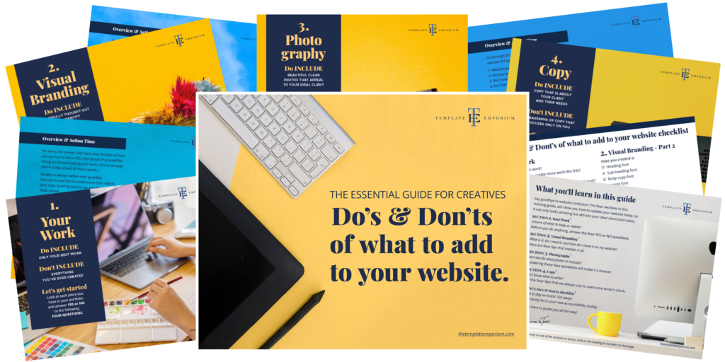
Grab our FREE Essential Guide for Creatives. “Do’s & Don’ts of what to add to your website”. We give you a simple plan to follow so you’ll never have to question what to show online again.

You Did it!
That’s a wrap on Part 2 of our Type Tip Series Uppercase to Lowercase. Use our tips to ensure you’ll always use the correct one making you and your website look professional and easier to read.
Where to now?
- Before you pick your Brand Font, ensure it has these 3 features
- The Four most common Font Styles
- Our 5 favourite Google Font Pairings for your Website
Like the Blog Post?
PIN IT FOR LATER. And for more helpful tips follow us on PINTEREST.

Search
Create & launch your website in a
few simple steps
FREE GUIDE
While you’re here,
grab our FREE
‘Do’s & Don’ts of what to add to your website’ Guide.
‘Do’s & Don’ts of what to add to your website’ Guide.
When you sign up, we’ll send you
emails with additional helpful content.
About Lavinia & Tom
Hi, we're so glad you found us.
We love helping creatives like you finally have the website you’ve always wanted.
Blog Categories
Follow us