grab our FREE
‘Do’s & Don’ts of what to add to your website’ Guide.
‘Do’s & Don’ts of what to add to your website’ Guide.
emails with additional helpful content.
Hi, we're so glad you found us.
We love helping creatives like you finally have the website you’ve always wanted.
few simple steps
Follow us
What’s the difference between Primary & Secondary colours (+ which one is best for my brand)?
With so many colours available, how do you know which is the right choice for your brand? The easiest way is to break down all your preferences into colour categories. And in this blog, we will start with the Primary & Secondary Colours.
Then we’ll look at their differences. And by the end of this blog, you’ll know how to pick the best one for your brand. Are you ready to find out?
Before we start – missed a part of our Colour Branding Tips Series? Catchup up below
- Pastel Perfect: Infuse your Visual Branding with a touch of Pastel Magic
- Which Colour should you use for your Branding?
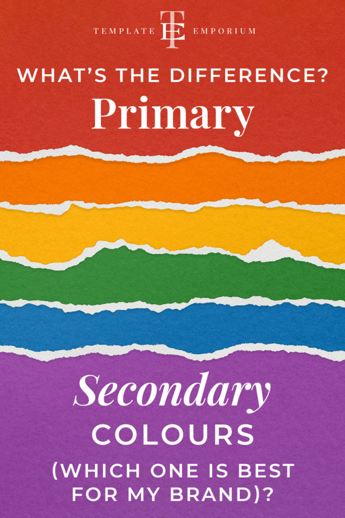
Firstly, we’ll discuss what Primary and Secondary colours are and how the colour wheel is your insider secret to picking what colours will go with your chosen colour.
Next, we’ll look at the meaning of all three Primary and Secondary colours and the best way to incorporate them into your branding.
Index
What are Primary Colours?
What are Secondary Colours?
Primary Colours & The Colour Wheel
Secondary Colours & The Colour Wheel
Which Primary & Secondary Colours are best for my brand?
What’s the difference between Primary & Secondary Colours?
What are Primary Colours?

Every colour is made up of just three colours – Yellow, Blue & Red -which are also called Primary Colours.
Firstly, Primary colours can’t be made from any other colour, so we refer to them as pure colours.
And, being pure colours means that these three primary colours can create all the colours around you. And every colour consists of these three colours.
Every other colour is created by mixing the primary colours in different amounts. The only exception to this rule is shades of black and white.
Each primary colour has an opposing secondary colour and we’ll learn about them next.
What are Secondary Colours?

These are the colours you get when you mix two Primary colours. The three Secondary colours are Orange, Purple and Green.
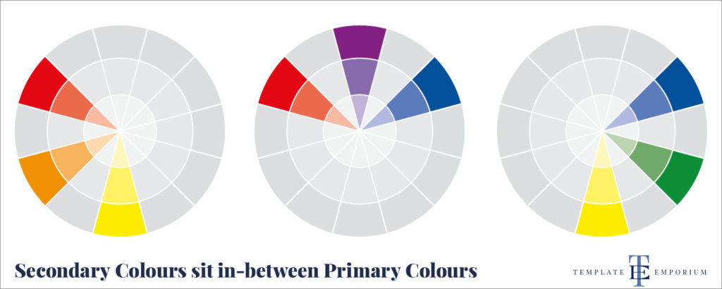
Secondary colours are created by mixing the primaries on either side of the colour wheel. We’ll talk more about the colour wheel later on.
Secondary Colour – Orange
Created by mixing the two primaries Red & Yellow.

Secondary Colour – Purple
Created by mixing the two primaries Blue & Red

Secondary Colour – Green
Created by mixing the two primaries Yellow & Blue.

Primary Colours & The Colour Wheel
The image below shows where the Primary Colours Red, Yellow and Blue sit on the wheel.
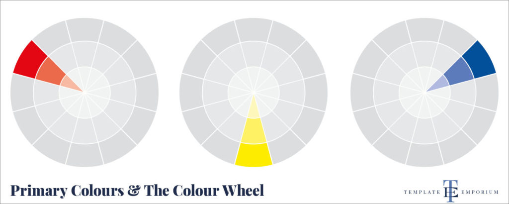
The colour wheel consists of an arrangement of colours that all have a relationship with each other.
All the colours on the wheel have an exact placement which helps us know which colours we need to mix to create new colours.
Let’s start with the purest colours – Red, Yellow and Blue (or as we learnt earlier are called Primary Colours).
The Primary Colours are spaced out equally on the Colour Wheel, as shown in the image above.
Secondary Colours & The Colour Wheel
The image below shows where the Secondary Colours, Orange, Purple and Green, sit on the wheel.
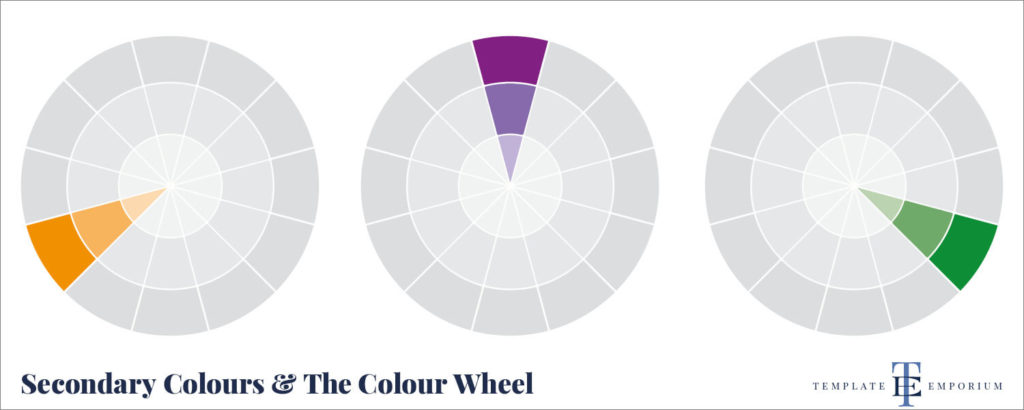
The Secondary Colours, Orange, Purple and Green, fit in between the Primary colours. And can be created by mixing the primaries on either side – as shown below.
Which Primary & Secondary Colours are best for my Brand?
In our Branding Colour Series, we looked at each Primary & Secondary colour by developing a three-part system that takes a deep dive into:
- The Colour’s Meaning
- Colour Varieties & Shades include light, bright & dark meanings
- How to use this information in your branding
Primary Colour – Red
Red is one of the most conflicting emotional colours as it represents both passion and danger. But with such contrasting elements, how do you know whether you Should use Red as your Branding Colour?
For a deep dive into Red – click on the image below.
Primary Colour – Yellow
Yellow is the brightest of all the colours, which means it can make us feel both happy and energised while having too much of it can feel overwhelming. So how do you know whether you Should use Yellow as your Branding Colour?
Are you a fan of Mellow Yellow? Click the image below to find out.

Primary Colour – Blue
Blue is the world’s most popular colour, and we can see why, after all, it is all around us, starting at the sky above and heading to the waters below. It’s in the clothes we wear to the flags we fly. There is no escaping from blue. But its meanings can vary from feelings of coldness, loyalty, peacefulness and authority.
Wondering if Blue is for You? Click the image below.

Secondary Colour – Orange
Orange is a youthful, exciting and festive colour that ties fun and activity together. But even though it is energetic, it also has an inspiring side. But how can a colour that aims to lift us also have a controversial side of feeling untrustworthy?
Ready to discover the cheeriest colour of all? Enter the world of Orange below.
Secondary Colour – Purple
Purple is often associated with magic, mystery and creativity. But, this non-traditional hue can also have a polarizing effect, with people finding its luxurious and royal look too aloof and vain. Are you Team Purple? Let’s discover whether you should use Purple as your branding colour.
Dive into the most creative colour of all by clicking the image below.

Secondary Colour – Green
Green is the colour of nature and is around us every day. On one end, it can make you feel optimistic and compassionate. It is, however, also associated with feelings of greed and jealousy. With such extremes how, do you know whether you should use green as your branding colour?
Let’s go green and discover whether it’s right for you. Click below to find out.

You Did it!
That’s a wrap on What’s the difference between Primary & Secondary colours & which one is best for my brand?
Being our first deep dive into colour categories, how do you feel now about Primary & Secondary colours? Did all our tips, infographics, and breakdowns help you decide which colour you should use for your brand?
Let us know. And in the meantime, follow us on Pinterest for more blog posts like this.
Where to now?
- Check out our Branding Colour Series – Starting with Blue.
- Get all our Insider tips with – Our Top Four Free Colour Generator Sites.
- Here’s the Colour Rule to Make Your Website Look Amazing! – Find it Here.
Want more Colour Tips?
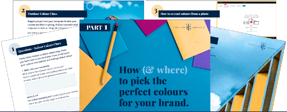
Grab our FREE GUIDE – How (& where) to pick the perfect colours for your brand.
Do you struggle when it comes to picking a colour palette for your business? In this 2-Part Training Guide, you’ll learn three ways to use colour clues (that are already around you), to ensure you pick the perfect palette every time!
Like the Blog Post?
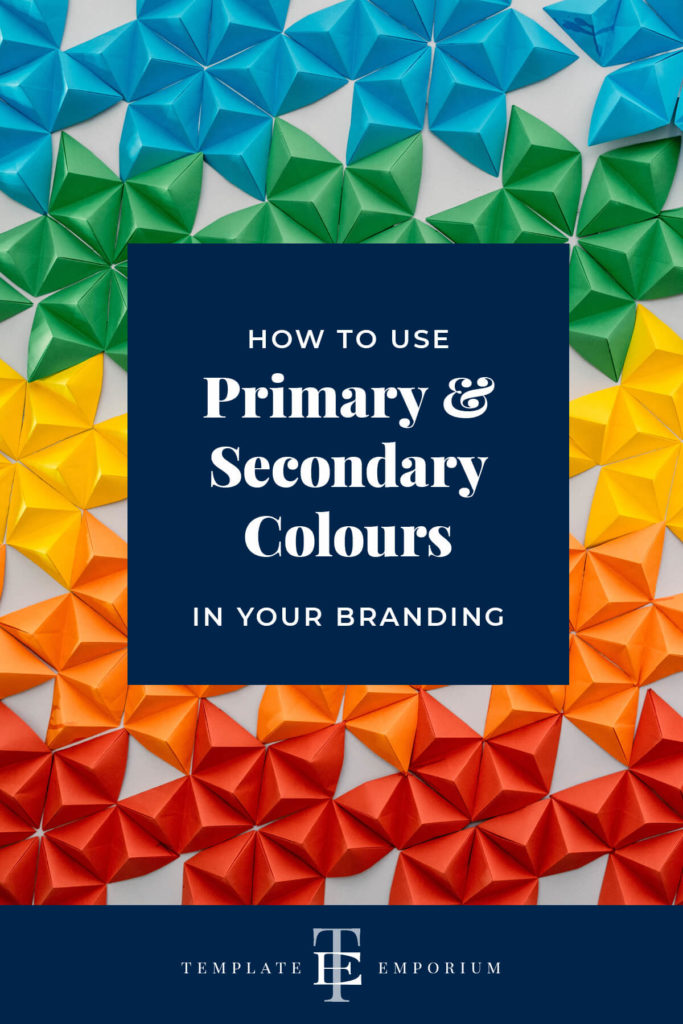
PIN IT FOR LATER. And for more helpful tips follow us on PINTEREST.
Search
Create & launch your website in a
few simple steps
FREE GUIDE
While you’re here,
grab our FREE
‘Do’s & Don’ts of what to add to your website’ Guide.
‘Do’s & Don’ts of what to add to your website’ Guide.
When you sign up, we’ll send you
emails with additional helpful content.
About Lavinia & Tom
Hi, we're so glad you found us.
We love helping creatives like you finally have the website you’ve always wanted.
Blog Categories
Follow us