grab our FREE
‘Do’s & Don’ts of what to add to your website’ Guide.
‘Do’s & Don’ts of what to add to your website’ Guide.
emails with additional helpful content.
Hi, we're so glad you found us.
We love helping creatives like you finally have the website you’ve always wanted.
few simple steps
Follow us
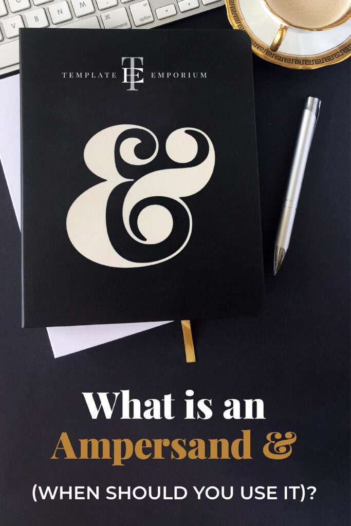
What is an Ampersand (& when do you use it)?
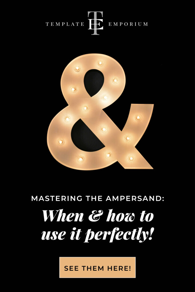
Even if you didn’t know its name, you’ve probably come across this typography symbol that looks more like a musical treble clef than a piece of type. In this blog, we’re breaking down when to use it and some of our favourite Ampersands styles.
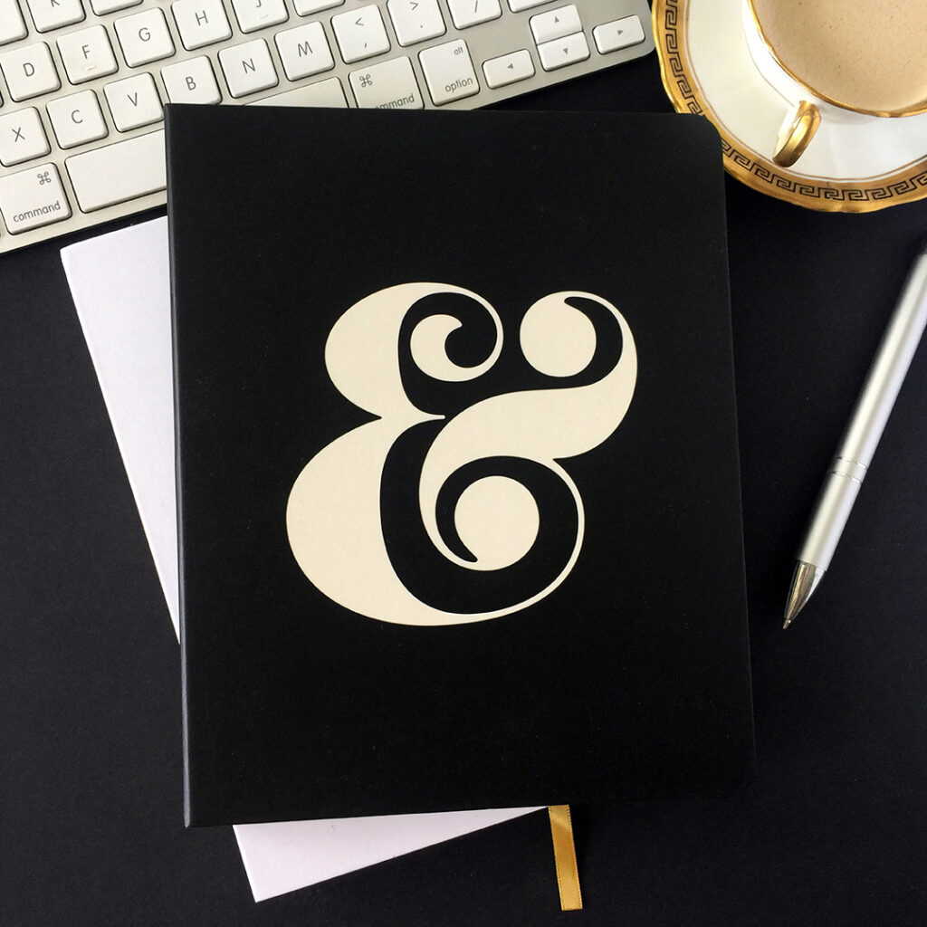
What is an Ampersand?
Being one of the oldest alphabetic abbreviations, it evolved from the letters ‘e’ and ‘t’ combining to form the Latin word ‘et’. And is the abbreviation for ‘and’.
Today, the “&” is a popular symbol when you have limited space and, depending on the font you choose, to show creative flair and fun.
How to use Ampersands on your website
A great place to start is using an ampersand in your website’s headings. Check out the examples below from our site.


Once you feel comfortable using it as a word substitute, try incorporating it into the design of your website.
In this example, we changed the ampersand colour, size and spacing between the words turning the design lockup into a creative stand-out piece.
Are you a fan of the Ampersand?
The main purpose of an Ampersand is to substitute for the word, and.
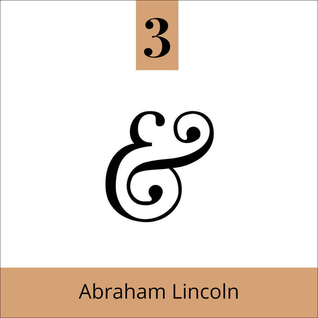
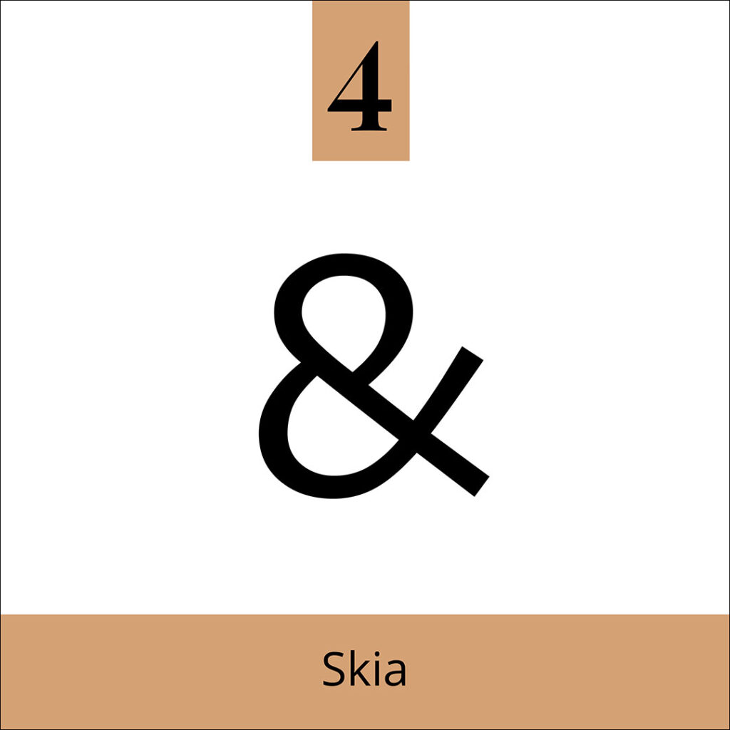
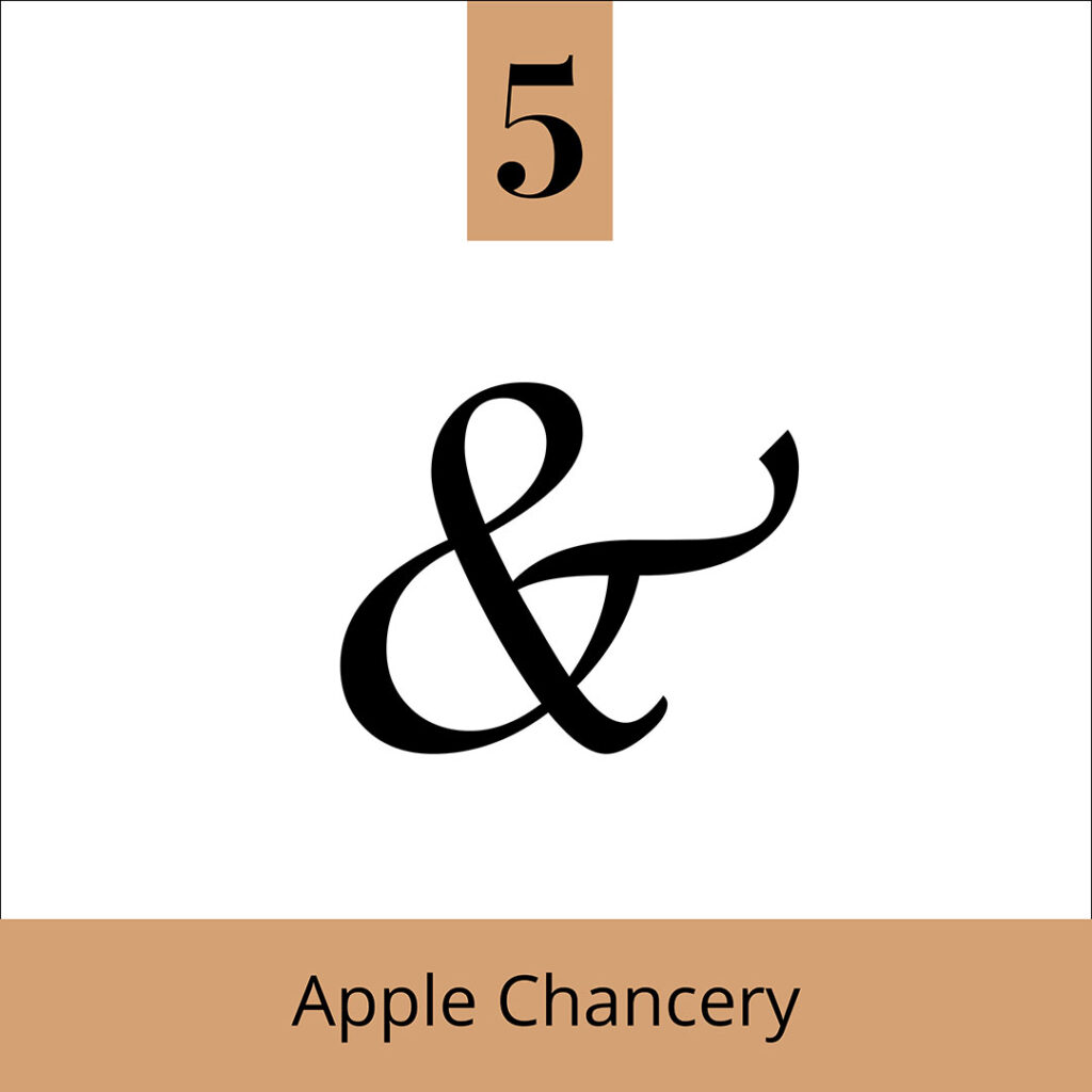
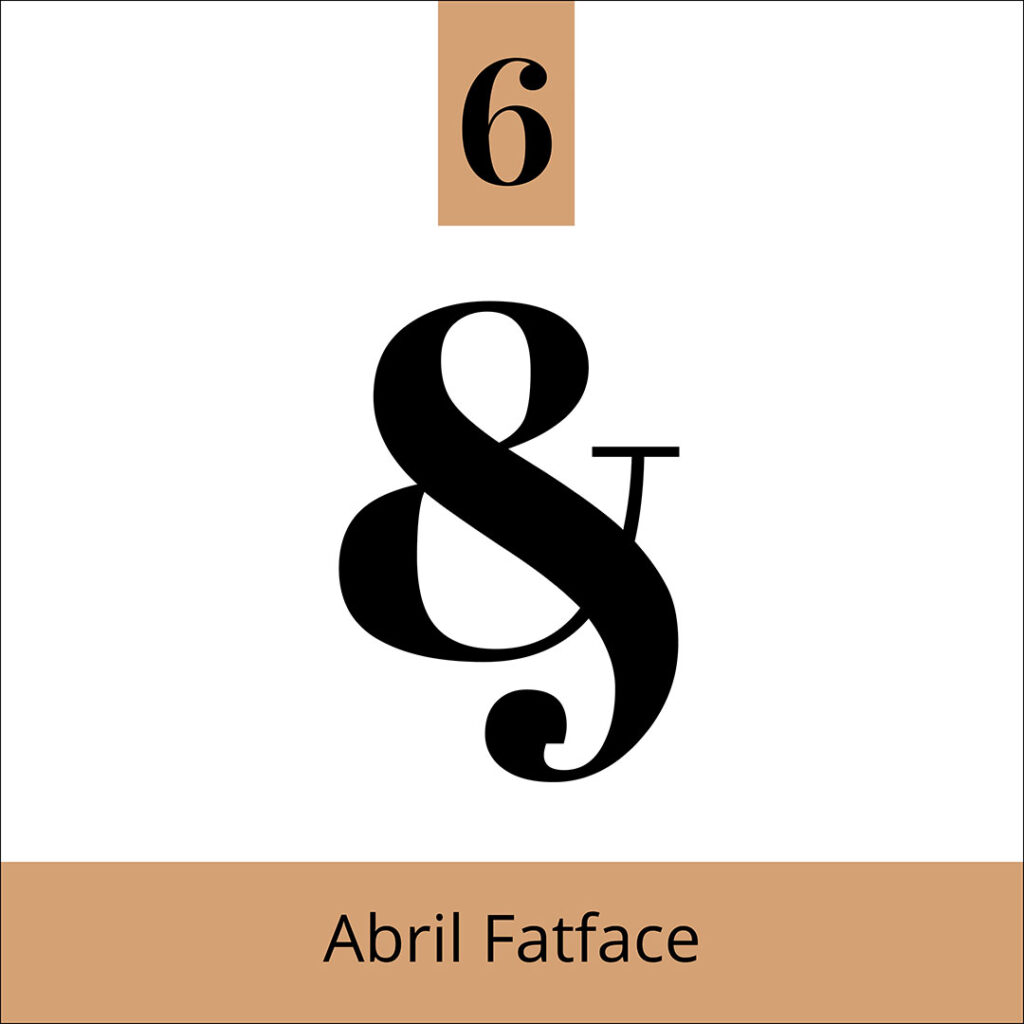
We, however, prefer to think of them as little pieces of art in typography. Because there’s nothing quite as enchanting as the creativity and curves of an a &.
This powerful glyph can add depth and intrigue to your designs.
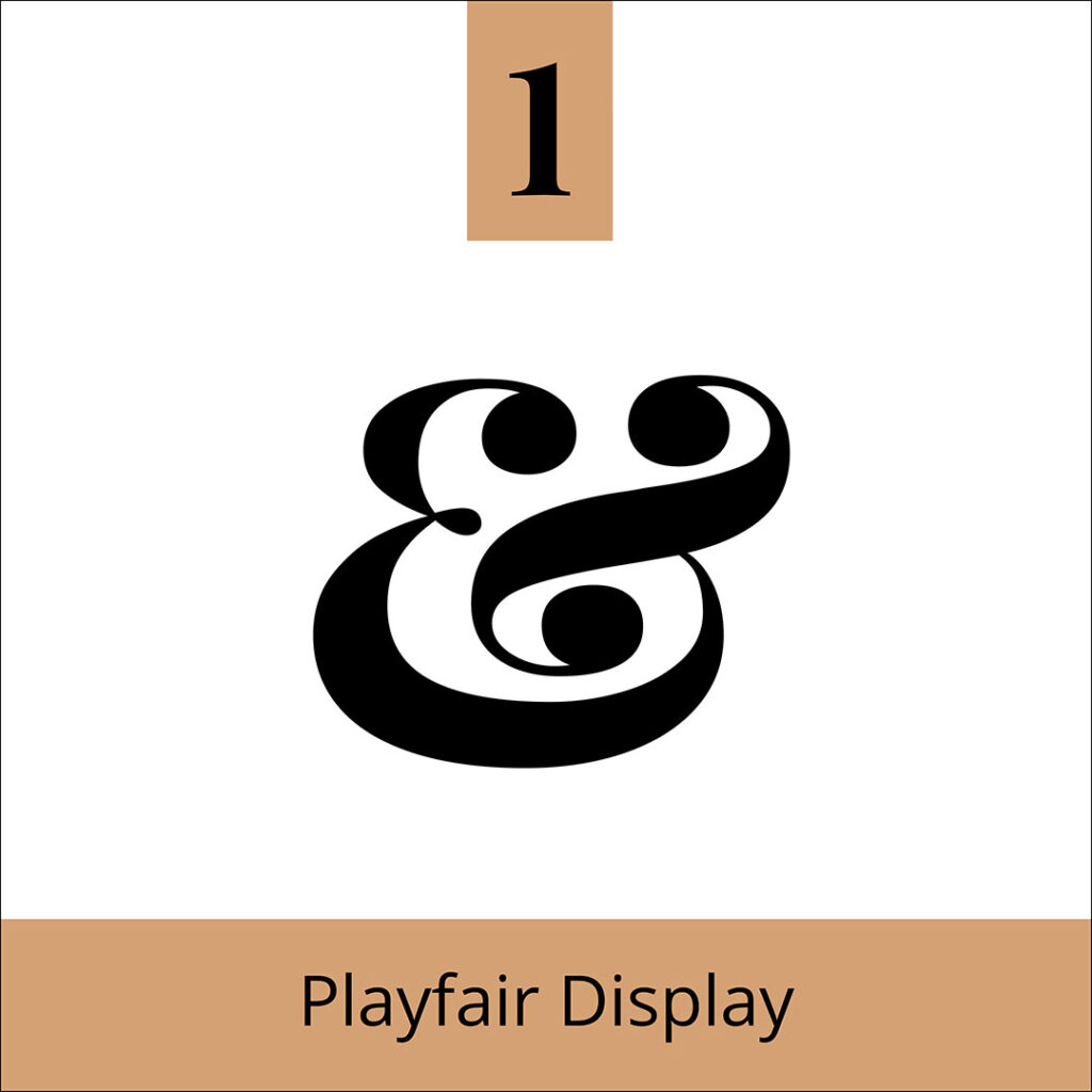
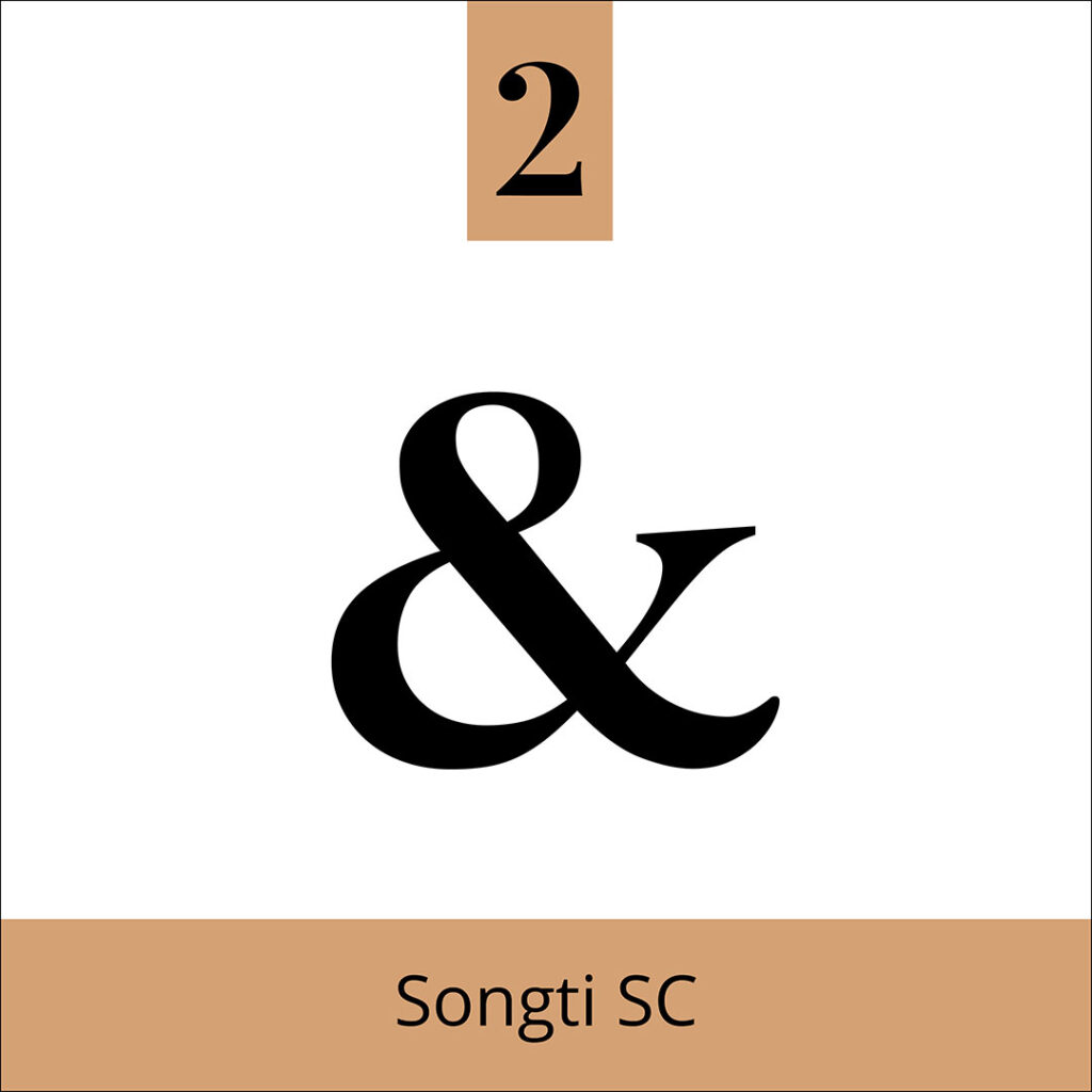
Here are a few of our favourite Ampersands.
You Did it!
That’s a wrap on What is an Ampersand (& when do you use it)? In this blog, we shared our favourite Ampersands and why we’re such huge fans of this decorative glyph. How about you? Are you team Ampersand? Let us know. In the meantime, follow us on Pinterest for more blog posts like this.
Want more designer Insider Tips?
Grab our FREE Essential Guide for Creatives – Do’s & Don’ts of what to add to your website.

Where to now?
Want more Type Tips? Check out these blog posts.
- Display Typefaces: The secret ingredient for eye-catching visuals that captivate your audience.
- The Ultimate Typeface Series (you didn’t know you needed)!
- Type Terms you have likely seen (but never knew what they were called).
Like the Blog Post?
PIN IT FOR LATER. And for more helpful tips follow us on PINTEREST.
Search
Create & launch your website in a
few simple steps
FREE GUIDE
While you’re here,
grab our FREE
‘Do’s & Don’ts of what to add to your website’ Guide.
‘Do’s & Don’ts of what to add to your website’ Guide.
When you sign up, we’ll send you
emails with additional helpful content.
About Lavinia & Tom
Hi, we're so glad you found us.
We love helping creatives like you finally have the website you’ve always wanted.
Blog Categories
Follow us