grab our FREE
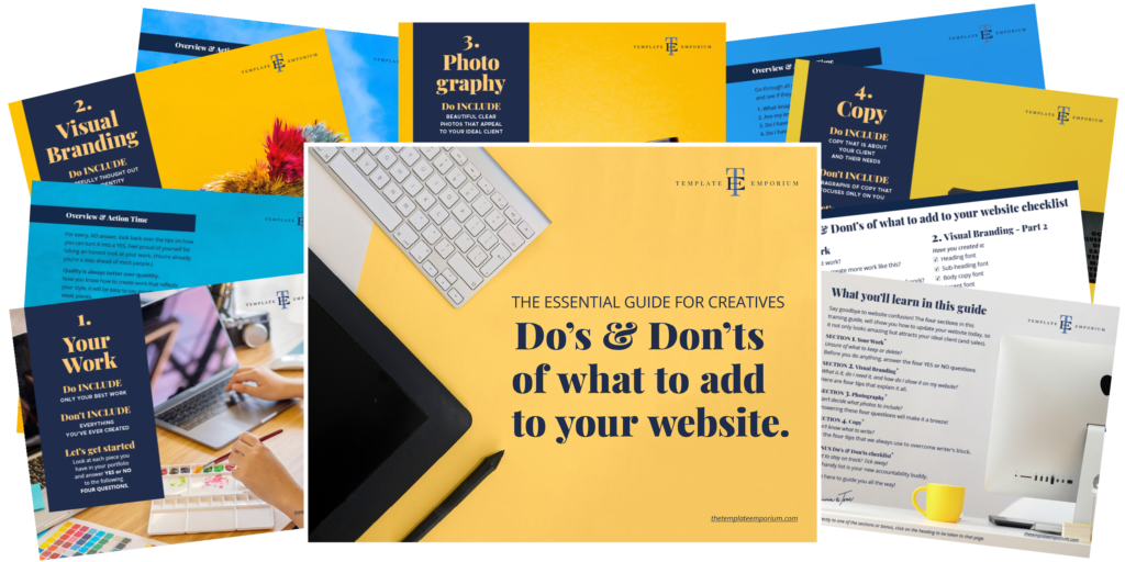
‘Do’s & Don’ts of what to add to your website’ Guide.
‘Do’s & Don’ts of what to add to your website’ Guide.
emails with additional helpful content.
Hi, we're so glad you found us.
We love helping creatives like you finally have the website you’ve always wanted.
few simple steps
Follow us
What is a One-Pager Website? (& why do I need one?)
You’re likely familiar with websites consisting of multiple pages that allow you to visit various sections of a website. But, if you’ve never heard of (or even fully understood), What is a One-Pager Website? Sit back, and we’ll explain everything you need to know (and why this type of website might be the perfect option for you)!
Before we start – check out our Website Series below.
- 3 Reasons why not adding your favicon is hurting your website
- Is your website breaking the law?
- Why do I need a Domain name? (and what do I do with it?)
- Do’s & Don’ts of What to Add to Your Website
- Top Website Mistakes creative professionals make (& how to avoid them)
Multiple Page VS One-Pager Website
Firstly, let’s discuss the difference between a multiple-page and a single-page website.
Multiple Page Website
You are probably familiar with this type of layout. As per the icons below, your website elements, such as About, Portfolio, and Contact, are all on separate pages.
See our Multi-Page Website in action here.

One-Pager Website
Here, all the pages of your website are combined into one. Doing so creates a different experience for clients and customers visiting your website.
Visitors can simply scroll down, rather than having to click on menus and navigate to multiple pages.
See our One-Pager Website in action here.

Want some tips for building your One-Pager website?
Grab our FREE Essential Guide for Creatives. “Do’s & Don’ts of what to add to your website”.

5 Reasons why you need a One-Pager Website
- Getting work & contracts
- Setup is quick & easy
- Cost Savings
- All of what you need in a condensed package
- Ease of Maintenance
1. Getting work and contracts
Time-poor clients like Art Directors, Art Buyers & Publishers need to ‘scan’ your site quickly. If they can’t find what they are looking for, they will move on to someone else.
These potential customers and clients have very busy schedules and tight timings, so they need to see your work and see if you are a good fit quickly.
One-pagers are visually appealing and easy to navigate. They can quickly grasp who you are and what you offer without endless scrolling or clicking.
If your work is hidden away a few pages deep, you run the risk that the Art Director could move on to someone else.
2. Setup is quick & easy
All our Template Emporium websites are focused on ease of use and setup, but our one-pager sites – here and here make the process even easier as you don’t have to worry about multiple pages of content and how these will relate to each other.
The faster your site loads, the better the experience for your visitors. With a one-pager, you’ll keep them engaged without the frustration of slow load times.
One-pagers also make great first websites if this is your first venture into getting your work online.
3. Cost Savings
Creating multiple-page designs, including fully-featured shops and blogs, not only takes time but money.
You, however, may not be in a position to need all these features yet. And if you are in the early stages of running your business, you can save the money you would have spent on a multiple-page website and instead invest it in your business in other ways. Including:
- Buy some props and items you can use as backdrops for your work.
- Put the money towards a photographer to shoot your best pieces.
- Hire a copywriter to look over your website, and make sure the message and tone of voice are consistent with you, your artwork and what you are trying to communicate.
4. All of what you need in a condensed package
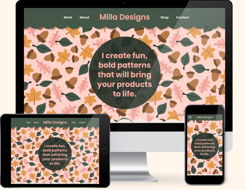
Our one-pager websites – Milla and Artwork & Design have all of what you need and nothing you don’t – all condensed down into a neat one-page design.
5. Ease of maintenance
Our One-Pager website templates take care of everything for you, which means hands-off maintenance for you.
They include continually backing up your website to protect it against hackers. So, you can relax and focus on doing what you do best – creating your artwork.
Our One-Pager template designs are perfectly crafted for Artists, Illustrators and designers.
If that sounds like you, our Milla one-pager Showit Website Template may be perfect for you!

You Did it!
That’s a wrap on our What is a One-Pager Website. Does this type of website sound exactly like what you’ve been looking for? Be sure to check out our one-pager designs below, and if you have any questions at all about whether this is a good fit for you, email us here. And in the meantime, follow us on Pinterest for more tips like this.
Where to Now?
- Check out a live version of our One-Pager Website Template Milla – Here
- Here’s a live version of the Artwork & Designs One-Pager Website Template – Here
- Want FREE TRAINING guides to boost your business? – Show me FREE GUIDES
Grab our Free Guide on building your One-Pager website
Grab our FREE Essential Guide for Creatives. “Do’s & Don’ts of what to add to your website”. We give you a simple plan to follow so that you’ll never have to question what to show online again.

Like the Blog Post?
PIN IT FOR LATER. And for more helpful tips, follow us on PINTEREST.

Search
Create & launch your website in a
few simple steps
FREE GUIDE
While you’re here,
grab our FREE
‘Do’s & Don’ts of what to add to your website’ Guide.
‘Do’s & Don’ts of what to add to your website’ Guide.
When you sign up, we’ll send you
emails with additional helpful content.
About Lavinia & Tom
Hi, we're so glad you found us.
We love helping creatives like you finally have the website you’ve always wanted.
Blog Categories
Follow us