grab our FREE
‘Do’s & Don’ts of what to add to your website’ Guide.
‘Do’s & Don’ts of what to add to your website’ Guide.
emails with additional helpful content.
Hi, we're so glad you found us.
We love helping creatives like you finally have the website you’ve always wanted.
few simple steps
Follow us
What is a Call To Action? + which CTAs you should use (& avoid)
If you’ve ever heard the abbreviation CTA and thought – What in the world does that stand for? You’re in the right place because not only are we going to explain what a CTA is, but also how to write your own and which ones you should avoid using altogether.
Get ready to learn all our tips and tricks in this blog – What is a Call-to-Action? And which ones you should use (& avoid).
Missed a part of our Branding Your Business Series? Catch up below.
- Brand Style Guides Explained (& why your business needs one now!)
- How to Design Your Visual Branding with the Problem & Solution Method.
PIN THE BELOW FOR LATER. And, for more helpful tips, follow us on PINTEREST.
WHAT is a Call To Action?

Call to Action can be abbreviated to CTA and tells your customer exactly what you want them to do next.
When creating a CTA, the chosen words should be clear, strong and direct.
And, they should allow your customer to either accept or reject what you’re asking them to do.
WHERE do I use a Call to Action on my Website?
When written, a CTA can be in the form of a button on your website.

Before we continue, want a Quick Tip?
Use an accent colour to make your button stand out from everything else on your site. This pop of colour will also help draw your customer’s attention to it.
Adding a CTA button to your website may seem obvious, but you’d be surprised how many people don’t include it or add enough CTAs throughout their site. So once you do, you’re already ahead of your competition.

Put your clear CTAs everywhere on your site to make it easy for your customers to know what they need to do.
They can be in either button form or written as a line of text.
Insider Tip

If you’ve never used CTA buttons on your website before, a great place to start is on your home page, in the top right-hand corner.
Use this spot for your primary CTA as it catches the eye of your viewer. (And, you’ll be surprised how often people will click it!).
WHEN do I use a Call to Action on my Website?

Think of a Call to Action as the next step your customer takes if they want to do business or learn with you.
You’re giving them a choice to either accept or reject your offer, which will take them to the next step.
If they think yes, I want to accept your offer, then they’ll click on the CTA. Alternatively, they can reject it by not following through.
Using CTA’s doesn’t mean you’re being pushy or salesy. It’s quite the opposite.
Instead, if you know what you’re offering is helpful and will solve your customer’s problem, give them the exact path to follow.
Your customer doesn’t always know what to do, so use a CTA to guide them in the right direction.
There’s nothing worse than getting to a website, believing that the product or service is what you need or the cure to all your problems, only to discover you can’t find out how to purchase it.
In other words, a simple CTA button would have prevented all of this.
What call-to-action words should I use?
There are numerous ways to write a Call to Action. But not all of them are effective, and there are even some that you should avoid.
Firstly, we’ll look at what words make a strong CTA. Next, we’ll cover the three sections they sit under. And finally, you’ll learn how to recognise a weak CTA and what to use instead.
Strong Call to Action Examples
Above all, your main goal with a CTA is to always give your customer a reason to click on your CTA. You can do this by explaining what’s in it for them with short, clear instructions.
These strong CTAs will help entice your customer to act now if they want their problem solved by you.

Meanwhile, don’t be afraid to ask for the sale in your CTA.
So many people assume, “My customer knows what to do”.
But the truth is, they don’t. Firstly, they can’t read your mind, and we should never assume. Instead, if you want them to do business with you, tell them what to do.
The 3 Sections of a Strong Call to Action
1. Verbs
2. Exclusivity
3. Urgency
1. How to use Verbs in a CTA

A verb is a word or a group of words that tells you what a person or thing is being or doing.
And it’s often called a doing word.
That’s why verbs are so effective in a CTA because they tell your customer what you want them to do.
Without it, the instruction you’re giving won’t make sense.
Verbs to try in your CTAs
Now you know what a verb is and how it works in CTAs, we’ve compiled a list for you to try on your website. To make it easy, we’ve highlighted the verb in bold below.
- Check it Out
- Get unlimited access
- Click Here to Start
- Download your Free Cheat Sheet
- Get a 40% Discount Today Only
- Find Out Here
- Get Tips Today
- Grab This Freebie
- Claim your free Trial
- Grab your copy
- Join Now
- Start Saving Now
- Register Here
- Save this to use
- See How It Works
- Share this with friends
- Start your Membership
- Stop everything and get this now!
- Try it for $1
- Start For Free
Insider Tips
In the examples above, we have included strong words such as Free.
And, to make the CTA even more enticing to your customer, we have included the word your. – Download your Free Cheat Sheet rather than download my Free Cheat Sheet. Doing so helps make the customer the star, not you.
2. How to use Exclusivity in a CTA

Next, we’ll look at how making something exclusive in your CTA, makes your customer feel they are getting something not available to everyone.
For example:
- Access All Areas
- Limited supply
- Advanced Copy
- Exclusive Offer
- Become an Expert
- Featured
- Limited Spots
- Members Only
- Now Closed
- Only a Few Left
- Pre-order
- Pre-register
- Request an Invitation
- Special Offer
- Subscribers Only
- While Supplies Last
3. How to use Urgency in a CTA

When a CTA has urgency attached to it, your customer is more likely to take action to avoid missing out.
Including a time frame and a special price can further encourage this.
For instance:
- Act Now
- Book my appointment
- Buy Now
- Closing soon
- Deadline
- Download now
- Ends Tomorrow
- Enter to Win
- Expires soon
- Hurry Ends Soon
- Immediately
- Instant Access
- I’m Ready
- Join Free for a Month
- Last Chance
- Limited Time Only
- Get it Now
- Offer ends on
- One-Time Offer
- Only 4 days left
- Only available up to Monday
- See in Action
- Shop Now
- Sign Me Up
- Talk to Us Now
- Today Only
- Try for 7 Days for $1
- Urgent
Bonus Call To Action Examples
– Other ways to say: Download my Freebie

As a bonus, if you’re running out of ways to encourage your customers to download your opt-in, we’ve created a list below for you to try.
- Free Resources
- Get Access Now
- Give it to Me Now
- Grab Your Freebie
- Grab Your Copy Now
- Let’s do it
- Let’s Go
- Send it to Me Now
- Yes, I want it now
- Yes, Please
Weak CTA Examples
Finally, on the opposite end, weak CTAs feel indecisive and leave your customer unclear on what to do. Plus, they become confused over what they are actually saying Yes or No to.
In an attempt to make us sound friendly and not pushy, we’ll use passive words.
Doing this has the opposite effect, with the CTAs below sounding wishy-washy and not strong and clear like the previous examples above.

You Did it!
That’s a wrap on What is a Call To Action?
How do you feel about CTAs now? Are you feeling more confident knowing which ones are strong and which ones to avoid? Let us know. And in the meantime, follow us on Pinterest for more blog posts like this.
Where to now?
- Want more website tips? Hurry, you don’t want to miss this blog.
- Add your new CTAs to your Brand Style Guide. Grab your Free Guide Here.
- Need a new website to add your CTAs? Check out our Templates.
A Free Gift for You
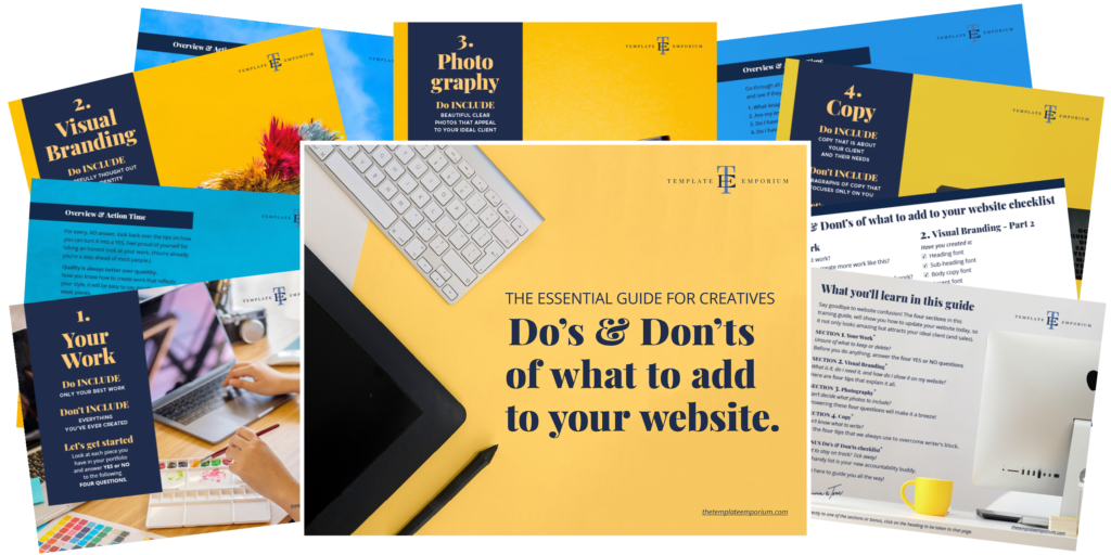
Grab our FREE Essential Guide for Creatives. “Do’s & Don’ts of what to add to your website”. We give you a simple plan to follow so that you’ll never have to question what to show online again.
Like the Blog Post?
PIN IT FOR LATER. And for more helpful tips, follow us on PINTEREST.
Search
Create & launch your website in a
few simple steps
FREE GUIDE
While you’re here,
grab our FREE
‘Do’s & Don’ts of what to add to your website’ Guide.
‘Do’s & Don’ts of what to add to your website’ Guide.
When you sign up, we’ll send you
emails with additional helpful content.
About Lavinia & Tom
Hi, we're so glad you found us.
We love helping creatives like you finally have the website you’ve always wanted.
Blog Categories
Follow us