grab our FREE
‘Do’s & Don’ts of what to add to your website’ Guide.
‘Do’s & Don’ts of what to add to your website’ Guide.
emails with additional helpful content.
Hi, we're so glad you found us.
We love helping creatives like you finally have the website you’ve always wanted.
few simple steps
Follow us
Type Lingo to make you feel like a Pro!
Knowing Type Lingo can help you better understand and communicate about typography and design. In this recap blog, we have gathered all the Type Lingo terms discussed in our previous blogs. And instead of using industry jargon, we’ll give you easy-to-understand explanations and visual examples.
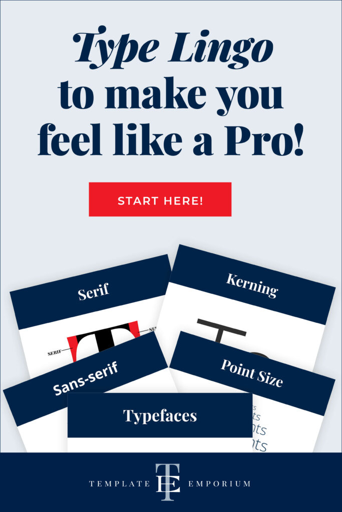
Here is a recap of a few essential ones.
Kerning
When the spacing between letters doesn’t look right – use this Type Tip.
Kerning is the total space between 2 single letters.
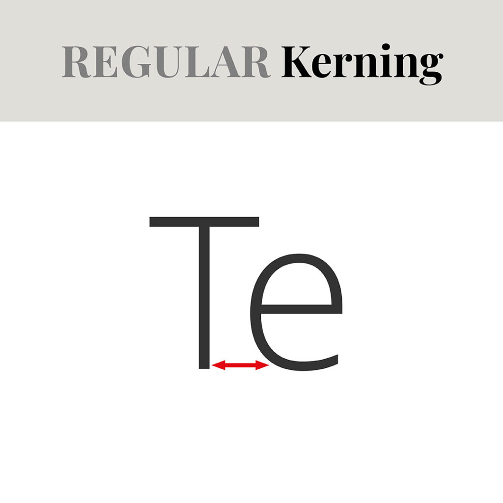
Regular Kerning – the amount of space that appears automatically by your design program.
Sometimes regular kerning may have too much space between characters.
Once you’re aware of it, you’ll be able to judge spacing and see if there is too much or too little between individual letters.
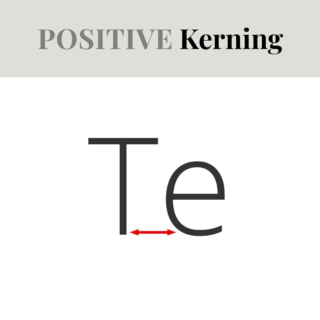
Positive Kerning is adding space between letters.
The amount of Kerning between each set of two single letters will always be different.
The decided amount will depend on what looks the best to create balance and make it easier to read.
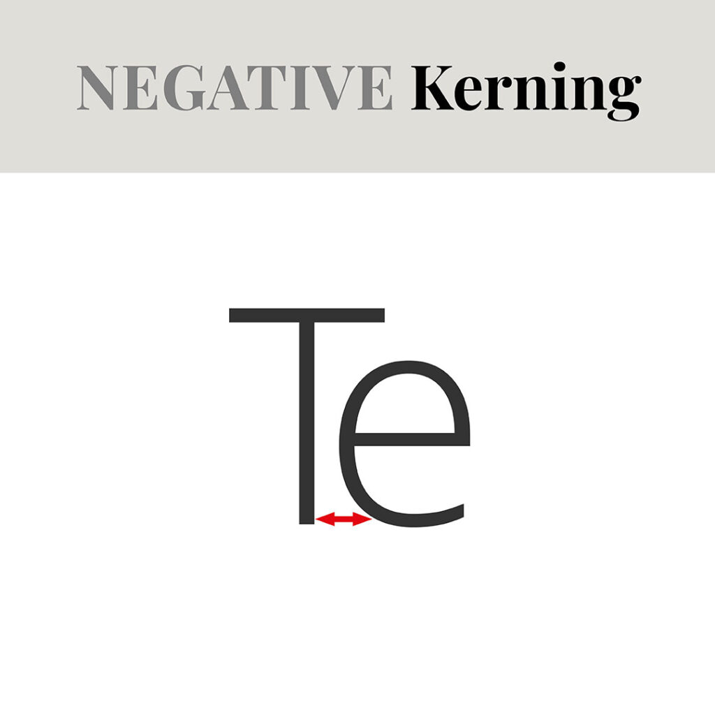
Negative Kerning is deleting space between letters.
Some letters must be placed close together to make the word look right.
Kerning that is too tight, however, will make the text harder to read, so be careful when using it.
Serif
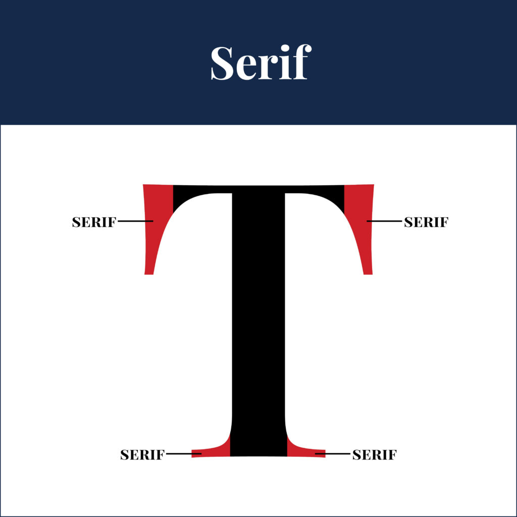
A Serif refers to the small lines or flourishes at the ends of letters in a font.
The different varieties include:
– Old Style
– Modern
– Transitional
– Slab Serif Typefaces.
Part 1 & 2 of this blog will explain more.
Sans-serif
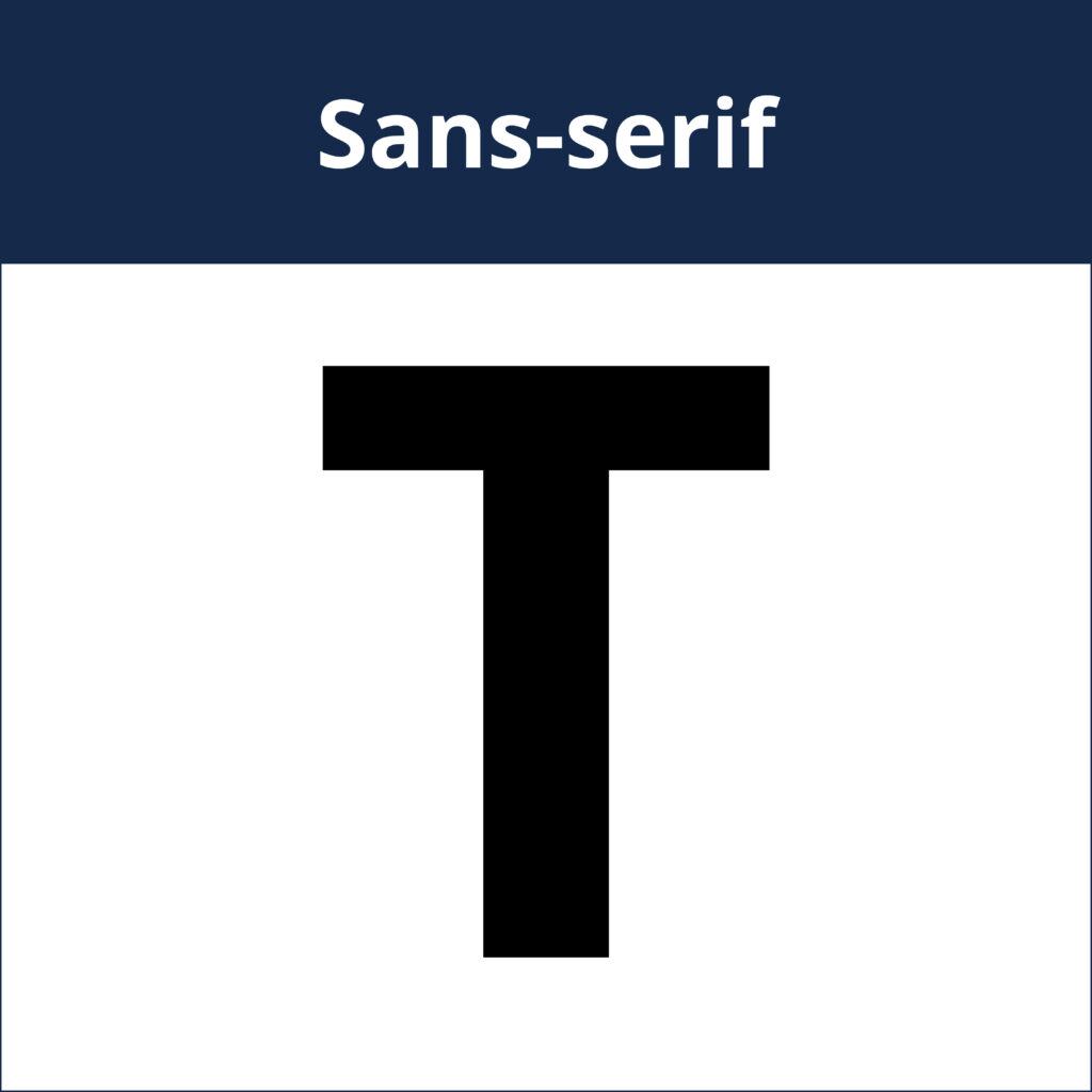
This refers to fonts that do not have small lines, flourishes or “little feet” at the ends of letters.
There are 3 types of Sans-serif Typefaces:
– Grotesque
– Humanist
– Geometric
Part 3 of this blog will explain their differences.
Insider Tip
Sans-serifs look more modern than Serif typefaces. So for balance, pair them with a Serif font.
For more tips like this check out Serifs or sans-serifs: Which font do you prefer?
Typeface
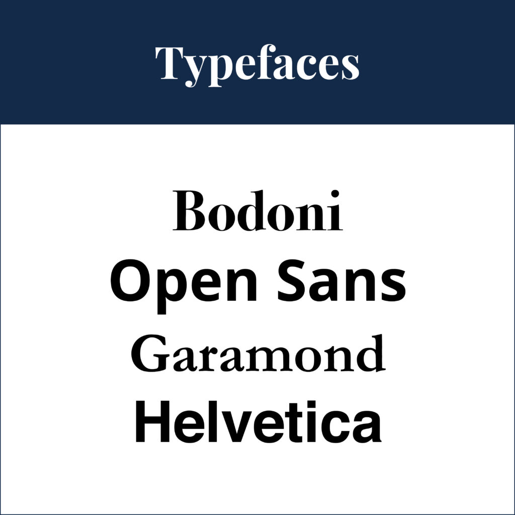
Typefaces are a set of fonts that share a common design.
This family of designed letters include all the Type Weights and Slopes from Regular, Italic, Medium, Semibold, Bold through to Black.
You can learn more about Typefaces here.
Point Size

When it comes to picking a size for your type, there are two units you can use. Points or Pica (pronounced pie-ka).
• A pica = 12 points
• A point = 1/72 of an inch or 0.352778mm
We prefer working in Points, and this is abbreviated to pt.
Insider Tips
In most Adobe design programs, if you want to make your type larger or smaller you can choose from a tiny 0.1pt all the way to 1296 pt.
Using different Point Sizes allows you to create a hierarchy and interest within your design.
You Did it!
That’s a wrap on Type Lingo to make you feel like a Pro! Come back here when you need a refresher. And in the meantime, Follow us on Pinterest for more blog posts like this.
Where to now?
Discover more about Type Lingo in the blogs below.
- Type Terms you have likely seen (but never knew what they were called).
- Type Crimes on your Website (are you committing any of these?)
- The Four most common Font Styles
Like the Blog Post?
PIN IT FOR LATER. And for more helpful tips follow us on PINTEREST.
Search
Create & launch your website in a
few simple steps
FREE GUIDE
While you’re here,
grab our FREE
‘Do’s & Don’ts of what to add to your website’ Guide.
‘Do’s & Don’ts of what to add to your website’ Guide.
When you sign up, we’ll send you
emails with additional helpful content.
About Lavinia & Tom
Hi, we're so glad you found us.
We love helping creatives like you finally have the website you’ve always wanted.
Blog Categories
Follow us