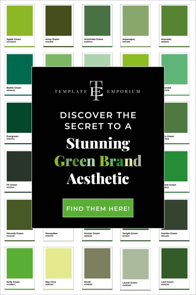
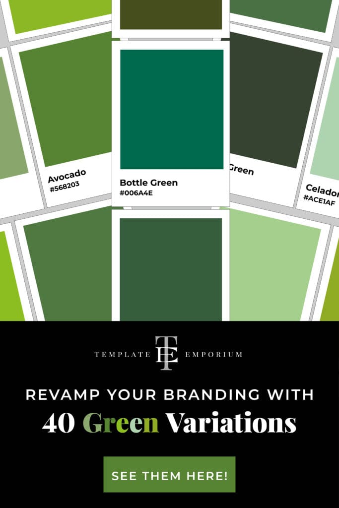
Transform your brand with the Perfect Green Palette
If you’re thinking about using Green as your branding color, which variations comes to mind? Do you prefer a light, bright, or dark Green shade? Each one carries its own meaning and purpose.
In this blog, we’ll introduce you to various shades of Green that you might not have heard of or considered before, along with the colours that pair well with them.
Check out all 40 Green variations below; you’re sure to find one that perfectly matches your creative business.
This blog is part of our new Colour Series. Explore all the colours below.
- Fed up with Plain Red? Check out these exciting Red variations.
- Unlock the Secret to Perfect Blue Colour Pairings
- Best Yellow colour pairings: Transform your designs with vibrant duos.
- Transform Your Brand with the Perfect Green Palette (The blog you are reading).
Using Green in your Branding
Green is universally associated with nature, peace, and growth.
It evokes feelings of tranquillity, health, and prosperity, making it an excellent choice for brands seeking to establish themselves as sustainable, eco-friendly, or wellness-oriented. If you’re unsure whether to use Green in your branding, check out this blog post.
But to truly leverage the power of green, you need to understand its different shades and their connotations.
Shades of Green Variations
Dark Green
When we think of Dark Green it brings to mind power, affluence, and stability. It’s a good choice for high-end or luxury brands aiming to portray an image of reliability and trustworthiness.
Light Green
Light green, on the other hand, symbolises growth and harmony, making it ideal for businesses focused on personal development and holistic well-being.
Green Variations
Apple Green
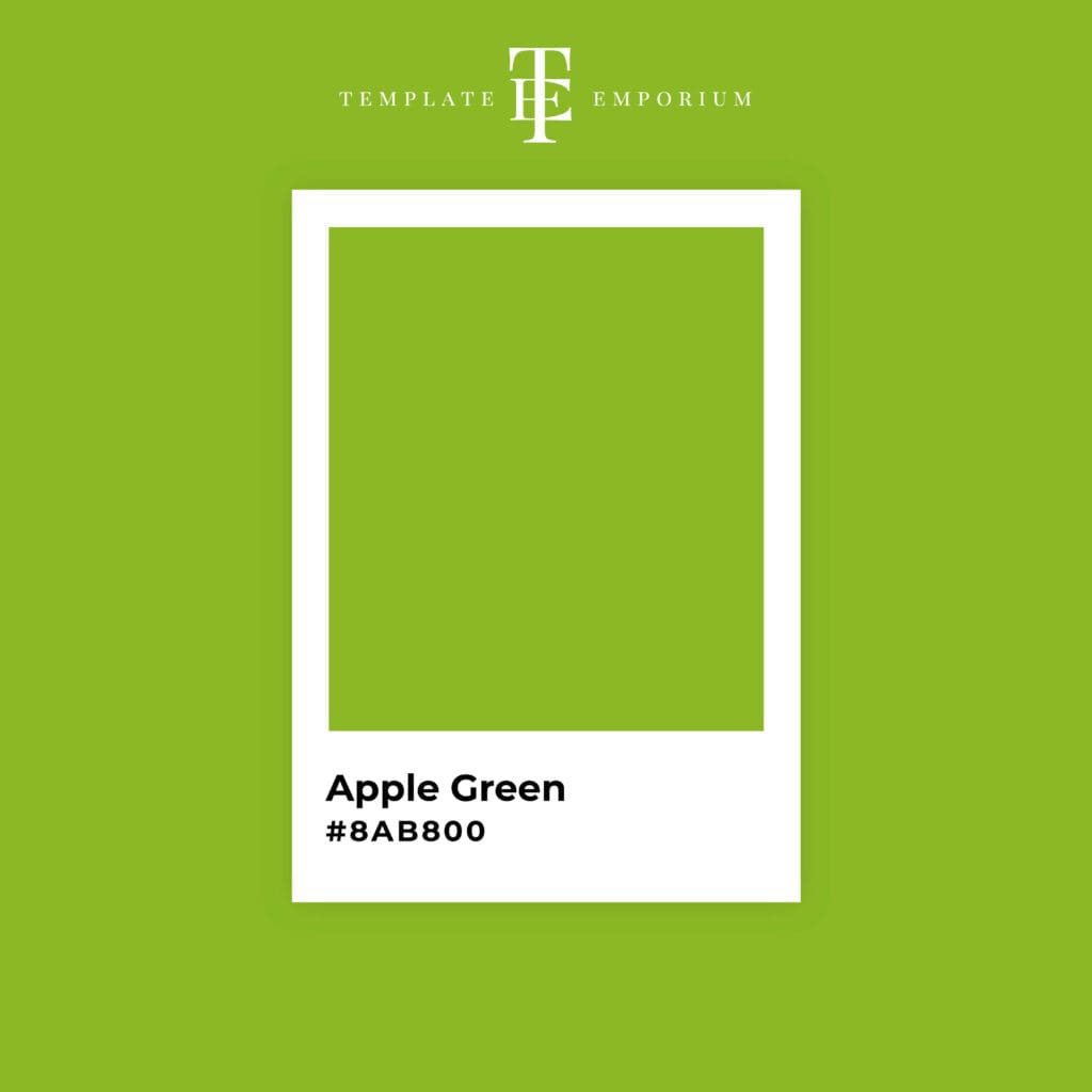
If you love a vivid Yellow Green, Apple Green is for you! Try it with the following:
Apple Red + Apple Green
Light Grey + Apple Green
Purple + Apple Green
Butter Yellow + Apple Green
Army Green

This Dark, muted Olive Green is perfect for a more mature audience.
Burnt Orange + Army Green
Tan + Army Green
Apricot + Army Green
Midnight Blue + Army Green
Artichoke Green

Being a dark, subdued Green, try pairing it with the colour combos below.
Dark Oak + Artichoke Green
Chocolate Brown + Artichoke Green
Burgundy + Artichoke Green
Black + Artichoke Green
Asparagus

Looking for a Green that strikes the perfect balance of brightness and vibrancy? Asparagus is our top choice.
Coral + Asparagus
Lavender + Asparagus
Coral + Asparagus
White + Asparagus
Avocado

Yellow tone Greens are a popular choice in branding and this medium, natural Green could be the colour you’ve been searching for.
Brown + Avocado
Beige + Avocado
Burgundy + Avocado
Gold + Avocado
Bottle Green

This rich, dark Blue-Green shade is sure to impress when paired with our suggestions below.
Soft Pink + Bottle Green
Warm Gold + Bottle Green
Cream + Bottle Green
Copper + Bottle Green
Bud Green

This soft, natural, Pastel-Green is always a good choice.
Lilac + Bud Green
Olive Green + Bud Green
Teal + Bud Green
Dusty Rose + Bud Green
Celadon Green

A pale Blue-Green color that radiates harmony and serenity. Unsure what to pair with such a calming shade? Check out our options below.
Grey + Celadon
Peach + Celadon
Salmon + Celadon
Bronze + Celadon
Chartreuse

If your brand is fun, young and wants to stand out, this vivid, bright Yellow-Green is waiting for you!
Dark Brown + Chartreuse
Deep Purple + Chartreuse
Sky Blue + Chartreuse
Dark Grey + Chartreuse
Emerald

If you’re looking for a sophisticated shade that transitions from Medium Green to Bluish-Green, the ever-popular Emerald is a perfect choice.
Royal Blue + Emerald
Champagne + Emerald
Burnt Orange + Emerald
Peach + Emerald
Evergreen

Evergreen is a dark, deep Green color. It’s mature, thoughtful, and appealing, making it a guaranteed winner.
Soft Gold + Evergreen
Slate Grey + Evergreen
Dusty Rose + Evergreen
Burnt Orange + Evergreen
Fern Green

Picked straight from the floor of Jurassic Park, this dark, Yellowish-Green pairs beautifully with the following colours.
Golden Yellow + Fern Green
Teal + Fern Green
Terracotta + Fern Green
Brown + Fern Green
Fir Green

Resembling Christmas pines, this dark Forest Green is similar to Bottle Green and comes to life when paired with the following:
Copper + Fir Green
Red + Fir Green
Pink + Fir Green
Orange + Fir Green
Forest Green

Continuing with the nature theme, our next option is the brightest Yellowish-Green we have yet!
Grey + Forest Green
Mustard Yellow + Forest Green
Brown + Forest Green
Deep Burgundy + Forest Green
Harrods Green

The deep Green colour of the world’s most iconic department store exudes glamour and sophistication.
Gold + Harrods Green
Blood Red + Harrods Green
Nude + Harrods Green
Rosewater + Harrods Green
Honeydew

For a hint of green, Honeydew is the lightest shade in our collection. Pair this Soft Green with our suggestions below for a dynamic duo.
Creamy Yellow + Honeydew
Fuchsia + Honeydew
Lavender + Honeydew
Slate Grey + Honeydew
Hunter Green

Dark, yellowish greens are a popular choice for conveying class, elegance, and sophistication in your branding.
Beige + Hunter Green
Purple + Hunter Green
Rose + Hunter Green
Burnt Orange + Hunter Green
Jade

Modern, youthful and with a touch of the classics this Dark-Yellow Green always hits the right notes.
Peach + Jade
Grey + Jade
Soft Pastels + Jade
Pink + Jade
Jungle Green

Much like the vibrant foliage of a dense jungle, this deep, rich Green colour evokes a sense of abundance and tranquility.
Warm White + Jungle Green
Brown + Jungle Green
Yellow + Jungle Green
Earth Tones + Jungle Green
Kombu Green

Rich and earthy, this dark olive green with natural hues fosters a sense of tranquility.
Rustic Orange + Kombu Green
Beige + Kombu Green
Gold + Kombu Green
Deep Brown + Kombu Green
Kelly Green

Everyone loves a classic, and this brilliant, intense pure Green continues to be a favourite.
Peacock Navy + Kelly Green
Magenta + Kelly Green
Cream + Kelly Green
Mint Green + Kelly Green
Key Lime

Sweet, summery, and delicious, just like its counterpart Key Lime pie, this vibrant shade of green is sure to stand out.
Fuchsia + Key Lime
Ocean Blue + Key Lime
Deep Purple + Key Lime
Orange + Key Lime
Khaki

Khaki is a versatile green that complements a variety of colors. Consider using this light, earthy brown-green with our suggestions below.
Mustard Yellow + Khaki
Burgundy + Khaki
Navy Blue + Khaki
White + Khaki
Laurel Green

This calming moderate Yellow-Green colour often represents renewal and growth.
Cream + Laurel Green
Purple + Laurel Green
Mustard Yellow + Laurel Green
Sky Blue + Laurel Green
Leaf Green

With a perfect balance, this medium-dark and bright shade of Green is an excellent choice. We love it paired with the following:
Poppy Red + Leaf Green
Orange + Leaf Green
Chocolate + Leaf Green
Olive Green + Leaf Green
Lime Green

If you want to push boundaries and demonstrate your brand’s fun, youthful spirit, this vibrant green colour is a guaranteed winner!
Eggplant + Lime Green
Slade Grey + Lime Green
Hot Pink + Lime Green
White + Lime Green
Malachite

Named after the gemstone, this vibrant Yellowish-Green color stands out even more when paired with the options below.
Burnt Orange + Malachite
Violet + Malachite
Cream + Malachite
Warm Gold + Malachite
Mantis

Named after the garden insect, this brilliant medium shade of Yellow-Green evokes a feeling of nature and harmony.
Sky Blue + Mantis
Coral + Mantis
Teal + Mantis
Lime + Mantis
Mint

Looking for a light, cool-toned green? We recommend mint! The name itself evokes feelings of freshness, crispness, and coolness. And becomes a hit when paired with the colours below.
Candy Pink + Mint
Tomato Red + Mint
Lavender + Mint
Peach + Mint
Moss Green

This deep, muted shade of Yellow-Green exudes maturity while also incorporating a modern twist.
Lemon + Moss Green
Cream + Moss Green
Pink + Moss Green
Muted Blue + Moss Green
Myrtle

Named after the beautiful Myrtle plant, this rich dark Green pairs wonderfully with the combinations below.
Coral + Myrtle
Sage + Myrtle
Navy + Myrtle
Deep Pink + Myrtle
Olive

A versatile shade of dark Yellowish-Green, it is muted and earthy while still exuding sophistication and calmness.
Navy Blue + Olive
Burnt Sienna + Olive
Rust + Olive
Soft Beige + Olive
Pastel Green

If you love Pastels, then this muted, soft and desaturated Shade of Green is calling your name!
Pastel Pink + Pastel Green
Lilac + Pastel Green
Periwinkle + Pastel Green
Ivory + Pastel Green
Pea Green

This soft Mid-Green color, with Yellow undertones, is cheerful, bright, and light.
Mustard Yellow + Pea Green
Pearl + Pea Green
Burgundy + Pea Green
Bright Pink + Pea Green
Pistachio

Pistachio is a soft Green and has pastel qualities with it’s creamy hue and Yellow undertones.
Grey-Blue + Pistachio
Chocoalte + Pistachio
Lilac + Pistachio
Burgundy + Pistachio
Racing Green

Racing Green is a blend of Emerald and dark Green. Try this rich, deep hue with our suggestions below.
Gold + Racing Green
Navy Blue + Racing Green
White + Racing Green
Burnt Orange + Racing Green
Sage Green

Named after the cooking herb, Sage Green is a soft, muted Green with Grey undertones.
Beetroot + Sage Green
Light Blue + Sage Green
Beige + Sage Green
Pale Purple + Sage Green
Sea Green

A calming and tranquil shade of Green, this intense hue combines Jade and Yellow.
Silver-Grey + Sea Green
Coral + Sea Green
Peach + Sea Green
Orchid + Sea Green
Seafoam Green

Cousins of Sea Green, Seafoam Green contain more Cyan, making it a cool, muted hue.
Navy Blue + Seafoam Green
Tangerine + Seafoam Green
Lilac + Seafoam Green
Salmon + Seafoam Green
Teal Green

If you are undecided between Blue and Green for your branding, this deep Blue-Green may be your solution.
Raspberry + Teal Green
Golden Yellow + Teal Green
Aqua + Teal Green
Coral + Teal Green
Insider Tip
Experiment with the different variations of the Green palettes above. A monochromatic scheme (one single colour) can create a harmonious and balanced visual. While an analogous colour scheme (three-colours) could add more vitality. Or a complementary colour scheme, (opposite colours on the colour wheel) on the other hand, can create a bold and dynamic visual.
You Did it!
That’s a wrap on Transform your brand with the Perfect Green Palette. From Apple Green to Pistachio and everything in between, what was your favourite Green variations? Let us know. And in the meantime, follow us on Pinterest for more blog posts like this.
Where to Now?
Want more Green variations? Check out these blog posts.
- Should you use Green as your Branding Colour?
- A Year of Vibrant Discoveries: Explore 52 Colourful Weekly Finds!
- St. Patrick’s Day Lucky Colour Pairs
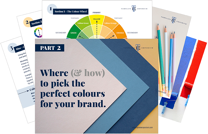
Want to start using Green as your Branding Colour now?
Download our FREE Guide
Like the Blog Post?
PIN IT FOR LATER. And for more helpful tips follow us on PINTEREST.