grab our FREE
‘Do’s & Don’ts of what to add to your website’ Guide.
‘Do’s & Don’ts of what to add to your website’ Guide.
emails with additional helpful content.
Hi, we're so glad you found us.
We love helping creatives like you finally have the website you’ve always wanted.
few simple steps
Follow us
How to Design Your Visual Branding with the Problem & Solution Method
When it comes to Visual Branding, there is one method I have used throughout my entire Graphic Designer career – The Problem & Solution Method.
Want to know how you can use it on your Visual Branding?
In this blog, I’m sharing tips, questions to ask and five (very different) client examples that I have used this method with spectacular results. Let’s see how we could make it work for you.
Missed a part of our Branding Your Business Series? Catch up below.
- What is a Call to Action + Which CTAs should you use (& avoid)?
- Brand Style Guides Explained (& why your business needs one now!)
What is the Problem & Solution Method?
Before you start creating a Pinterest Board called “Branding Ideas” I want you to first start with the problem you are facing with your branding.
A problem, in this case, doesn’t necessarily mean a bad thing instead refers to any conflicting ideas or beliefs you want to express in your visual branding. And deciding what solution would help bring all those ideas together.
Client Example 1: Countdown to Kindy
If one of your Visual Branding Problems is that you have two ideal clients, but don’t know who to target, this example will be perfect for you!
My client, the owner and teacher of her School Readiness program Countdown to Kindy came to me to create her Visual Branding.
I asked her three WHO-HOW-WHAT Problem Questions:
1. Who is your ideal client?
2. How do you want them to feel about your brand?
3. What do you want them to say about your brand (when you’re not there!)
Insider Tip:
In this case, there are two ideal clients – the Parent and the Student.
But, who do you target?
The decision-maker. So, the parent.
The Parent = PRIMARY ideal client.
The Student = SECONDARY ideal client.
Visual Branding still attracts the student but seeing that the parent is the final decision maker (and the one that is paying for the service) focus your efforts on what their problems are and how you can solve them.
Problem 1
My client wanted her Visual Branding (including her logo and brand identity) to feel fun, and friendly. Yet, still maintaining a learning environment overall look and feel.
Doing so helped ensure the parents could feel confident their children would have fun while learning, but still be academically ready for school.
Due to the sensitivities around using images of children, she didn’t want any photos included in her branding.
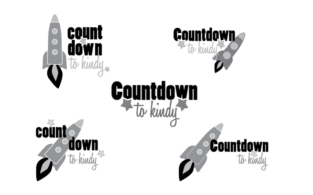
Below are the initial concepts and logo sketches for Countdown to Kindy.

I introduced the rocket into the logo to represent that your child is ready to fly off to school, after completion of the course.
Solution 1
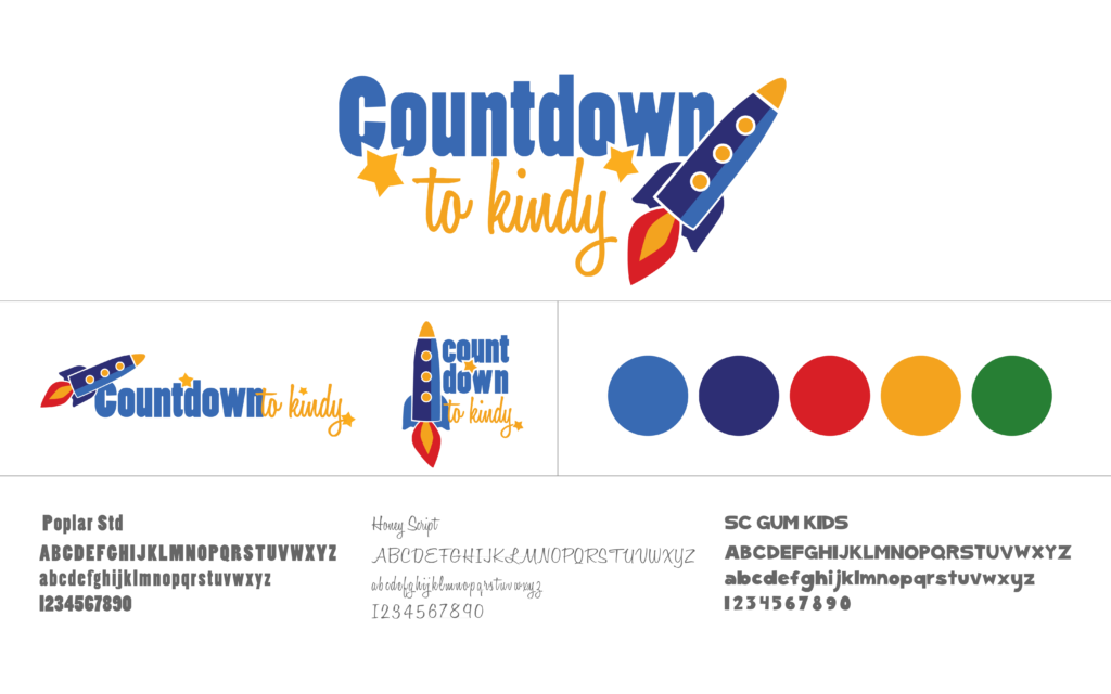
I created a bright colour palette that would appeal to children and introduced the background green to pay homage to the green chalkboards my client remembered learning from as a child.
To cater to the fun and friendly “problem”, I chose the fonts Honey Script for its hand-written style and SG Gum Kids to represent the cheerful and child-friendly look.
The font Poplar Std was a perfect choice to help maintain the overall learning environment look.
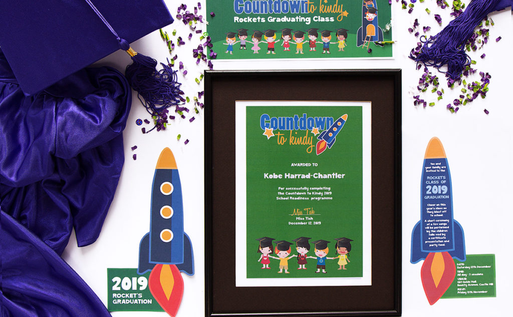
Pictured below, are the chosen logo and Visual Branding board.
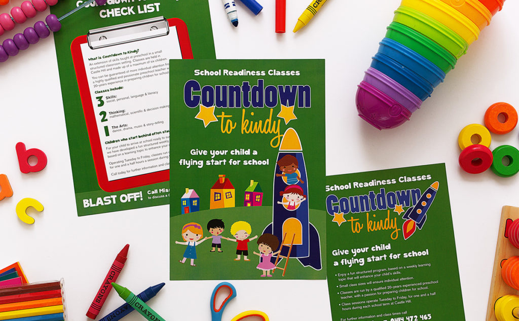
The cartoon-style drawings replaced photos of children.
Icons such as graduation hats (seen below) could be added depending on the season of the year.
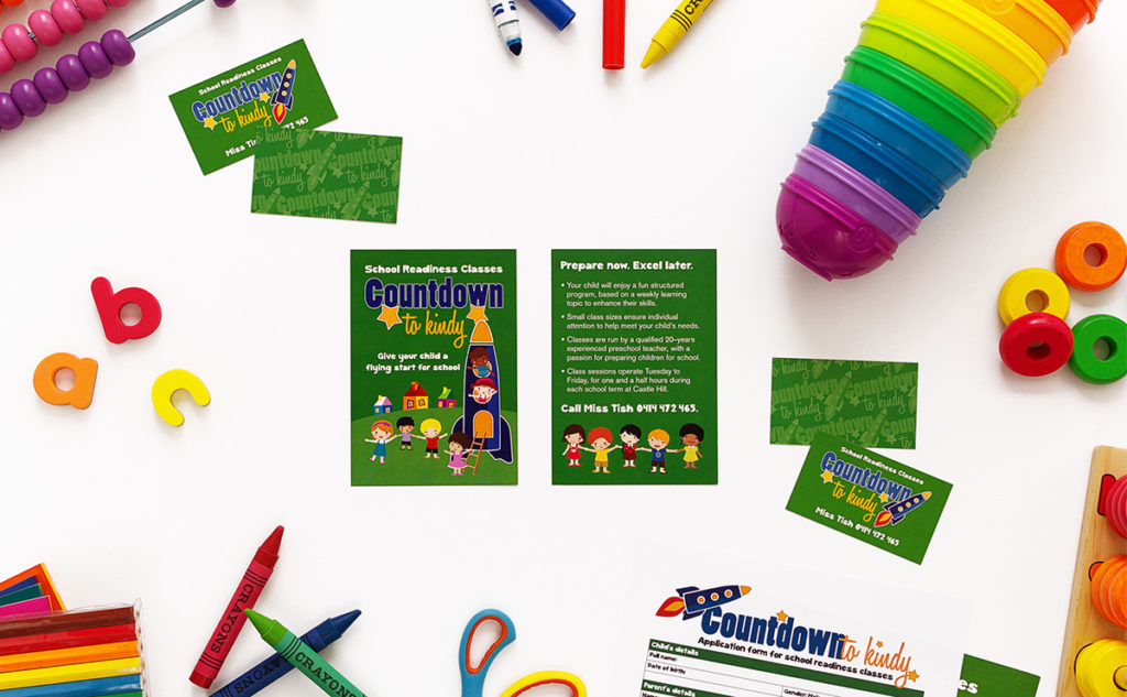
The Visual Branding as it appeared on business cards, postcards and flyers.
Client Example 2: Nuttwood Consulting
Let’s look at another example of a Visual Branding Problem being that you have two ideal clients.
The Problem & Solution Method works across all types of businesses and this time my client was Nuttwood Consulting.
Again, I asked the three WHO-HOW-WHAT Problem Questions:
1. Who is your ideal client?
2. How do you want them to feel about your brand?
3. What do you want them to say about your brand (when you’re not there!)
Problem 2
My client’s wife combined her maiden name Nutt with her husband’s surname Wood to create Nuttwood.
Using this as his business name, reflected his love of the Australian bush combined with his chosen career field as an Environmental Planner.
He wanted his Visual branding to:
– Feel accessible to families buying their first home
– As well as large corporations wanting a local consultant they could trust.
Below are the initial concepts and logo sketches for Nuttwood Consulting.

I created a gum nut and leaf icon as a nod to his love of the Australian bush.
Pictured below, finalising the preferred logo versions.

Insider Tip:
Again, in this case, there are two ideal clients – first-home buyers and large corporations. This time, however, they are both the decision-maker.
Are you experiencing this situation with your business? This problem can feel unachievable, but the key is to create a design that acts as a comprise between both ideal clients.
Solution 2
To achieve the accessible feeling:
I chose Bickham Script Pro a font that has a beautiful hand-written look with flourishes that flowed alongside the gum nut icon that I created.
To achieve a trustworthy feeling:
I contrasted the hand-written font with a strong sans-serif font, Akzidenz Grotesk this grounded the logo introducing the trust element to the overall look.
Pictured below, are the chosen logo and Visual Branding board.
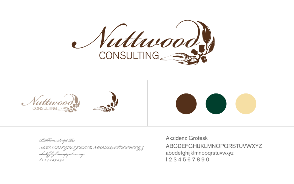
The colour palette represented the outdoorsy aspect of his business. This solid, trustworthy mature palette also appealed to both of his ideal clients.
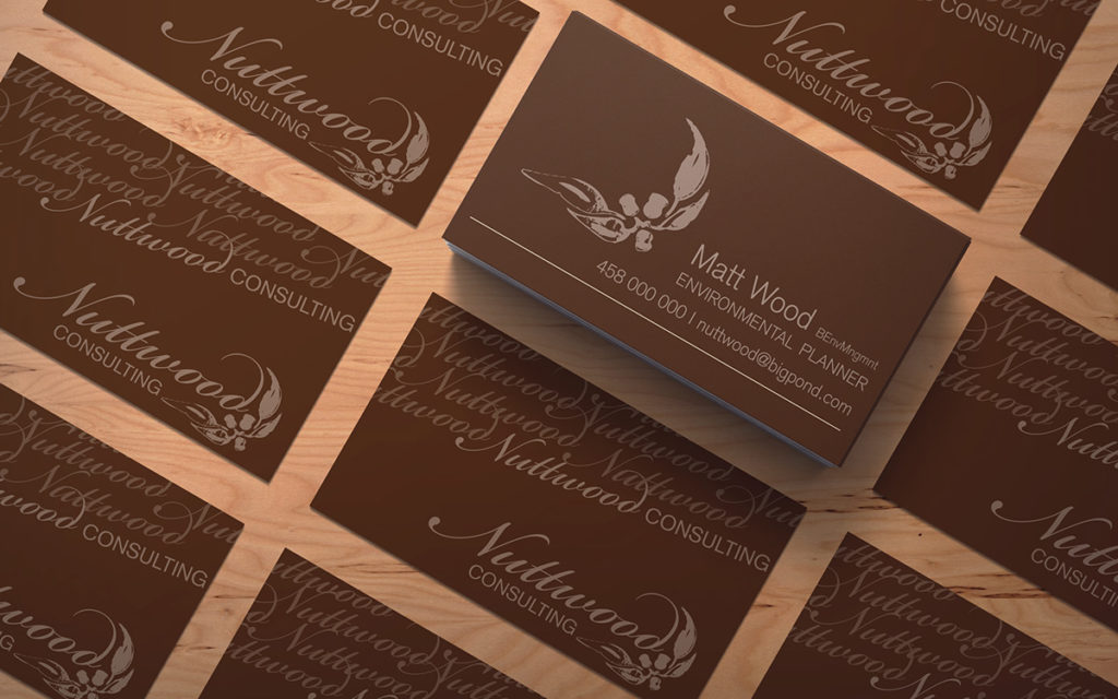
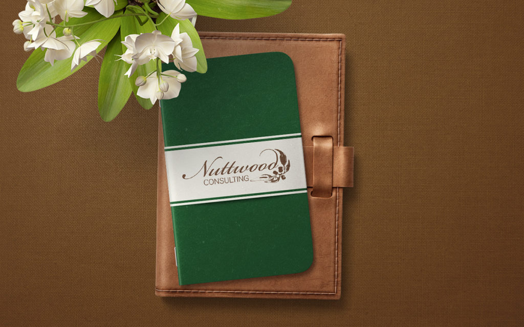
I designed a welcome notebook gift that he gave to his first home buyer families, making them feel so much more than just another customer.
Client Example 3: Jed & Babycakes
Does your business have an unusual name and you are trying to figure out a way to show it visually in a logo? This example will give you all the answers.
Taking a different direction, I used the Problem & Solution Method with the owner of a children’s clothing start-up brand called Jed & Babycakes.
Firstly, I asked the three WHO-HOW-WHAT Problem Questions:
1. Who is your ideal client?
2. How do you want them to feel about your brand?
3. What do you want them to say about your brand (when you’re not there!)
Problem 3
My client wanted a logo that incorporated both the nicknames of her two children, her son’s which was Jed and her daughter’s Babycakes.
Due to the unusual combination of the names, she thought the inclusion of a baby animal would serve as a visual connection that this was a brand for children.
Below are the initial logo sketches and concepts for Jed & Babycakes.

Solution 3
I choose the font Pechmilk as it was reminiscent of paper cutting which helped create a youthful look and feel. Solving the issue of my client’s problem of ensuring the customer knew this was a children’s brand.
For the baby animal, I chose a baby bird and combined a twig jutting out from the logo to connect the two.
Pictured below, is the chosen logo with icon and branding board.
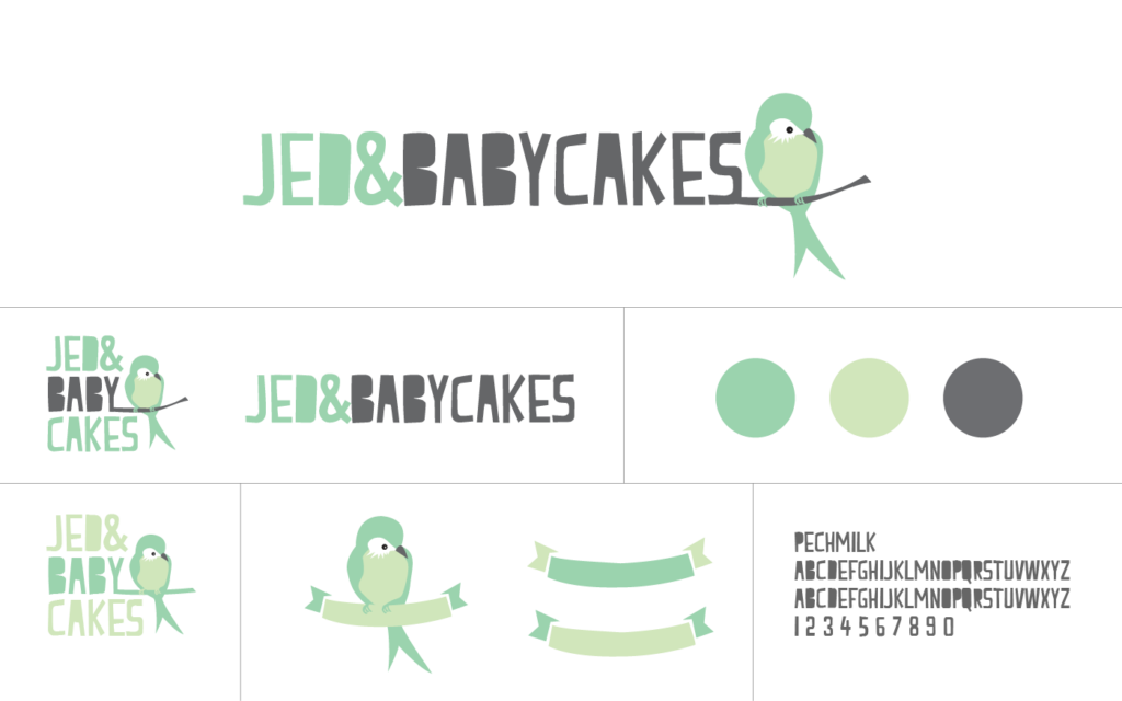
I picked a mint colour palette for its freshness and youthfulness. And, with my client being a personal brand, it also incorporated her love of green.
The final result is pictured on the bag, badge and tag below.

Client Example 4: Pet Tales Photography
Does the name of your business have a story behind it that you would love to incorporate into the Visual Branding? This example does exactly that.
The Problem & Solution Method works brilliantly with creative fields, and if that’s where your business sits, let’s look at a photography example with a twist – Pet Tales Photography.
I asked the three WHO-HOW-WHAT Problem Questions:
1. Who is your ideal client?
2. How do you want them to feel about your brand?
3. What do you want them to say about your brand (when you’re not there!)
Problem 4
My client wanted her logo to represent the reason she started her company, which was the belief that there was a gap in the market for quality pet photography that tells a story about your pet.
Below are the initial logo sketches for Pet Tales Photography.

Finalising the preferred logo versions.

Solution 4
Incorporating the pet’s story idea and the image of a tail, I created a logo that reflected an old-style storybook and fairytale.
I chose regal colours of purple and gold to make the pet the hero of the story.
Pictured below, is the chosen logo with icon and branding board.
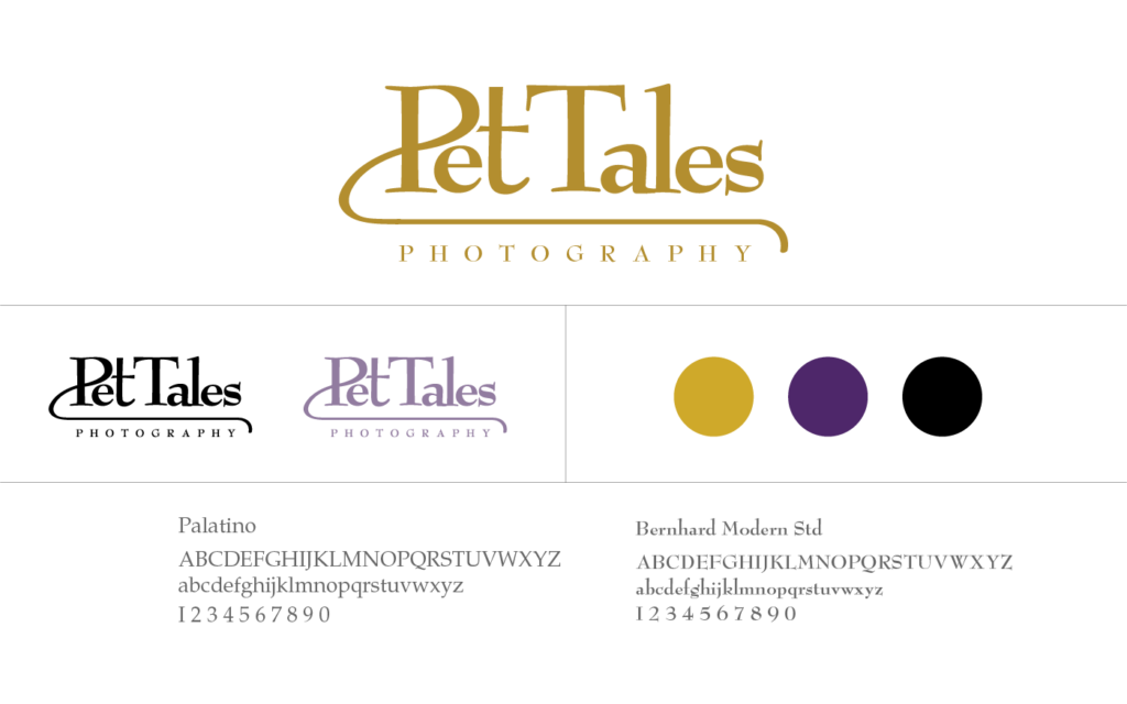
The serif font Palatino had both a traditional and fairytale feel within the characters of it, and once I added the extension of the P as a tail, I could picture the logo embossed in gold on the front of an old-style storybook.
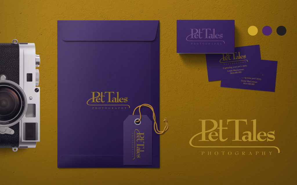
The final result is pictured on business cards and promotional pieces.
Client Example 5: Empire Promotions & Apparel
Do you want your customers to feel a particular way when they come in contact with your business and visual branding? This client example shows you exactly how to achieve it.
Moving into another business industry, the Problem & Solution Method worked beautifully with this start-up – Empire Promotions & Apparel.
Don’t forget to ask the three WHO-HOW-WHAT Problem Questions:
1. Who is your ideal client?
2. How do you want them to feel about your brand?
3. What do you want them to say about your brand (when you’re not there!)
Problem 5
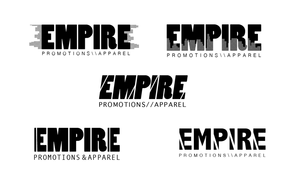
This start-up company required a logo that tied in aspects of the city into its name.
The aim was to create the feeling that they were creating their business Empire. And the skyline represents the heights they dreamt of reaching.
Pictured below, are initial logo sketches for Empire Promotions & Apparel.

Pictured below, finalising the preferred logo versions.
Solution 5
Using the city skyline within the letters of the name, I converted the shapes of the buildings, into hundreds of tiny dots to represent the look of machine embroidery stitches.
This tied in with one of the major services the company offered – embroidering company logos onto apparel.
Pictured below, is the chosen logo and branding board.
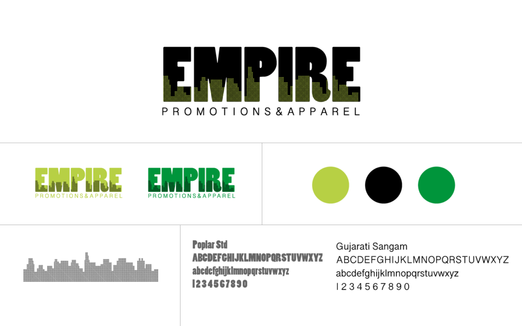
The modern-looking font Poplar Std was a perfect choice for this start-up. As it captured the feeling of confidence and success.
The thickness of the font also allowed me to incorporate the skyline idea into the finished design.
The Lime & Slime green colour palette showed, just like a green traffic light, this start-up was ready to go and create its Empire.
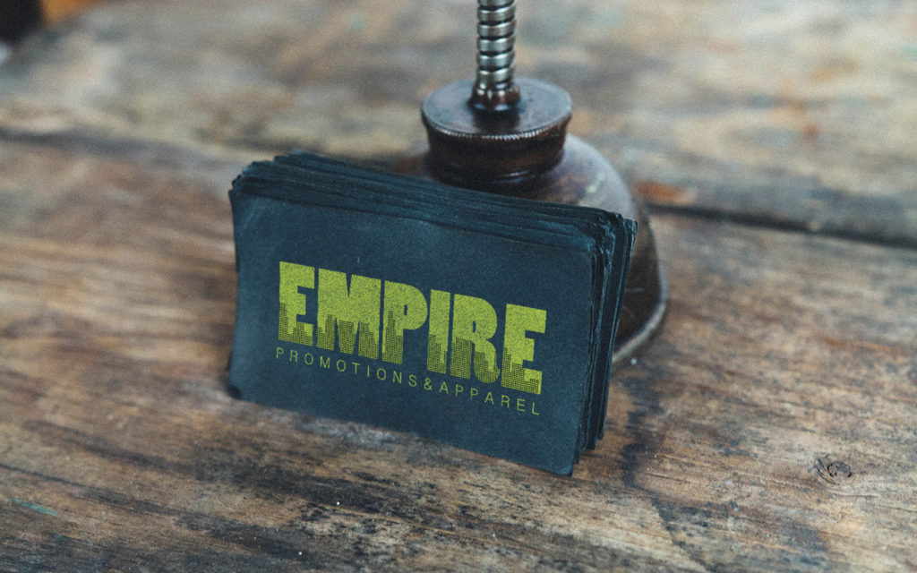
The final result is pictured on business cards.
Well, that brings us to the end of our How to design your Branding Using the Problem & Solution Method.
Did any of the five examples relate to the problems you are facing with your Visual Branding? I hope the solutions give you a clear direction as you begin your Visual Branding journey.
Your Action Steps
- Read through the Problem & Solution Examples.
- What Problems are you facing with your Visual Branding?
- Answer the three WHO-HOW-WHAT Problem questions.
Who is your ideal client?
How do you want them to feel about your brand?
What do you want them to say about your brand? - Use your Solutions to create your Visual Branding.
Where to next?
How to use your Brand Colours to make your site Pop! Here’s How
Our Favourite 5-step Process to Creating a Mood Board Show Me
Do you know how to create your (own) signature style? Tell Me Now
Want to learn more about Branding?
Grab our FREE Essential Guide for Creatives. “Do’s & Don’ts of what to add to your website”. We give you a simple plan to follow so that you’ll never have to question what to show online again.
And our blog post Should I name my business after myself will also help.
Like this blog post?
PIN IT FOR LATER. And For more helpful tips follow us on PINTEREST.
Search
Create & launch your website in a
few simple steps
FREE GUIDE
While you’re here,
grab our FREE
‘Do’s & Don’ts of what to add to your website’ Guide.
‘Do’s & Don’ts of what to add to your website’ Guide.
When you sign up, we’ll send you
emails with additional helpful content.
About Lavinia & Tom
Hi, we're so glad you found us.
We love helping creatives like you finally have the website you’ve always wanted.
Blog Categories
Follow us