grab our FREE
‘Do’s & Don’ts of what to add to your website’ Guide.
‘Do’s & Don’ts of what to add to your website’ Guide.
emails with additional helpful content.
Hi, we're so glad you found us.
We love helping creatives like you finally have the website you’ve always wanted.
few simple steps
Follow us
The Four most common Font Styles
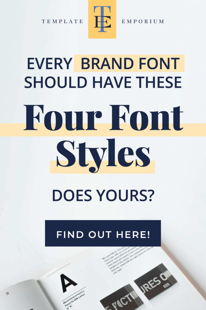
If you struggle to understand how to use fonts correctly, in this blog, we’re taking you back to the beginning and breaking down the four most common font styles so you can finally feel confident in knowing how to pick the perfect font for your next design project.
Before we start – missed a part of our Fonts Series? Catch up below.
- Your new favourite Font Finder
- How to Update Master Fonts in Showit
- Our 5 Favourite Google Font Pairings for Your Website
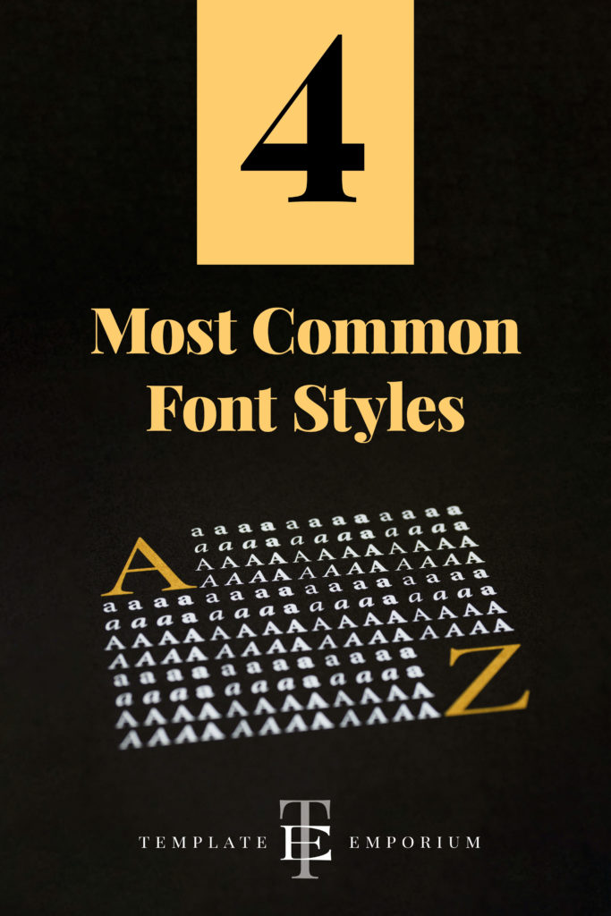
When choosing a font for your branding or next design project, we always suggest choosing one that comes from a Font Family.
Font Family
A Font Family consists of more than one variety of that font, giving you choices and options plus allowing you to create a hierarchy of importance by using the different body weights, styles and slopes available.
Within that family, are four font styles that you’ll use
4 Most Common Font Styles
- Regular
- Bold
- Black
- Italic
1. Regular Font Style

The Regular font is also known as a Type Weight and will be the style you’ll use the most.
Regular is neither too thick nor too thin, making it the perfect match to use for the body copy on your website.
This font style is also the thinnest of all the four styles discussed.
2. Bold Font Style
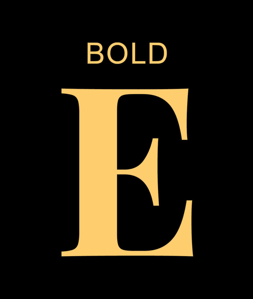
The second Type Weight available in a Font Family is Bold.
The Bold font style is perfect for headings or to make a section of your body copy stand out.
Regarding thickness, Bold is thicker than Regular but thinner than Black.
3. Black Font Style
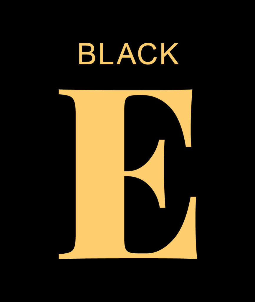
Being the thickest font style in this selection, the Type Weight of this font style will make it stand out.
Therefore Black is a perfect pick for Headings.
Avoid using it in the body copy. When reduced, and due to its weight, this will make the copy too hard to read.
4. Italic Font Style
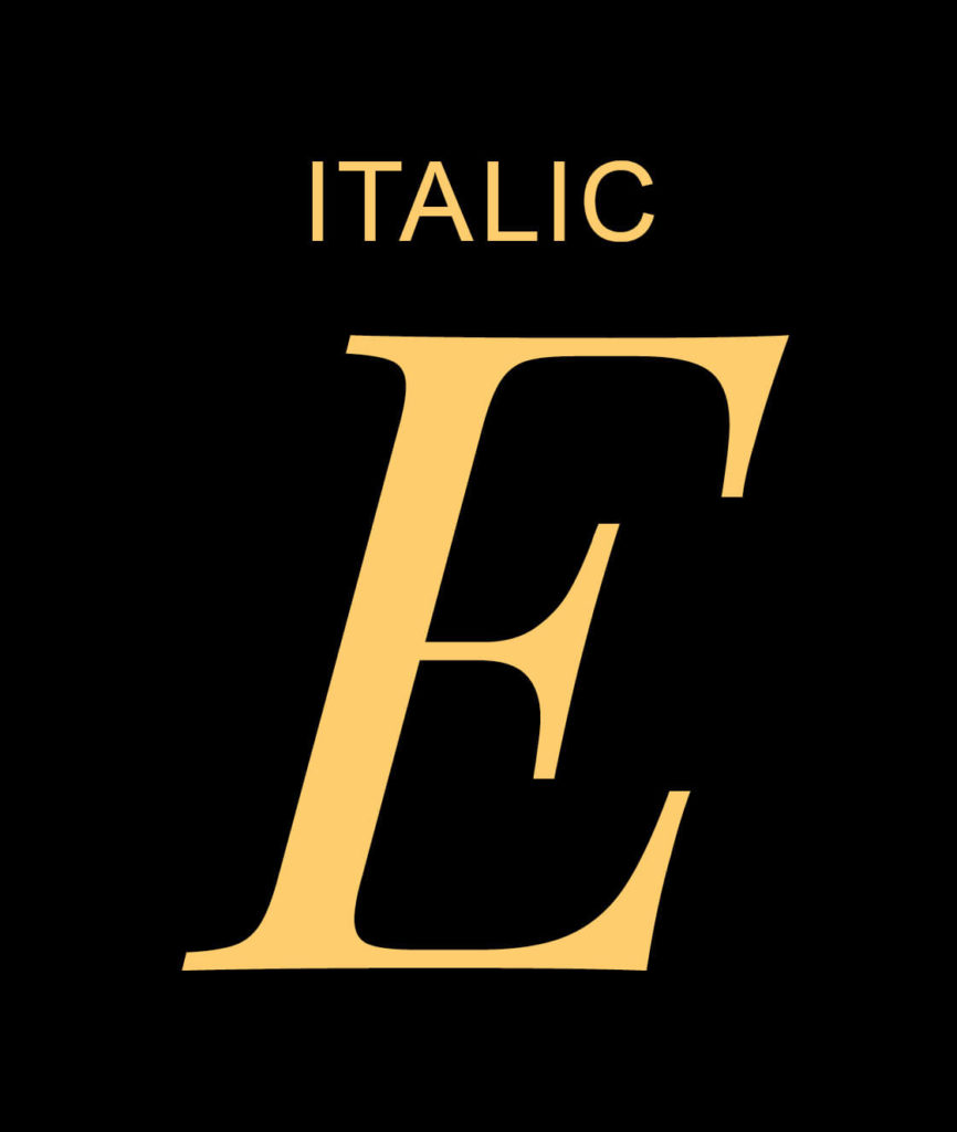
Italic sits under the Type Slopes in a Font Family and angles slightly to the right making it perfect to use for emphasis.
Or to state the name of something, such as a film, show or even your business name.
For example, our business – The Template Emporium.
You did it!
That’s a wrap on The Four Most Common Font Styles, and in this blog, we covered Regular, Bold, Black and Italic Font Styles.
Using our tips, try them on your website to create a clear hierarchy making it easier for your customers to understand how you can help them.
Where to Now?
We’ve got even more Tips on using Fonts. Check out the below.
- Before you pick your Brand Font, ensure it has these 3 features.
- Our 5 Favourite Google Font Pairings for your Website.
- Do you know the different Typeface Categories?
Like the Blog Post?
PIN IT FOR LATER. And for more helpful tips follow us on PINTEREST.
Search
Create & launch your website in a
few simple steps
FREE GUIDE
While you’re here,
grab our FREE
‘Do’s & Don’ts of what to add to your website’ Guide.
‘Do’s & Don’ts of what to add to your website’ Guide.
When you sign up, we’ll send you
emails with additional helpful content.
About Lavinia & Tom
Hi, we're so glad you found us.
We love helping creatives like you finally have the website you’ve always wanted.
Blog Categories
Follow us