grab our FREE
‘Do’s & Don’ts of what to add to your website’ Guide.
‘Do’s & Don’ts of what to add to your website’ Guide.
emails with additional helpful content.
Hi, we're so glad you found us.
We love helping creatives like you finally have the website you’ve always wanted.
few simple steps
Follow us
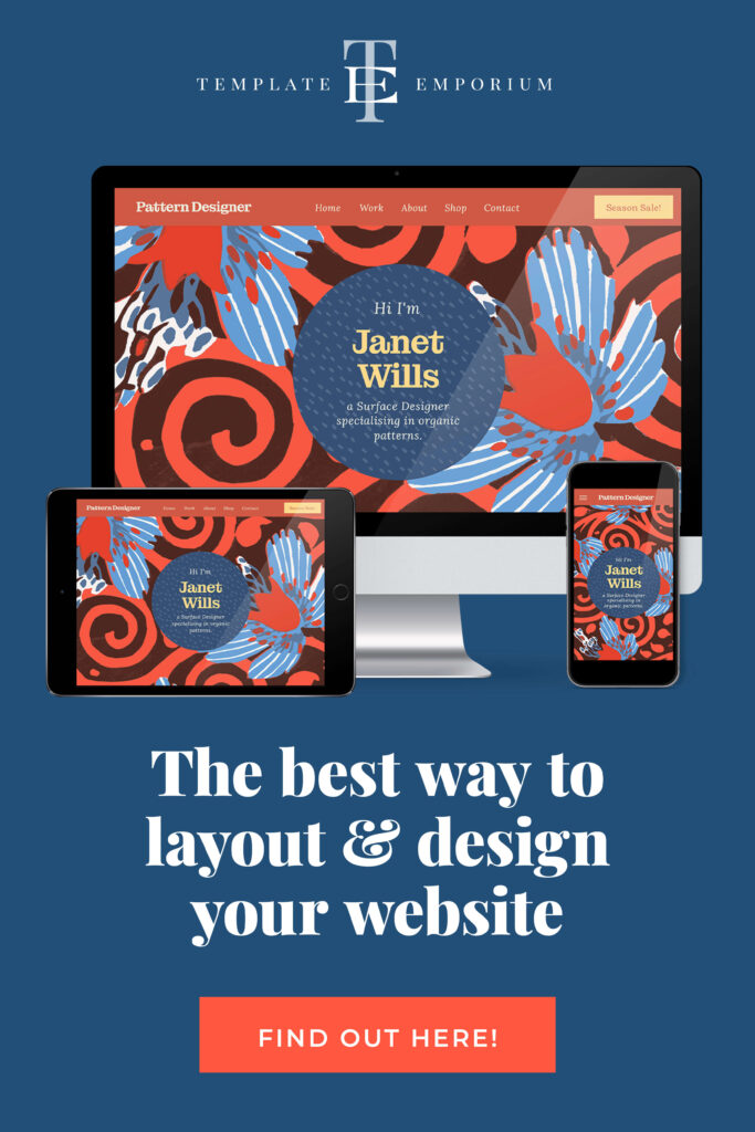
The Best Way to Layout and Design Your Website
Are you lost in a web of website design dilemmas? Figuring out the best way to layout and design your website can feel like trying to solve a jigsaw puzzle with a million pieces. But worry no more! We’re here to share our ultimate tips to transform your website into a digital masterpiece.
The Most Important Section of your Website
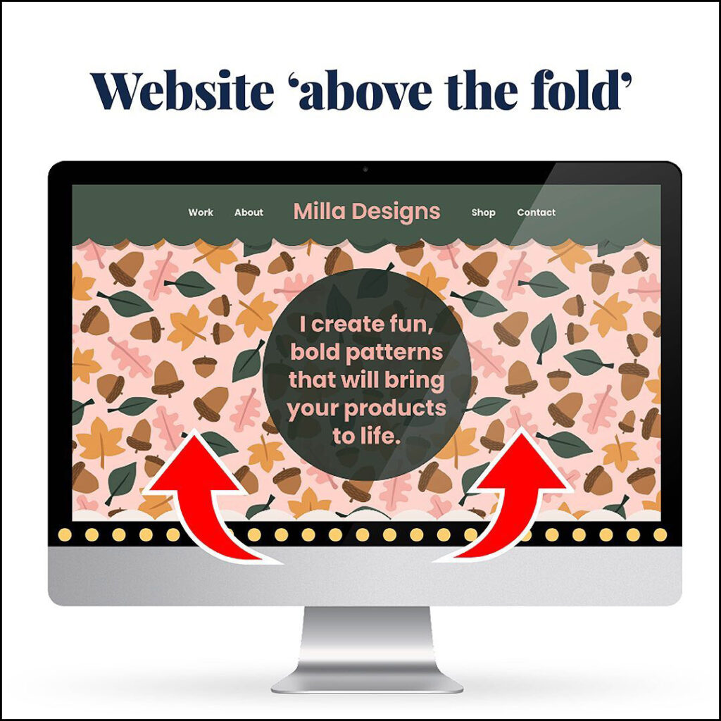
If you want to grab the attention of potential clients, art directors or customers, first impressions matter, so don’t neglect the opening section of your website.
This top opening section is known as ‘above the fold’.
On your website, ‘above the fold’ should include:
- Your Logo
Make it large enough to be read but not too big that it overpowers. - A Slide Show
This could also be a video or area highlighting a variety of your work in clear, large images. - Your Design Title
Or the design area you specialise in. - Geographical Area
The area you service (if applicable). For example, include the state, suburb or country that you look after. - BUY NOW button
This button takes them to your shop page (if applicable). - Established year within your logo
Some designers like to include this to show their level of experience (which also builds trust).
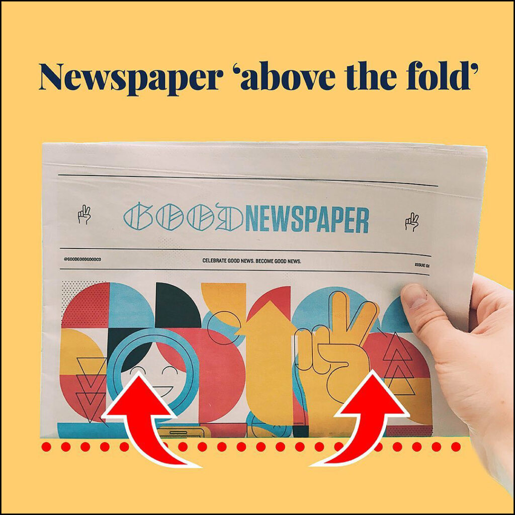
‘Above the fold’ comes from the newspaper and media industry.
The term refers to the attention-grabbing headline, images and body copy printed in the top half of a folded newspaper displayed at a newsagent or newsdealer.
Adding your logo to your website? Here’s the best way to do it.
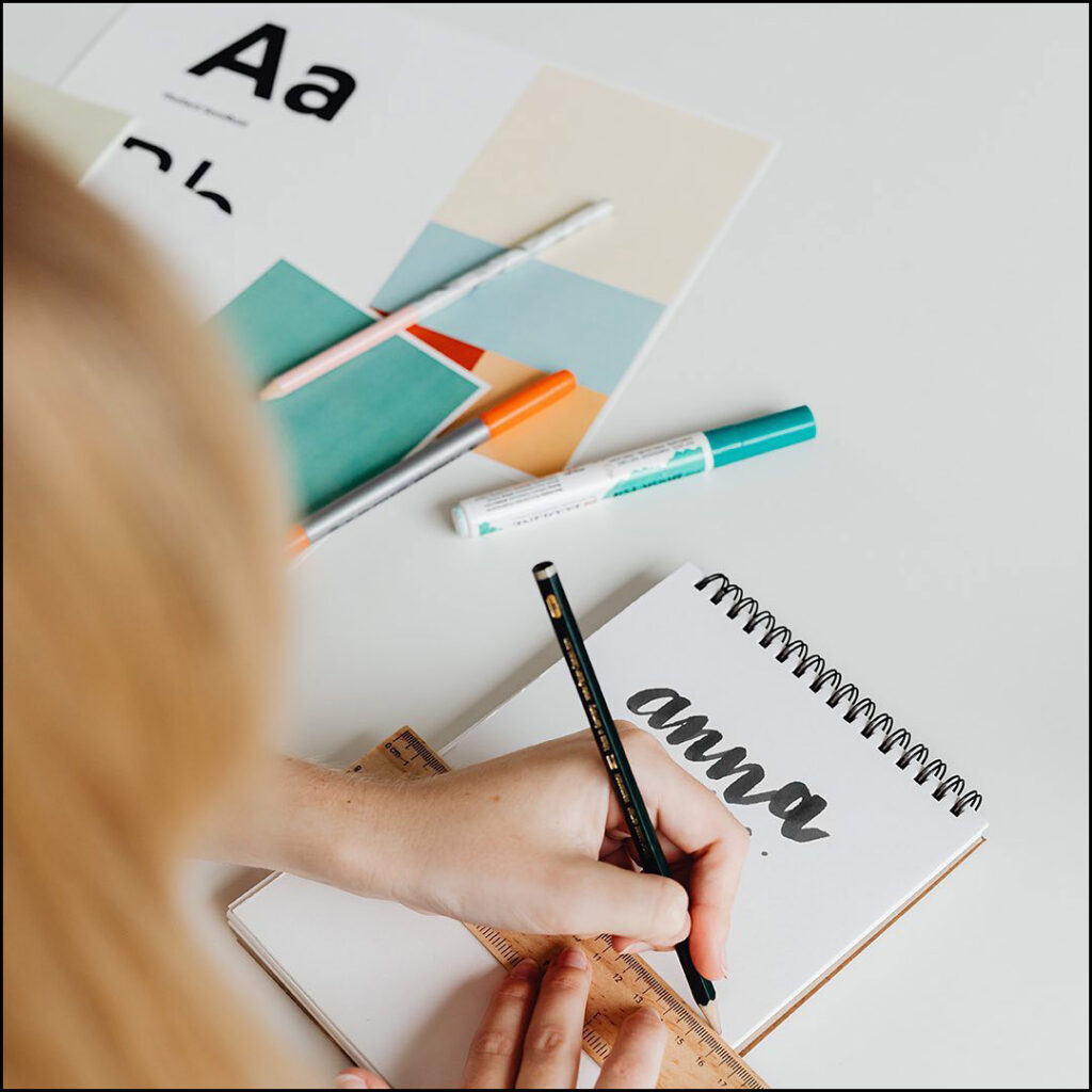
Your logo will be on display throughout your site.
We recommend you include it ‘above the fold’ and in your Footer.
There are three ways we recommend you save and upload it, they include as SVG, PNG or JPEG.
1. SVG – Best version
- Known as the web version of an eps it stands for Scalable Vector Graphic.
- Being a vector it is scalable without becoming blurry or pixelated.
- Yet it is still low in file size.
2. PNG – Ok Version
- Short for Portable Graphics Format.
- When scaled up in size, a PNG can become pixelated and blurry.
- Instead, create it at 2X the size so that high-resolution screens like Apple Retina, will display it sharply.
- If you’re using one of our Showit Templates, take the enlarged PNG and scale it to 50% in Showit. This enlarged version will now display sharply on Retina Screen Devices (such as mobile phones and Mac laptops).
3. JPEG – Restricted Version
- JPEG stands for Joint Photographic Experts Group.
- This file type is only useable for logos with a coloured background.
- If it doesn’t, a white box will appear around the logo and instead, you’ll have to use one of the other options above.
- Save this version at 2X the size to allow for Retina Screen Devices.
Finding the Sweet Spot: How many Navigation Tabs should your website have?
When it comes to creating an intuitive browsing experience for your visitors, finding the right balance is key.
Too few tabs might leave visitors feeling lost.
While too many can overwhelm them.
Remember, simplicity and clarity are key.
Give these Navigation Tabs Tips a try:
- Assess which sections are essential for your audience to navigate easily and prioritise those.
- Delete the unimportant ones (or move them to your footer).
- Aim for 6 tabs or less.
- This will help guide your audience to where you want them to go.
How many categories should you have on your website?
Here’s a little insider tip: less is more!
Having a few well-thought-out categories that are easy to navigate and understand will keep your visitors engaged. Such as:
1. Home
2. Portfolio
3. About
4. Shop
5. Blog
6. Contact
Plus, a streamlined website will make it easier for search engines to find you.
Have you updated this often-neglected part of your website?

All the visual branding on your website needs to reflect you and your brand.
But your Website Footer is a part that many people neglect (or just forget about).
If you scroll to the bottom of your website page, you’ll reach the footer.
It can work like a Mini Site Map letting users navigate to other parts of your website not found in your main menu.
In your Footer, we suggest including:
- Your logo.
- Social media icons.
- Copyright & privacy policy details.
- Your main website pages.
- “Spare drawers”
These are all the pages of your website that are of secondary importance and the home for pages that aren’t important enough for your main menu.
Insider Tip
Always keep your social media icons in the footer.
When you add them at the top, you’re sending potential customers away from the one place you can get them on your email list or buy your product.
When they are at the bottom, it’s simply a second way for them to keep in touch with you.
You Did it!
That’s a wrap on The Best Way to Layout and Design Your Website. We unveiled the secrets to the perfect layout and design that ensures success.
From the best number of navigation tabs and categories, you should have to the most important section of your website (and the part often forgotten). Plus, our bonus section on the correct logo format you should always use on your site.
If you enjoyed this blog, Follow us on Pinterest for more posts like this.
Feeling overwhelmed at the thought of doing all of this on your own?

Don’t worry! We’ll do it for you.
Pick one of our 1-pager Premium Showit Website Templates and leave the updating to us.
If you’ve discovered that DIY takes too long, The Helping Hand website template update is for you.
Where to now?
Want more website tips?
- How to Create & Launch Your Website with the Pick, Place & Publish Method
- 4 Free Resources to help you pick the perfect photos for your website.
- Type Crimes on your Website (are you committing any of these?)
Like the Blog Post?
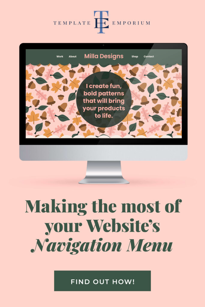
PIN IT FOR LATER. And for more helpful tips follow us on PINTEREST.
Search
Create & launch your website in a
few simple steps
FREE GUIDE
While you’re here,
grab our FREE
‘Do’s & Don’ts of what to add to your website’ Guide.
‘Do’s & Don’ts of what to add to your website’ Guide.
When you sign up, we’ll send you
emails with additional helpful content.
About Lavinia & Tom
Hi, we're so glad you found us.
We love helping creatives like you finally have the website you’ve always wanted.
Blog Categories
Follow us