grab our FREE
‘Do’s & Don’ts of what to add to your website’ Guide.
‘Do’s & Don’ts of what to add to your website’ Guide.
emails with additional helpful content.
Hi, we're so glad you found us.
We love helping creatives like you finally have the website you’ve always wanted.
few simple steps
Follow us
Text not looking right? Try using these tips
If you have ever visited a website and the text in front of you just didn’t look right, there’s a good chance that the text alignment, line length and readability need work. In this blog, we’re going to share our tips on how to correct this issue and make everything easier to read.
What are the most common types of Text Alignment?
This Text Tip will help you understand the best way to lay out your text. Plus, you’ll discover why there’s not one set solution for every situation.
So, whether you choose left, justified, or centred make sure it’s consistent throughout your design.
Left-Aligned Text
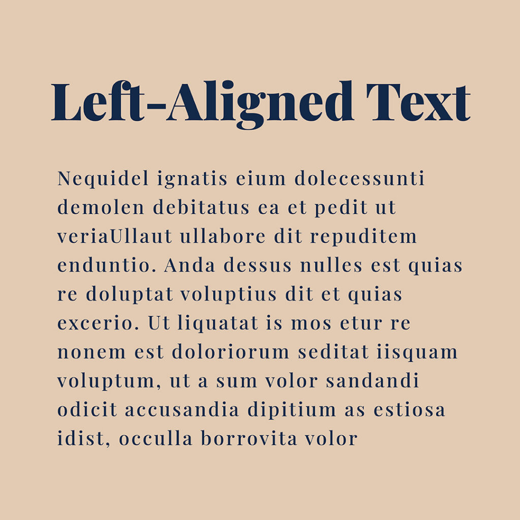
This type of alignment makes the text easier to read.
Spaces between the characters are all the same, allowing the eye to move freely across the screen or page when reading.
Justified Text
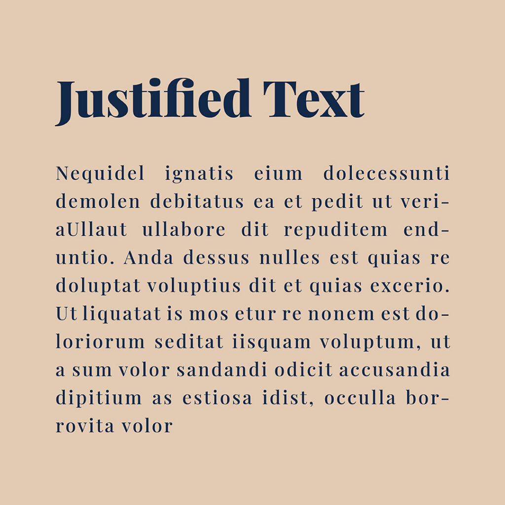
When justified the left and right sides are even.
This is how text is laid out in books. If a word needs to run over the line, a hyphen is used to break it up.
Centred Text
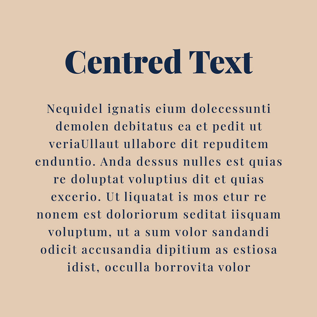
Centered text works best on headings.
It is also effective with subheadings and short phrases.
This is because it creates an impressive look and can stand out amongst a sea of words.
Line Length in Body Text
There are three ways we often see body text laid out. If the line length is too long or too short, it can affect readability.
That’s why we recommend choosing the third option below, as it will ensure it’s easier to read, every time.!
Tool Long – Line Length
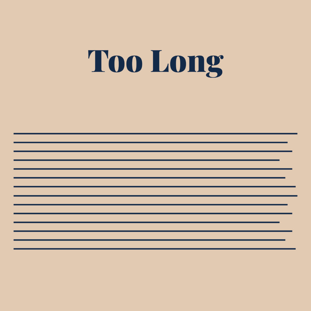
Any more than 12 words on a single line, means the reader will find it difficult to keep their place and may cause eye strain.
Tool Short – Line Length

Adding too few words results in having to jump from one line to the next – losing the flow & meaning.
Just Right! – Line Length
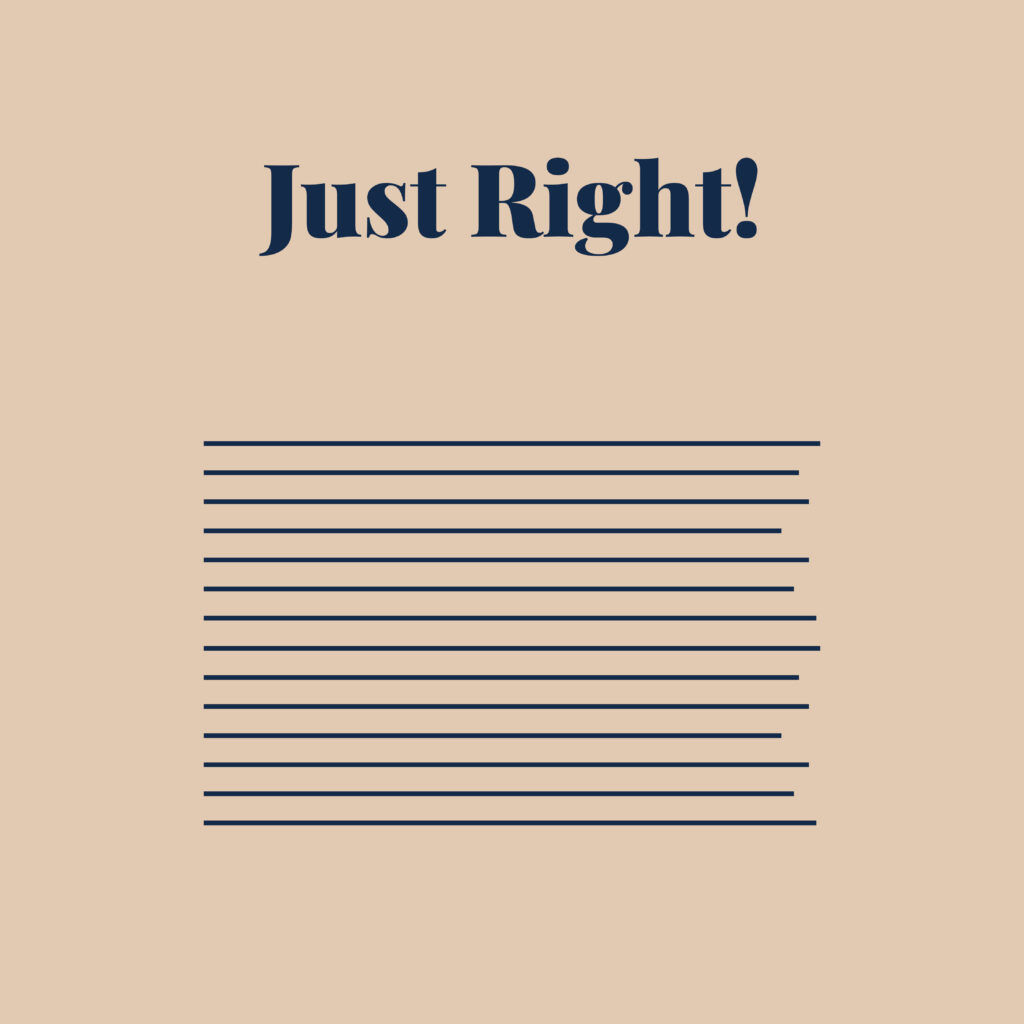
12 words on a single line is the sweet spot for a comfortable read.
Or aim for around 45-75 characters per line to keep things visually appealing.
Bonus Tip – Designing with limited space on your website?
One of the issues you’ll encounter with type when designing within a limited space is – Readability.
When laying out headings or copy on your website, some typefaces may appear larger than others, making them easier to read.
This is due to the x-height of the typeface which is the height of lowercase letters.
Adjusting the x-height can make your text more legible and balanced. Play around with different font sizes and styles to find the right balance.
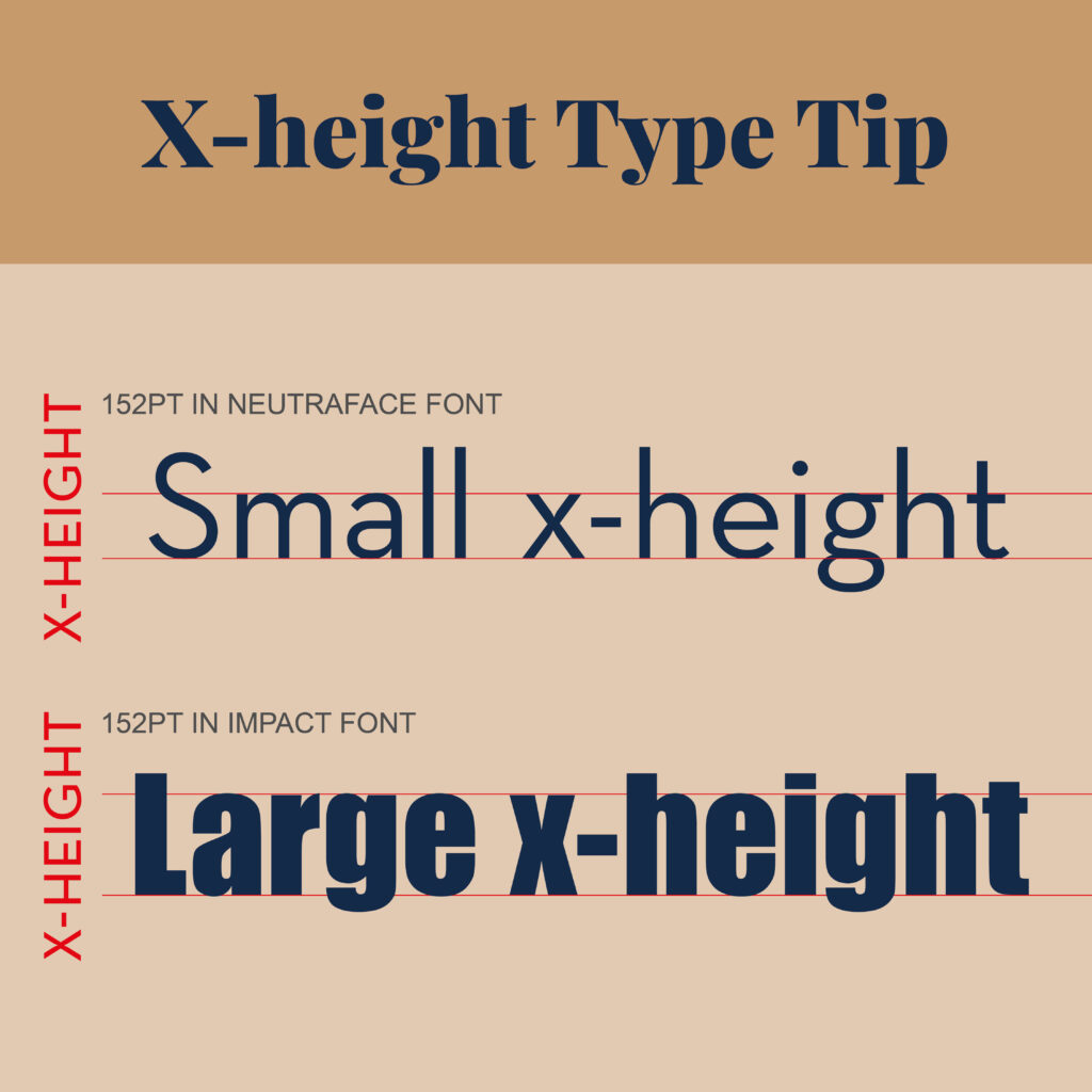
In our example below, the two typefaces are the same point size.
– 152pt in Neutraface Font
– 152pt Impact Font
The second one, however, looks much larger. That’s because it has a taller x-height.
So next time you’re designing with limited space and find your copy hard to read, try using a typeface with a tall x-height. (You’ll be amazed at the difference).
You Did it!
That’s a wrap on Text not looking right? (Try using these tips). In this blog, we looked at the most common types of text alignment, left, justified and centred and shared our insider tips on what makes text too long and too short in length, including our formula for the perfect word count for a comfortable read.
Will you be trying these tips out on your website? Let us know. In the meantime, Follow us on Pinterest for more blog posts like this.
Want to try these tips on your Website – grab our FREE guide
Our FREE Essential Guide for Creatives. “Do’s & Don’ts of what to add to your website” will give you a simple plan to follow so that you’ll never have to question what to show online again.
Where to now?
Want more helpful Type tips? Check out the blogs below.
- Typeface & Font: Are They Really the Same? Think Again!
- Three Type Terms that you need to know (& want to avoid using)
- Type Lingo to make you feel like a Pro!
Like the Blog Post?
PIN IT FOR LATER. And for more helpful tips follow us on PINTEREST.
Search
Create & launch your website in a
few simple steps
FREE GUIDE
While you’re here,
grab our FREE
‘Do’s & Don’ts of what to add to your website’ Guide.
‘Do’s & Don’ts of what to add to your website’ Guide.
When you sign up, we’ll send you
emails with additional helpful content.
About Lavinia & Tom
Hi, we're so glad you found us.
We love helping creatives like you finally have the website you’ve always wanted.
Blog Categories
Follow us