grab our FREE
‘Do’s & Don’ts of what to add to your website’ Guide.
‘Do’s & Don’ts of what to add to your website’ Guide.
emails with additional helpful content.
Hi, we're so glad you found us.
We love helping creatives like you finally have the website you’ve always wanted.
few simple steps
Follow us
Should you use White as your Branding Colour?
Do you love White’s clean, fresh, modern look, or do you find it too clinical, sparse and innocent? With such conflicting views, White can sometimes be misunderstood. So in this blog, you’ll discover whether you should use white for your branding.
We have developed a three-part system that takes a deep dive into White’s meaning, varieties and how to use this information in your branding.
Is White right for you? Get ready to find out!
Before we start – missed a part of our Branding Colour Series? Catch up below.
- 1. Should you use Blue as your Branding Colour?
- 2. Should you use Red as your Branding Colour?
- 3. Should you use Yellow as your Branding Colour?
- 4. Should you use Green as your Branding Colour?
- 5. Should you use Pink as your Branding Colour?
- 6. Should you use Orange as your Branding Colour?
- 7. Should you use Purple as your Branding Colour?
- 8. Should you use Grey as your Branding Colour?
- 9. Should you use White as your Branding Colour? (this is the blog you’re reading)
- 10. Should you use Black as your Branding Colour?
- 11. Should you use Beige as your Branding Colour?
- 12. Should you use Brown as your Branding Colour?
Want to start using White as your Branding Colour now?
Download our FREE Guide
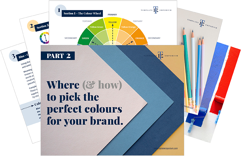
Here’s what we’ll cover
MEANING OF WHITE
The psychological meaning of White
Meaning of White to you
White in Business
VARIETIES OF WHITE
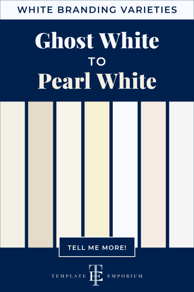
Ghost White to Pearl White, we share our favourite Whites
White & The Colour Wheel
Colours that go with White
WHITE IN BRANDING
Matching to the Tone of your Business
Picking the Perfect Palette with White
When not to use White in your Branding
Should you use White as your Branding Colour?
1. Meaning of White
The Psychological Meaning
Welcome to the lightest colour in our colour series – White. Being a neutral colour, it does not demand attention. Instead, it acts as a source of calmness, goodness and serenity.
Think of the white dove and its representation as a sign of peace. Or when you hear “White as snow”, it creates feelings of softness, beauty and coolness. However, on the other end, it can also be referred to as too clinical, aloof or obsessive.
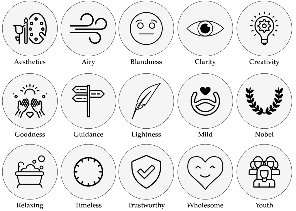
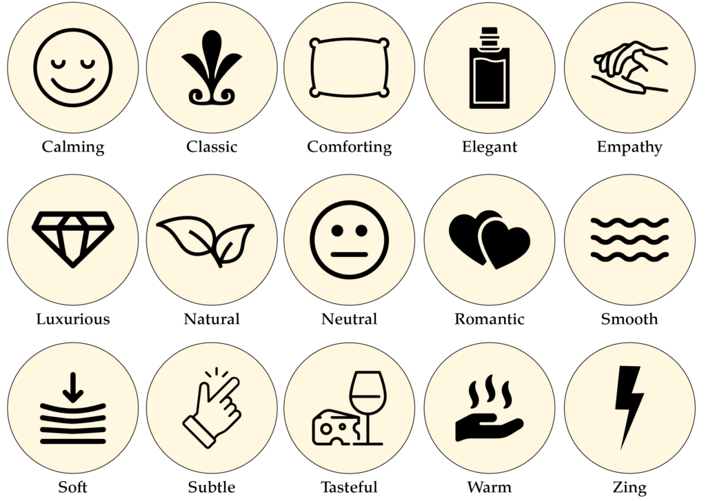
We believe it is based more on the shade of white rather than the colour itself. And to make it a little easier, we’ve created an icon guide below and broken it into Light, Bright and Dark White.
Original unedited icons from the Noun Project
Light White Meaning
Bright White Meaning
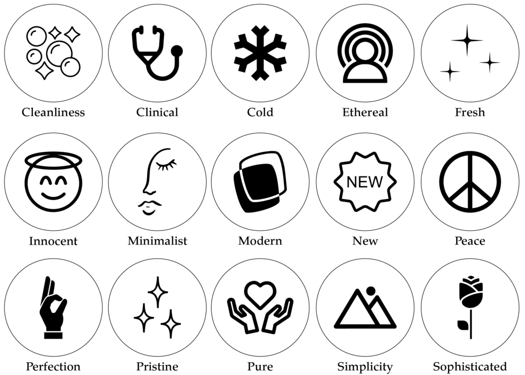
Dark White Meaning
Meaning of White to You
How you think, feel and react to colour is subjective. It’s all based on your life experiences. From childhood to today, your meaning of white will be unique to you, forming a physical and emotional reaction to the colour.
A great place to start is making a list of the positive and negative words you associate with White. What is that you like or don’t like about the colour? Being aware of this will help you take in an overall view of the colour.
If you’re a personal brand, the key is to find a balance between the colours you like and the ones that will attract your ideal client.
Look at the icons above and pick which words sum up the way you feel about White. Or the way you want your business to be perceived. Doing this will be a great way to determine the shade of white that’s right for you.
Colour Clues
Every colour makes us feel a certain way. Once you learn how to use the Indoor Clues, it will open your eyes to new options and feelings about colour.

Using White in your home helps create balance. We incorporate white with our bedding and dinnerware as its subtle features allow it to be matched with numerous other colours making them the star of the show.
Would your ideal client like White, how would it make them feel?
In Part 1 of our Colour Guide series “How (& where) to pick the perfect colours for your brand.” we explain everything about Colour Clues. Click here to download it – it will be super helpful.
White in Business
Including White in your business branding allows everything around it to breathe. It creates space and air, which in turn creates calmness. So whether used alone or as a complement to another colour, White is a popular branding colour used in healthcare, cleaning, child-related, and fashion.
All photos below are from Unsplash.

Fashion
White is often teamed with black in this industry for the ultimate nod to sophistication and style.
DKNY
Calvin Klein
Giorgio Armani
Healthcare
In this industry, a pairing of white and blue is common to help create calmness and simplicity.
Pfizer
GE Healthcare
Child-related
Often teamed with a bright, loud colour, white represents innocence, purity and imagination.
Lego
CN Network
Play-Doh
Should you use White as your Branding Colour?
2. Varieties of White
Ghost White to Pearl White, we share our favourite Whites
Many varieties of White may look similar to each other but have different names. From light to dark White we’ve compiled a cheat sheet of our favourites below (and included a few you may have never heard of!).
And to make it easy, we added the hex numbers. So you can start using them in your branding today.
Press play on the image below or get all the colour breakdowns in our FREE Guide.
White & The Colour Wheel
Unlike most colours in our Branding Colour Series, White is neutral, and neutrals don’t appear on the colour wheel.
White is a COOL, NEUTRAL colour. It is the lightest colour and has no HUE.
Insider Tip
Even though White can’t be created by mixing any colours on the colour wheel, if you were to spin a colour wheel fast enough, all the colours would blend to make white!
Colours that go with White
Using a neutral colour like white will help create balance. Because of its subtle features, white doesn’t demand attention. Instead, it helps the other colour you match it with being the star.
Blending Whites
A monochromatic palette refers to using one colour. We love combining White with White because not only does it elevate the look, but the multiple shades of White create harmony together.
White Colour Combinations

White & Red
Snow + Crimson
Winter White + Burgundy
Cream + Sienna
Pure White + Cardinal Red
Creamy White + Rustic Red
White & Green
Ivory + Forest
Optic White + Khaki
White + Kelly Green
Crisp White + Mint
Chalk + Emerald
White & Blue
Optic White + Azure
Chalk White + Cornflower
Winter White + Navy
Coconut + Cobalt
Milk + Sky Blue
White & Pink
White + Pale Pink
Stark White + Watermelon
Optic White + Flamingo
Milk + Petal
Chalk + Peachy Pink
White & Yellow
Bright White + Buttercup
Pure White + Lemon
White + Tumeric
Off-White + Banana Yellow
Crisp White + Marigold
White & Black
White + Dove
Crisp White + Slate
Ivory + Ebony
Bone + Jet Black
Chalk + Liquorice
Want more White Colour Combination ideas? Click the image below.
Should you use White as your Branding Colour?
Matching to the Tone of your Business
As discussed earlier, we break White into three options, light, bright and dark. Use this as a guide to help you pick the right shade of White for your branding.
Light White
Aesthetics, airy, blandness, clarity, creativity, goodness, guidance, lightness, mild, noble, relaxing, timeless, trustworthy, wholesome and youth.
Bright White
Cleanliness, clinical, cold, ethereal, fresh, innocent, minimalist, modern, new, peaceful, perfection, pristine, pure, simple and sophisticated.
Dark White
Calming, classic, comforting, elegant, empathy, luxurious, natural, neutral, romantic, smooth, soft, subtle, tasteful, warm and zing.
Picking the Perfect Palette with White
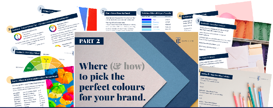
Our 5-step Perfect Palette Process
Need help choosing your Brand Colour Palette? We’ve created a simple step-by-step process. Grab our free guide as a handy download.
Step 1
Pick the Main Brand Colour
So you’ve picked White. Now you have to decide on the type of White, is it light, bright or dark?
Step 2
Pick a Support Brand Colour
If you feel stuck at this stage, just remember this colour creates harmony with the MAIN. Refer back to our tips earlier on Colours that go with White to help you decide.
Step 3
Pick a Light Neutral Brand Colour
Why do you need neutrals in your brand colour palette? Because it creates balance.
Not sure which neutrals to pick? Go to page 16 of our free guide.
Step 4
Pick a Dark Neutral Brand Colour
Your light neutral colour needs a partner. So now it’s time to pick a dark neutral colour for even more balance. Our guide on page 16 explains everything.
Step 5
Pick an Accent Colour
This colour is used to make something on your website pop. Therefore it’s only used sparingly. Page 22 of our free guide will explain more.
Web and Print Branding

Once you have picked the right White for your business, add the hex code to your website.
View how it looks on both desktop and mobile. To create consistency only, use the one hex code number to ensure the White you chose is always the correct shade.
For print, instead of a hex code, you will need the CMYK (Cyan, Magenta, Yellow & Black) or Pantone, colour breakdown to ensure the White will print out the way you want.
When not to use White in your Branding
Too much White can come across as cold, sterile or unwelcoming, so incorporating different shades of White will help inject a bit of warmth.
If you opt for an all-white logo in your branding so you can see it, you’ll need to put it on a coloured background. This additional colour should represent what your brand stands for and should work well with White so that there is cohesiveness between the two.
You Did it!
That’s a wrap on Should you use White as your Branding Colour?
How do you feel about White now? Would it suit you and your branding? Let us know. And in the meantime, follow us on Pinterest for more blog posts like this.
Where to now?
- What’s the difference between Primary & Secondary Colours – Find out Here
- Find out our Insider Colour Secret for your Website – Check it out Here
- Need help picking a colour here’s our Top Four Free Colour Generator Sites
Don’t forget to download our FREE Colour Guide.

Like the Blog Post?
PIN IT FOR LATER. And for more helpful tips follow us on PINTEREST.
Search
Create & launch your website in a
few simple steps
FREE GUIDE
While you’re here,
grab our FREE
‘Do’s & Don’ts of what to add to your website’ Guide.
‘Do’s & Don’ts of what to add to your website’ Guide.
When you sign up, we’ll send you
emails with additional helpful content.
About Lavinia & Tom
Hi, we're so glad you found us.
We love helping creatives like you finally have the website you’ve always wanted.
Blog Categories
Follow us