grab our FREE
‘Do’s & Don’ts of what to add to your website’ Guide.
‘Do’s & Don’ts of what to add to your website’ Guide.
emails with additional helpful content.
Hi, we're so glad you found us.
We love helping creatives like you finally have the website you’ve always wanted.
few simple steps
Follow us
Should you use Pink as your Branding Colour?
Pink is the colour of fun, youth and romance. This fully charged colour varies in its representation from softness and innocence to attention-grabbing and sophistication. With such opposites, how do you know whether you should use pink as your branding colour?
We have developed a three-part system that takes a deep dive into Pink’s meaning, varieties and how to use this information in your branding.
Are you ready to be a flamingo in a flock of pigeons? Well, pink might be just for you. Let’s find out.
Before we start – missed a part of our Branding Colour Series? Catch up below.
- 1. Should you use Blue as your Branding Colour?
- 2. Should you use Red as your Branding Colour?
- 3. Should you use Yellow as your Branding Colour?
- 4. Should you use Green as your Branding Colour?
- 5. Should you use Pink as your Branding Colour? (this is the blog you’re reading)
- 6. Should you use Orange as your Branding Colour?
- 7. Should you use Purple as your Branding Colour?
- 8. Should you use Grey as your Branding Colour?
- 9. Should you use White as your Branding Colour?
- 10. Should you use Black as your Branding Colour?
- 11. Should you use Beige as your Branding Colour?
- 12. Should you use Brown as your Branding Colour?
Want to start using Pink as your Branding Colour now?
Download our FREE Guide
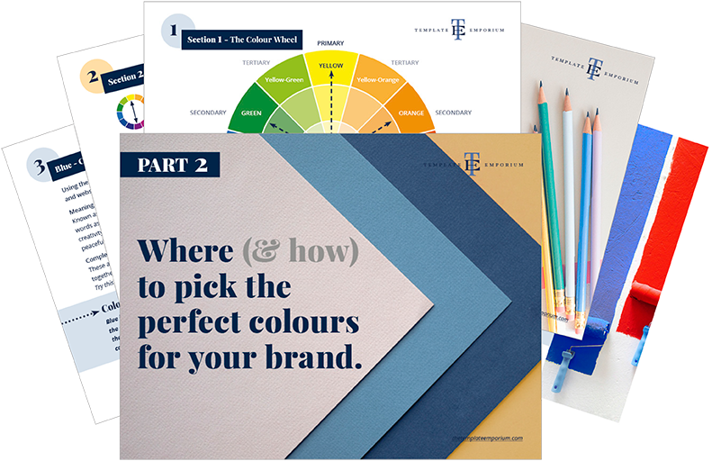
Here’s What We’ll Cover
MEANING OF PINK
The Psychological Meaning of Pink
Meaning of Pink to you
Pink in Business
VARIETIES OF PINK
From pale Dogwood to Cerise, we share our favourite Pinks
Pink & The Colour Wheel
Colours that go with Pink
PINK IN BRANDING
Matching to the Tone of your Business
Picking the Perfect Palette with Pink
When not to use Pink in your Branding
Should you use Pink as your Branding Colour?
1. Meaning of Pink
The Psychological Meaning
Pink is Red’s little sister that just wants to have some fun. From our favourite sweet desserts to pink clouds over the horizon to the pink bunch of flowers that cheer you or give your home that personal touch. Bring on more Pink!
But like most colours, there are also conflicting meanings of what pink represents. It can vary from tenderness and kindness to appearing oversweet, cheap, cloying or even tacky.
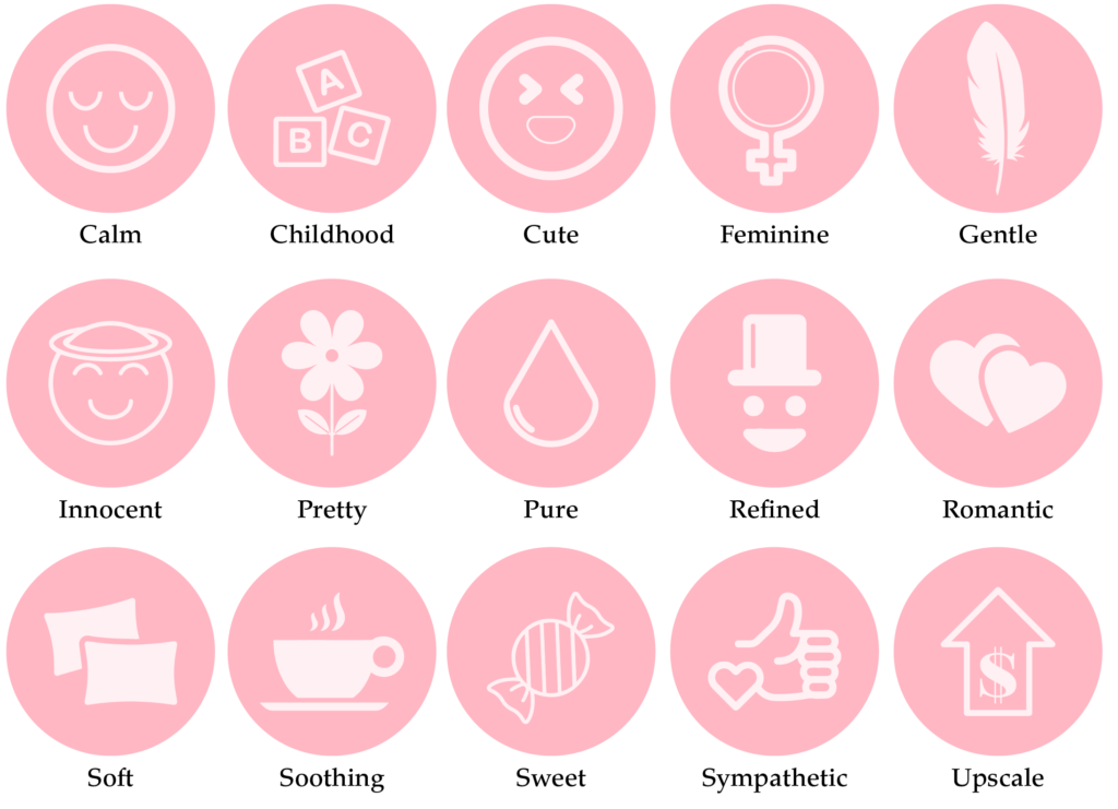
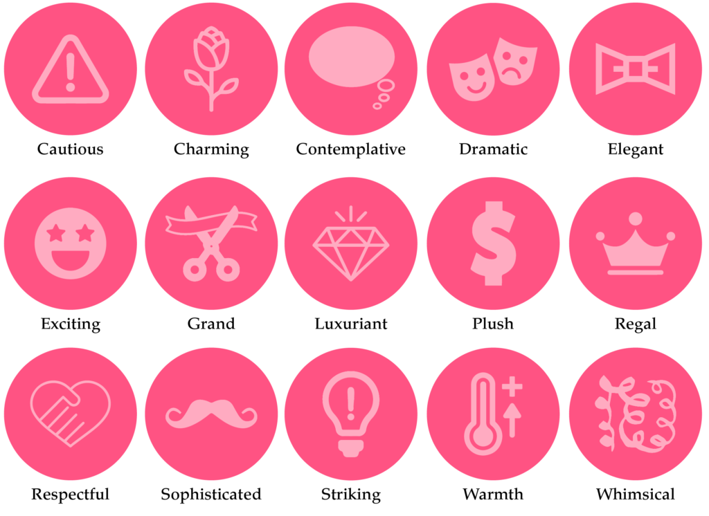
We believe it is based more on the shade of pink rather than the colour itself. And to make it a little easier, we’ve created an icon guide below and broken it into Light, Bright and Dark Pink.
Original unedited icons from the Noun Project
Light Pink Meaning
Bright Pink Meaning

Dark Pink Meaning
Want a Pink Branded Website?
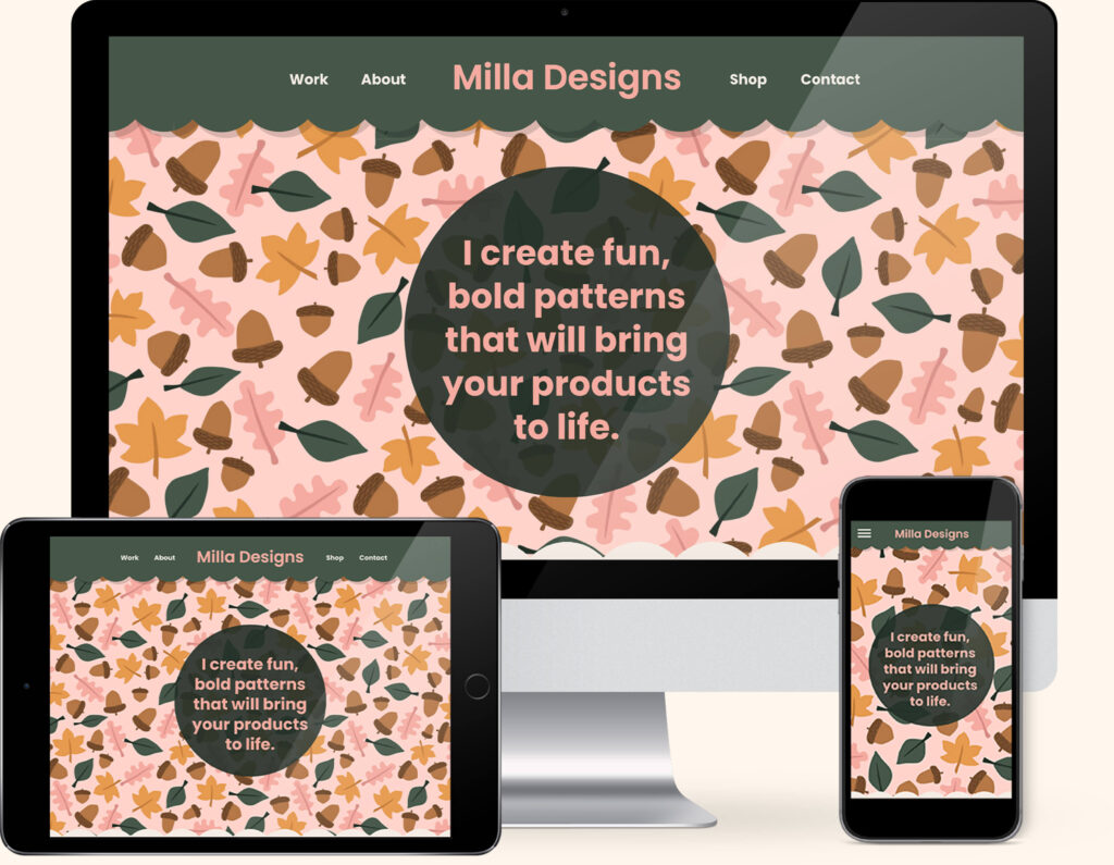
If you love Pink, we have the perfect website template for you. Our “Milla” template combines everyone’s favourite pairing of Pink and Green to create the ultimate pink lover’s website.
Created exclusively for the Showit platform, now you can showcase your collection of designs alongside your favourite colour.
Meaning of Pink to You
How do you feel about Pink? Is it a colour you would like to incorporate into your branding? Or does it feel too youthful, sweet or not professional enough?
Any experiences or memories you’ve had with Pink will help determine how you feel about it.
I love pink. I can still picture the beautiful soft shade my dad painted on my bedroom walls when I was young. It felt calming, relaxing and homely. And to this day, I still feel drawn to it.
It might remind you of your childhood too. From toys to food to fun parks, there was no escaping it. And who wanted to anyway? Or maybe you’re not a fan and, it just doesn’t sit well with you. Whatever your past feelings are will help determine how you view Pink today.
If you’re a personal brand, the key is to find a balance between the colours you like and the ones that will attract your ideal client.
Look at the icons above and pick which words sum up the way you feel about Pink. Or the way you want your business to be perceived. Doing this will be a great way to determine the shade of Pink that’s right for you.
Colour Clues
Every colour makes us feel a certain way. Once you learn how to use the Indoor Clues, it will open your eyes to new options and feelings about colour.
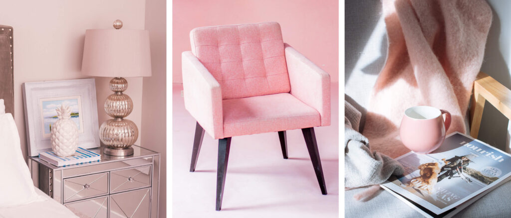
Although my bedroom walls are no longer pink, I’ve incorporated pink in more subtle ways in my home now. Mainly by using it as a pop of colour. From a single chair or cushion to surrounding myself in my office with pink stationery items or drinking cups. These are all Colour Clues to determine how you feel about a particular colour.
Would your ideal client like Pink, how would it make them feel?
In Part 1 of our Colour Guide series “How (& where) to pick the perfect colours for your brand.” we explain everything about Colour Clues. Click here to download it – it will be super helpful.
Pink in Business
For companies that want to look different, be memorable and feel forever young, (here’s looking at you Madonna Inn) choosing pretty in pink is always the way to go, let’s look at a few more below.
Toy Industry
Representing a feeling of youth, fun and feminine connotations, pink has always been a popular choice in this industry.
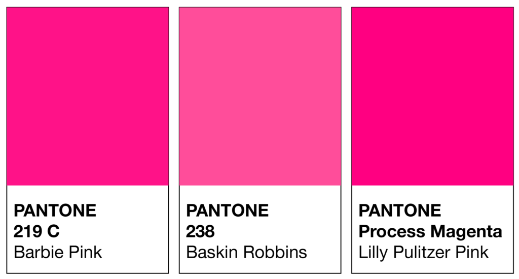
Barbie
My Little Pony
Snacks and Desserts
Pink helps inject a feeling of joy and excitement into every bite. So it’s no surprise that this colour choice is popular in the snack and dessert industries.
Baskin-Robbins
Voodoo Doughnut
Clothing Industry
Some consider pink “too girly”. But Betsy Johnson took pink and turned that theory upside by making it edgy and confident. Lilly Pulitzer turned it into a timeless and classic colour. And together, they also made pink fun.
Betsy Johnson
Lilly Pulitzer
Disney
The happiest place on earth would naturally have Pink incorporated into its branding. And in this instance, it is via the Disney Parks Colour Trends.
You can choose from a soft pink hue Briar Rose Gold – inspired by Sleeping Beauty and Imagination Pink, a vibrant and fun Magenta.
Should you use Pink as your Branding Colour?
2. Varieties of Pink
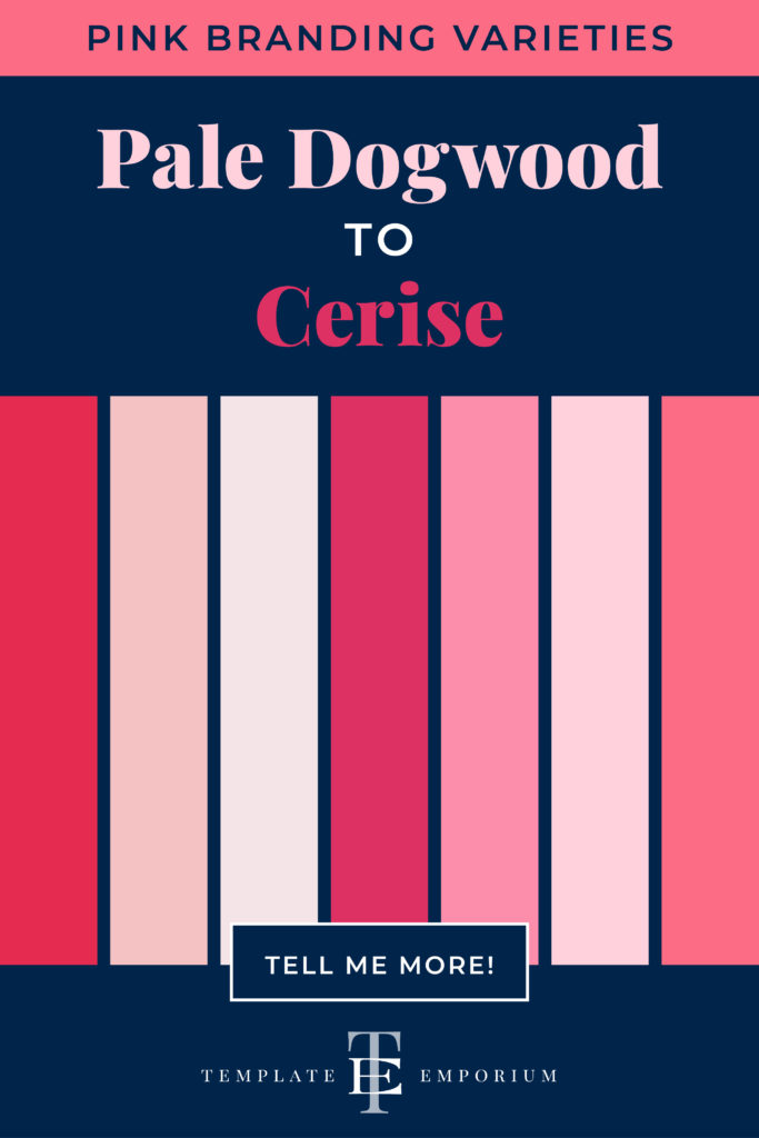
From pale Dogwood to Cerise, we share our favourite Pinks
Many varieties of Pink may look similar to each other but have different names. From light to dark Pink we’ve compiled a cheat sheet of our favourites below (and included a few you may have never heard of!).
And to make it easy, we added the hex numbers. So you can start using them in your branding today.
Press play on the image below or get all the colour breakdowns in our FREE Guide.
Insider Tips
To make Pink, mix White and a little bit of Red.
Tints of Pink = Lighter varieties reflect the fun and youthful audience. It feels more approachable and friendly. Such as Baby Pink and Pale Dogwood.
Shades of Pink = Darker varieties attract a more mature audience. If your business is more traditional, a deeper pink such as Beet, Puce or even Rosewood is a safer option.
Pink & The Colour Wheel
Most Colour Wheels won’t show Pink. This is due to it being a TINT of Red and not a HUE. It’s made by using the base colour Red & combining it with white, resulting in a lighter shade of Red.
Being absent from the Colour Wheel, Pink instead follows the rules of its base colour, Red. And just as Red and Green are complementary, so are Pink and Green.
Want to know more about Red & The Colour Wheel? This blog post will help.
Colours that go with Pink
Whether you wear that shocking pink jacket to inject some fun into your day or pair your coffee with that irresistible pink doughnut for something extra sweet, seeing the peaceful pink skies at night just proves how versatile pink can be.
And being versatile also means that it can work well with other colours creating some spectacular colour combos.
Blending Pinks

A monochromatic palette refers to using one colour. We love combining Pink with Pink because not only does it elevate the look, but the multiple shades of Pink create harmony together.
Try adding Light and Dark variations together.
The lighter shade will soften, while the darker one will be the highlight.
Pink Colour Combinations

Pink + Blue
Split Complementary colours Red + Blue work well together. And seeing that Pink is a tint of Red, the same theory works with Pink.
Hot Pink + Sapphire Blue
Blush Pink + Navy
Dusty Rose + Baby Blue
Bubblegum Pink + Blue-Grey
Pink Rose + Powder Blue
Salmon Pink + Teal Blue
Pink + Black
All tones of Pink and Black, work well together.
Baby Pink + Grey
Pale Pink + Steel Grey
Soft Pink + Slate Grey
Powder Pink + Black
Raspberry + Soft Grey
Blush Pink + Black
Light Pink + Subtle Grey
Pink + Green
As Red (the base of Pink) + Green are complementary colours (opposite each other on the colour wheel), this combination always works well.
Fuchsia Pink + Lime Green
Rose Quartz + Emerald Green
Beet + Sage Green
Carnation Pink + Kelly Green
Flamingo Pink + Bottle Green
Pink + Yellow
This combo works well together because they are both WARM colours.
Bubblegum Pink + Lemon Yellow
Magenta + Marigold
Hot Pink + Sunshine Yellow
Pastel Pink + Canary Yellow
Pale Pink + Mustard
Pink + Purple
With red and purple being neighbours on the colour wheel, pink (as a tint of red) is a natural pairing.
Bubblegum Pink + Lavender
Rose Quartz + Lilac
Neon Pink + Dark Purple
Pale Pink + Ultraviolet
Berry + Deep Purple
Pink + Red
Red is the base colour of Pink. Therefore, this is a perfect pairing.
Hot Pink + Electric Red
Baby Pink + Soft Rosy Red
Bubblegum Pink + Bright Red
Magenta + Maroon
Ballet Shoes Pink + Ruby Red
Dusty Pink + Bright Red
Pink + Orange
This dynamic pairing is due to them being neighbours on the colour wheel.
Blush Pink + Tangerine
Pink Lemonade + Coral
Rosy Pink + Orange
Pale Pink + Orange
Cerise Pink + Princeton Orange
Baby Pink + Orange-Gold
Want more Pink Colour Combination ideas? Click on the image below.
Should you use Pink as your Branding Colour?
3. Pink in Branding

Matching to the Tone of Your Business
As discussed earlier, we break Pink into three options, light, bright and dark. Use this as a guide to help you pick the right shade of Pink for your branding.
Light Pink
Calm, childhood, cute, feminine, gentle, innocent, pretty, pure, refined, romantic, soft, soothing, sweet, sympathetic and upscale.
Bright Pink
Assertive, attention-getting, brave, energetic, fun, go-getter, happy, high spirits, passionate, playful, protective, shocking, tantalizing, vibrant and youthful.
Dark Pink
Cautious, charming, contemplative, dramatic, elegant, exciting, grand, luxuriant, plush, regal, respectful, sophisticated, striking, warm and whimsical.
Picking the Perfect Palette with Pink
Our 5-step Perfect Palette Process
Need help to choose your Brand Colour Palette? We’ve created a simple step-by-step process. Grab our free guide as a handy download.

Step 1
Pick the Main Brand Colour
So you’ve picked pink. Now you have to decide on the type of pink, is it light, bright or dark?
Step 2
Pick a Support Brand Colour
If you feel stuck at this stage, just remember this colour creates harmony with the MAIN. Refer back to our tips earlier on Colours that go with Pink to help you decide.
Step 3
Pick a Light Neutral Brand Colour
Why do you need neutrals in your brand colour palette? Because it creates balance.
Not sure which neutrals to pick? Go to page 16 of our free guide.
Step 4
Pick a Dark Neutral Brand Colour
Your light neutral colour needs a partner. So now it’s time to pick a dark neutral colour for even more balance. Our guide on page 16 explains everything.
Step 5
Pick an Accent Colour
This colour is used to make something on your website pop. Therefore it’s only used sparingly. Page 22 of our free guide will explain more.
Web and Print Branding
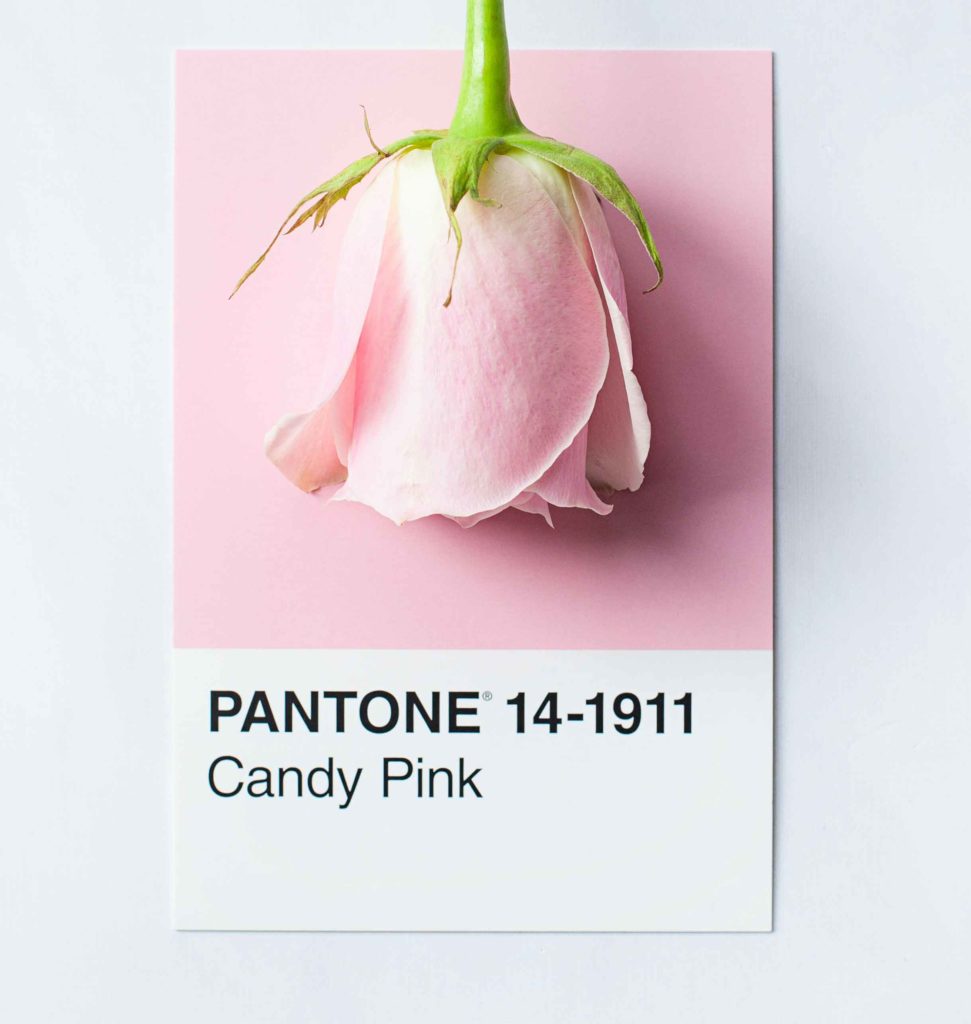
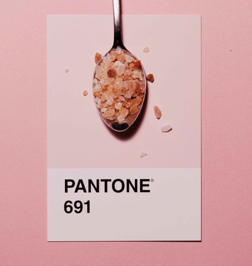
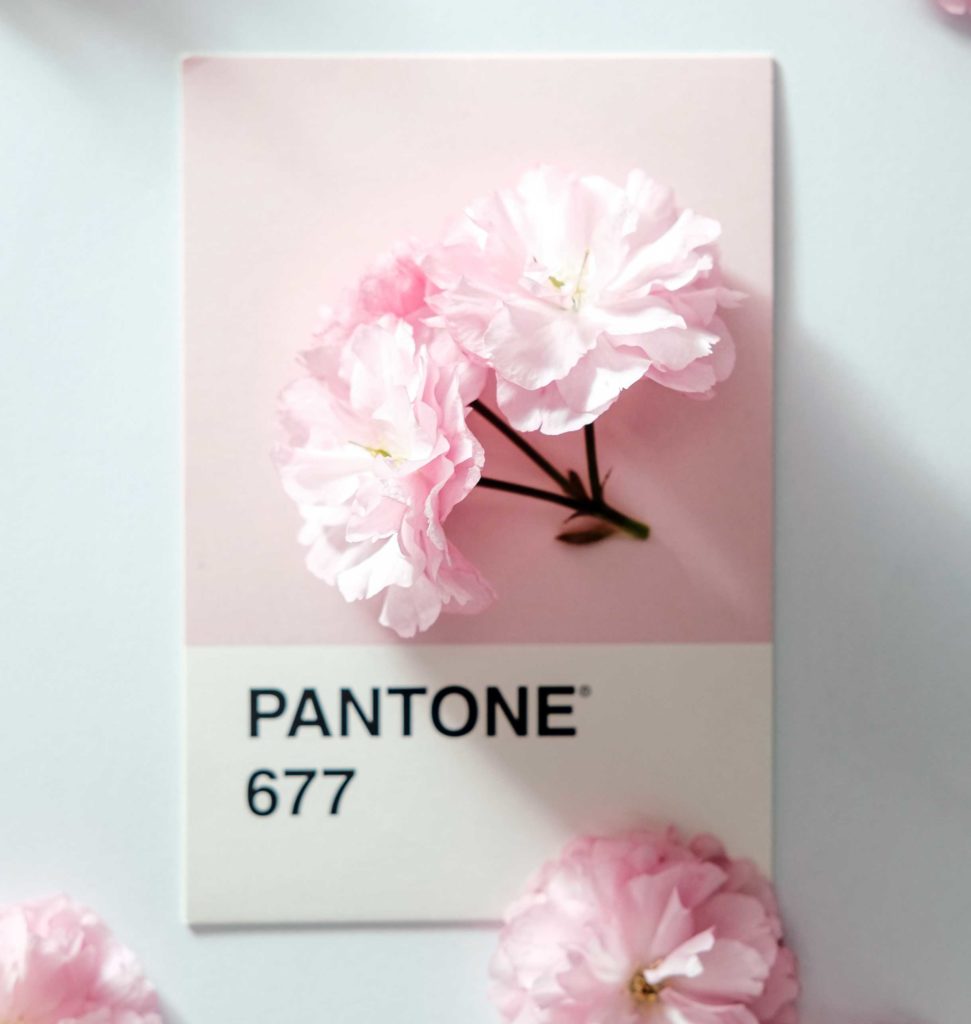
Once you have picked the right Pink for your business, add the hex code to your website.
View how it looks on both desktop and mobile. To create consistency only, use the one hex code number to ensure the Pink you chose is always the correct shade.
For print, instead of a hex code, you will need the CMYK (Cyan, Magenta, Yellow & Black) or Pantone, (examples shown above) colour breakdown to ensure the Pink will print out the way you want.
When Not to Use Pink in Your Branding
Banking or financial-based industries
Pink is the perfect palette to get noticed and often stands out amongst a sea of blue, green and red logos.
But it also has to represent and suit your audience and brand. So always consider how your colour choice will make them feel.
For banking and finance, pink could be seen as too childish, fun and carefree. And certainly not mature enough to look after someone’s life savings. This disconnect could make your audience not trust you, and without trust, you don’t have a customer.
You Did it!
That’s a wrap on Should you use Pink as your Branding Colour?
How do you feel about Pink now? Would it suit you and your branding? Let us know. And in the meantime, follow us on Pinterest for more blog posts like this.
Where to now?
- Maybe Green is more your style? Find out here.
- How about the happiest colour of them all – Yellow! Check it out here.
- Need some help picking? The Colour Wheel can help – Go here now!
Don’t forget to download our FREE Colour Guide.

Like the Blog Post?
PIN IT FOR LATER. And for more helpful tips follow us on PINTEREST.
Search
Create & launch your website in a
few simple steps
FREE GUIDE
While you’re here,
grab our FREE
‘Do’s & Don’ts of what to add to your website’ Guide.
‘Do’s & Don’ts of what to add to your website’ Guide.
When you sign up, we’ll send you
emails with additional helpful content.
About Lavinia & Tom
Hi, we're so glad you found us.
We love helping creatives like you finally have the website you’ve always wanted.
Blog Categories
Follow us
