grab our FREE
‘Do’s & Don’ts of what to add to your website’ Guide.
‘Do’s & Don’ts of what to add to your website’ Guide.
emails with additional helpful content.
Hi, we're so glad you found us.
We love helping creatives like you finally have the website you’ve always wanted.
few simple steps
Follow us
Should you use Grey as your Branding Colour?
Grey is often referred to as the perfect neutral as it sits halfway between Black and White, but because of its lack of colour, some people also find it too dull and ordinary. What’s your take? Join us for a deep dive as we answer the question – Should you use Grey as your Branding Colour?
We have developed a three-part system that takes a deep dive into Grey’s meaning, varieties and how to use this information in your branding.
Are you ready to go Grey? Let’s find out!
Before we start – missed a part of our Branding Colour Series? Catch up below.
- 1. Should you use Blue as your Branding Colour?
- 2. Should you use Red as your Branding Colour?
- 3. Should you use Yellow as your Branding Colour?
- 4. Should you use Green as your Branding Colour?
- 5. Should you use Pink as your Branding Colour?
- 6. Should you use Orange as your Branding Colour?
- 7. Should you use Purple as your Branding Colour?
- 8. Should you use Grey as your Branding Colour? (this is the blog you’re reading)
- 9. Should you use White as your Branding Colour?
- 10. Should you use Black as your Branding Colour?
- 11. Should you use Beige as your Branding Colour?
- 12. Should you use Brown as your Branding Colour?
Want to start using Grey as your Branding Colour now?
Download our FREE Guide
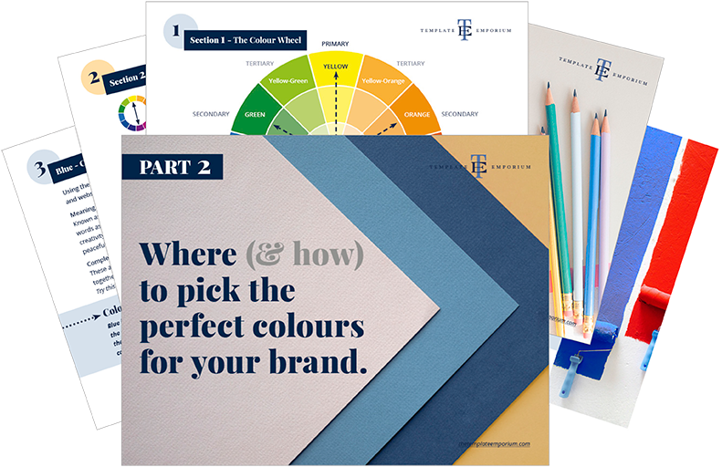
Here’s what we’ll cover
MEANING OF GREY
The psychological meaning of Grey
Meaning of Grey to you
Grey in Business
VARIETIES OF GREY
Battleship Grey to Pewter, we share our favourite Greys
Grey & The Colour Wheel
Colours that go with Grey
GREY IN BRANDING
Matching to the Tone of your Business
Picking the Perfect Palette with Grey
When not to use Grey in your Branding
Should you use Grey as your Branding Colour?
1. Meaning of Grey
The Psychological Meaning
Grey stands alone due to its completely neutral look and feel. It is neither masculine nor feminine. Being neutral also means it can be viewed as dull, detached or conformist.
In cartoons, a grey raining cloud over a head represents sadness or depression. While back in the real world, a grey suit or school uniform represents conservativeness. And at the same time, grey is part of the magical moonlight that shines and guides us.
So, how do you decide grey’s real meaning?
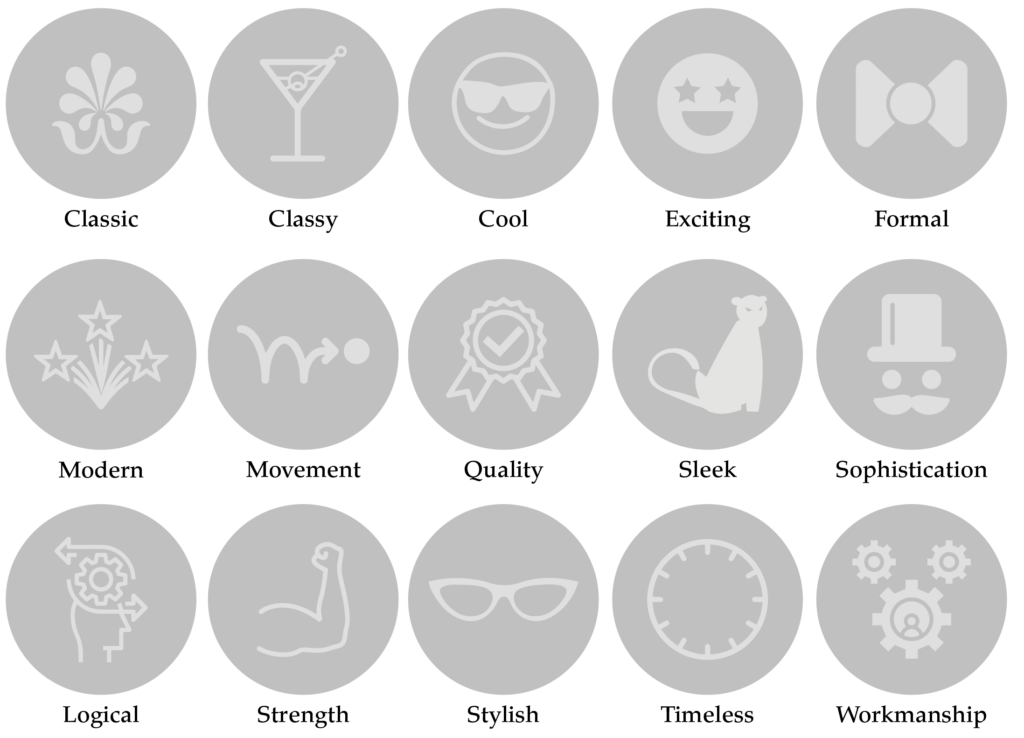
We believe it is based more on the shade of Grey rather than the colour itself. And to make it a little easier, we’ve created an icon guide below and broken it into Light, Bright and Dark Grey.
Original unedited icons from the Noun Project
Light Grey Meaning

Medium Grey Meaning
Dark Grey Meaning

Want a Grey Branded Website?
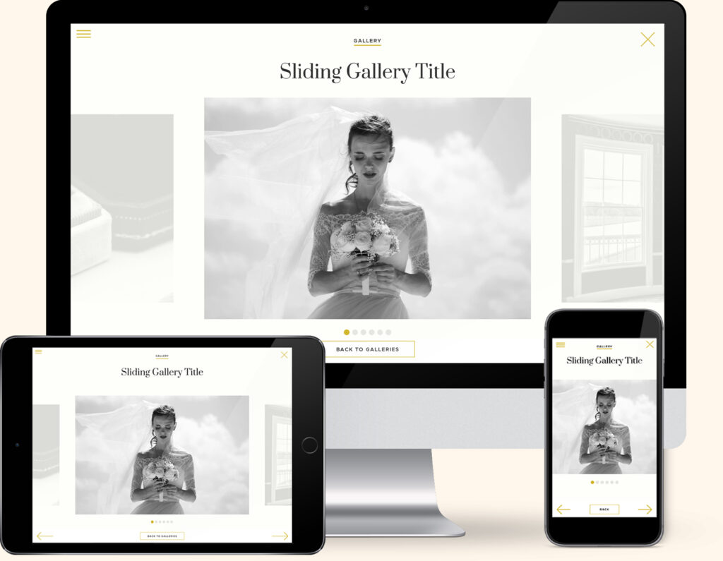
If you love Grey, we have the perfect website template for you. Our Elegant Weddings Template combines the sophistication of Greyscale Photography with a subtle pop of gold, creating the website of your dreams.
Created exclusively for the Showit platform, now you can showcase your collection of photography alongside your favourite colour.
Meaning of Grey to You
Is Grey a colour you and your brand could resonate with? Above we learnt the meaning of grey, but how do you personally feel about it?
Any experiences or memories you’ve had with Grey will help determine how you feel about it.
Childhood memories of grey are a great place to start. Perhaps the silver pieces of the Monopoly board game take you back to the sibling competitive rivalry over who would get the Scottie dog (a favourite in my household). Or use the electric pencil sharper to ensure your graphite pencil was extra sharp.
If you’re a personal brand, the key is to find a balance between the colours you like and the ones that will attract your ideal client.
Look at the icons above and pick which words sum up the way you feel about Grey. Or the way you want your business to be perceived. Doing this will be a great way to determine the shade of Grey that’s right for you.
Colour Clues
Every colour makes us feel a certain way. Once you learn how to use the Indoor Clues, it will open your eyes to new options and feelings about colour.

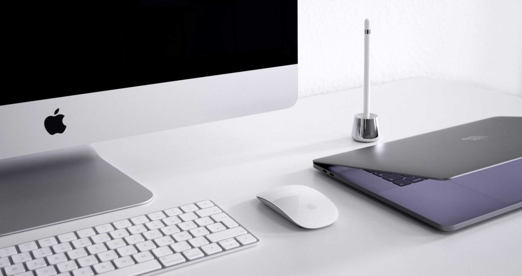
We love using grey in our household. Firstly through our throw pillows in a colour combination of yellow and black. We then carry grey across to the kitchen with our stainless steel appliances and finally in our office, incorporating it in our computer equipment as silver and space grey Macs.
Would your ideal client like Grey, how would it make them feel?
In Part 1 of our Colour Guide series “How (& where) to pick the perfect colours for your brand.” we explain everything about Colour Clues. Click here to download it – it will be super helpful.
Grey in Business
According to the founder Silver is a popular choice as a branding colour in business, with 28% of the biggest brands opting for it as their brand colour.
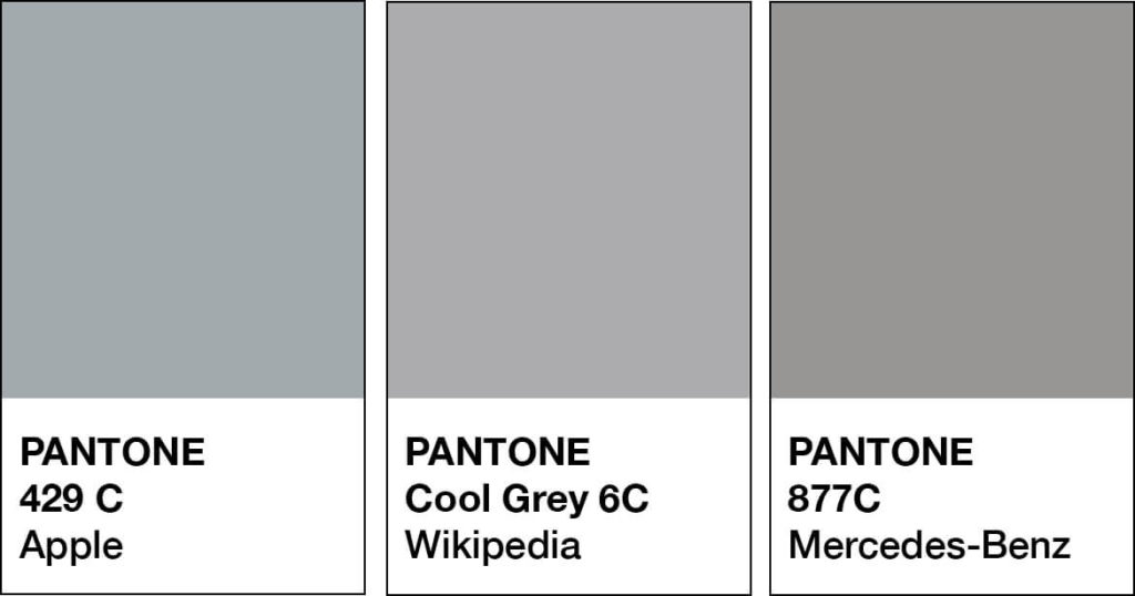
Electronics
Apple
As one of the most recognisable logos around, Apple has used various tints and tones of grey in their branding and products over the years, and each one represents a new direction and era.
Image from Unsplash.
Automotive
Grey Silver is a popular choice in this industry as it represents quality, prestige, confidence and luxury.
Examples include:
Jaguar
Mercedes
Mazda
Aston Martin

Jewellery
To represent innovation, design and quality grey is the perfect choice for this industry.
Swarovski
Should you use Grey as your Branding Colour?
2. Varieties of Grey
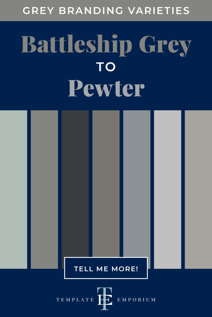
From Battleship Grey to Pewter, we share our favourite Greys
Many varieties of Grey may look similar to each other but have different names. From light to dark Grey we’ve compiled a cheat sheet of our favourites below (and included a few you may have never heard of!).
And to make it easy, we added the hex numbers. So you can start using them in your branding today.
Press play on the image below or get all the colour breakdowns in our FREE Guide.
Insider Tips
To make Grey, mix Black and White.
Tints of Grey = Lighter varieties feel more approachable and classic. It doesn’t demand attention or want to stand out. Such as Aluminium, Taupe Grey, Slate and Pewter.
Shades of Grey = Darker varieties attract a more mature audience. If your business is more traditional, a deeper Grey such as Battleship Grey, Graphite, Payne’s Grey and Gunmetal are all safer options.
Grey & The Colour Wheel
Unlike most colours in our Branding Colour Series, Grey is neutral, and neutrals don’t appear on the colour wheel.
Grey is a COOL NEUTRAL colour between black and white.
It is created by mixing Black + White = Neutral Grey. Or blending three primary colours = Primary Grey.
Colours that go with Grey
Pantone named Ultimate Gray PANTONE 17-5104 colour of the year in 2021, and we can see why! Being a neutral colour, it works beautifully well with brighter tones such as orange, blue, red and purple.
Greys also have undertones of blue, green or pink. Below, we’ve patched each one to its perfect pair.
Blending Greys

A monochromatic palette refers to using one colour. We love combining Grey with Grey because not only does it elevate the look, but the multiple shades of Grey create harmony together.
Try adding Light and Dark variations together.
The lighter shade will soften, while the darker one will be the highlight.
Grey Colour Combinations

Grey & Blue
Silver + Cobalt
Eggshell Grey + Sapphire
Heather Grey + Cyan
Glacier Grey + Navy
Slate + Lapis
Grey & Pink
Dark Grey + Hot Pink
Smoke + Mauve
Slate + Powder Pink
Glacier Grey + Blush
Dove Grey + Petal Pink
Grey & Red
Charcoal + Apple Red
Taupe + Garnet
Pewter + Cherry
Pale Grey + Poppy
Dove + Burgundy
Grey & Purple
Grey + Lavender
Taupe + Mauve
Heather Grey
+ Ultra Violet
Silver + Eggplant
Pewter + Wisteria
Grey & Yellow
Dove Grey + Citron
Smoke + Golden Yellow
Ultimate Grey + Illuminating Yellow (Pantone 2021 Colour Pair of the Year)
Grey & Green
Stone Grey + Grass Green
Silver + Spruce
Pewter + Chartreuse
Smoke + Emerald
Want more Grey Colour Combination ideas? Click on the image below.
Should you use Grey as your Branding Colour?
3. Grey in Branding
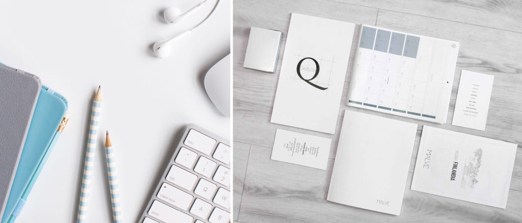
Matching to the Tone of Your Business
As discussed earlier, we break Grey into three options, light, bright and dark. Use this as a guide to help you pick the right shade of Grey for your branding.
Light Grey
Composure, credible, dependable, efficient, neutral, practical, professional, reserved, resilience, rock-solid, serious, simple, steady, subdued and unbiased.
Bright Grey
Classic, classy, cool, exciting, formal, modern, movement, quality, sleek, sophistication, logical, strength, stylish, timeless and workmanship.
Dark Grey
Accountable, business-like, conscientious, conservative, corporate, enduring, functionality, loyalty, maturity, mystery, resolute, responsible, restrained, stable and steadfast.
Picking the Perfect Palette with Grey
Our 5-step Perfect Palette Process
Need help to choose your Brand Colour Palette? We’ve created a simple step-by-step process. Grab our free guide as a handy download.

Step 1
Pick the Main Brand Colour
So you’ve picked Grey. Now you have to decide on the type of Grey, is it light, bright or dark?
Step 2
Pick a Support Brand Colour
If you feel stuck at this stage, just remember this colour creates harmony with the MAIN. Refer back to our tips earlier on Colours that go with Grey to help you decide.
Step 3
Pick a Light Neutral Brand Colour
Why do you need neutrals in your brand colour palette? Because it creates balance.
Not sure which neutrals to pick? Go to page 16 of our free guide.
Step 4
Pick a Dark Neutral Brand Colour
Your light neutral colour needs a partner. So now it’s time to pick a dark neutral colour for even more balance. Our guide on page 16 explains everything.
Step 5
Pick an Accent Colour
This colour is used to make something on your website pop. Therefore it’s only used sparingly. Page 22 of our free guide will explain more.
Web and Print Branding
Once you have picked the right Grey for your business, add the hex code to your website.
View how it looks on both desktop and mobile. To create consistency only, use the one hex code number to ensure the Grey you chose is always the correct shade.
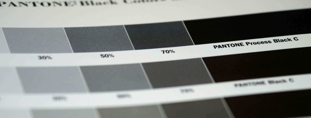
For print, instead of a hex code, you will need the CMYK (Cyan, Magenta, Yellow & Black) or Pantone, colour breakdown to ensure the Grey will print out the way you want.
Insider Tip
Acting as a bridge between colours on your website, use grey (rather than black) for your body copy.
This subtle difference will make your headings pop out and help create a hierarchy between the two.
When not to use Grey in your Branding
Because of Grey’s lack of colour, it could feel too dull for a younger audience, especially ones focused on children. While this industry demands attention, Grey is the opposite and could feel lost in this loud environment.
And in fast food industries, while red increases the appetite, grey could have the opposite effect.
You Did it!
That’s a wrap on Should you use Grey as your Branding Colour?
How do you feel about Grey now? Would it suit you and your branding? Let us know. And in the meantime, follow us on Pinterest for more blog posts like this.
Where to now?
- After a youthful, festive colour? Orange could be for you.
- Maybe a magical, mysterious colour like Purple is more you?
- For an optimistic & compassionate colour, you can’t go past Green.
Don’t forget to download our FREE Colour Guide.

Like the Blog Post?
PIN IT FOR LATER. And for more helpful tips follow us on PINTEREST.
Search
Create & launch your website in a
few simple steps
FREE GUIDE
While you’re here,
grab our FREE
‘Do’s & Don’ts of what to add to your website’ Guide.
‘Do’s & Don’ts of what to add to your website’ Guide.
When you sign up, we’ll send you
emails with additional helpful content.
About Lavinia & Tom
Hi, we're so glad you found us.
We love helping creatives like you finally have the website you’ve always wanted.
Blog Categories
Follow us