grab our FREE
‘Do’s & Don’ts of what to add to your website’ Guide.
‘Do’s & Don’ts of what to add to your website’ Guide.
emails with additional helpful content.
Hi, we're so glad you found us.
We love helping creatives like you finally have the website you’ve always wanted.
few simple steps
Follow us
Should you use Brown as your Branding Colour?
Brown is often associated with all things earthy, mature and practical. It’s the sensible friend you can count on, especially if you want to establish trust and reliability. For some, however, it fits more in the box of dull, predictable and cheap. So, should you use brown as your branding colour – let’s find out!
We have developed a three-part system that takes a deep dive into Brown’s meaning, varieties and how to use this information in your branding.
Are you ready to dive into the most earthy colour of all?
Before we start – missed a part of our Branding Colour Series? Catch up below.
- 1. Should you use Blue as your Branding Colour?
- 2. Should you use Red as your Branding Colour?
- 3. Should you use Yellow as your Branding Colour?
- 4. Should you use Green as your Branding Colour?
- 5. Should you use Pink as your Branding Colour?
- 6. Should you use Orange as your Branding Colour?
- 7. Should you use Purple as your Branding Colour?
- 8. Should you use Grey as your Branding Colour?
- 9. Should you use White as your Branding Colour?
- 10. Should you use Black as your Branding Colour?
- 11. Should you use Beige as your Branding Colour?
- 12. Should you use Brown as your Branding Colour? (this is the blog you’re reading)
Want to start using Brown as your Branding Colour now?
Download our FREE Guide
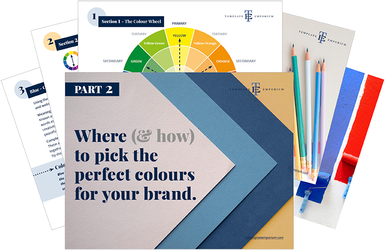
Here’s what we cover
MEANING OF BROWN
The psychological meaning of Brown
Meaning of Brown to you
Brown in Business
VARIETIES OF BROWN
Apple Cider to Sepia, we share our favourite Browns
Brown & The Colour Wheel
Colours that go with Brown
BROWN IN BRANDING
Matching to the Tone of Your Business
Picking the Perfect Palette with Brown
When not to use Brown in your Branding
Should you use Brown as your Branding Colour?
1. Meaning of Brown
The Psychological Meaning
Brown is a comforting colour and can feel like a big bear hug offering strength, security and one you can trust. Unlike some other colours we’ve discussed in this series, it doesn’t demand attention, as it can both work well as the primary branding colour or as a compliment to another.
Being a neutral colour, it also offers balance in a palette. And with so many options to choose from, including buttery browns to chocolate hued, each one will express a different meaning.
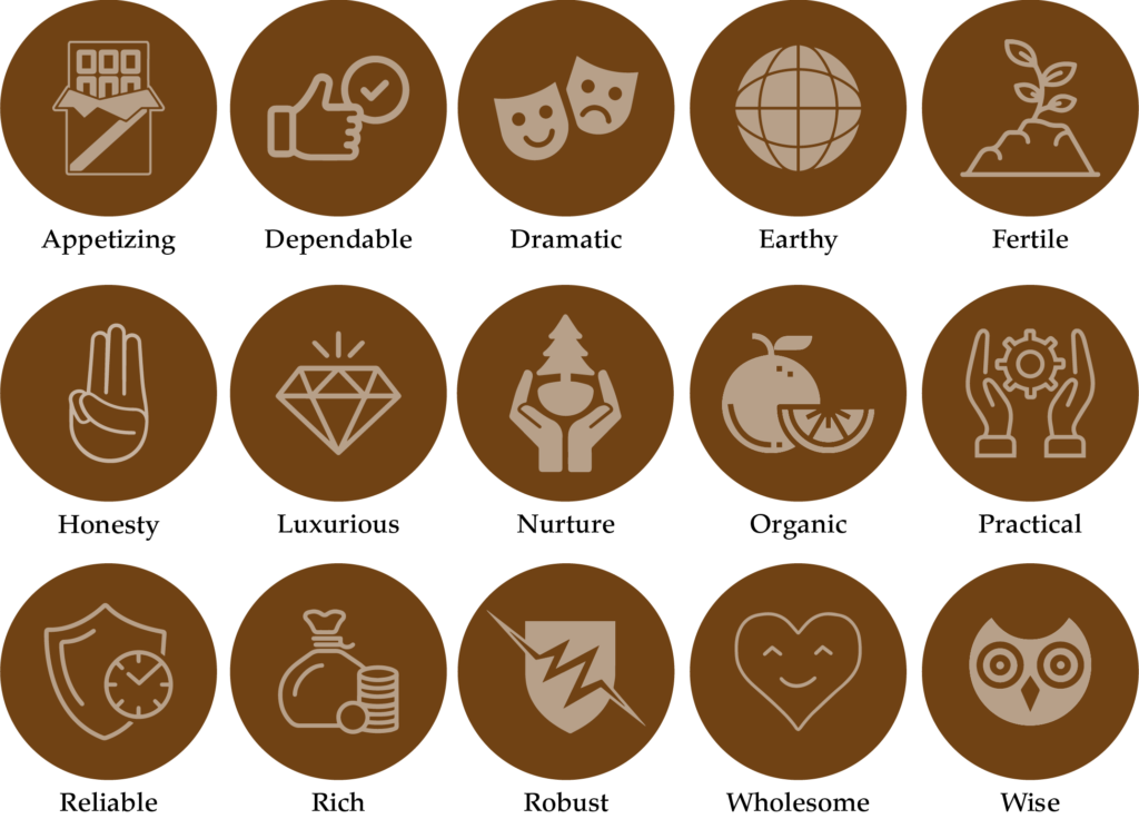
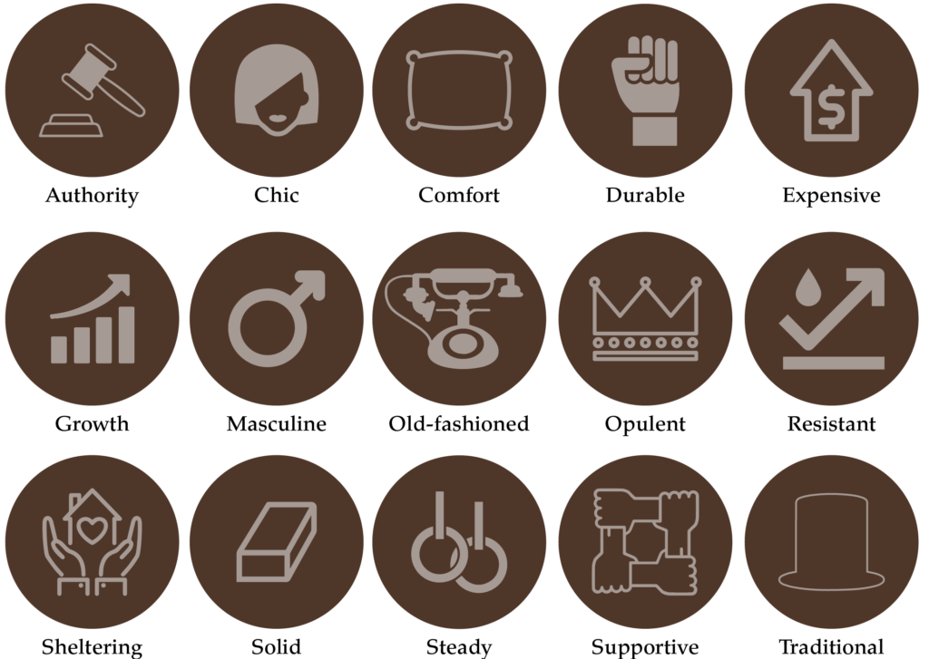
But how do you know which one to pick? We believe it is based more on the shade of Brown rather than the colour itself. And to make it a little easier, we’ve created an icon guide below and broken it into Light, Medium and Dark Brown.
Original unedited icons from the Noun Project
Light Brown Meaning

Medium Brown Meaning
Dark Brown Meaning
Meaning of Brown to You
Whether you refer to Brown as Terracotta, Fawn, Umber, Tan, Sepia, or Chestnut, all these varieties mean there’s a particular brown for everyone.
Working in the media industry, we would refer to the big bosses’ floor as “Mahogany Road” due to the floor-to-ceiling mahogany cabinets, desks and big thick furniture.
At the time, my feelings towards brown felt dark, heavy and intimidating, my views have changed over the years, and now I can appreciate the richness and classic feel of this shade of brown.
- How were you introduced to Brown?
- Was it a positive or negative experience?
- Have your feelings for Brown changed over the years?
What type of business do you have?
If you’re a personal brand the key is to find a balance between the colours you like and those that will attract your ideal client.
The varieties of brown available now are endless. In the past, mission brown may have been the only brown alternative in decorating the different tones, tints and shades, meaning that you can pick the perfect one that matches you and your business.
Once considered a plain and boring colour, brown has made a major comeback lately. Whether it’s because customers related to its earthy and organic look and feel or it brings comfort in a commercial world, brown is here to stay.
In conclusion, look at the icons above and pick which words sum up how you feel about Brown and what words describe how you want your ideal customer to feel about your business.
Colour Clues
Every colour makes us feel a certain way. Once you learn how to use the Indoor Clues, it will open your eyes to new options and feelings about colour.
A great place to start is to look for brown colour clues in your home. This perfect neutral can be an anchor to other colours or stand alone in wooden textures and hero pieces. If you enjoy using brown within your home, this could be a clue that you could carry it across to your business branding.

Would your ideal client like Brown, how would it make them feel?
In Part 1 of our Colour Guide series “How (& where) to pick the perfect colours for your brand.” we explain everything about Colour Clues. Click here to download it – it will be super helpful.
Brown in Business
Brown is popular with brands that want to convey trust and reliability. That’s why UPS is one of the most famous brands to adopt it into their branding.
As discussed earlier in The Psychological Meaning of Brown, picking the right shade of Brown that reflects your target audience is the key to using this earthy, mature colour.
Below shows how versatile Brown can be in branding simply by picking the right shade.
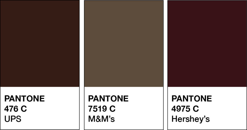
Organic Food Brands
The colour Brown is closely associated with earth, nature and wholesomeness, so using this colour in this industry’s branding was a natural fit.
Amy’s
Lotus Foods
Organic Valley
Coffee Brands
Using brown in your branding as a coffee business is a perfect fit, and brown’s richness, warmth and comfort blend together spectacularly.
McCafe
Peet’s Coffee
Gloria Jeans’s
Food – Chocolate Brands
Brown would have to be one of the most popular colours used by companies that sell chocolate – after all, there is a shade of brown named after it!
M&M’s
Hershey’s
Max Brenner

Should you use Brown as your Branding Colour?
2. Varieties of Brown
Apple Cider to Sepia, we share our favourite Browns
Many varieties of Brown may look similar to each other but have different names. From light to dark Brown we’ve compiled a cheat sheet of our favourites below (and included a few you may have never heard of!).
And to make it easy, we added the hex numbers. So you can start using them in your branding today.
Press play on the image below or get all the colour breakdowns in our FREE Guide.
Brown & The Colour Wheel
Unlike most colours in our Branding Colour Series, Brown is neutral, and neutrals don’t appear on the colour wheel.
Insider Tip
Brown is a composite colour made by mixing all three primaries (yellow, red & blue) equally together. Or by mixing a primary colour with its complementary colour.
Colours that go with Brown
Look at the neutral’s undertone to find its compliment.
Orange (undertone) Brown compliment = Blue.
Red (undertone) Brown compliment = Green.
Purple (undertone) Brown compliment = Yellow.
Blending Browns
A monochromatic palette refers to using one colour.
We love combining Brown with Brown because not only does it elevate the look, but the multiple shades of Brown create harmony together.
Try adding Light and Dark variations together.
The lighter shade will soften, while the darker one will be the highlight.

Brown Colour Combinations
Brown + Yellow
Cinnamon Brown + Ochre
Umber + Canary
Chesnut Brown + Gold
Mahogany + Daffodil
Chocolate + Marigold
Brown + Buttercup Yellow
Brown + Green
Latte + Kelly Green
Bark + Olive Green
Mahogany + Teal
Toffee + Desert Sage
Chocolate + Jade
Bronze + Evergreen
Brown + Red
Chocolate + Aurora Red
Brown + Berry Red
Cinnamon + Scarlet
Brown + Scarlet
Chestnut + Cherry
Brown + Maroon
Brown + Blue
Brownstone + Cobalt
Tobacco + Indigo
Caramel + Navy
Chocolate + Royal Blue
Brown + Baby Blue
Sienna + Grey Blue
Brown + Orange
Toffee + Cadmium Orange
Chocolate + Pumpkin
Caramel + Coral
Cinnamon + Salmon
Tobacco + Cognac
Brown + Flame Orange
Brown + Pink
Camel + Blush
Golden Brown + Petal
Bronze + Bubblegum
Copper + Rose
Toffee + Cashmere Rose
Chocolate + Fuchsia
Should you use Brown as your Branding Colour?
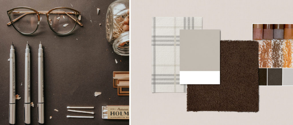
Matching to the Tone of Your Business
As discussed earlier, we break Brown into three options, light, medium and dark. You can use the breakdown as a guide to help you pick the right Brown for your branding.
Light Brown
Effortless, elegant, fresh, friendly, gentle, grounded, natural, nature, outdoor, rustic, sophisticated, strong, warm, wistful and woodsy.
Medium Brown
Appetizing, dependable, dramatic, earthy, fertile, honest, luxurious, nurturing, organic, practical, reliable, rich, robust, wholesome and wise.
Dark Brown
Authority, chic, comfortable, durable, expensive, growth, masculine, old-fashioned, opulent, resistant, sheltering, solid, steady, supportive and traditional.
Picking the Perfect Palette with Brown
Our 5-step Perfect Palette Process
Need help to choose your Brand Colour Palette? We’ve created a simple step-by-step process. Grab our free guide as a handy download.

Step 1
Pick the Main Brand Colour
So you’ve picked Brown. Now you have to decide on the type of Brown, is it light, medium or dark?
Step 2
Pick a Support Brand Colour
If you feel stuck at this stage, just remember this colour creates harmony with the MAIN. Refer back to our tips earlier on Colours that go with Brown to help you decide.
Step 3
Pick a Light Neutral Brand Colour
Why do you need neutrals in your brand colour palette? Because it creates balance.
Not sure which neutrals to pick? Go to page 16 of our free guide.
Step 4
Pick a Dark Neutral Brand Colour
Your light neutral colour needs a partner. So now it’s time to pick a dark neutral colour for even more balance. Our guide on page 16 explains everything.
Step 5
Pick an Accent Colour
This colour is used to make something on your website pop. Therefore it’s only used sparingly. Page 22 of our free guide will explain more.
Web and Print Branding

Once you have picked the right Brown for your business, add the hex code to your website.
View how it looks on both desktop and mobile. To create consistency only, use the one hex code number to ensure the Brown you chose is always the correct shade.
For print, instead of a hex code, you will need the CMYK (Cyan, Magenta, Yellow & Black) or Pantone, colour breakdown to ensure the Brown will print out the way you want.
When not to use Brown in your Branding
If the wrong shade of Brown is used or the messaging doesn’t complement it, brown in branding can appear dull, depressing and cheap.
Companies associated with cleanliness or cleaning are best to avoid the use of Brown in their branding
You Did it!
That’s a wrap on Should you use Brown as your Branding Colour?
How do you feel about Brown now? Would it suit you and your branding? On Instagram here’s what triciabee_designs had to say – Brown is classic! I like the pecan brown best 🤩
Where to now?
If you enjoyed this Branding Colour Series, check out our Holiday ones:
- Halfway to Halloween – Top 20 Colour Pairs
- The Ultimate Christmas Colour Combination Collection
- The Ultimate Easter Colour Pair Collection
Like the Blog Post?
PIN IT FOR LATER. And for more helpful tips follow us on PINTEREST.
Search
Create & launch your website in a
few simple steps
FREE GUIDE
While you’re here,
grab our FREE
‘Do’s & Don’ts of what to add to your website’ Guide.
‘Do’s & Don’ts of what to add to your website’ Guide.
When you sign up, we’ll send you
emails with additional helpful content.
About Lavinia & Tom
Hi, we're so glad you found us.
We love helping creatives like you finally have the website you’ve always wanted.
Blog Categories
Follow us