grab our FREE
‘Do’s & Don’ts of what to add to your website’ Guide.
‘Do’s & Don’ts of what to add to your website’ Guide.
emails with additional helpful content.
Hi, we're so glad you found us.
We love helping creatives like you finally have the website you’ve always wanted.
few simple steps
Follow us
Should you use Blue as your Branding Colour?
Want to set the mood and tone of your brand? Start with picking a brand colour. But, with so many available, choosing the perfect one can be a (real) struggle. If you are a personal brand, it’s often a fine line between what colours you like, and what will resonate with your ideal client. Using Blue for your branding colour could be the perfect solution.
Is blue truly for you? Let’s find out!
Before we start – missed a part of our Branding Colour Series? Catch up below.
- 1. Should you use Blue as your Branding Colour? (this is the blog you’re reading)
- 2. Should you use Red as your Branding Colour?
- 3. Should you use Yellow as your Branding Colour?
- 4. Should you use Green as your Branding Colour?
- 5. Should you use Pink as your Branding Colour?
- 6. Should you use Orange as your Branding Colour?
- 7. Should you use Purple as your Branding Colour?
- 8. Should you use Grey as your Branding Colour?
- 9. Should you use White as your Branding Colour?
- 10. Should you use Black as your Branding Colour?
- 11. Should you use Beige as your Branding Colour?
- 12. Should you use Brown as your Branding Colour?
Want to start using Blue as your Branding Colour now?
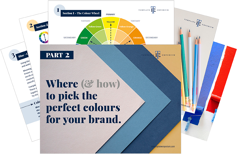
Download our FREE Guide
Here’s What We’ll Cover
THE MEANING OF BLUE
The Psychological Meaning of Blue
Meaning of Blue to you
Blue in Business
VARIETIES OF BLUE
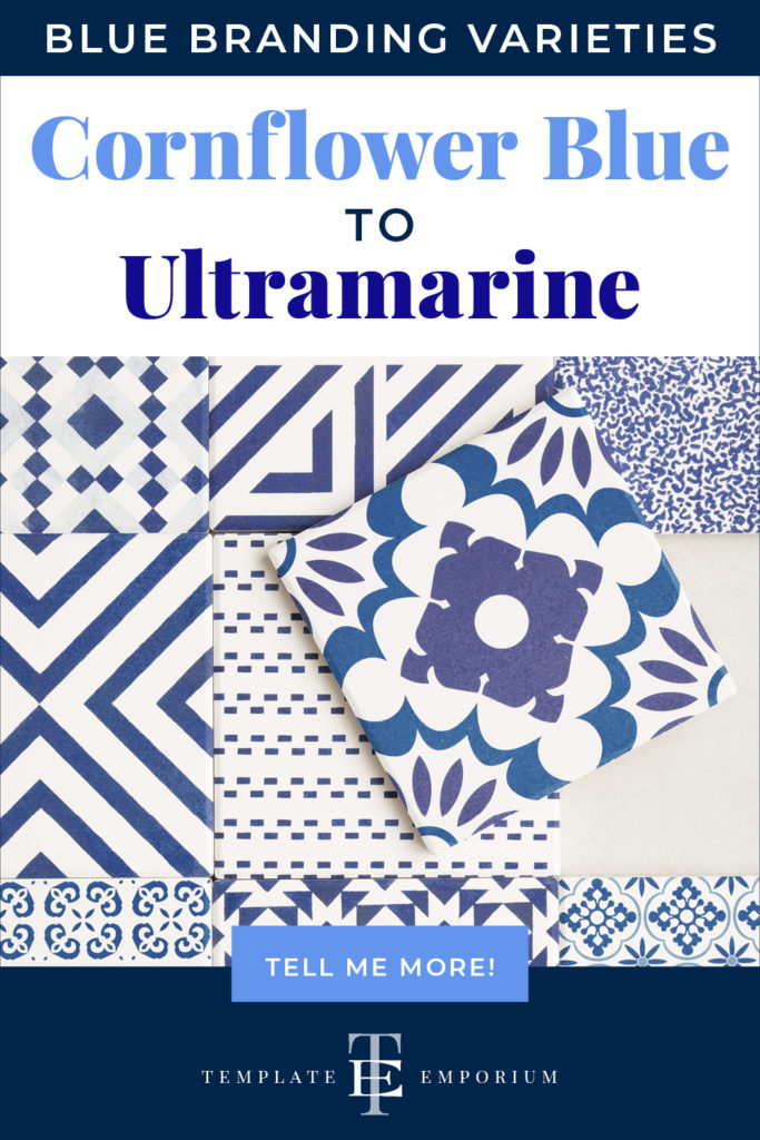
Cornflower Blue to Ultramarine, we share our favourite Blues
Blue & The Colour Wheel
Colours that go with Blue
BLUE IN BRANDING
Matching to the Tone of your Business
Picking the Perfect Palette with Blue
When not to use Blue in your Branding
Should you use Blue as your Branding Colour?
1. Meaning of Blue
The Psychological Meaning
Blue, according to a survey conducted by YouGov, is the world’s most popular colour.
And we can see why, after all, it is all around us. Starting at the sky above and heading to the waters below. From the clothes we wear to the flags that fly, there is no escaping from Blue.
But when it comes to discovering the psychological meaning of blue, it varies from feelings of coldness, loyalty, peacefulness and authority. All of this may seem a little contradictory. But we believe it is based more on the shade of blue, rather than the colour itself.
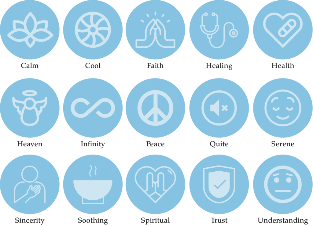
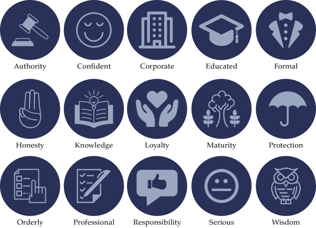
To make it a little easier, we’ve created an icon guide below and broken it into Light, Bright and Dark Blue.
Original unedited icons from the Noun Project
Light Blue Meaning
Bright Blue Meaning
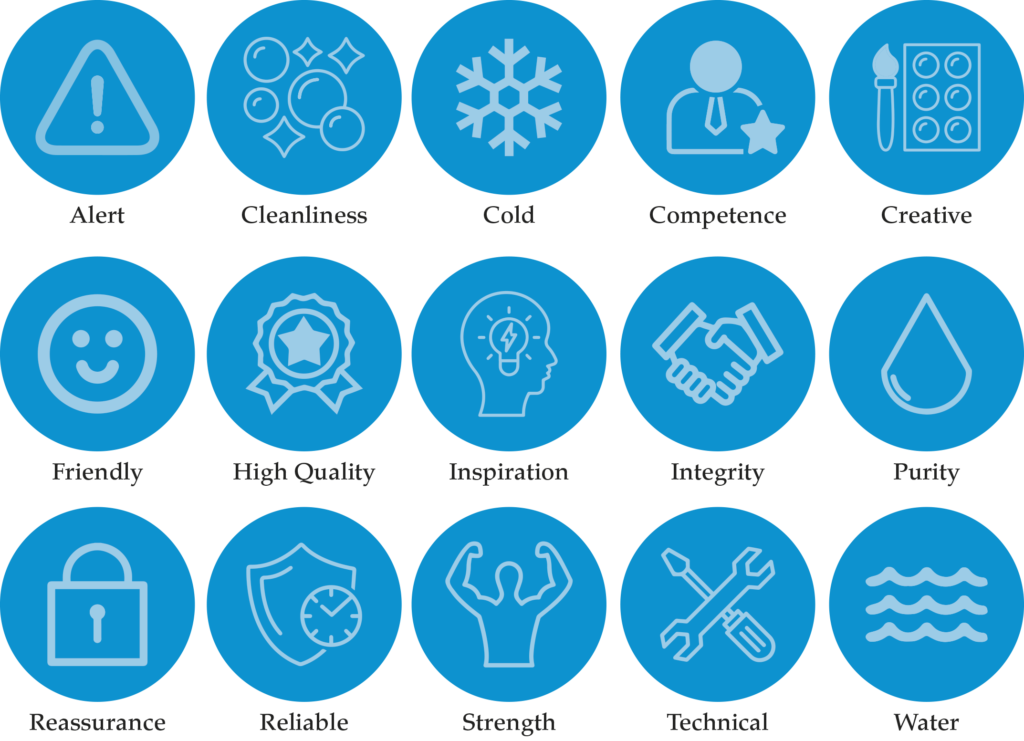
Dark Blue Meaning
Want a Blue Branded Website?
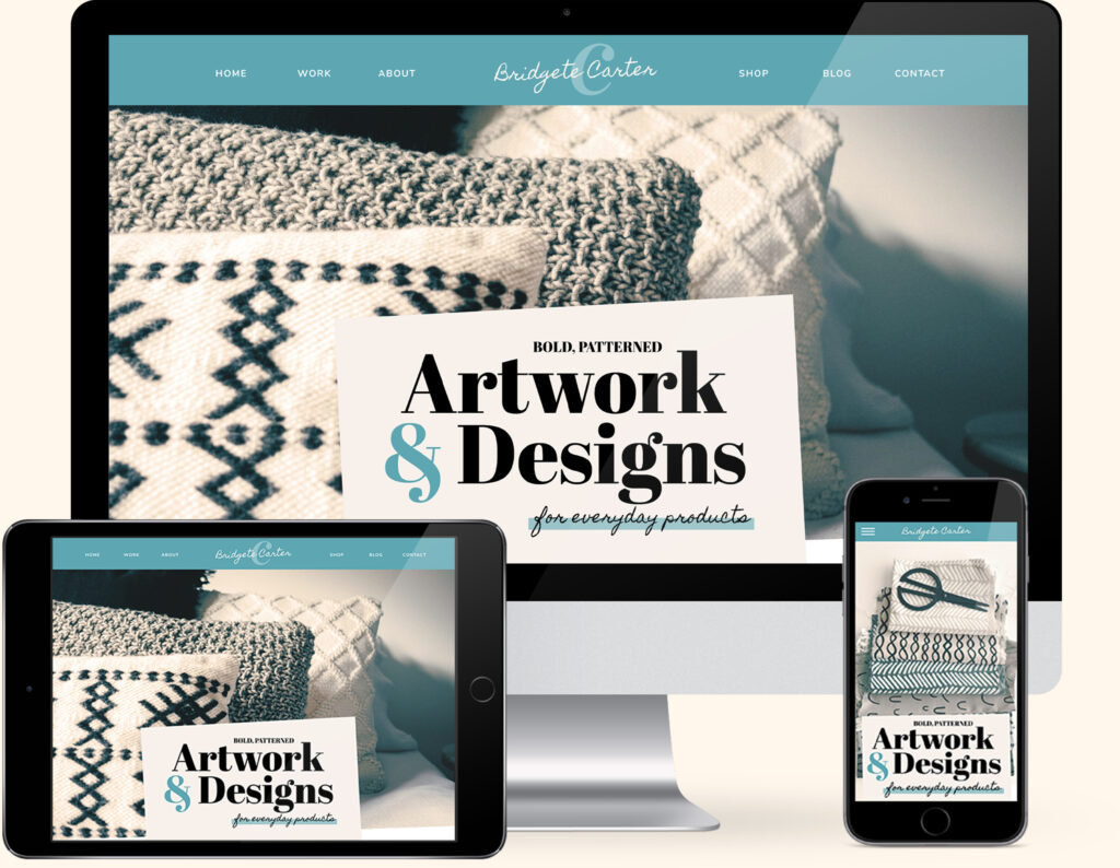
If you love Blue, we have the perfect website template for you. Our Artwork & Designs Template combines a stunning Teal Blue with pairings of Black and cream combinations.
Created exclusively for the Showit platform, now you can showcase your collection of designs alongside your favourite colour.
Meaning of Blue to You
When you think of blue, what is your first reaction? Are you a fan? Do you instantly feel calm as it reminds you of the sky or the deep ocean?
Secondly, your experience with blue will determine how you feel about it. If your school uniform was blue and you enjoyed school, or your favourite sporting team wears blue the way you react to it will be a positive one.
And finally, look at the list above and note which words capture the way you feel about blue or the way you want your business to be perceived. This will be a great indication of the shade of blue that’s right for you.
Colour Clues
Every colour makes us feel a certain way. Once you learn how to use the Colour Clues, it will open your eyes to new options and feelings about colour.
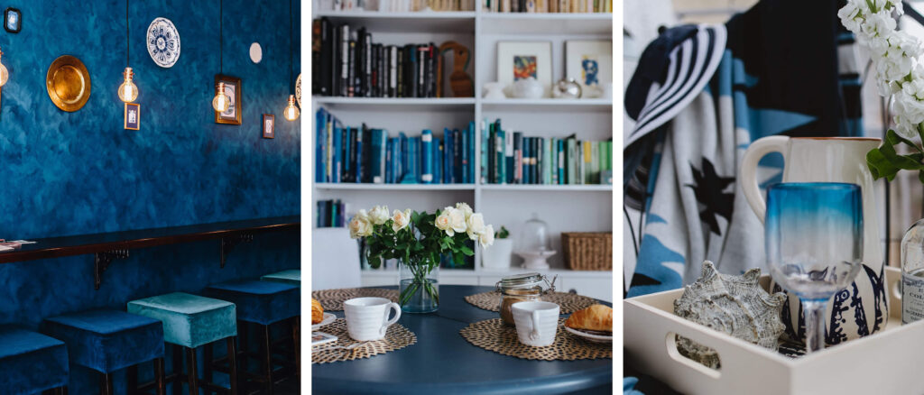
Maybe you wear a lot of blues, or you have used it in decorating, these are all Colour Clues* to determine how you feel about colour.
Would your ideal client like blue, how would it make them feel? Relaxed, and confident that they could trust you and your business?
In Part 1 of our Colour Guide series “How (& where) to pick the perfect colours for your brand.” we explain everything about Colour Clues. Click here to download it – it will be super helpful.
Blue in Business
In the corporate world, blue is the most commonly used colour.
There are so many shades to choose from. We share our favourites here.
And from the article by YouGov, we also know blue is popular with both men and women and across age groups and racial subgroups. And therefore makes it feel non-threatening and a safe, dependable and positive colour to use in your visual branding.
Disney

Disney uses blue throughout their characters to show bravery and trust, but an insider secret is they created a unique blue hue called “Blending Blue”.
Firstly, this unique blue paint disguises construction and buildings that Disney doesn’t want their guest to see.
Secondly, this shade is an exact match to the Florida skyline. So suddenly, an ugly construction area or building that takes you out of the magical world of Disney blends into the sky.
Disney Parks Colour Trends
Look out for Arendella Aqua (Inspired by the movie Frozen) throughout the parks on Mickey ears, food, merchandise and clothing. How about a blue churro?
And for celebrating their latest addition Disney+, forget the red carpet! Instead, Disney had put a unique spin on this classic with a blue carpet version.
All Photos below from Unsplash

Banking
Blue has also been used in corporate branding to represent trust, security, safety and reliability.
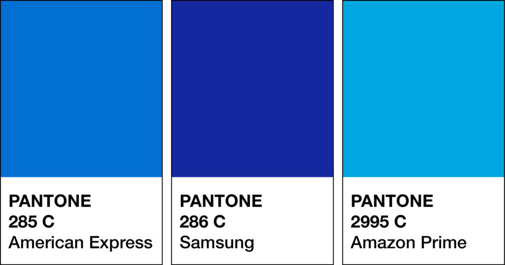
Therefore making it a popular choice in banking and travel. Some examples from around the world include Bank of America, American Express, Chase Bank, Citi the ANZ bank in Australia, German Deutsche Bank and Bank of Ireland.

Airlines
Next up is Airlines, and according to APEX – The Airline Passenger Experience Association “True to the hues of the skies, blue dominated the palettes of airline logos around the world. Regionally, it’s the primary colour in Europe, North America, and South America.” Examples include:
Europe: British Airways, Air France and Lufthansa. North America: Southwest, United, Delta, and JetBlue. South America: Latam Airlines.
Cruise Liners
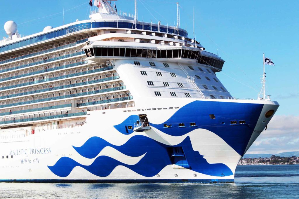
Finally, let’s look at cruise liners and how blue signifies water, calmness, relaxation and trust. And, that’s why Cruise Liners worldwide have adopted some form or shade of blue in their branding. Examples include Princess, Royal Caribbean, Celebrity Cruises, Carnival, Holland America Line and Norwegian Cruises.
Should you use Blue as your Branding Colour?
2. Varieties of Blue
Blue is both a COOL & Primary colour. Along with the other two primary colours, (Red & Yellow), they make up every available colour. Other colours, however, can’t be mixed to make Blue.
Many varieties of Blue may look similar to each other but have different names. From light to dark blue we’ve compiled a cheat sheet of our favourites below (and included a few you may have never heard of!).
And to make it easy, we added the hex numbers. So you can start using them in your branding today.
Press play on the image below or get all the colour breakdowns in our FREE Guide.
Insider Tips
Tints of Blue = Lighter varieties reflect a cheerful and youthful audience.
Shades of Blue = Darker varieties attract a more sombre, formal and mature audience.
Blue & The Colour Wheel
The Colour wheel is every designer’s secret to knowing which colours go together.
There are 12 hues (colours) on the wheel and consist of the:
1. Primary
2. Secondary
3. Tertiary
In this post, we’re focussing on Blue which, is a Primary Colour.
Want Your Own Colour Wheel? Get it now in our FREE Guide
Blue & Monochromatic
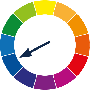
Monochromatic refers to using one colour only.
Take your one MAIN colour Blue and add in light and dark variations.
Using one hue (Blue) and adding white, black or grey to it creates tints, tones and shades. E.g.: Royal Blue, Baby Blue, Slate Blue, Navy Blue.
This simple colour scheme will keep your palette looking clean and fresh and, because it uses only a single hue, it has a soothing effect.
Blue & Complimentary Colours
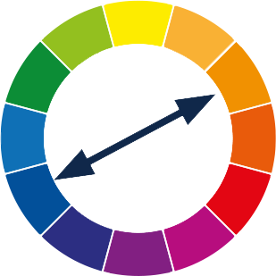
Secondary refers to the use of two colours.
These are colours that are opposite each other on the colour wheel. When used together, they bring out the best in each other.
Using your MAIN colour Blue, with its opposite Orange, will create contrast and make the colours look brighter and more vibrant.
Insider Tip
Use the complimentary colour Orange in small amounts so it becomes more of a pop of added colour or an accent.
To avoid them overpowering each other, mix in tints, tones and shades. If you made the orange a lighter shade, it would fade back allowing, the blue to come forward.
Blue & Analogous Colours
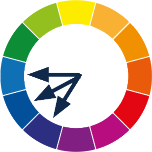
Analogous refers to the use of three colours.
These are any three colours that are side-by-side on the colour wheel. Think of them as colour neighbours.
Using your MAIN colour Blue, find the two similar supporting colours sitting next to each other. The undertones of these colours
Blue + Blue-Green + Blue-Purple are similar which help convey a low-contrast, friendly, harmonious mood & will appear easier on the eye.
Blue & Split Complimentary Colours
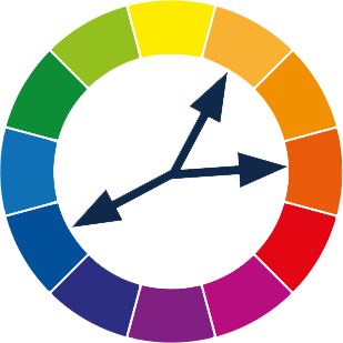
Split Complimentary is the use of two colours.
This is using a base colour and the two colours on each side of its complement.
When your MAIN colour is Blue, its complementary colour is Orange. The two colours on each side of the Orange are Yellow-Orange and Red-Orange.
A combination like this creates a low-contrast palette of Analogous colours. And the opposite colour gives a pop of colour.
Insider Tip
This time, we’re going to do the opposite of what we did with the complementary colour palette and the MAIN colour Blue would be used as the Accent.
Colours that go with Blue
Blue always manages to stand out (but for all the right reasons). It’s not over-vibrant. Yet, all its shades complement and work so well with a variety of colours. Let’s dive in and take a look.
Blending Blues

As discussed earlier, a monochromatic palette refers to using one colour.
We love combining blue with blue because not only does it elevate the look, but the multiple shades of blue create harmony together.
Light & Dark Blue Variations
Light Sky Blue + Navy
Baby Blue + Mid Blue + Navy
Lapis Blue + Navy + Baby Blue
Light Blues
Sky blue + Cherry-red + Grey or White
Light Blue + Turquoise + White
Baby Blue + Chocolate Brown
Light Blue + Pink
Sky Blue + Golden Yellow + Grey
Light Blue + Coral
Baby Blue + Light Brown + Cream-White
Bright Blues
Cyan + Tomato-Red + Grey or White
Bright Cyan + Brown + Beige + Cream
Electric Blue + Orange + Navy
Cornflower + Lavender + Mint
Caribbean Blue + Saffron + Salmon Pink
Bright Blue + Red + White
Cyan + Dark brown
Dark Blues
Navy + Silver
Ultramarine + Light Blue + Silver
Navy Blue + Grey
Dark Blue + Salad Green + Grey
Navy Blue + Grey + Metallic
Indigo + Buttery Yellow + White
Dark Blue + Gold
Blue Colour Combinations

Blue & Yellow
Try one strong Blue (such as Navy) + one soft Yellow. When both colours are too bright, it becomes too loud. Instead, use yellow as the support colour.
Combinations could include:
Blue + Yellow + Grey + Black
Lemon yellow + Blue + Grey
Pale Yellow + Blue + Grey
Navy & Orange
As complementary (opposite each other on the colour wheel) colours, this combination always works well. Try using Orange as the accent colour on the buttons on your website to make them pop out.
Combinations could include:
Navy + cream + Red-Orange + Sunglow
Denim Blue + Bright Orange
Navy + Orange + Lime Green + Cream
Blue & White
This is a favourite pairing and creates a light, breezy feel, especially if coastal blues are used. If you want to create a striking look or a pop of colour, try adding a warm colour such as yellow or red.
Combinations could include:
Dark Blue + Bright Blue + Sky Blue + White + Yellow
Navy + Gold + White
Blue + White + Blush
Navy Blue & Tan
These colours work beautifully together. And lighter shades of the two colours could also be added to complete the palette.
Combinations could include:
Navy + Light Grey + Sienna + Tan
Tan + Navy + Mint + Coral
Navy + Tan + Blush
Navy Blue & Fuchsia
This striking combination looks amazing together. You could also use different shades of colours and add a neutral for a striking look.
Combinations could include:
Navy Blue + White + Fuchsia
Navy Blue + Fuchsia + Gold
Fuchsia + Navy Blue + Grey
Want more Blue colour combination ideas? Click the image below.
Should you use Blue as your Branding Colour?
3. Blue in Branding

Photo from Amy Shamblen
Matching to the Tone of Your Business
Why use blue? Because it is versatile works well with many other shades and can create the exact mood you want to convey.
If your brand style is traditional, modern, classic, boho, coastal or even art deco blue can work for you.
Blue conveys a sense of confidence and intelligence. As an online educator, that is (exactly) how you want your customers to feel.
Are you selling products online? The idea that blue represents loyalty, trust, understanding, quality and knowledge could be your secret weapon in conveying your business tone.
Remember to consider the type of blue you want to use, then compare it to the meaning and you’ll have a perfect match. As discussed earlier, we break Blue into three options, light, bright and dark then consider the meaning of each one.
For a visual reference of the list below, Click Here.
Light Blue
Calm, cool, faith, healing, health, heaven, infinity, peace, quiet, serene, sincerity, soothing, spiritual, trust and understanding.
Bright Blue
Alert, cleanliness, cold, competence, creativity, friendly, high quality, inspiration, integrity, purity, reassurance, reliability, strength, technical and water.
Dark Blue
Authority, confidence, corporate, educated, formal, honesty, knowledge, loyalty, maturity, protection, orderly, professional, responsibility, seriousness and wisdom.
Picking the Perfect Palette with Blue
When you have a partner in your business choosing, a colour palette that you both love can sometimes become tricky. It’s a fine line between what you like and what will resonate with your ideal customer.
When we choose the colour palette for our Template Emporium business, blue was a popular choice with both myself and my husband and co-founder Tom. So we’re a living example that yes, blue is a universally loved colour amongst both males and females!
A variety of Blue will act as the MAIN. This colour stands out over everything else.
We both opted for a navy. (Another discovery was made by using the colour clues, found as a favourite colour to wear). And the psychological meaning of Blue tied in perfectly with what we wanted our brand to represent.

After that SUPPORT, and ACCENT. They make the MAIN colour look even better and create balance. Here you could also use Complimentary, Analogous or Split Complementary Colours.
We looked at our Colour Clues again and discovered Yellow was a popular colour in our decorating and again, a favourite with both of us.
The distinct difference between Blue and Yellow makes them pop against one another. We picked blue as our main colour. And, Yellow became our Secondary Colour. Finally are Neutrals. Pick a light and dark version.
We also incorporated shades and tints of the colours across our branding and website. See our final colour palette above.
Need help working out your Neutral Colours?
Download our FREE Guide

Insider Tip:
For a younger audience use a lighter shade of blue. And for an older audience, a darker shade will work best.
Web and Print Branding
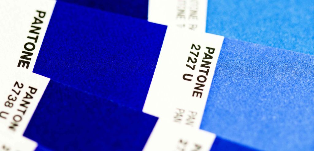
Once you have picked the right blue for your business, add the hex code to your website. View how it looks on both desktop and mobile. To create consistency only, use the one hex code number to ensure the blue you chose is always the correct shade.
For print, instead of a hex code, you will need the CMYK (Cyan, Magenta, Yellow & Black) or Pantone, colour breakdown to ensure the blue will print out the way you want.
When not to use Blue in your Branding
Avoid using blue when promoting food and cooking because blue suppresses the appetite. (That’s why Weight Watchers) favour it in their branding).
Blue Branding and Food
It is also rarely found in fruits and vegetables (blueberries are the exception). And when it comes to blue and food, the mind automatically links that to mouldy. And that is the last thing you want your branding to convey!
Seafood, however, is often linked to blue branding due to the water reference.
It seems as though everyone is using Blue Branding!
As we know, blue is the most popular branding colour in the corporate world. And also universally loved by (almost) everyone. Having all the traits of a dependable colour sometimes, people associate that as boring or following the crowd.
Instead, look at all the different varieties of blue available. Remember, If your target audience is younger, go for a lighter shade. For an older audience, a darker shade would work well. Then, consider the meanings behind them and pick the one that best reflects your brand.
Choose your Support, Neutral and Accent Colours.
By taking these conscious colour steps, you can say goodbye to “boring blue” as you have created a Blue Branding palette (totally) unique to you and your brand.
You Did it!
That’s a wrap on Should you use Blue as your Branding Colour? How do you feel about Blue now? Are you on the blue train with us and can’t wait to add it to your colour palette?
Let us know. And in the meantime, follow us on Pinterest for more blog posts like this.
Where to now?
- Download Where (& how) to pick the perfect colours for your brand
- Which Colour should you use for your Branding?
- Need an Undated Wall Planner? Pick one up here
Like the Blog Post?
PIN IT FOR LATER. And for more helpful tips follow us on PINTEREST.
Search
Create & launch your website in a
few simple steps
FREE GUIDE
While you’re here,
grab our FREE
‘Do’s & Don’ts of what to add to your website’ Guide.
‘Do’s & Don’ts of what to add to your website’ Guide.
When you sign up, we’ll send you
emails with additional helpful content.
About Lavinia & Tom
Hi, we're so glad you found us.
We love helping creatives like you finally have the website you’ve always wanted.
Blog Categories
Follow us
