grab our FREE
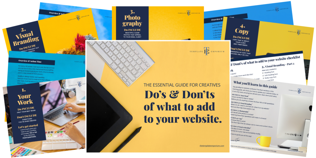
‘Do’s & Don’ts of what to add to your website’ Guide.
‘Do’s & Don’ts of what to add to your website’ Guide.
emails with additional helpful content.
Hi, we're so glad you found us.
We love helping creatives like you finally have the website you’ve always wanted.
few simple steps
Follow us
Planning on updating your current website? (Do this first).
While improving your website can be exciting, it’s easy to get carried away, making random changes that may not benefit your brand. So before you update your website, ensure you have a plan! Let’s go over that plan together.

Updating your Website Plan
It’s essential to sit down and consider your target audience for your branding, and the message you want to convey before implementing any changes.
A well-thought-out plan ensures your website updates align with your business goals and resonate with your target audience.
So it’s vital to know what you want your website to look and feel like before making any changes.
Let us help you start with our free website planning guide – “Do’s & Don’ts of What to Add to your Website”.
It will help you map your website design journey and build a memorable online presence for your business.

Is it time to freshen up your Email Opt-in?

Whether you’re just starting or planning on updating your website, it’s time to add (or change) your email opt-in!
Your email opt-in is like a secret weapon, helping you connect with your audience and build lasting relationships.
But have you given it a second look lately? It’s time to make sure it’s working its magic!
Take a moment to review your email opt-in.
- Is it enticing?
- Does it reflect your unique style & offerings?
- Is it irresistible & valuable to your audience?
- Think about what they would love to receive from you – a downloadable guide, a discount code, or exclusive content.
Don’t forget to promote your email opt-in across all your platforms – your website, blog, social media, and email signature.
Insider Tip
If you have more than one opt-in, try putting them all on one page on your website. That’s what we did. Check it out here.
You can also add a button on your homepage guiding them to it, like the example from our site.

The quickest way to date your Website

When it comes to anything creative, what was once in, can just as quickly become forgotten and out of style. The same is true for Websites.
To avoid this, don’t follow trends when designing your website. Including:
1. Trending colours.
2. The latest elaborate fonts.
3. Flashy elements that have no purpose.
Not only will your website look like everyone else, but you’ll be constantly updating it to match the latest trends.
Instead, opt for a simple, clean, timeless look.
Create your unique visual branding, including your brand fonts, and choose a colour palette that suits you, your business and your ideal client.
Add a Favicon
A favicon is an easy addition to make when you’re updating your website.
Have you added this tiny (but necessary) detail to your website?
Adding unexpected details to your website makes it truly unforgettable, & not including the tiniest detail of all – your favicon, could be hurting your website.
The word favicon is an abbreviation of two words – favourite & icon. But what does it do?
- Helps improve your branding.
- It makes your website look & feel professional.
- Creates a smooth & easy user experience for your viewer.
For more details on Favicons, check out this blog.
You Did it!
That’s a wrap on Planning to update your current Website. (Do this first). In this blog, we discussed how to freshen up your email opt-in, and how to access our essential free guide Do’s & Don’ts of what to add to your Website. Plus, we shared our insider tips on the quickest way to date your Website.
Insider Tip
If you want a completely fresh look to your website but don’t have time to do it yourself, you need our ‘Helping Hand’ website template update.
Pick one of our 1-pager Premium Showit Website Templates and leave the updating to us.
Want to know more? Find out about The Helping Hand website update here!
Where to now?
Want more website tips? Check out the blogs below.
- How to Create & Launch Your Website with the Pick, Place & Publish Method
- Top Website Mistakes creative professionals make (& how to avoid them)
- Which Template Emporium Website is right for you?
Like this Blog Post?
PIN IT FOR LATER. And for more helpful tips follow us on PINTEREST.

Search
Create & launch your website in a
few simple steps
FREE GUIDE
While you’re here,
grab our FREE
‘Do’s & Don’ts of what to add to your website’ Guide.
‘Do’s & Don’ts of what to add to your website’ Guide.
When you sign up, we’ll send you
emails with additional helpful content.
About Lavinia & Tom
Hi, we're so glad you found us.
We love helping creatives like you finally have the website you’ve always wanted.
Blog Categories
Follow us