grab our FREE
‘Do’s & Don’ts of what to add to your website’ Guide.
‘Do’s & Don’ts of what to add to your website’ Guide.
emails with additional helpful content.
Hi, we're so glad you found us.
We love helping creatives like you finally have the website you’ve always wanted.
few simple steps
Follow us
Picture Perfect Website Images
Have you ever uploaded what you thought were the perfect photos for your website only to discover they look pixelated and blurry when you view them online? We have the solution to fix this common problem, so you can say goodbye to blurry website images and discover how to have Picture Perfect ones every time.
Let’s get started with Part 1 of this two-part series.
Before you do, however, be sure to also check out Part 2:
From Blurry to Brilliant! Top 4 Ways to Improve Your Website Images
Why do I have Blurry Website Images?
Retina devices need bigger sized images
So all I have to do is upload the biggest image size I can get a hold of?
Finding the perfect image size is a Balancing Act
Ideal Image Tip Guide
How to Size Your Small to Medium Website Images
How to Size Large Background or Full-Width Images
Insider Tip
Why do I have Blurry Website Images?
The number one reason is due to the size you saved and uploaded your image at.
If the images you uploaded are not large enough, the browser will stretch them out, causing them to look pixelated, blurry, or both.
Retina devices need bigger sized images
“Retina” is a marketing and tech term that means higher resolution. A Retina screen displays more pixels per given area, making the images and text look sharper.
Retina devices include all Mobile Phones and computers like MacBook Laptops and iMac Desktop Computers.
So all I have to do is upload the biggest image size I can get a hold of?
It is almost that simple. And, if you use one of our Template Emporium Showit website templates, your images will automatically size correctly.
There is one major issue with uploading large images to your website – and that is Page Load speed.
Finding the perfect image size is a Balancing Act
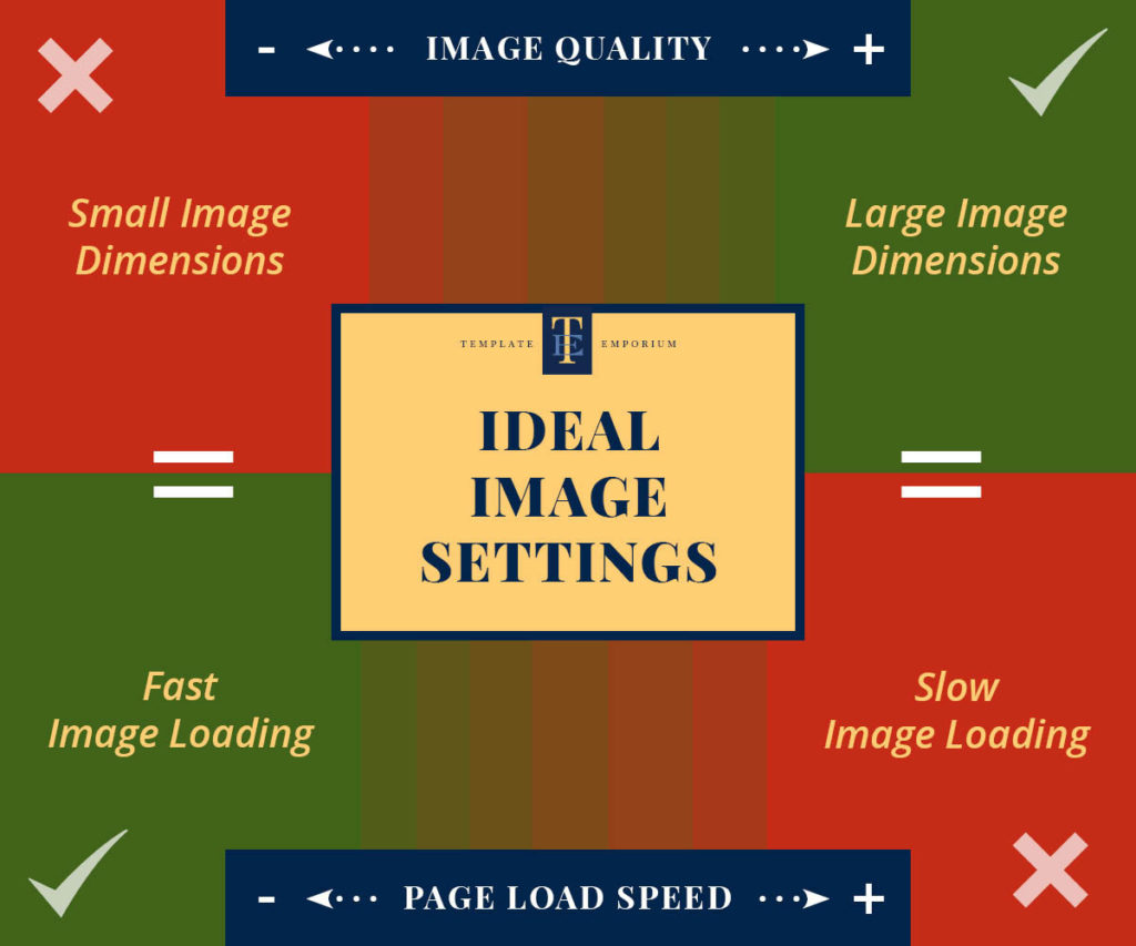
BIGGER IMAGES = Better Quality
But…
BIGGER IMAGES = Slower Page Load Speeds
And…
SLOWER PAGE LOAD SPEEDS = People getting annoyed and leaving your site!
The chart below shows the relationship between Image Dimensions & Page Load Speeds.
Basically, they are opposites – which means you have to find a middle ground.
Ideal Image Settings Tip Guide
Now you know why your images are appearing blurry or pixelated on your website, use our handy guide below to determine what your outcome needs to be before you upload your next photo.
Small to medium website images = 1.5 to 2x the size the image appears on your website.
Large Background or full-width images = 1.5x the size your image appears on your website.
How to Size Your Small to Medium Website Images
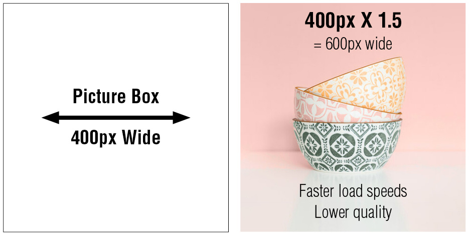
Imagine you are selling a set of patterned bowls on your website, and your template has a picture box for the image to sit in at 400px wide.
Your main aim is that the page loads fast, and you’re willing to sacrifice image quality for this to happen.
In this example, increasing your image by 1.5 times is the best option.
To work out how big your final image should be, take the size of your image that will appear on the template and multiply this by 1.5. Our calculation becomes 400px wide x 1.5 = 600px wide.
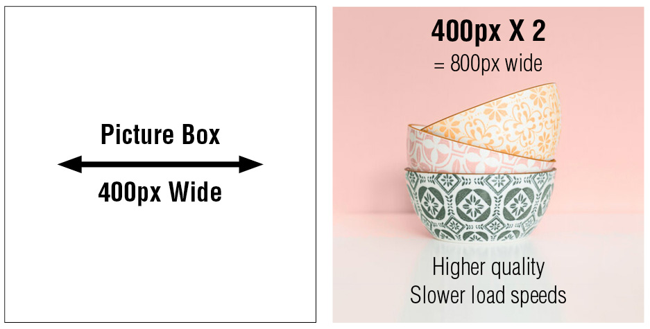
In the example below, however, we want a higher-quality image to be shown and aren’t as worried about fast load speeds.
Then increasing your image by 2 times is the best option.
Our calculation becomes 400px wide x 2 = 800px wide.
How to Size Large Background or Full-Width Images
In this example, your website template allows you to drop in a background image that sits behind your brand statement text at the top of the page.
You know lots of your clients use Macbook Laptops, so you want to make the background image appear nice and sharp for them.

Insider Tip
Background images can end up being very large in terms of dimensions and file size. This can dramatically slow down your page load speed. For this reason, we only recommend enlarging your image up to 1.5 times.
MacBook Laptop Screens at full width are around 1400px (depending on the model). So, in this case, take that size and multiply by 1.5
This works out as
1400px wide x 1.5 = 2100px wide
Note! If this is larger than the image you have. Don’t Worry – Part 2 of this blog covers how to get your images the right size.
Having perfect images means your site will look great, and you’ll stand out from your competitors – so it’s worth following a few more simple steps before you upload your images to make them sing!
You Did it!
Well, that’s a wrap on Part 1 of Picture Perfect Website Images. Be sure to keep a copy or pin our Ideal Image Setting Tip Guide and Picture Box Calculations or come back here whenever you need a refresher.
Now you know the correct size your images should be, In Part 2, we will show you the best approach to getting them looking great before you upload them to your website.
Where to Now?
Want to learn more image tips on how to avoid blurry and pixelated photos?
Then you will love Part 2 – From Blurry to Brilliant – The Top 3 Ways to Improve your Website Images Today!
We will look at automatically adjusting your image’s brightness, contrast, and colour to make them pop, as well as discovering the best settings to export them at before you upload them.
Discover all our insider tips and tricks we use to ensure the best-looking images every time. Check it out here.
Want to use your Picture Perfect images in your branding?
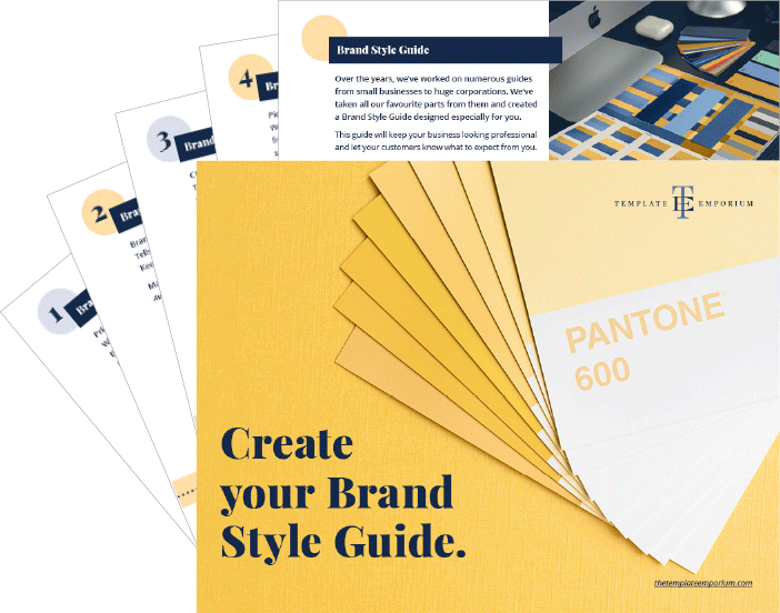
Get our FREE GUIDE – Create your Brand Style Guide.
Does your Visual Branding look consistent? If it isn’t, your customers don’t know what to expect from you. Think of this as your business blueprint. We’ll guide you through all the stages to help make your brand look (and feel) legitimate and one your customers can trust.
Like the Blog Post?
PIN IT FOR LATER. And for more helpful tips follow us on PINTEREST.

Search
Create & launch your website in a
few simple steps
FREE GUIDE
While you’re here,
grab our FREE
‘Do’s & Don’ts of what to add to your website’ Guide.
‘Do’s & Don’ts of what to add to your website’ Guide.
When you sign up, we’ll send you
emails with additional helpful content.
About Lavinia & Tom
Hi, we're so glad you found us.
We love helping creatives like you finally have the website you’ve always wanted.
Blog Categories
Follow us