grab our FREE
‘Do’s & Don’ts of what to add to your website’ Guide.
‘Do’s & Don’ts of what to add to your website’ Guide.
emails with additional helpful content.
Hi, we're so glad you found us.
We love helping creatives like you finally have the website you’ve always wanted.
few simple steps
Follow us
Inspirational Mood Board Series – Surface Pattern Designer
We are back for part 3 of our Inspirational Mood Board Series. And this time we are going to cover one of our favourite templates – Artwork and Design. (And if you are a Surface Pattern Designer, you will love this Mood Board.)
Get ready to feel inspired as we take you through the process of picking the colour palette, font combination and spectacular images for our Surface Pattern Designer Mood Board.
Before we get started, missed a part of our Mood Board Series? Catch up below.
- Our Favourite 5-step Process to Creating a Mood Board
- Destination Wedding Photographer Mood Boards
- Surface Pattern Designer Mood Boards (this is the blog you’re reading)
- Artists & Illustrator Mood Boards
- Pattern Designer Mood Boards
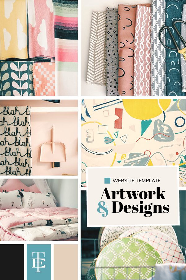
Want more Mood Board Ideas? Check out the entire collection in this blog post.
Using this process we created The Artwork & Design Mood Board, here’s how we did it.
Step 1 – Decide on an Idea
As a graphic designer, I was looking for a creative outlet away that didn’t require me to follow brand guidelines or strict deadlines. And I found exactly that when I stumbled upon Surface Pattern Design, specifically through the amazing Bonnie Christine.
I loved this creative industry and, the more I researched I found other Surface Pattern designers showing their beautiful work online. But unlike Bonnie’s fantastic website, a lot of their designs were on sites that felt clunky and lacked a professional edge.
Think of it like this. A picture (your design) sits inside a frame (the website).
You take your beautiful designs and pick a frame to house them in.
The frame should showcase your design, not distract or overpower. Instead, it should complement it.
It should make the designs the hero.
But what I found was the frame they picked was taking away from their beautiful designs.
And the frame was standing out for all the wrong reasons.
So we decided to create a website that would make the designs the hero and create harmony between the two.
Pick a Theme
A theme gives you a path to follow. It helps you decide what you should and should not include. It takes away the overwhelm of wanting to add everything and instead teaches you how to cull out what is not needed.
Our Website Template Theme: Surface Pattern Designer Mood Board
Give your Mood Board a Name
Artwork & Design
We choose Artwork & Design because we felt that encapsulated all the elements that a Surface Pattern Designer would want to show on their website.
From illustrations to patterns to paintings and sketches, from mockups to finished work, Artwork & Design fit in with each element.
Can’t think of a name? Start with WIP Mood Board (Work in Progress). Once you start building it out, the perfect name for your board will come to you.
Tagline
If you are not aware, a tagline is a short line of copy that sums up everything the Mood Board represents.
As we do with all our Mood Boards, we like to think of three words that best sum up the board.
Our 3 words: Creative, Colourful, Patterned
Our Tagline: Bold, Patterned Artwork & Design for everyday products
For every font, colour or photo you even think about adding to your Mood Board, check in with your three words and Tagline first.
They don’t have to match every one of your three words. If it represents at least one word, then add it on.
And, if it has an overall feeling of all three, even better!
Step 2 – Finalise the Format
You have your idea and theme decided upon and, now you get to pick how to show the inspiration you have collected.
For our Surface Pattern Designer Mood Board, we are going to look at two ways to present it.
Physical or Digital?
We discussed in Part 1 of our series all about mood boards and in Part 2 we provided YES or NO questions to help you decide which style of board is right for you. And where to purchase them.
Here’s a refresher of what a Physical Board looks like from Haute Stock.
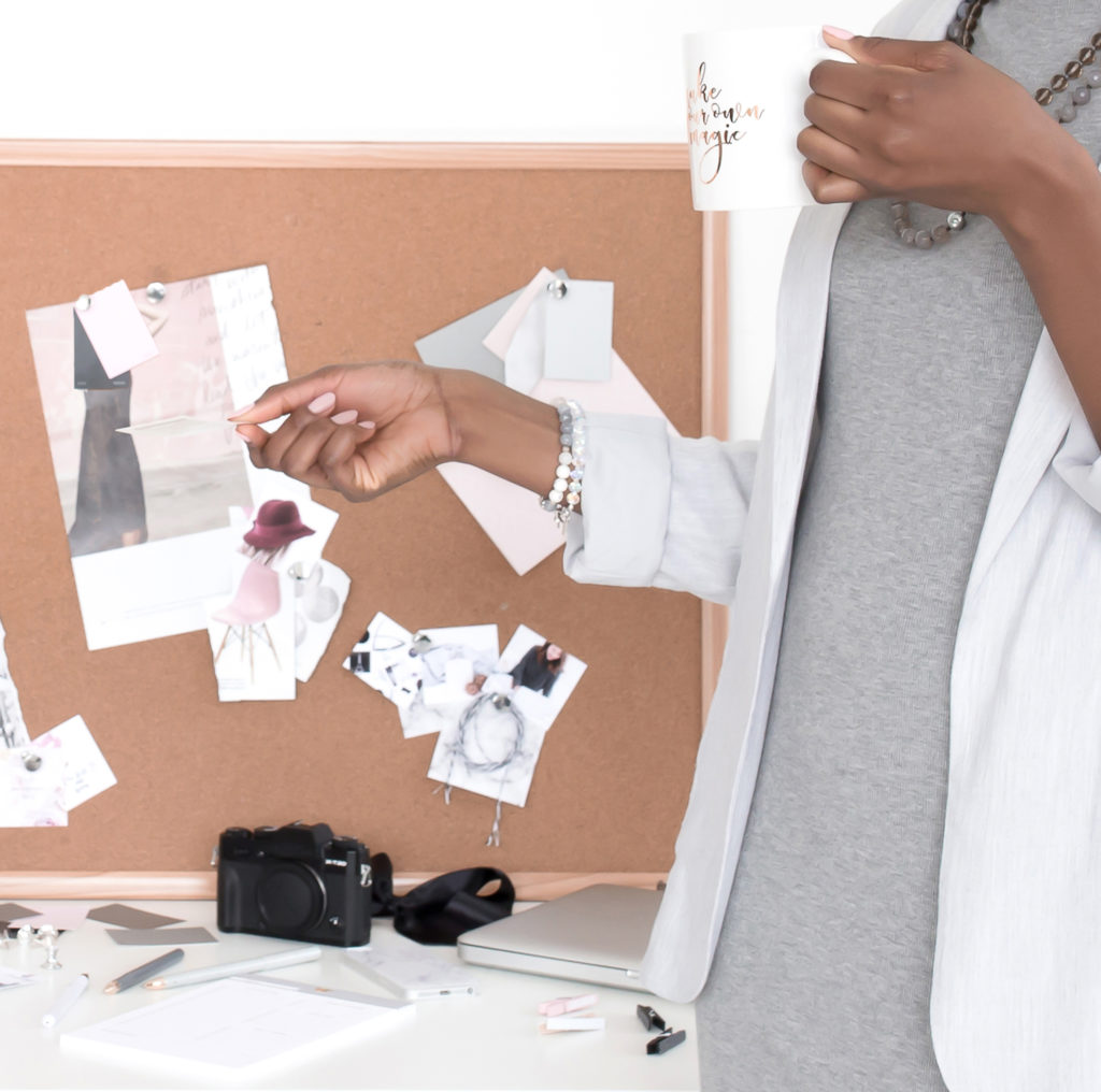
Now the fun part of creating your Board begins.
3 Senses with your 3 words
We will be focussing on Sight, Smell and Touch as these senses work best with mood boards.
Sight
If you were to look at this board, would the photos or objects you picked represent your theme, three words and tagline?
Once you have collected your inspiration, try describing what you see to someone and ask them what words come to mind.
If they use any of your three words or tagline or similar wording, then you know you have captured the feelings on your board.
Smell
Scents can be the perfect way to describe an emotion or feeling of a particular word.
La vie est belle en rose
We chose the scent of Lancome’s La Vie Est Belle En Rose because of its creative, patterned and colourful designed bottle and refreshing yet feminine everyday scent. We felt this made it a perfect match.
Insider Tip
Can’t find a perfume scent that feels like a good fit? Try a candle or familiar food that smells like popcorn or chocolate. Head outdoors with the smells of the ocean or woods. Let your imagination go wild.
Touch
Textures make a great addition to a mood board. Materials, paper or ribbons, all help to tell the story.
We included patterned material, notebook cover designs, cards and postcards.
Looking outside the box will help your mood board take you in a design direction, you may have never considered before.
Digital Mood Board
As mentioned in the other parts of this series, we always take a photo of our completed Physical Mood Board and use this as a reference if we want to create a digital version.
And, to create a Digital Mood Board, you will need Graphics Software.
As designers, we use either Indesign or Photoshop. (Which is what we used for all the mood boards in this blog post).
*For our non-designer friends, Canva is a great alternative
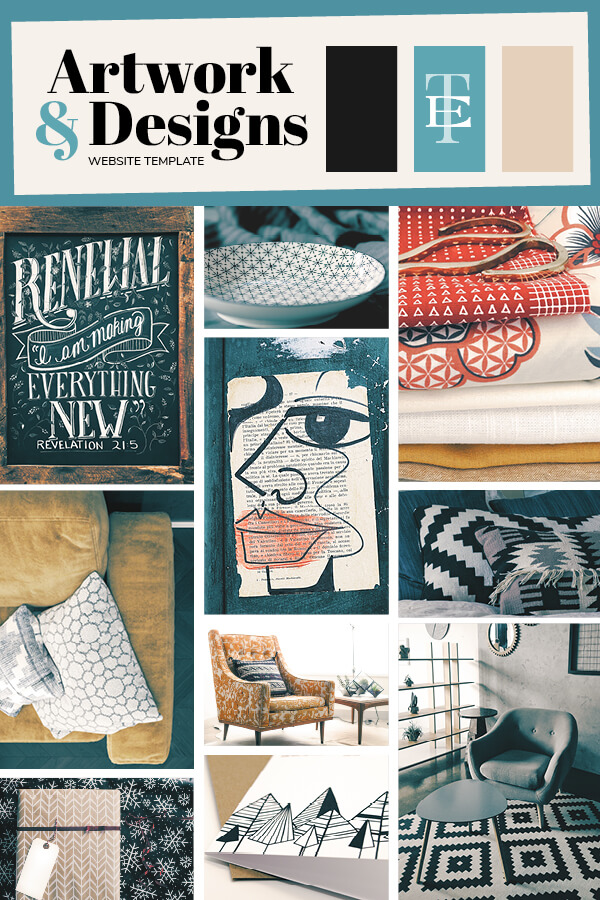
Step 3 – Pick the Photos
Now that you have created your Digital Mood Board Template and named it, it is time to start finding suitable photos to include.
Our Top 5 Free Online Resources for Photos
Step 4 – Choose Your Colours
If you are stuck as to what colours to use, start by looking at the photos, you picked. Look for:
- Similar colours
- Neutrals – such as white, cream, black or grey
- How the colours relate back to the theme of the board
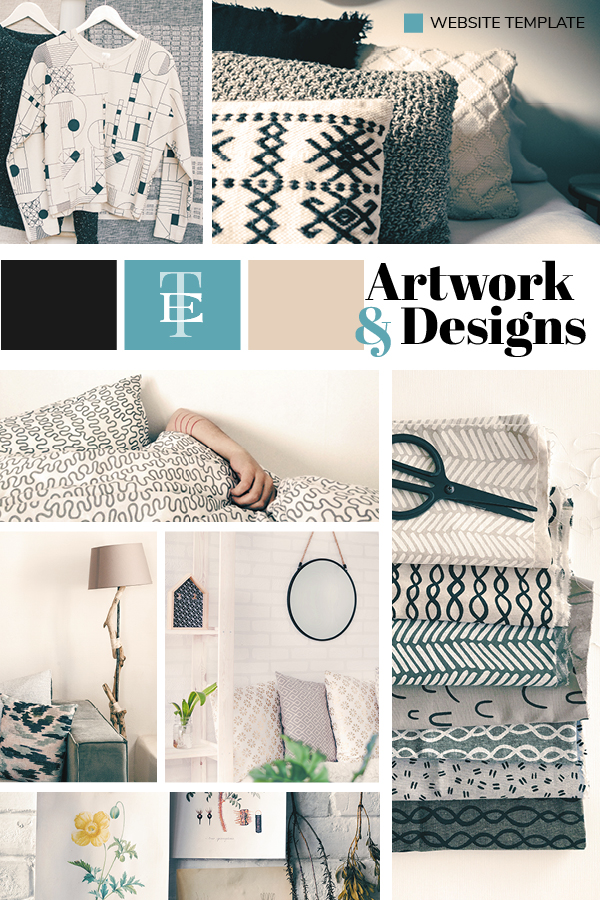
In our Artwork & Design mood board, as discussed earlier, we wanted to create a frame (website template) that showcased the designs of the artist.
And as they were going to be colourful, bold and patterned, we didn’t want to pick a colour palette that would compete for attention.
Instead, we focussed on the neutral palette and added a pop of colour that created a calming relief against the colourful and patterned designs.
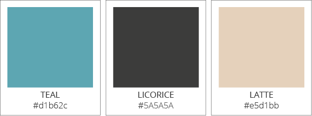
Artwork & Design Colour Palette
We pulled cream and black from our images and paired that with Teal. As we felt this cooling colour created a calming relief for your eyes between the bold patterns.
And, the neutrals, black and cream rounded off the colour palette by providing balance.
Insider Tip:
We love to give our colours unique names. With this board, we mixed traditional names with fun names relating to the feeling of the mood board.
When designing, coffee is mandatory. (Well, it is for us!) But in this case, we soften the blend to a latte to act as a beautiful background colour.
And why call it black, when you can be creative and name it Licorice?
Step 5 – Find Your Fonts
Not sure what we mean by Font Pairing? We explain the HOW WHAT & WHERE of choosing fonts for your Mood Board in Part 1 – Click here to check it out.
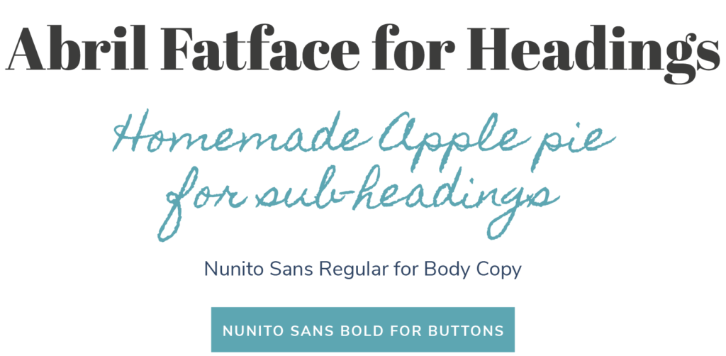
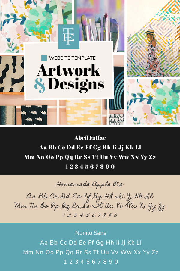
For the heading font, we wanted it to look creative yet still feel professional.
Abril Fatface was a perfect choice as it captured both those aspects with its elegant and refined look.
A lot of surface pattern designers and illustrators include hand lettering in their work and, we wanted to capture that in the sub-heading font.
Homemade Apple pie ticked all the boxes. With hand-written fonts, you have to be mindful that they can be hard to read if used in large clumps of text. As a sub-heading, it works well.
To finish it off, for the body copy and buttons we picked Nunito Sans. A clean well-balanced font.
Insider Tip:
Pick a font that is part of a family to give you more variety without having to bring in additional fonts.
Nunito Sans comes in Light, Regular, Bold and Black. And we chose regular for the body copy and bold for the buttons.
You Did it!
Well, that wraps up the Artwork & Design section for our Inspirational Mood Board Series.
Did you enjoy following along as we created our Surface Pattern Designer Mood Board?
Are you feeling inspired and ready to create your own Mood Board?
Your Action Steps:
- Decide on a Mood Board Idea – Pick a theme, name, and tagline.
- Finalise the Format – Physical or Digital? (Or both!).
- Pick the Photos – Try a free online resource from our list.
- Choose your Colours – Pull out colours from your chosen photos.
- Find your Fonts – Do your fonts match your theme?
Where to next?
Part 1 – Elegant Weddings Photographer Edition – Let’s See It
Part 2 – Destination Wedding Photographer Edition – Take Me There
See how this Mood Board turned into a Website Template – Check it Out
Want more insider tips?
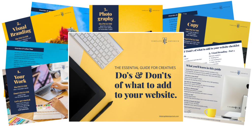
Grab our FREE Essential Guide for Creatives. “Do’s & Don’ts of what to add to your website”. We give you a simple plan to follow so that you’ll never have to question what to show online again.
Like this Blog Post?
PIN IT FOR LATER. And for more helpful tips follow us on PINTEREST.
Search
Create & launch your website in a
few simple steps
FREE GUIDE
While you’re here,
grab our FREE
‘Do’s & Don’ts of what to add to your website’ Guide.
‘Do’s & Don’ts of what to add to your website’ Guide.
When you sign up, we’ll send you
emails with additional helpful content.
About Lavinia & Tom
Hi, we're so glad you found us.
We love helping creatives like you finally have the website you’ve always wanted.
Blog Categories
Follow us