grab our FREE
‘Do’s & Don’ts of what to add to your website’ Guide.
‘Do’s & Don’ts of what to add to your website’ Guide.
emails with additional helpful content.
Hi, we're so glad you found us.
We love helping creatives like you finally have the website you’ve always wanted.
few simple steps
Follow us
Inspirational Mood Board Series – Pattern Designer
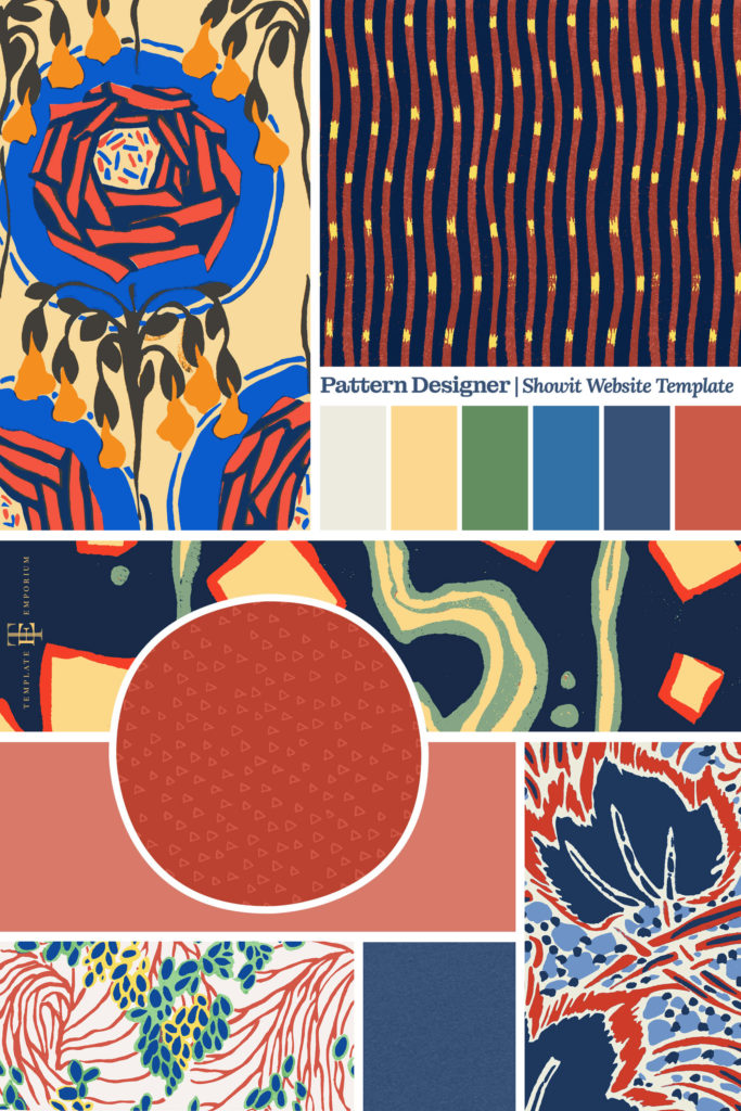
Now that our latest Pattern Designer Showit Template has launched, we want to take you on a behind the scenes tour of how we created this Place for your Patterns using our Pattern Designer Mood Board.
We’ll begin with the initial idea and then move to the concept stage and finally take you through the entire design process using our favourite method – mood boards. Welcome to Part 5 of our Inspirational Mood Board Series – Pattern Designer Edition.
Before we get started, missed a part of our Mood Board Series? Catch up below.
- Our Favourite 5-step Process to Creating a Mood Board
- Destination Wedding Photographer Mood Boards
- Surface Pattern Designer Mood Boards
- Artists & Illustrator Mood Boards
- Pattern Designer Mood Boards (this is the blog you’re reading)
Pattern Designer Mood Board – Collection
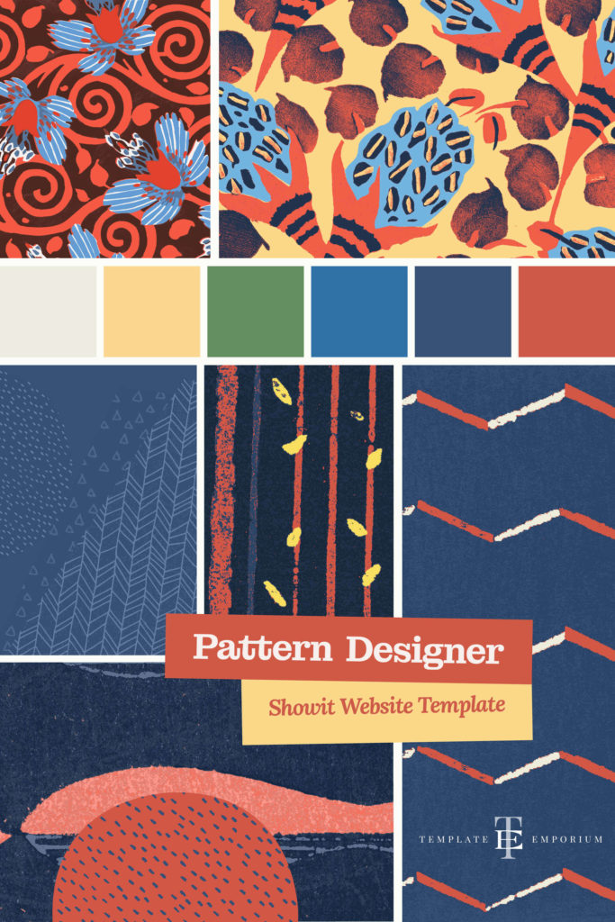
In creating this mood board set, we knew we wanted it to reflect the creative Artists, illustrators & Surface Pattern Designers.
We know that every artist and designer is different and doesn’t fit into the same box. The trouble with most website templates is that they follow the same restrictive boxy look. Not with our design. Our website template is as unique as the artist’s work.
Index
• Step 1 – Decide on an Idea
– Pick a Theme
– Give your Mood Board a name
– Tagline
• Step 2 – Finalise the Format
– Physical or Digital?
– 3 Senses with your 3 Words
• Step 3 – Pick the Photos
– Free resources or your own
• Step 4 – Choose your Colours
– Tips on choosing Colours
– Pattern Designer Colour Palette
• Step 5 – Find Your Fonts
– Font Pairing
– Heading & Body Copy Fonts
Using our time and tested 5-step process, we’ll take you through all the steps from ideas to choosing the colours, fonts and overall feel for our Pattern Designer Mood Board.
Pattern Designer Mood Board
Step 1 – Decide on an Idea
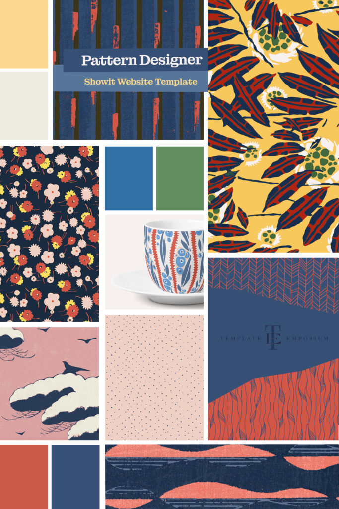
With this template design, we wanted to take a more organic approach. We incorporated a paper texture style by gathering inspiration from print magazines and books.
The organic feel also extended out to textures we included throughout the site. We believe this is something that has been missing from templates for creatives.
We wanted to break away from the common square, boxy look. And instead, create a website that looks as unique as the designer’s work.
Pick a Theme
A theme allows you to stay on track and gives you guidelines to follow when deciding what to add to your mood board.
Our Website Template Theme: Pattern Design for Artists, Illustrators & Surface Pattern Designer Mood Board.
Give your Mood Board a Name
We picked Pattern Designer as the name of our mood board because it tied in with our initial idea of a place for your patterns. Not only does do you know straight away what the mood board is all about, but it’s short enough to remember.
Tagline
As discussed throughout this series, a tagline is a short line of copy that sums up everything the Mood Board represents.
Our three words: Patterns, organic, textures
Our Tagline: A Place for your Patterns
If you’re stuck for ideas, think of three words that help sum up what the board represents. Use these words when choosing colours, images & photos.
Pattern Designer Mood Board Collection
Pattern Designer Mood Board
Step 2 – Finalise the Formal
Coming up with an Idea and Theme takes time so congratulate yourself for getting this far. The next step in this 5-step process is deciding how you will display everything by bringing it together in an organised collection.
Physical or Digital
A mood board can be either a physical board such as a corkboard or displayed in digital format.
If you need a refresher on Physical boards, head back to Parts 1 & 2, where we take a deep dive and include examples, images and insider tips.
To create a Digital Mood Board, you will need Graphics Software.
As designers, we use either Indesign or Photoshop. (Which is what we used for the mood boards in this blog post).
*For our non-designer friends, Canva is a great alternative.
Insider Tip
When creating a digital mood board, it’s easy to forget about anything other than the visual content you want to include. But in this case, think about sight, smell and touch, as these three work best with mood boards.
3 Senses with your 3 Words
Sight
Think back to the three words you picked to represent your Mood Board and the tagline. We chose Patterns, organic, textures.
If you look at the images and photos you have collected, do they match your words?
If you’re unsure, describe them to a friend and ask them to tell you the first three words that come to them. Does their answer match or resemble your words? If yes, great, you’re on the right track. If not, keep workshopping.
Smell
We know “smell” on a digital mood board seems a strange thing to include, but “smell” is so powerful as it helps conquer up feelings, images and thoughts faster than any image. Some examples could include:
A favourite perfume, candle, or food is a great place to start. And to fully immerse you – Scratch ‘n’ Sniff stickers circa the 1980s (you know the ones I mean!).
Using our words, we felt it represented smells of pine and forests and walking through nature came to mind. So we burnt a candle we all these smells as we designed it.
Touch
Textures are tactile and help put you immerse yourself into your mood board.
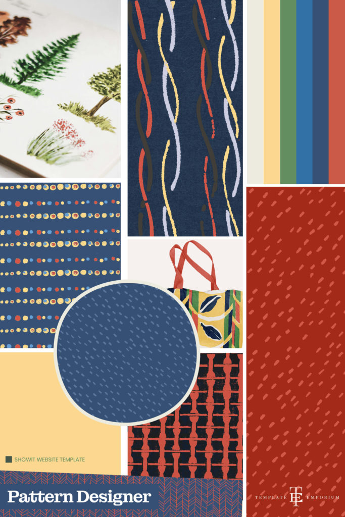
We included different thicknesses and textures of loose pieces of paper and collected magazines that focussed on quality using either hand-made or unique types of paper rather than a mass-produced option.
Pattern Designer Mood Board Collection
Pattern Designer Mood Board
Step 3 – Pick the Photos
Now that you have created your Digital Mood Board Template and named it, it is time to start finding suitable photos to include.
Free Resources or your own?
Using our tagline as our guide – A Place for your Patterns, we wanted to create a collection of patterns that complimented each other. To achieve this, we used public domain patterns from rawpixels.
If you’re a designer, photographer, or another form of creative, you’re already ahead of the game as you can source images from your collection.
But, if you need other photo resources, we always recommend Unsplash, Pexels and rawpixels.
Pattern Designer Mood Board
Step 4 – Choose Your Colours
Pattern Designer Mood Board Collection
Tips on Choosing Colours
A great place to start is looking at the photos or images you have collected.
Is there a particular colour or colours that are standing out? If so, note these colours down and start building on them.
We choose our colours by scanning physical pieces of paper from our findings and sampling the colours from them.
The final result was a collection of colours that expressed a far more organic feel. And the tints, tones and shades that we uncovered were nothing we could have imagined or created ourselves by following a digital route.

Pattern Designer Mood Board
Step 5 – Find Your Fonts
Font Pairing
Not sure what we mean by Font Pairing? We explain the HOW WHAT & WHERE of choosing fonts for your Mood Board in Part 1 – Click here to check it out.

Heading Font
When choosing our fonts, we wanted a collection that had an organic, humanist feel.
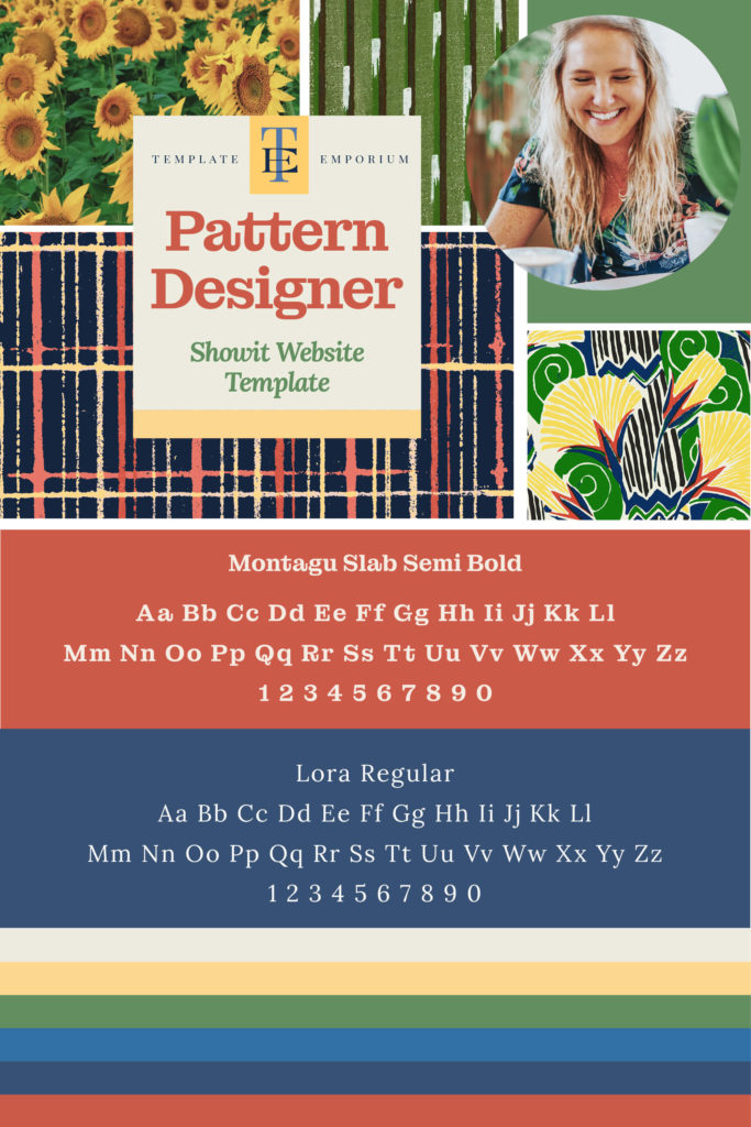
Montagu Slab Semi Bold font was a perfect choice. Its curved and friendly edges represented everything we wanted to capture in a font. It felt approachable and non-digital.
Body Copy Font
Lora Regular complimented Montagu perfectly. It was easy to read, flowed well and felt loose and organic.
Insider Tip
We always recommend starting with Google Fonts when searching for a font. Look for a font that is part of a Font Family. This gives you more variety in ways of Light, Regular, Bold and Black without having to bring in additional fonts.
You Did it!
That’s a wrap on Part 5 of our Inspirational Mood Board Series – Pattern Designer.
Now it’s your turn to create a Mood Board. Simply follow the step below and get creating.
- Decide on a Mood Board Idea – Pick a theme, name, and tagline.
- Finalise the Format – Physical or Digital? (Or both!).
- Pick the Photos – Try a free online resource from our list.
- Choose your Colours – Pull out colours from your chosen photos.
- Find your Fonts – Do your fonts match your theme?
Where to Now?
- Check out our Artwork & Designs Mood Board here.
- If you’re an Artist or Illustrator Milla is perfect for you.
- Want to discover more about Mood Boards? Find it here.
Want more insider tips?
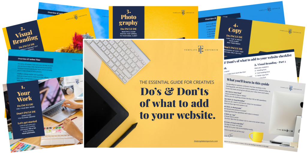
Grab our FREE Essential Guide for Creatives. “Do’s & Don’ts of what to add to your website”. We give you a simple plan to follow so that you’ll never have to question what to show online again.
Like this Blog Post?
PIN IT FOR LATER. And for more helpful tips follow us on PINTEREST.
Search
Create & launch your website in a
few simple steps
FREE GUIDE
While you’re here,
grab our FREE
‘Do’s & Don’ts of what to add to your website’ Guide.
‘Do’s & Don’ts of what to add to your website’ Guide.
When you sign up, we’ll send you
emails with additional helpful content.
About Lavinia & Tom
Hi, we're so glad you found us.
We love helping creatives like you finally have the website you’ve always wanted.
Blog Categories
Follow us