grab our FREE
‘Do’s & Don’ts of what to add to your website’ Guide.
‘Do’s & Don’ts of what to add to your website’ Guide.
emails with additional helpful content.
Hi, we're so glad you found us.
We love helping creatives like you finally have the website you’ve always wanted.
few simple steps
Follow us
Inspirational Mood Board Series – Artists and Illustrators
We want to take you behind the scenes leading up to the launch of our latest Showit Website Template – Milla. And, the perfect place to start is with our Artist and Illustrator Mood Board. That’s right. We are back for Part 4 of our Inspirational Mood Board Series – Artists and Illustrator Edition.
You’ll discover our exact process from picking images to choosing a colour palette, font pairing and everything in-between. All these steps help form a mood board that not only inspires but results in a design that captures exactly what your client was after.
Before we get started, missed a part of our Mood Board Series? Catch up below.
- Our Favourite 5-step Process to Creating a Mood Board
- Destination Wedding Photographer Mood Boards
- Surface Pattern Designer Mood Boards
- Artist & Illustrators Modd Boards (this is the blog you’re reading)
- Pattern Designer Mood Boards
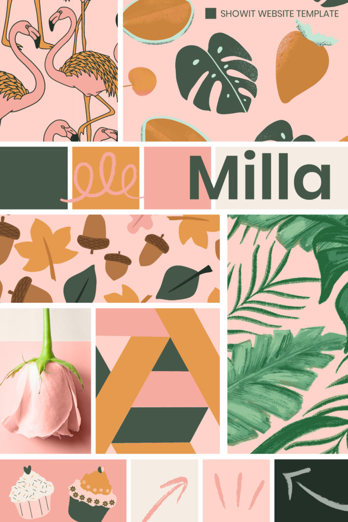
Check out the Artist and Illustrator Mood Board Collection above. Pin your favourite or pin them all!
Artist and Illustrator Mood Board – Collection
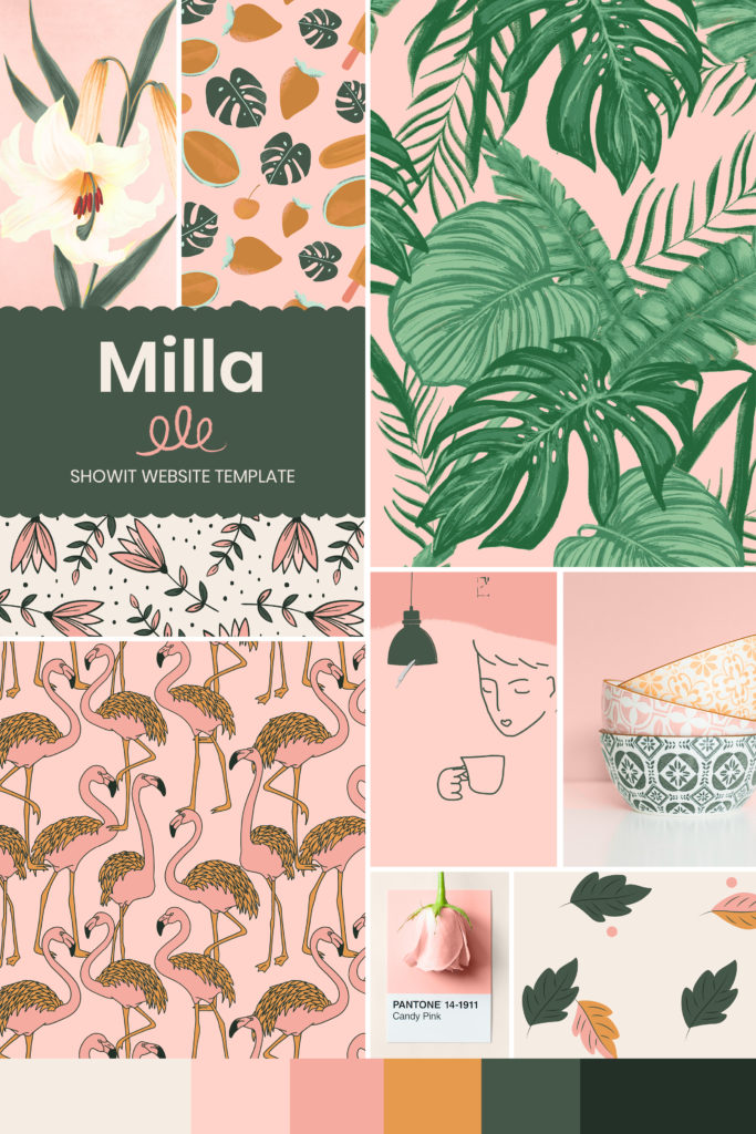
This fun and vibrant Milla mood board set would have to be our favourite one we have created. We not only included one but five mood boards.
We love using mood boards as inspiration, and we hope that something within our boards will spark inspiration within you. Here’s how you can do it.
Index
• Step 1 – Decide on an Idea
– Pick a Theme
– Give your Mood Board a name
– Tagline
• Step 2 – Finalise the Format
– Physical or Digital?
– 3 Senses with your 3 Words
• Step 3 – Pick the Photos
– Free resources or your own
• Step 4 – Choose your Colours
– Tips on choosing Colours
– Milla Colour Palette
• Step 5 – Find Your Fonts
– Font Pairing
– Heading & Body Copy Fonts
Artist and Illustrator Mood Board
Step 1 – Decide on an Idea
After listening and talking to numerous creatives, the same issue kept coming up. How could they incorporate their work and the look and feel of their branding into their website? We knew exactly what direction to take and, here’s how we did it.
Pick a Theme
We love using a theme in everything we create. It’s similar if you receive an invitation to a party. Imagine it said 80s fancy dress. (My favourite type of party!) Now you know what to expect. You know what you need to wear, what it could involve, and the overall look and feel of the night.
A theme gives you direction and a path to follow and, that’s why it’s so important to have one for your mood board.
Our Website Template Theme: Artists, Illustrators & Surface Pattern Designer Mood Board
Give your Mood Board a Name
We choose Milla as the name of our Mood Board. It felt like a short, sweet and catchy name. Being short always makes it easier to refer to it or for people to remember it. And this is exactly what we wanted as we also used it for the name of our website template.
Tagline
As we have discussed throughout this series, a tagline is a short line of copy that sums up everything the Mood Board represents.
As we do with all our Mood Boards, we like to think of three words that best sum up the board.
Our 3 words: Fun, Colourful, Vibrant
Our Tagline: Fun and bold patterns that bring your products to life
Before you add anything to the board, use these three words for picking every font, colour or photo.
They can include one or all three (the choice is yours). As long as it passes at least one, then add it to the board.
Artist and Illustrator Mood Board Collection
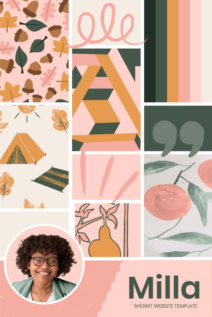
Artist and Illustrator Mood Board
Step 2 – Finalise the Format
Now you know your idea and theme. The next step is how you will display everything together.
Physical or Digital
We discussed in Part 1 of our series all about mood boards and in Part 2 we provided YES or NO questions to help you decide which style of board is right for you. And where to purchase them.
The majority of the boards we create are digital. But we also incorporate physical elements into it using the 3 Senese with your 3 words tips below.
To create a Digital Mood Board, you will need Graphics Software.
As designers, we use either Indesign or Photoshop. (Which is what we used for the mood boards in this blog post).
*For our non-designer friends, Canva is a great alternative.
3 Senses with your 3 words
Sight, Smell and Touch will be the senses we will concentrate on as they work best with mood boards.
If you have a physical board you could attach them and with a digital one, we often keep them by our desk when creating the mood board for inspiration.
Sight
Think back to the three words you picked to represent your Mood Board and the tagline. If you look at the images and photos you have collected are they are perfect match?
A quick way to test this is to describe the images to someone and ask them what words come to mind.
The words don’t have to be the exact ones you picked. But, if they are generally similar, then great you are on the right track.
Smell
Smell? On a mood board? Yes, it’s our insider tip to capturing a mood or feeling, unlike anything a photo can do.
You could pick a perfume scent to a favourite food that brings back memories. Now you’re aware of how scents impact us, your nose will be ready to choose the perfect one for each mood board you create.
We picked the candle Magic Candle Company Churro for our mood board.
The warmth in the colour of our mood board reminded us of the cinnamon and sugar aroma. And something as magical as a Churro makes you feel happy and puts a smile on your face, and that’s how we wanted this mood board to feel.
Touch
Textures make a great addition to a mood board. Materials, paper and ribbons, all help to tell the story.
Whenever you are out, collect advertising material, postcards, labels, business cards or packaging that you like and store it in an inspiration box. Before you create your mood board, go through it and see if anything jumps out to you that could inspire an idea you never considered before.
Insider Tip
If your smell inspiration was a candle, burn it while you create your mood board. If it was perfume, spray it on you or around you. You will suddenly be transported to a time and place the smell reminds you of that inspiration.
Artist and Illustrator Mood Board Collection
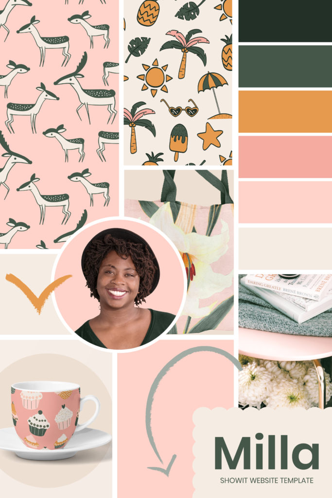
Artist and Illustrator Mood Board
Step 3 – Pick the Photos
Now that you have created your Digital Mood Board Template and named it, it is time to start finding suitable photos to include.
Free resources or your own?
As an artist, illustrator or designer, you have an advantage in that you can include your work in your mood boards. Look through old and new pieces and add the ones that inspire you.
If instead, you choose to use free photo site resources, we have found that you need to search and search (and search some more) for the image that will make it to your board.
No one free photo site will provide everything you need. But by trying out different sites, you often come across images you may have never thought of before.
For the boards in this blog, we used photos and images from Unsplash, Pexels and rawpixels.
Artist and Illustrator Mood Board
Step 4 – Choose Your Colours
Artist and Illustrator Mood Board Collection
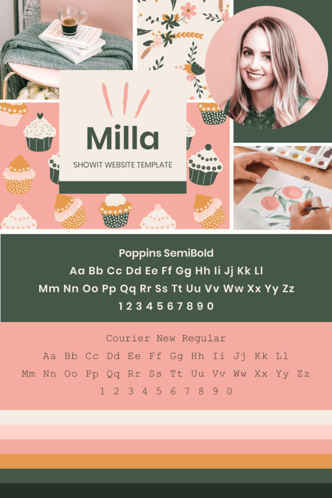
Tips on Choosing Colours
You may already have an idea of what colours you want to use. If not, look at the ones you picked and consider the following:
- Similar colours
- Neutrals – such as white, create, black or grey
- How the colours relate back to the theme of the board
For our board, we already had a colour scheme in mind – Pink and Green. From there, we choose different tints, tones and shades of the colour. Then we colour corrected the images to match our colour palette.
If Photo Enhancement is something you would like done, we offer that service here.
Milla Colour Palette
Starting with Pink and Green, we incorporated light and dark neutral.
From there, we introduced another colour (Mustard). Yellow and Green are what’s known as Analogous Colours (side-by-side on the colour wheel). That’s why this colour combination works so well.
The undertones of these colours coney a low-contrast, friendly harmonious mood and appear easier on the eye.

Artist and Illustrator Mood Board
Step 5 – Find Your Fonts
Font Pairing
Not sure what we mean by Font Pairing? We explain the HOW WHAT & WHERE of choosing fonts for your Mood Board in Part 1 – Click here to check it out.

Heading Font
We picked Poppins SemiBold. This playful font had a human feel to it, and the overall look was more creative than corporate. It also looked as though it had been hand created by an Artist’s lower case writing. And that was exactly the look we were trying to achieve.
Body Copy Font
For this, we chose Courier New. This classic font oozed old school charm. It felt less digital and more organic, as though written by an old typewriter. And we imagined that is what an artist would want to express in their website design.
Insider Tip
The first place we always start when looking for fonts is Google Fonts. That’s where we found Poppins.
Look for a font that is part of a Font Family. This gives you more variety in ways of Light, Regular, Bold and Black without having to bring in additional fonts.
Conclusion
Well, that’s a wrap on Part 4 of our Inspirational Mood Board Series – Artist & Illustrators edition.
Are you feeling inspired and ready to create your own Mood Board? Follow the steps below and have fun!
- Decide on a Mood Board Idea – Pick a theme, name, and tagline.
- Finalise the Format – Physical or Digital? (Or both!).
- Pick the Photos – Try a free online resource from our list.
- Choose your Colours – Pull out colours from your chosen photos.
- Find your Fonts – Do your fonts match your theme?
Where to Now?
- Need more inspiration? Visit our Surface Pattern Designer Mood Board – Here!
- Discover our favourite 5-step process to Creating a Mood Board – Here!
- Want some Island Wedding Mood Board Inspiration? Head over here.
Want more insider tips?
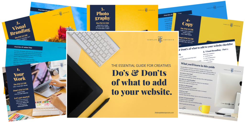
Grab our FREE Essential Guide for Creatives. “Do’s & Don’ts of what to add to your website”. We give you a simple plan to follow so that you’ll never have to question what to show online again.
Like this Blog Post?
PIN IT FOR LATER. And for more helpful tips follow us on PINTEREST.
Search
Create & launch your website in a
few simple steps
FREE GUIDE
While you’re here,
grab our FREE
‘Do’s & Don’ts of what to add to your website’ Guide.
‘Do’s & Don’ts of what to add to your website’ Guide.
When you sign up, we’ll send you
emails with additional helpful content.
About Lavinia & Tom
Hi, we're so glad you found us.
We love helping creatives like you finally have the website you’ve always wanted.
Blog Categories
Follow us