grab our FREE
‘Do’s & Don’ts of what to add to your website’ Guide.
‘Do’s & Don’ts of what to add to your website’ Guide.
emails with additional helpful content.
Hi, we're so glad you found us.
We love helping creatives like you finally have the website you’ve always wanted.
few simple steps
Follow us
Insider Type Tips for Your Website
Did you know the way type looks and is laid out on a website is often one of the most forgotten parts? That’s why we’re sharing all our Insider Type Tips to ensure your website doesn’t fall into this trap.
Our Website Type Tips will also help improve the design, readability and overall look. Ready to find out what they are?
Type Tips for Your Website
Hyphens & Dashes
When writing copy for your website, there are two things often neglected, hyphens and dashes.
But this is often due to the uncertainty of when and how to use them.
So after spending years working as a graphic designer in the media industry, I’ve gathered all my insider tips from journalists and sub-editors and broken down this complicated subject into bite-sized pieces to make it easier to understand.
Hyphens –
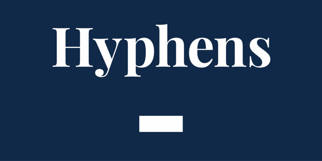
These are the shortest mark of our three examples.
Hyphens look like this –
This invaluable aid helps make the meaning of a word more straightforward.
They break long words into smaller parts (such as the examples in the paragraph above).
Hyphens also allow you to join many words into one, E.g. award-winning or no-holds-barred.
En dash –
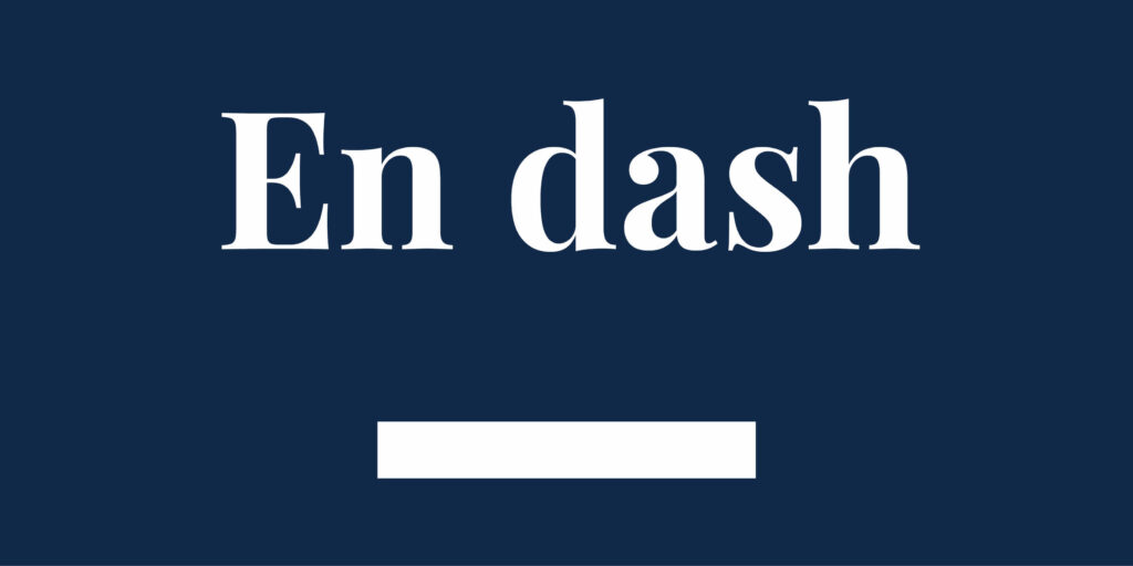
A dash equal to the width of a lowercase letter ‘n’.
An En dash looks like this –
It’s longer than a hyphen but shorter than an Em dash.
Instead of writing the word through, use an En dash to connect time, numbers or distance.
For example, Monday–Friday, 9–5 pm, Sydney–LA.
Here’s the keyboard shortcut: MAC: option (alt) + hyphen key.
Em dash —

A dash equal to the width of an upper case letter ‘M’.
It’s twice as long as an En dash.
It creates a sudden or strong break in a sentence or for emphasis.
For example, Since opening her business, Jade wanted one thing — customers.
Here’s the keyboard shortcut: MAC: option (alt) + shift + hyphen key
Type Tips for Your Website
The Secret to Using Hierarchy in Type
When you place type on your website, the key is to use hierarchy.
Your goal is to help your readers look at what’s most important first, then guide them through the path you want them to take.
Insider Tip
Look at what you have created as a stranger who has never seen it before.
Stand back from your computer screen and blur your vision. What do you notice first? What stands out after that?
Type Tips for Your Website
How to create a Type Hierarchy

Create Type hierarchy by using different:
- Sizes
- Weights
- Widths
- Typefaces
- Colours
Type Hierarchy Order
Heading
At the top of the hierarchy is your most important information, for example, a Heading or Headline.
Make this big and bold. So it stands out and draws your reader in.
Subheading
Important information comes after the heading, such as a subheading.
Make this a different size and weight to distinguish between the two.
Body Copy
The hierarchy ends with the essential details. The size and weight of this copy will be the smallest, yet still legible to read.
Following this type of Hierarchy Order means your reader knows where to look to gather the information they need.
Type Tips for Your Website
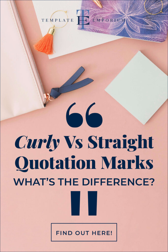
Curly vs. straight Quotation marks – what’s the difference?
Using oversized quotation marks in your designs or on your website is a fun & creative way to make a quote or testimonial stand out.
But, before you start, ensure you pick the correct marks for what you’re trying to convey.
Curly Quotation Marks
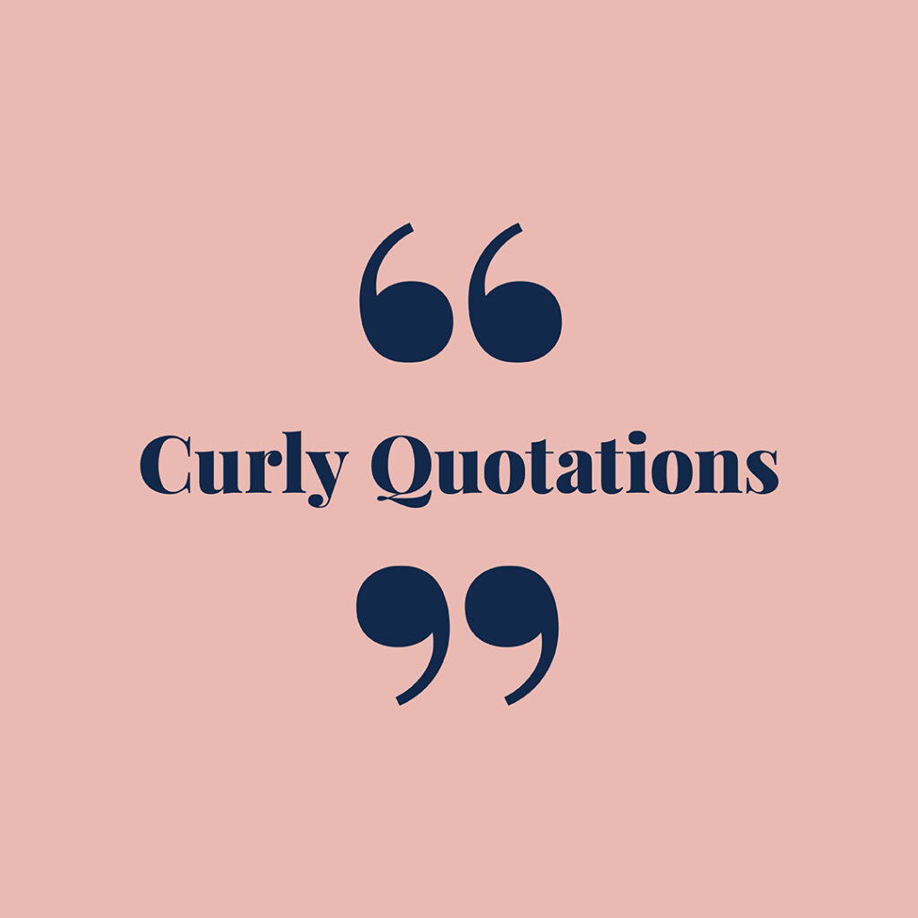
Double quotation marks are used to show someone is speaking.
Visually, they look similar to the numbers 66 & 99.
The opening quotation mark looks like 66.
And the closing quotation mark is the one similar to 99.
Straight Quotation Marks
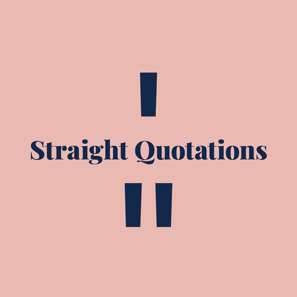
They are also known as Hash & Prime Marks.
Use these for measurements, not for quotes.
A single one = feet.
A double one = inches.
You Did it!
That’s a wrap on Insider Type Tips for Your Website. In this blog, we covered Hyphens and dashes (and the intricate ways to tell them apart), the secret to creating a Type Hierarchy and finished with Curly vs. straight Quotation marks, including when to use one over the other. Until next time, Follow us on Pinterest for more blog posts like this.
Use these Type Tips to create your perfect brand style guide.
If you liked the tips in this blog post, you’ll love the tips we share in our Brand Style Guide. Think of this as your business blueprint. Plus, you’ll finally learn the secret to keep your Visual Branding look consistent. Click the image below.
Where to now?
- Are you tired of running out of Creative Ideas?
- Seven Classic Fonts guaranteed never to go out of style.
- Three Type Terms that you need to know (& want to avoid using)
Like the Blog Post?
PIN IT FOR LATER. And for more helpful tips follow us on PINTEREST.
Search
Create & launch your website in a
few simple steps
FREE GUIDE
While you’re here,
grab our FREE
‘Do’s & Don’ts of what to add to your website’ Guide.
‘Do’s & Don’ts of what to add to your website’ Guide.
When you sign up, we’ll send you
emails with additional helpful content.
About Lavinia & Tom
Hi, we're so glad you found us.
We love helping creatives like you finally have the website you’ve always wanted.
Blog Categories
Follow us