grab our FREE
‘Do’s & Don’ts of what to add to your website’ Guide.
‘Do’s & Don’ts of what to add to your website’ Guide.
emails with additional helpful content.
Hi, we're so glad you found us.
We love helping creatives like you finally have the website you’ve always wanted.
few simple steps
Follow us
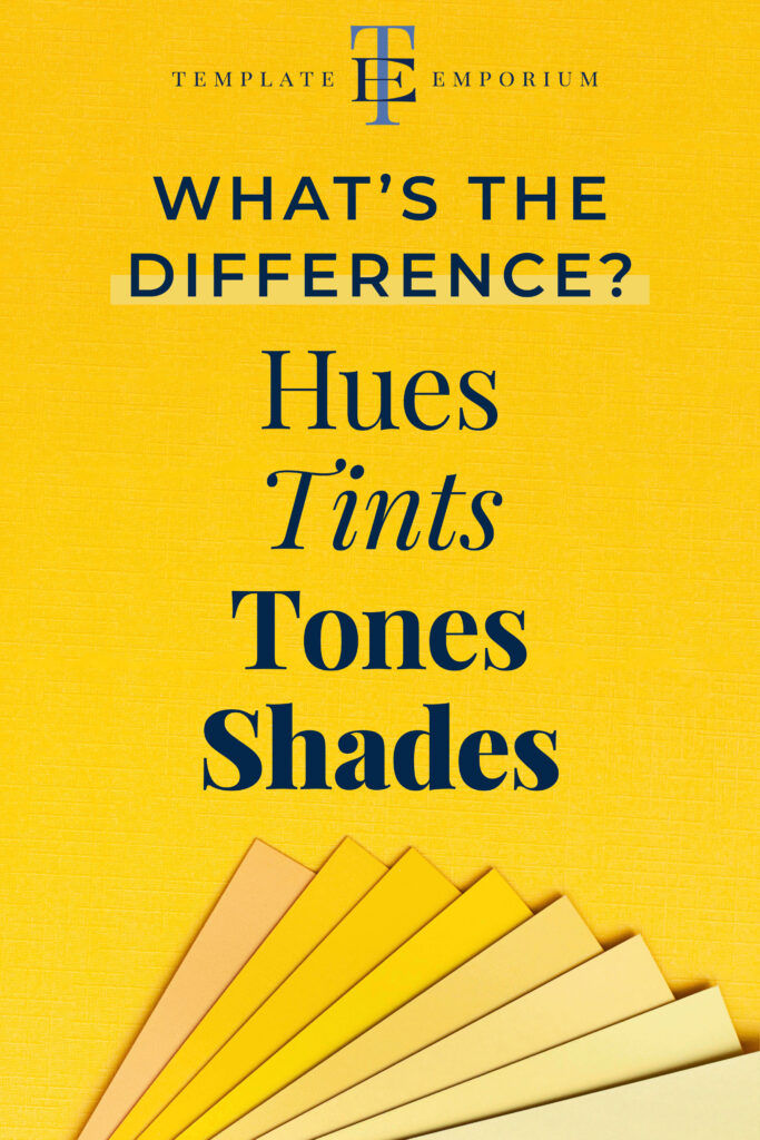
Hues, Tints, Tones & Shades – What’s the difference?
Are you confused about all the different colour terms? Hues, tints, tones & shades are frequently used to create beautiful and visually appealing pieces. But what sets each apart from the other?
In this blog, we share a simple way to easily remember the differences and dive into the distinctive characteristics of each one.
Plus, we’ll explore how to use them to create rich and dynamic visuals. So, if you’re ready to take your colour game to the next level, keep reading!
Before we start – missed a part of our Colour Tips Series? Catchup up below.
- How to Use Harmonious Colour Combinations in Your Designs
- The number one Printing Tip you need to know
- Our Top Four Free Colour Generator Sites
INDEX
- The surprising differences between Hues, Tints, Tones & Shades
- The simple way to remember the differences
- Understanding Hues
- The Functionality of Tints
- The Importance of Tone
- Understanding their differences
The surprising differences between Hues, Tints, Tones & Shades
Artists and designers use colour to speak directly to our emotions and senses. From a simple splash of red to a cool blue gradient, different colours can evoke different feelings and set the tone for any creative work.
But how do hues, tints, tones and shades fit into this process?
As a Creative, mastering the differences between these terms is essential to understanding the art of colour design and creating beautiful colour palettes for your work.
The simple way to remember the differences
- Hue = is the actual colour.
- Tints = hue mixed with white.
- Tones = hue mixed with grey.
- Shades – hue mixed with black.
By understanding the differences and uses of these four terms, you can begin creating more cohesive and engaging designs.
You’ll also be able to manipulate and mix colours with intention and purpose and create compelling colour stories in your work.
Hues
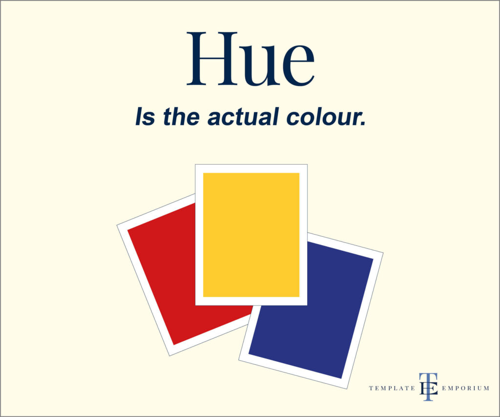
Hue = is the actual colour.
Understand Hues
When learning design terms, you may not be familiar with certain words, such as HUE. It’s the feeling of unknowing which makes you feel confused. But don’t worry. We’re here to help and explain everything.
Broken down plainly, Hue means colour.
Think of Hues as the building blocks of colour. They are the purest forms of colour that appear on the colour wheel.
Sometimes they are called “pure hue” because no white, black or grey is added.
They include the primary colours of red, blue and yellow, as well as their secondary and tertiary variations.
Insider Tip
Use complimentary or analogous hues to create a harmonious and visually compelling design. This combination will also draw the eye and demand attention!
Tints
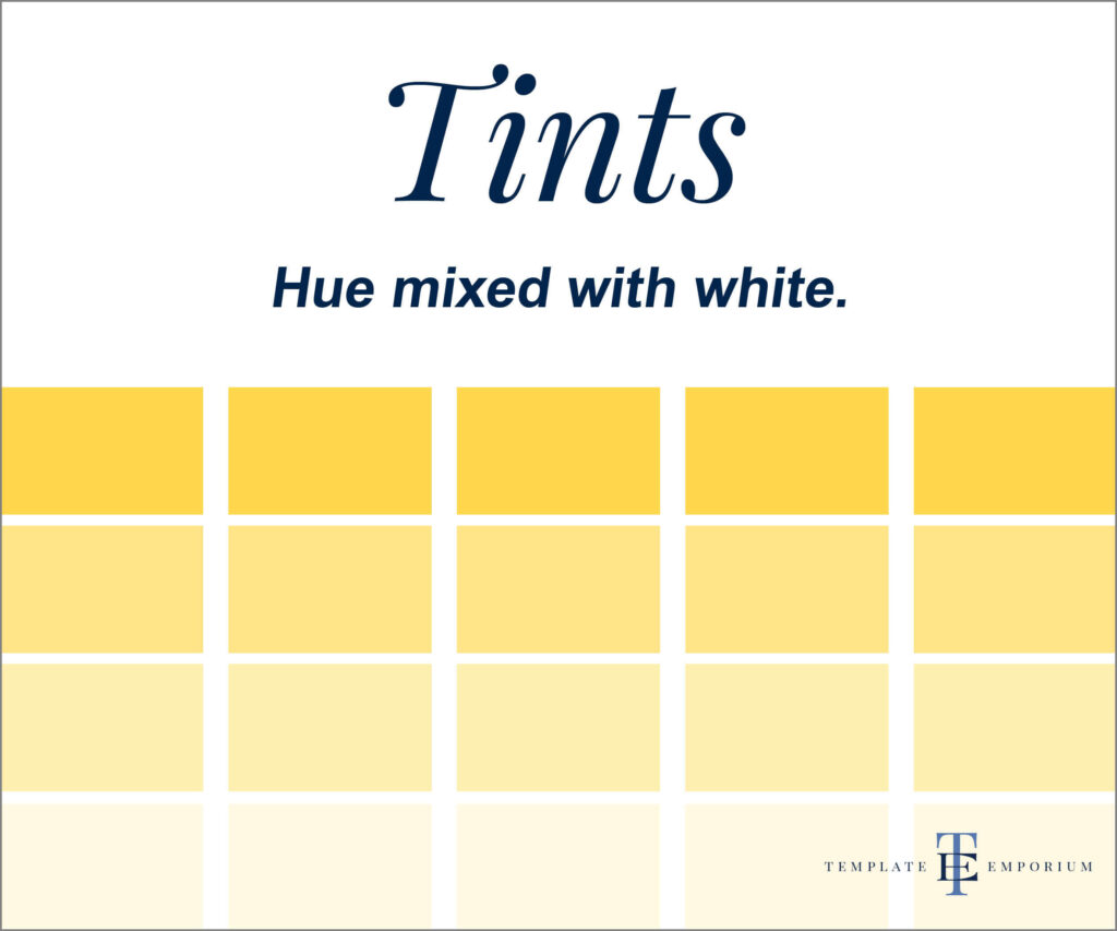
Tints = hue mixed with white.
The Functionality of Tints
Tints are created by adding white to a pure hue, resulting in a lighter and softer version of the original colour.
They are often used to create a sense of playfulness and delicacy in design, and their functionality lies in their ability to add depth and dimension to your designs.
By using tints, you can create a sense of balance and harmony in your designs without being too overpowering.
Tints are a versatile tool in any designer’s toolkit. They can create various effects, from soft pastels to bright and vibrant hues.
When used effectively, they can help highlight important elements in a design, such as headlines or call-to-action buttons, by creating contrast with darker tones.
Below, we have created rows of Tints. Each row is a softer and lighter version of the original Hue.
Insider Tip
One important consideration when working with tints is their transparency. Because they are created by adding white to a hue, they can sometimes appear less opaque than darker shades or tones.
Tints in layering can get complicated. The key is to ensure the underlying layers do not bleed through.
Tones
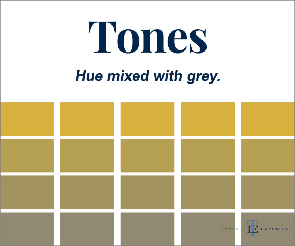
Tones = hue mixed with grey.
The Importance of Tones
Unlike tints, tones are created by adding black and white (grey) to a hue, resulting in a muted colour with a less vibrant appearance.
This muted effect allows tones to be used in design to create a sense of ambience or mood.
Muted tones of blue and green create a calming and serene feeling. While darker tones of red and orange can evoke a sense of passion or intensity.
By utilizing tones strategically, they can create a range of moods and atmospheres that bring their designs to life.
In our example below, we have created rows of Tones. Each row of tones is a more subtle version of the original Hue.
Insider Tip
When working with Tones, it’s essential to consider the contrast between them to create a balanced composition.
Pairing muted tones with vibrant hues can create a dynamic effect that can draw attention to specific design elements.
Additionally, using various tones of the same hue can add depth and dimension to a design, giving it a more visually appealing and polished look.
Shades
Shades – hue mixed with black.
Creating Depth with Shades
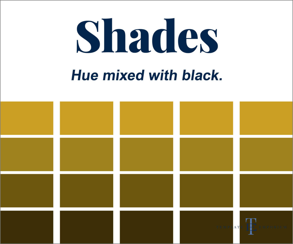
Shades are the darkest version of hues and are created by mixing Black with Hue, resulting in a darker and richer colour.
One way to use shades is to create the illusion of depth.
For instance, incorporating darker shades into the background while using lighter tones in the foreground can create a sense of distance and space.
Similarly, using different shades of the same hue in a design can add dimension and interest.
Another technique to consider is subtle shading to create a three-dimensional effect. Achieve this by adding slight variations of shades to specific areas of a design, such as a logo or typography. By doing so, it can appear to have depth and texture.
This time in our example below, we have created rows of Shades. Each row of shades is a darker version of the original Hue.
Insider Tips
When working with shades, it’s also important to consider the overall balance of the design.
Using too many dark shades can create a heavy and sombre mood while incorporating too many light tones can result in a washed-out look. Striking a balance between the two is crucial.
Understanding their differences
Colour is a critical element in any design, and the effective use of hues, tints, tones, and shades can make all the difference.
By understanding the unique characteristics of each, you can take your work to the next level.
- Hues offer a wide range of possibilities.
- Tints provide functionality and tonality.
- Tones are vital for creating depth.
- Shades add richness and depth to your creations, everything becomes darker, just as it does when you put on a pair of “shades”.
Now that you understand these concepts, it’s time to put them into practice. Start experimenting and sit back and watch how much your work will improve.
You Did it!
That’s a wrap on Hue, Tints, Tones & Shades – What’s the difference? In this blog, we shared what each one is and how to tell them apart. Understanding designer lingo and knowing when and how to use it will make you feel more confident in every design you create.
Where to now?
Want more Designer Tips? Check out the blogs below.
- What’s the difference between Primary & Secondary colours?
- How to Use Harmonious Colour Combinations in Your Designs
- Should I Watermark my Designs?
Use these colour term tips in your FREE Brand Style Guide
If you liked the tips in this blog post, you’ll love the tips we share in our Brand Style Guide. Think of this as your business blueprint. Plus, you’ll finally learn how to keep your Visual Branding look consistent. Click the image below.
Like the Blog Post?
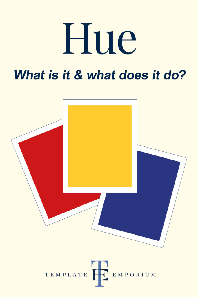
PIN IT FOR LATER. And for more helpful tips follow us on PINTEREST.
Search
Create & launch your website in a
few simple steps
FREE GUIDE
While you’re here,
grab our FREE
‘Do’s & Don’ts of what to add to your website’ Guide.
‘Do’s & Don’ts of what to add to your website’ Guide.
When you sign up, we’ll send you
emails with additional helpful content.
About Lavinia & Tom
Hi, we're so glad you found us.
We love helping creatives like you finally have the website you’ve always wanted.
Blog Categories
Follow us