grab our FREE
‘Do’s & Don’ts of what to add to your website’ Guide.
‘Do’s & Don’ts of what to add to your website’ Guide.
emails with additional helpful content.
Hi, we're so glad you found us.
We love helping creatives like you finally have the website you’ve always wanted.
few simple steps
Follow us
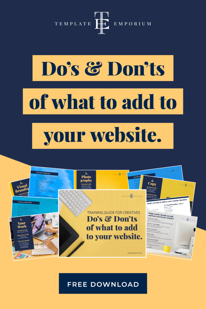
Do’s & Don’ts of what to add to your Website
Now more than ever, you need to be online. But we get it. Creating a website can feel overwhelming. This blog will give you the run-down of all the Do’s & Don’ts of What to add to your Website.
Have you spent months tweaking your site (& you are still not happy with how it looks?) Then our blog is the solution for you.
And to make it even simpler for you, we have turned it into a free essential guide download. We’re here to guide you all the way!
Before we start – check out our Website Series below.
- 3 Reasons why not adding your favicon is hurting your website
- Is your website breaking the law?
- Why do I need a Domain name? (and what do I do with it?)
- What is a One-Pager Website (& why do I need one?)
- Top Website Mistakes creative professionals make (& how to avoid them)
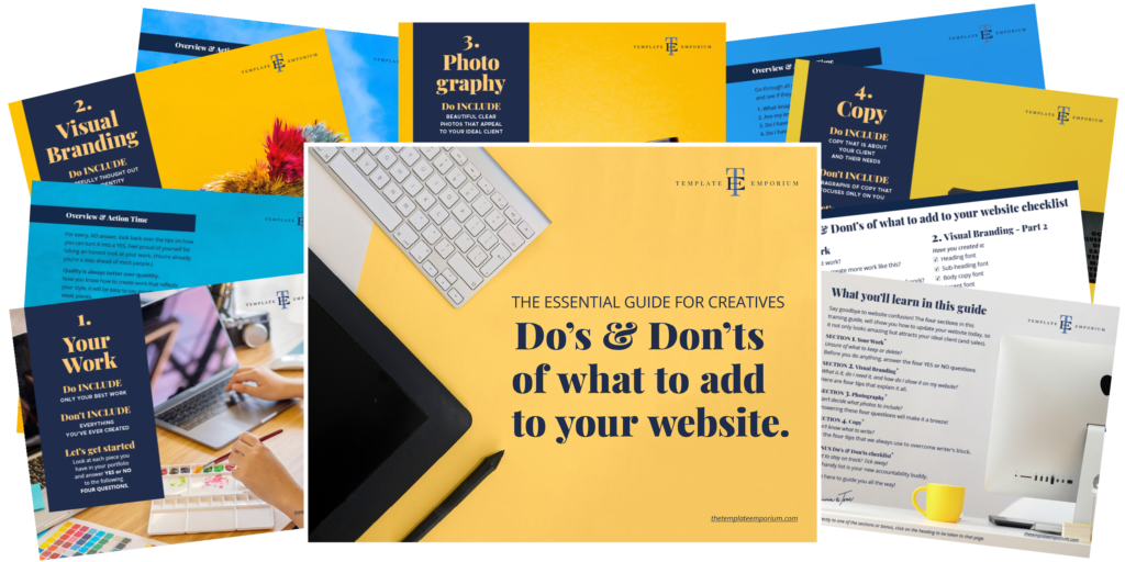
Want to get started now? Download our Essential Guide
What exactly should you Add and Leave from your website?

There are four essential sections we believe your website needs:
Index
Do’s & Don’ts of What to Add to your Website
1. Your Work
Unsure of what to keep or delete?
Before you do anything, answer the four YES or NO questions.
2. Visual Branding
What is it, do I need it, and how do I show it on my website?
Here are four tips that explain it all.
3. Photography
Can’t decide what photos to include?
Answering these four questions will make it a breeze!
4. Copy
Don’t know what to write?
Try the four tips that we always use to overcome writer’s block.
BONUS Checklist
Do’s & Don’ts of What to Add to your Website
Want to stay on track? Tick away!
This handy list is your new accountability buddy.
You’ll find it on page 28 in your Free Guide Download.
Do’s & Don’ts of What to Add to your Website
1. Your Work

• Do include only your best work.
• Don’t include everything you’ve ever created.
Look at each piece you have in your portfolio and answer YES or NO to the following four questions.
1. Is this my best work?
You have about three seconds to catch the attention of your ideal client.
If you’re saving your best work to show your client in person, that might never happen!
Also, showing work that’s “just ok” could mean losing a potential job.
Including weak pieces confuses the client as to what type of work they’ll get. Make it easy for them to pick you and only show your best work.
Insider Pro Tip
Unsure of what’s your best work? Ask a fellow creative that you trust with a ‘good eye’ to help you choose. We often become too close to our work and, a fresh set of eyes is the answer you need.
2. Would I like to create more work like this?
The work you show is the work you’ll attract.
If you’re a photographer and you show DIY weddings, you’ll attract DIY brides. If DIY brides aren’t your style, and glamorous weddings are, leave out the DIY weddings.
Just because you can do it, doesn’t mean you have to include it in your portfolio. Even if you find something easy to create, but hate doing it, don’t show it. You only want to show work you love creating.
Insider Pro Tip
If your current clients aren’t asking for the type of work you want to do, create your own. Organize a styled shoot or create a pattern design with your dream client in mind. If you love the result, upload it.
3. Does it reflect my style?
Your Signature Style should carry across everything you create, especially in your portfolio.
Finding your style can take time. If you’re still in the developing stages, that’s fine. Even when you discover your style, a portfolio is always a work in progress.
Try experimenting with different styles, colours, materials and themes. Once you find what you love, practise, practise, practise! Creating the work you enjoy doing most will help hone in on your style.
Insider Pro Tip
If the thought of picking a style is too much to think about, ask yourself “What would I like to be known for?” Write it down and think of small action steps to get you started.
4. Do I have a good range in my collection?
Even if you can do one thing well, mix it up with other pieces to show variety in your work.
If you’re a designer, and you create patterns, try offering a few colour options of the same design. Always include neutral colours such as white, beige and grey to tell a complete colour story.
If you’re a wedding photographer, try showing bridal, group, portrait and detail shots. An illustrator may show faces, florals, lettering and detailed illustrations.
Insider Tip
Everything you create can be in your style, but it’s good to show your potential clients you can push yourself and can offer them a range in your work. This range will keep your work fresh and interesting.
It’s Overview & Action Time – turn to page 8 of our free guide
Do’s & Don’ts of What to Add to your Website
2. Visual Branding

A brand with a consistent look and feel takes its customers on a wonderful experience. Want to learn how?
• Do include our four tips below to create your brand’s visual identity.
• Don’t include more than four different fonts and colours.
Let’s look at four ways you can include visual branding on your website that help make your customers feel something about your brand.
1. Your Logo
Is it a clean design?
Decrease the size of your logo, is it still easy to read?
If not, try simplifying the design. Not sure where to start, one of the options below will help.
A. Your signature.
If your business is your name, your signature is a great way to personalize your logo.
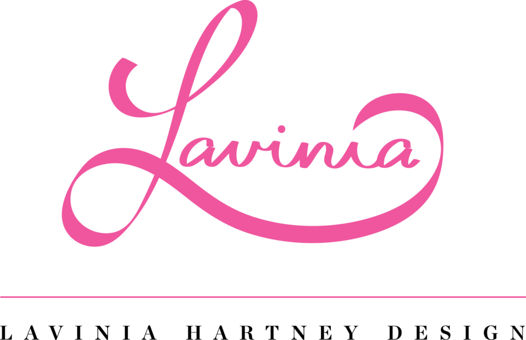
Below is my signature logo for my design business.

B. Typography.
Made of text only. Try sans serif fonts* for a modern look, or serif* for a classic feel. Below is my Typography logo for my design business.
* 4 – Your Brand Fonts – explains the difference between sans serif and serif fonts.

C. Typography & Graphic.
A graphic could include your initials made into a monogram.
Below is an example of my design logo below.
Insider Pro Tip
To help with recognition, lock the logo to the top of your webpage, so it will appear as you scroll down the page. And never squash or stretch your logo, this makes your business appear amateurish.
2. Your Tagline
What exactly is a tagline?
It tells your potential clients what you do, sell or offer. Keep it short and easy to understand. You could add it under your logo, or use it on its own.
You could even use it as an opening heading or sub-heading on your website.
Our business, The Template Emporium, sells Showit Website Templates for creatives like you.
What’s our tagline?
Beautifully Simple Showit Templates – Simple to use. Simple to update. Simple to launch.
Insider Pro Tip
To create your tagline, make a list of words that describe what you do. Leave out complicated or industry jargon words. A clear tagline means you can remember it easily.
3. Your Brand Colours
Different colours create different emotions.
How do you want your clients to feel about you?
Pick colours that express that emotion. Black and Gold suit luxury brands, while a bright, bold palette is a good match with younger brands. And, Blue is universally loved and used as a branding colour worldwide.
A clean website consists of ideally 3 to 4 colours.
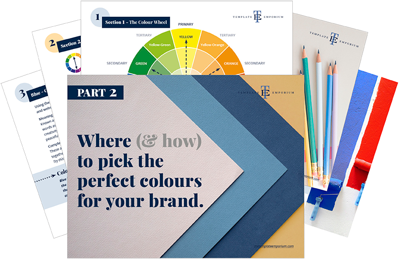
Below are the three colour options to consider.
1. Main – This colour is throughout your site. E.g. Navy
2. Support – Colours that complement the Main E.g. Yellow
3. Accent – A colour used for emphasis on buttons/links
Want to know more about Brand Colours? Download this guide.
Insider Pro Tip
To keep your colours looking consistent across web assets find out the Hex numbers of your chosen palette. A Hex number is written with a # in front of the number. E.g. Our navy blue is #12294a.
4. Your Brand Fonts
Many people get stuck when it comes to fonts.
To prevent your site from looking complex and busy stick to 3 to 4 fonts. You’ll need a heading font, a sub-heading, a body copy font and if required an accent font.
The key to using fonts is to create a hierarchy. You can do this by using different font sizes, and body weights and using different font classifications.
Fonts are broken up into many categories.
The most common are known as serif and sans-serif. To remember the difference, a serif has a small line (or little feet) that are attached to the end of the letter.
Insider Pro Tip (this is a serif font)
If you choose a serif headline, try using a sans-serif font for the body copy or vice-versa. This contrast will create balance, and the two fonts won’t compete against each other. Google fonts are our favourite.
Its Overview & Action Time
– turn to page 14 of our free guide

Do’s & Don’ts of What to Add to your Website
3. Photography

The images you choose for your site will help attract or scare away your ideal client.
• Do Include beautiful clear photos that appeal to your ideal client.
• Don’t include dull, low res images that have nothing to do with your audience.
Let’s go over FOUR TIPS for selecting the best photos to show visual branding.
1. What images would your ideal client like?
Start with a picture in your head of how your ideal client looks. Next, find images that reflect this.
You’ll start attracting your ideal client as they can see themselves using your product successfully.
Use lifestyle images that would stand out to them and incorporate their style. Try a flat lay. (That’s viewing the image top-down).
Positive images of happy clients using your product, help strengthen your message and add personality to your photos.
Insider Pro Tip
Guide the viewer through page content by ensuring the direction a person is looking is either:
A. Into the website at the copy on the page
B. With a headline next to them
2. Are your images high-resolution?
For photos to look sharp and professional, always start with the best quality source images and reduce images down as needed for elements on your website.
If you are using an advanced website builder such as Showit, you can upload high-resolution images. When your client visits your website, all images will automatically scale down to suit the viewing device.
Use Lightroom, Photoshop, or an app on your phone to ensure your photos are bright and light.
Insider Pro Tip
To tie your photos in with your branding, try to always include one of your branding colours in each photo on your site. This subtle tip will further help your site look cohesive.
3. Is there something living in your photos?
A living photo is created by adding a prop. You could add one or more of the following.
1. Plant
2. Person
3. Animal
Using this technique often generates a positive emotion in your viewer. It will help draw your ideal client in and form a connection with you.
At your next photo shoot, try using anything from a flower, someone’s hand or your pet pooch to give life to your photo.
Insider Pro Tip
Try using your living thing to direct the viewer’s eye to the centre of interest. (just as we have in the photo above). Doing so will create balance and interest in your photos.
4. Is your face on your website?
Putting a face to a brand makes it more personal, (especially if your name is your brand).
It shows your ideal client who is running the business.
A stronger connection between you and your potential client will form as they begin to get to know you.
Don’t feel comfortable in front of the camera? Have a conversation with your photographer, as she shoots. This will help you feel relaxed and often creates a natural smile, pose and look. Try a few different options, until you find the right one that works for you.
Insider Pro Tip
Trade your services with a photographer in exchange for a professional photo of you. Remember, looking away or covering your face will break the connection between your eyes and your potential client.
Its Overview & Action Time
– turn to page 20 of our free guide

Do’s & Don’ts of What to Add to your Website
4. Copy
• Do include copy that is about your client and their needs.
• Don’t include paragraphs of copy that focuses only on you.
As creatives, we often struggle the most with our website copy. If you’re stuck looking at a flashing cursor, not knowing what to write, consider the following FOUR TIPS to get you started.
1. Explain how you can help your client
What does your business do?
Make it clear and the first thing you see when you land on your website.
What problem do you solve for your client?
If your product is the answer they’ve been looking for, tell them how and why in both your copy and headlines.
Talk more about your client, and less about you.
Use your story to show your client that you understand them, where they are now and how you can help them move to where they want to be.
Insider Pro Tip
As creatives, asking for a sale can be hard. Instead, use the call to action (CTA) buttons. Be clear and use action words such as BUY Now or Enroll. Let the button guide them to what you want them to do next.
2. Keep your copy conversational and concise
Your ideal clients are busy! And, they don’t have time to read paragraphs of copy.
Instead, they will scan and skim your website.
Make it easier for them by using short, conversational sentences.
It’s also ok to use abbreviations or more casual, conversational copy. Your high school English teacher might not appreciate it, but your clients surely will!
Insider Pro Tip
If you want something in your copy to stand out, try bolding or using italics. • Bullet points are also a great way to turn long paragraphs into bite-sized pieces of information.
3. Give your copy some space
After reading chunks of text, your eyes need to rest.
White space is the answer.
Giving some “air” to your copy allows your brain to take in what you’ve just read.
You don’t need to fill every bit of space on your website. Once you discover the power of white space, it will elevate your branding and everything you create.
If your logo or an image is within your copy, add white space between the two to create balance.
Insider Pro Tip
Make every single word on your website count. Go through and cut out anything that isn’t needed. The new white space that you gained will make the words that are left, stand out.
4. The secret behind the about page
Everyone thinks the about page is where you talk all about yourself.
It’s actually where your clients go to learn how you can help them. They want to know whether you’re easy to work with and if you’re someone that would fit in with them, and their needs.
Instead of talking about yourself, let your testimonials and ways you’ve helped your clients do the talking.
Further down the page, add some fun facts about you. If they’ve reached this far, it’s likely you’re a good fit!
Insider Pro Tip
When you talk about “your why” write it in a way that will help benefit your clients and make them want to work with you. Also, Include a Call to Action (CTA) button, so they know what to do next.
Its Overview & Action Time
– turn to page 26 of our free guide

You did it!
Now you know all the Do’s & Don’ts of what to add to your Website. You can start by giving it a mini-makeover today!
Where to now?
- Download our Free Do’s & Don’ts of what to add to your Website
(and be sure to fill in the bonus checklist on page 28) - Is it time for a new website? Check out our TE Website Templates
- Want more FREE Training? Grab a Guide here
Like the Blog Post?
PIN IT FOR LATER. And for more helpful tips follow us on PINTEREST.
Search
Create & launch your website in a
few simple steps
FREE GUIDE
While you’re here,
grab our FREE
‘Do’s & Don’ts of what to add to your website’ Guide.
‘Do’s & Don’ts of what to add to your website’ Guide.
When you sign up, we’ll send you
emails with additional helpful content.
About Lavinia & Tom
Hi, we're so glad you found us.
We love helping creatives like you finally have the website you’ve always wanted.
Blog Categories
Follow us