grab our FREE
‘Do’s & Don’ts of what to add to your website’ Guide.
‘Do’s & Don’ts of what to add to your website’ Guide.
emails with additional helpful content.
Hi, we're so glad you found us.
We love helping creatives like you finally have the website you’ve always wanted.
few simple steps
Follow us
A Year of Vibrant Discoveries: Explore 52 Colourful Weekly Finds!
Are you ready for a year filled with 52 fabulous colour finds? Each week, on Instagram, I shared a hue to spark creativity, inspire your next masterpiece, or even use in your Visual Branding.
In this blog, I have combined them all, from Nantucket Red to Chocolate Brown (plus 48 other fabulous finds in between). Let’s take this wonderful walk of colour together!
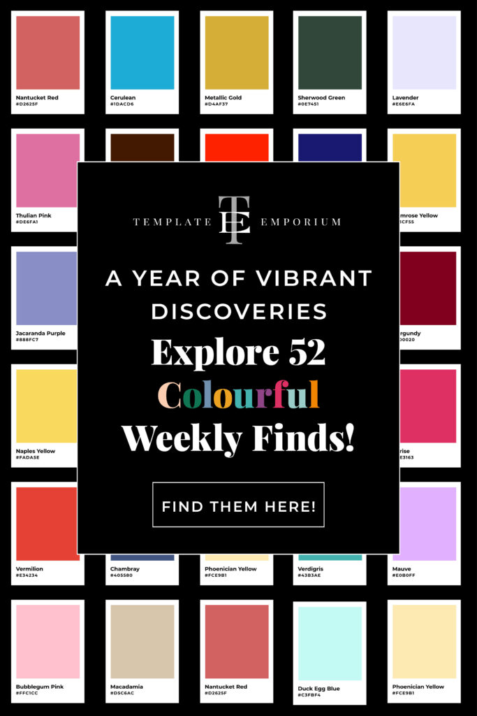
Before we begin, if you’re passionate about colour tips, don’t miss out on our FREE branding colour guides!
Colour Find of the Week – 1
Nantucket Red – #D2625F
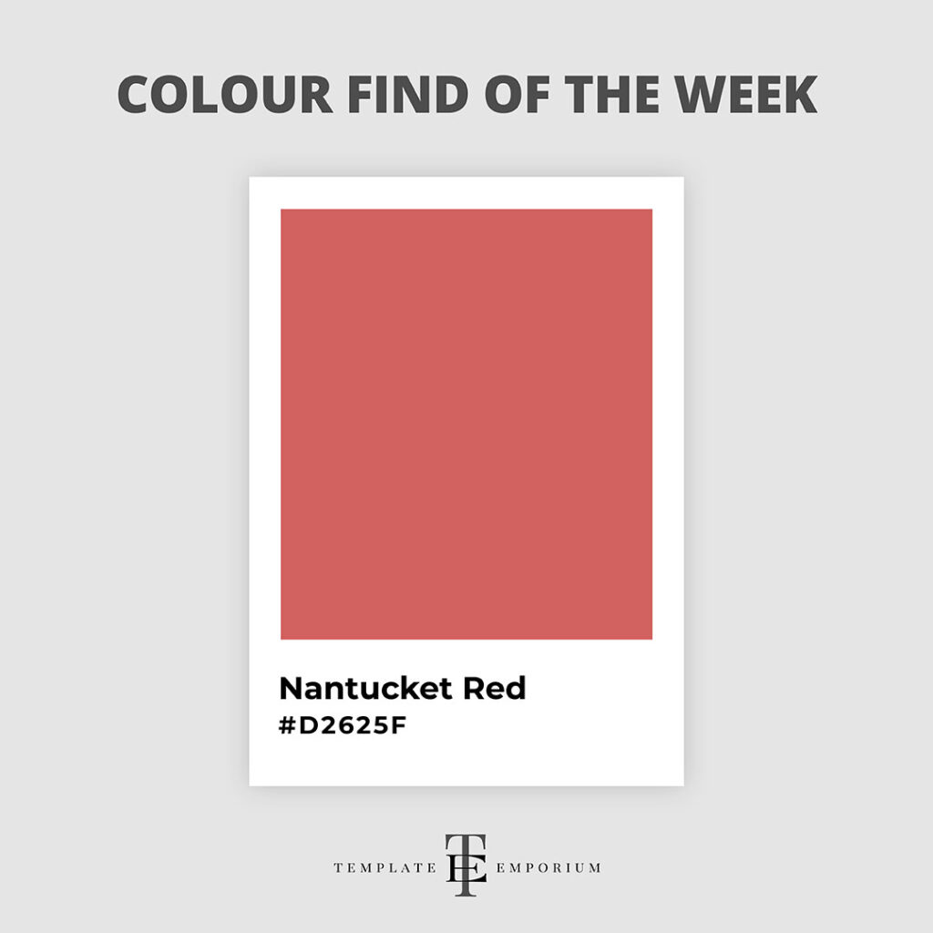
We first discovered Nantucket Red via Sue B Zimmerman at The Instagram Expert.
In her Instagram stories, she showed her latest summer clothing finds from fabulous boutiques in her local Massachusetts area.
After she described the red trimming on one of her dresses as “We call this Nantucket Red”, we knew we needed to highlight this gorgeous shade of Red.
Colour Find of the Week – 2
Periwinkle – #CCCCFF
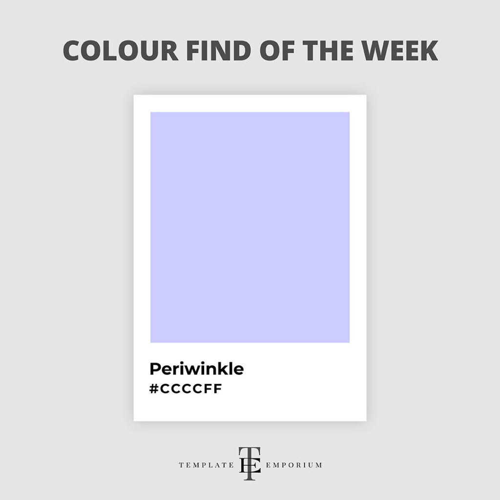
Whether it’s just its adorable name or because it feels like the perfect shade between Blue and Violet that draws us to this week’s colour find, we can’t quite decide.
This delicate Lavender-Blue creates a calming and elegant atmosphere.
Although Perriwinkle was first known as a colour in the 1920s, it still has a modern look and feel.
Colour Find of the Week – 3
Cornflower Blue – #6495ED
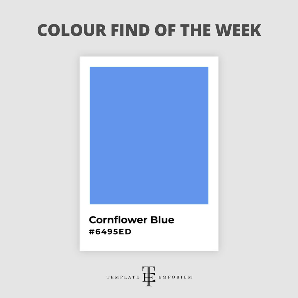
Cornflower Blue is often described as a medium to light blue colour resembling the vivid blue petals of a cornflower plant.
This hue is bright and eye-catching, exuding a cheerful and playful vibe. And it is sure to add a pop of radiance to your designs.
It is also versatile as it pairs well with warm and cool tones, making it a great choice in branding colour palettes.
Colour Find of the Week – 4
Seafoam Green – #93E9BE
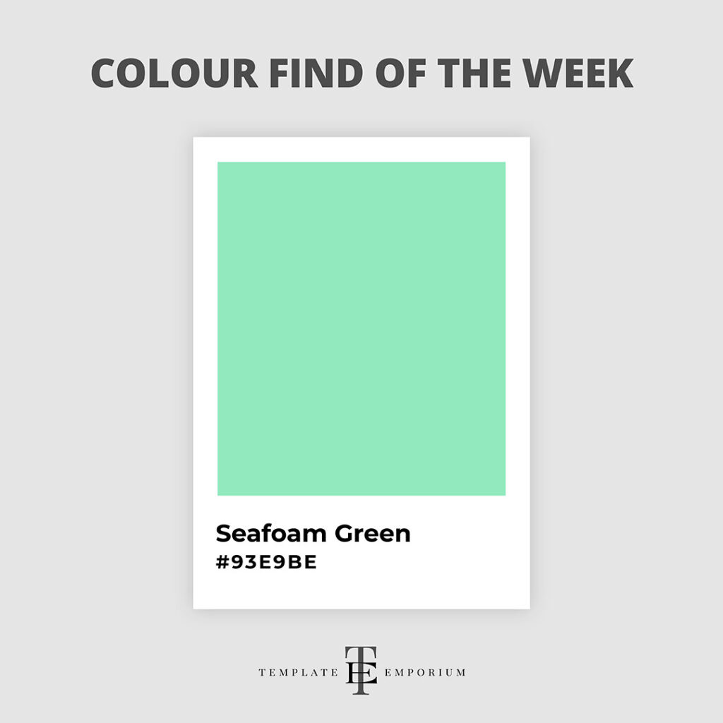
The name of this week’s colour find – Seafoam Green sums up perfectly what this colour represents.
It’s a soothing shade transporting you to the ocean and sits perfectly between Green and Blue.
If you’ve been searching for a tranquil hue, try this beautiful and calming colour in your designs to bring a fresh and airy vibe. Or use it for a serene and peaceful atmosphere for your Visual Branding.
Colour Find of the Week – 5
Light Salmon – #FFA07A
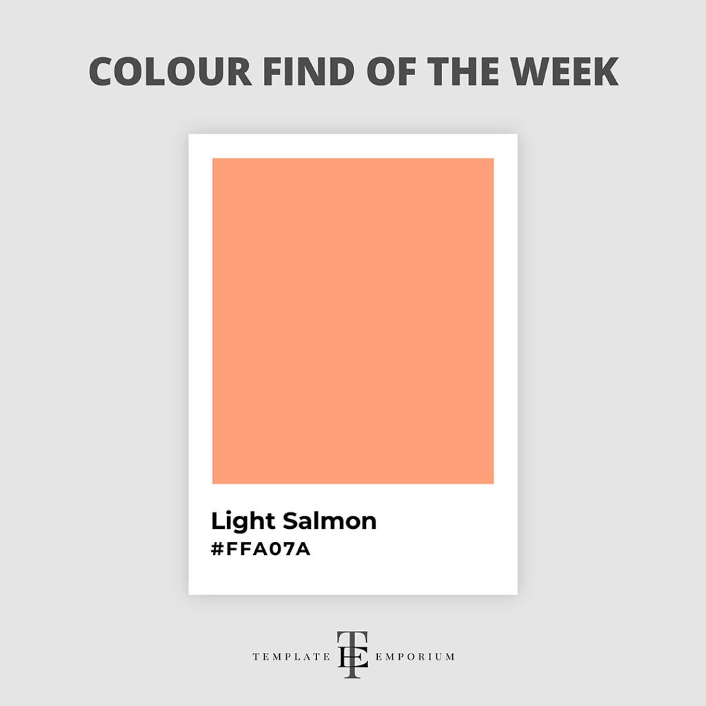
There’s something beautiful about the versatility of the Light Salmon.
Being a medium light shade of Red-Orange, this soft and delicate hue adds a touch of warmth and elegance.
Whether you use it as your Main branding colour or as an accent to add interest to your palette, this hue could add a touch of style and grace. It pairs perfectly with various complementary colours, such as Soft Blue.
Colour Find of the Week – 6
Neon Blue – #1F51FF

Neon Blue might not be as widely known as its other Neon colour cousins, but it is just as electrifying & eye-catching. (Yet somehow the most calming and balanced of all the Neons).
This vibrant colour has a Blue-Green tint and can add a pop of energy and excitement.
Although this medium-dark shade of Blue feels relatively modern, it was first known as a colour in the 1920s, named after blue neon lights.
Colour Find of the Week – 7
Dandelion – #F0E130
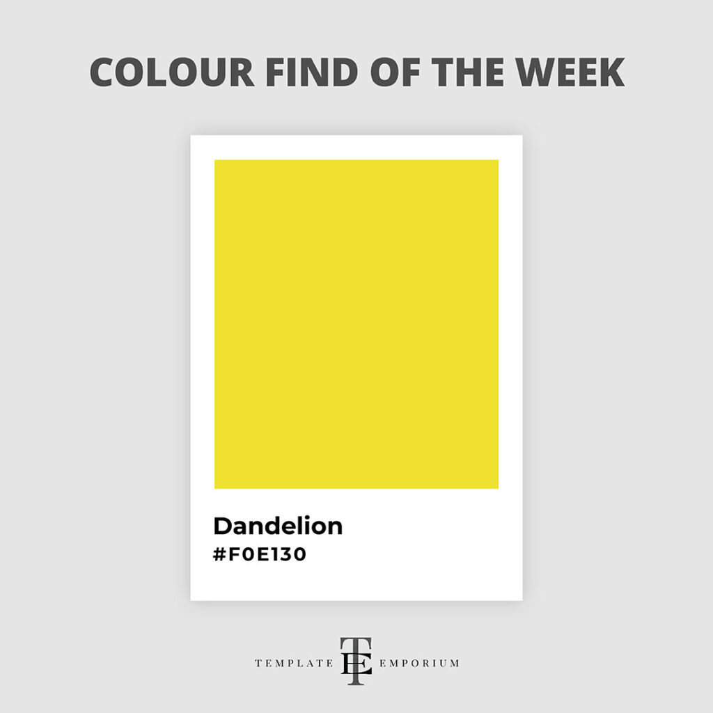
Inspired after viewing a field of Dandelions, we could not think of a more perfect colour find to share with you.
Dandelion belongs to the Yellow family. Therefore, this sunny hue is perfect for bringing vibrancy to your designs.
Its Yellow-Orange shade creates a cheerful and energetic vibe and, if used in your visual branding, is a surefire way to stand out.
Colour Find of the Week – 8
Vermilion – #E34234

This vivid colour is a hue that demands attention yet still feels warm and inviting.
Vermilion is an intermediate colour created by mixing Primary (Red) and Secondary (Orange) colours to form a vibrant Red-Orange.
The meaning behind its beautiful name is derived from the French word – Vermeil, which translates to red dye.
Colour Find of the Week – 9
Blue Moon – #3686A0

There’s something mysterious and intriguing about this dark blue shade.
Blue Moon is a captivating colour that exudes a sense of calmness and tranquillity.
And due to them being opposites on the colour wheel, Chestnut Brown pairs beautifully with this soothing hue.
Colour Find of the Week – 10
Spanish Pink – #FEC6C4
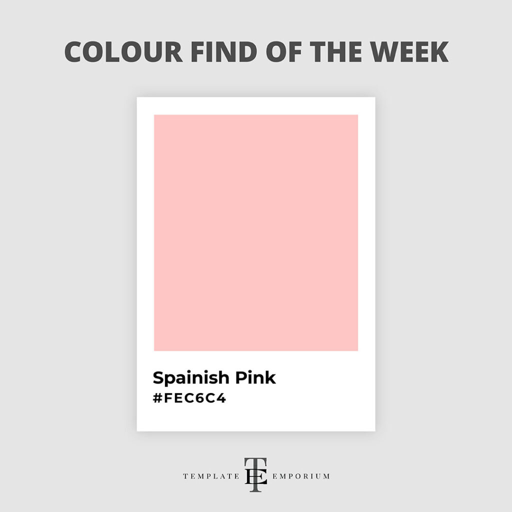
Spanish Pink is a very light shade of Red and a beautiful, warm hue.
If you’ve never heard of this gorgeous shade, you may be more familiar with its other name – Rosa. (Which is the Spanish word for Pink).
This enchanting hue holds a rich history, and it pairs perfectly with Chocolate Brown. And for a fun twist, try it with Pastels.
Colour Find of the Week – 11
Light Jade – #9BCDCc
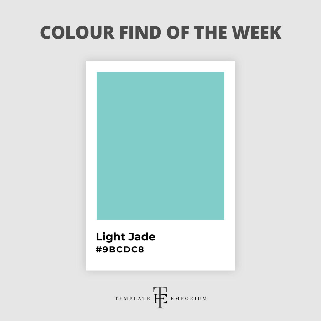
Belonging to the pastel Family, Light Jade has a fabulous 1950s feel.
This pastel retro green is soft and soothing. And because it’s so neutral, it works well with various colours.
Our favourite pairings, however, would have to be with other pastels such as Lilac or Blush Pink.
Colour Find of the Week – 12
Pale Lavender – #DDD1F7
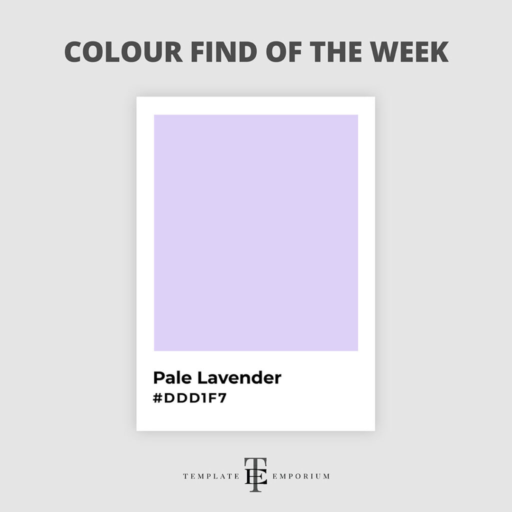
Lavender is a shade of Purple, and the word originates from the Latin word lavāre, meaning to wash.
But Pale Lavender stands out on its own as a calming pastel hue.
It works beautifully paired with Lemon or Light Grey. And for a more playful 1980s feel, try it with Pastel Pink.
Colour Find of the Week – 13
Emerald – #0E7451

This colour find is all about the gorgeous jewel-tone Emerald.
This highly saturated hue is both dynamic and eye-catching.
You can feel the boldness and joy that radiates from this green-based colour.
Just picture the Emerald City in The Wizard of Oz, and you will understand the impact this colour creates.
Colour Find of the Week – 14
Midnight Blue – #191970

Midnight Blue is often described as a blackish-blue tone and is known as the darkest shade of Blue, even darker than Navy.
This confident Blue is used to convey elegance, royalty and power.
And being such a deep dark blue, it carries an air of sophistication and mystery (picture the opening of a Scooby-Doo cartoon, and Midnight Blue is everywhere!)
Colour Find of the Week – 15
Halloween Orange – #EB6123
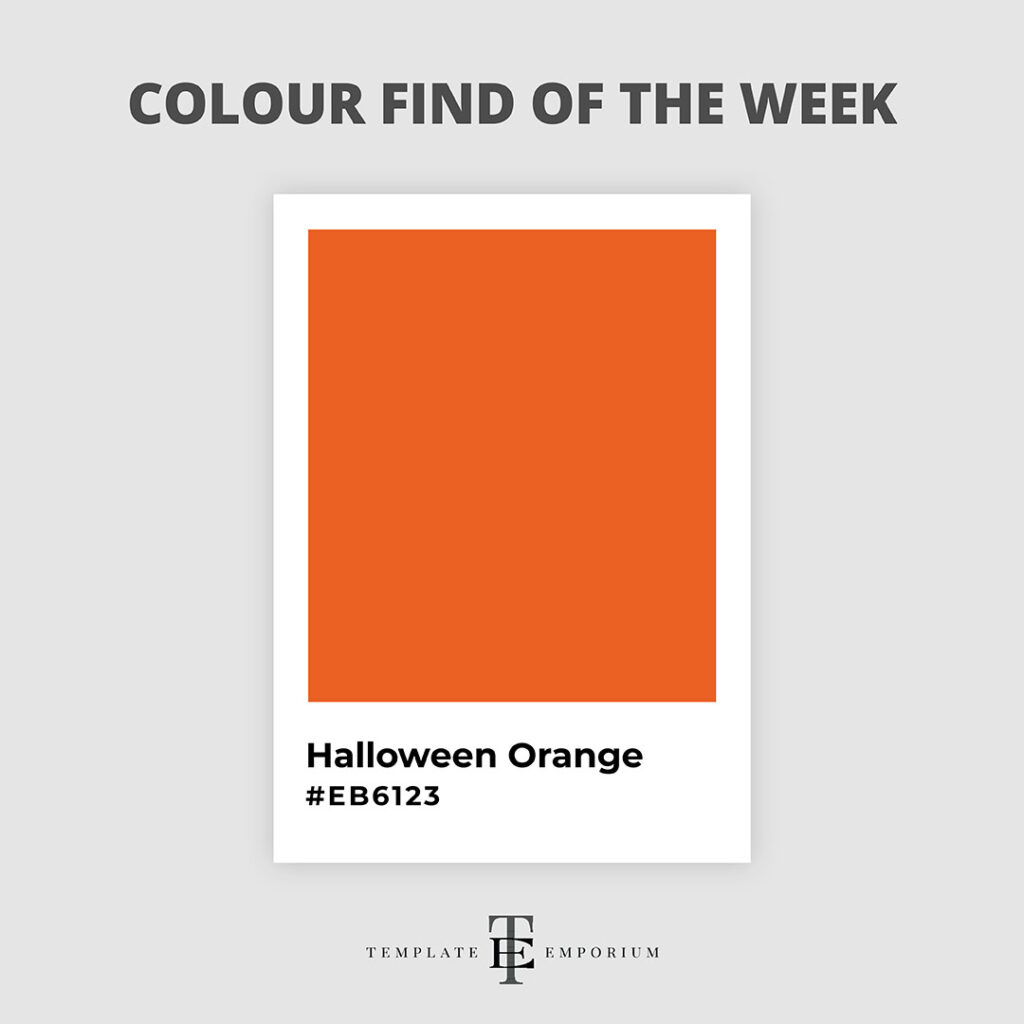
Orange takes the crown as the official colour of Halloween. But our Halloween Orange colour find takes it a step further!
Halloween Orange has a vibrant, rich, warm tone and stands out for all the right reasons.
This Red-Orange pairs perfectly with Black. And for a more dynamic feel, try it with Indigo Blue.
Colour Find of the Week – 16
Plum – #8E4585
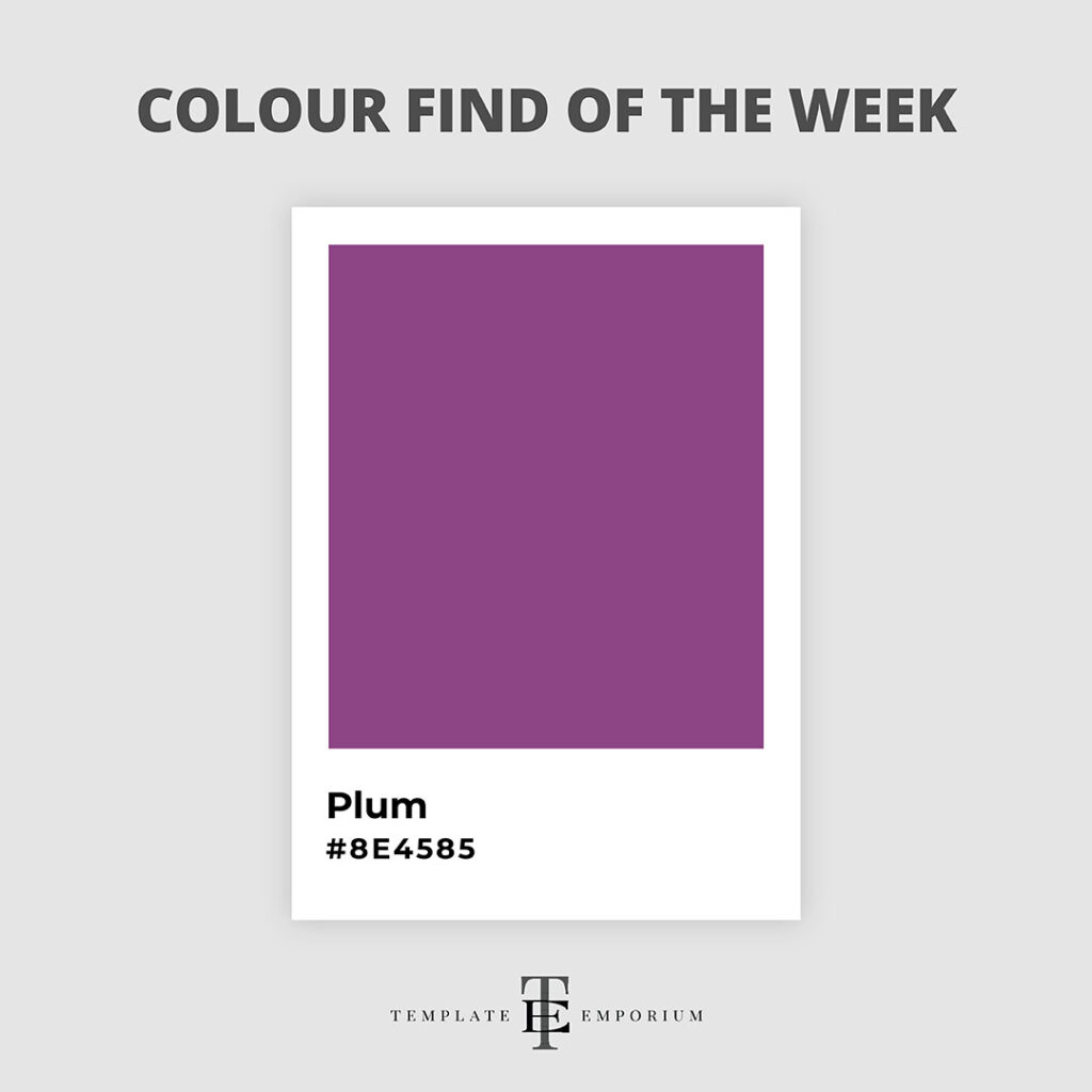
This luscious shade has a unique charm by bringing depth and richness.
Think of Plum more as a Red-Purple, giving a classic and regal look and feel.
If you want to incorporate this warm hue into your branding colours, it pairs perfectly with Olive Green and Marigold Yellow or for a bright pop, try it with Chartreuse.
And to create balance to your Plum branding colour palette, add in a neutral Grey or Beige.
Colour Find of the Week – 17
Cerise – #DE3163
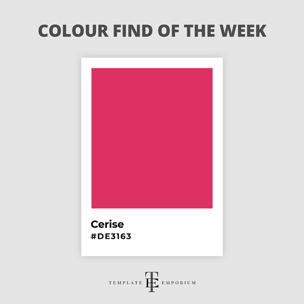
Colour Find of the Week – 18
Primrose Yellow – #F3CF55
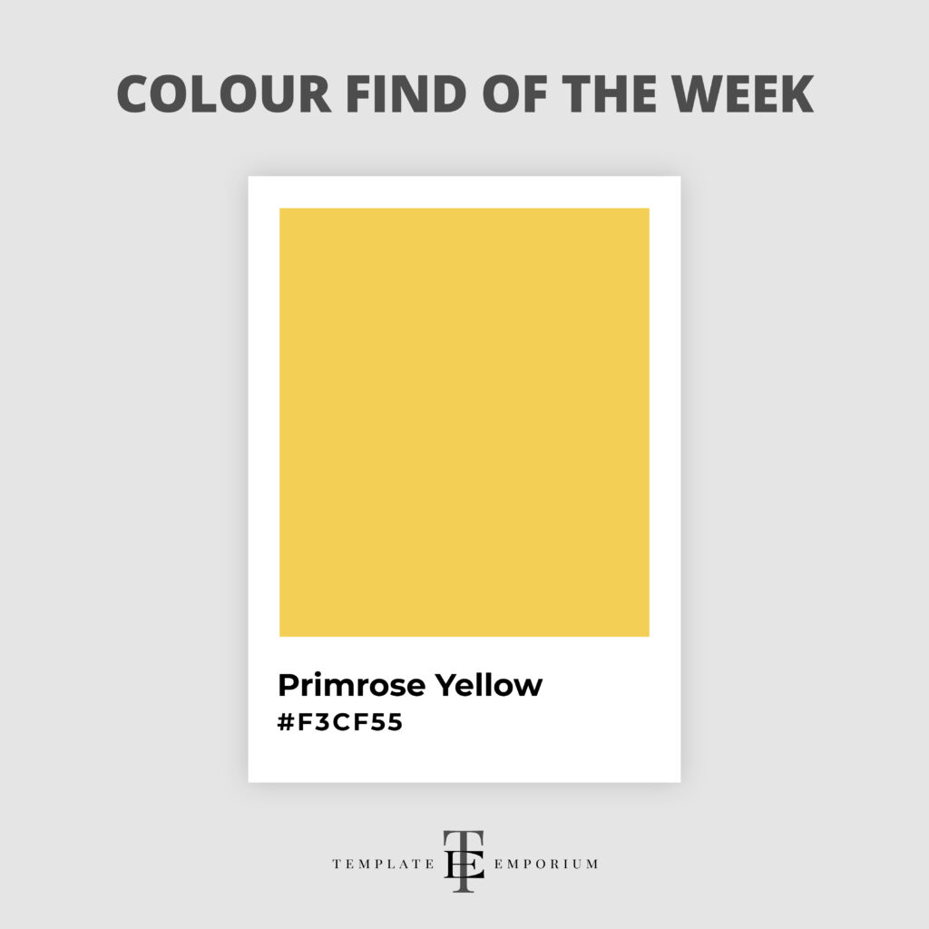
Primrose Yellow feels like a touch of sunshine to your day.
This captivating hue represents both warmth and radiance.
Plus, it’s the perfect shade of Yellow to rejuvenate your surroundings and mood.
It works beautifully with neutrals such as Grey and, for a fresh branding colour palette, try it with Leaf Green or Denim Blue.
Colour Find of the Week – 19
Jacaranda Purple – #888FC7
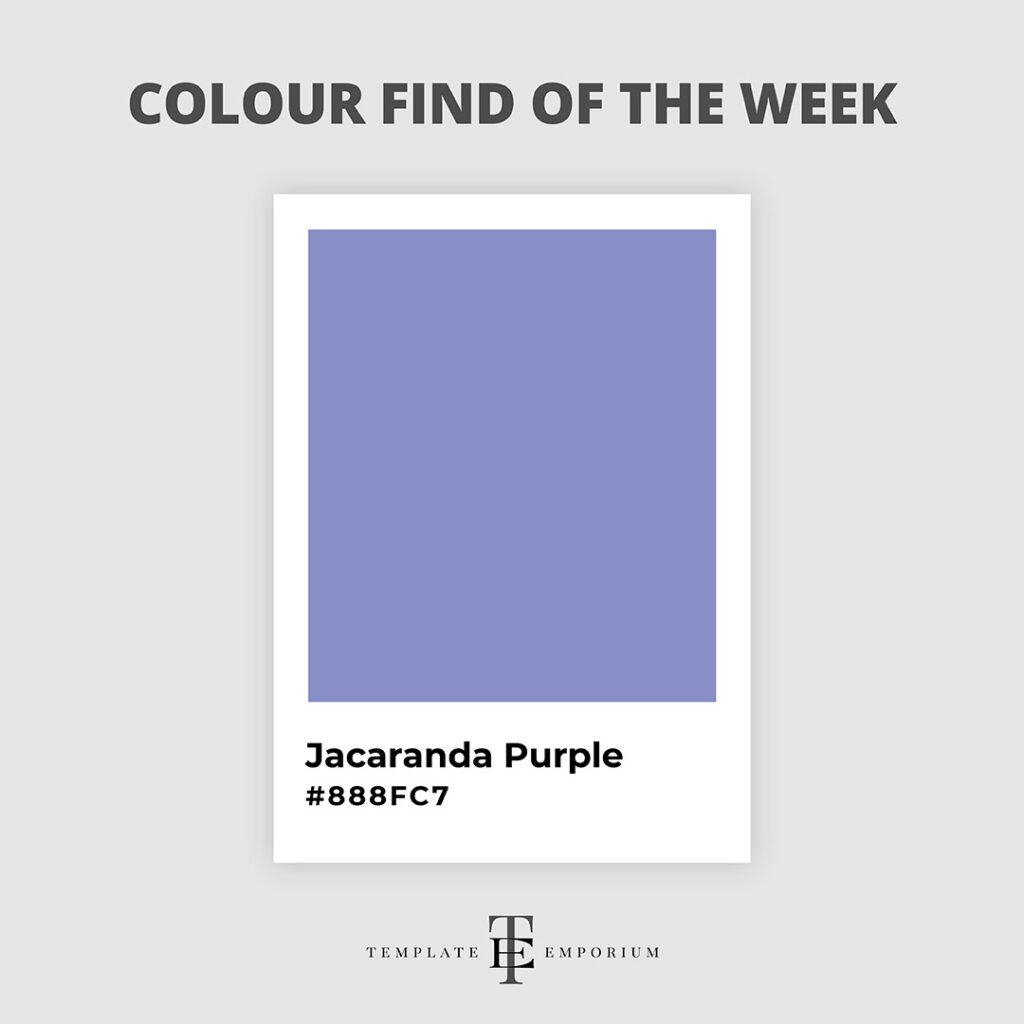
November in Australia could be declared Jacaranda Purple month, as this stunning hue is everywhere! (And we couldn’t be happier about it).
The cool tones of this blue-purple are rich and intense, making it an extremely inviting colour.
To create an overall colour combination, try it with its complementary colours of Green and Yellow, and to balance it off, add a neutral Grey.
Colour Find of the Week – 20
Christmas Red – #D6001C

If there’s one colour that represents December more than any other, it has to be this charming hue. This warm, rich Red is both inviting and nostalgic.
So, if you’re having a seasonal sale, try incorporating a touch of Christmas Red into your website for that pop of festive cheer.
And while we love pairing this hue with Christmas Tree Green, it also partners beautifully with Turquoise or Pink.
Colour Find of the Week – 21
Sherwood Green – #1B4636

Sherwood Green derives its name from England’s lush and picturesque Sherwood Forest.
The enchanting foliage and natural beauty of this legendary forest inspired the rich, earthy green shade.
Just like the forest itself, Sherwood Green brings a touch of elegance and organic charm to any design or branding colour combo.
Colour Find of the Week – 22
Thulian Pink – #DE6FA1
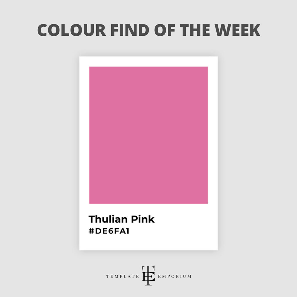
This captivating hue is a combination of Pale Rose and Lavender and possesses a unique blend of softness and vibrancy.
Thulian Pink is a stunning, warm shade that evokes a sense of femininity and elegance.
And it pairs beautifully with either Blue or Green. Or for a bolder approach, try using it with Red or Black.
Colour Find of the Week – 23
Burgundy – #800020
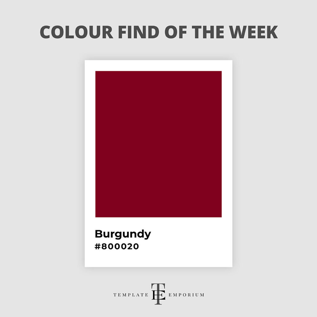
Colour Find of the Week – 24
Metallic Gold- #D4AF37
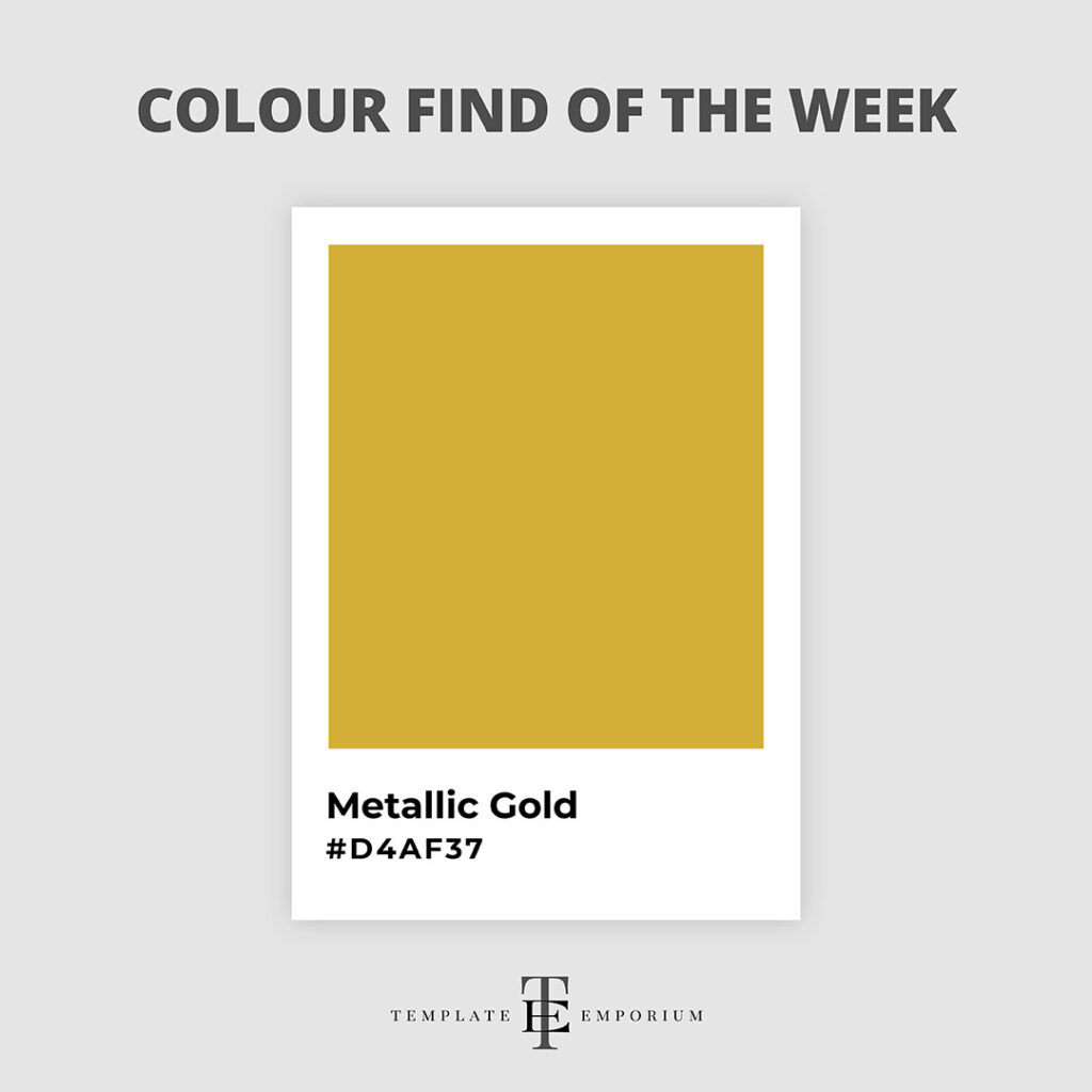
This week, we’re diving into the enchanting realm of Metallic Gold.
This rich and captivating hue instantly adds a touch of glam and elegance to any design.
Pair it with navy blue or royal purple for the ultimate feeling of luxury and refinement.
As a branding colour, Metallic Gold injects a warm, rich glow that never fails to captivate.
Colour Find of the Week – 25
Cerulean- #1DACD6
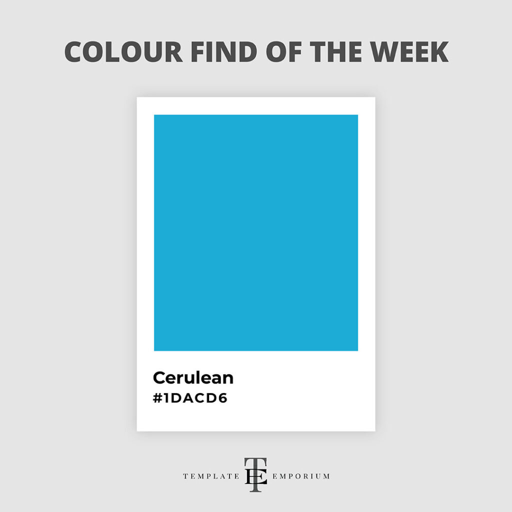
Welcome to Shades of Blue like you’ve never seen before.
Our stunning colour find of the week is the deep, mesmerising hue of bright Cerulean.
This beautiful shade is perfect for bringing a calming and tranquil vibe to your designs or visual branding.
Our favourite colour pairings with bright Cerulean are complimentary chocolate browns, purple and deep greens.
Colour Find of the Week – 26
Apricot- #FBCEB1

Peach Fuzz may be Pantone’s colour of the year, but another fruit has grabbed our attention this week, and it is Apricot.
This warm and vibrant hue is perfect for adding a splash of energy and creativity to your designs or branding.
And this captivating and inviting orange-yellow shade pairs perfectly with other oranges and pinks.
Before we share our next colour find, grab our FREE colour guide!
Do you struggle to pick a colour palette for your website? In this 2-Part Training Guide, you’ll learn three ways to use colour clues (already around you), to ensure you pick the perfect palette every time! Get the guide here!
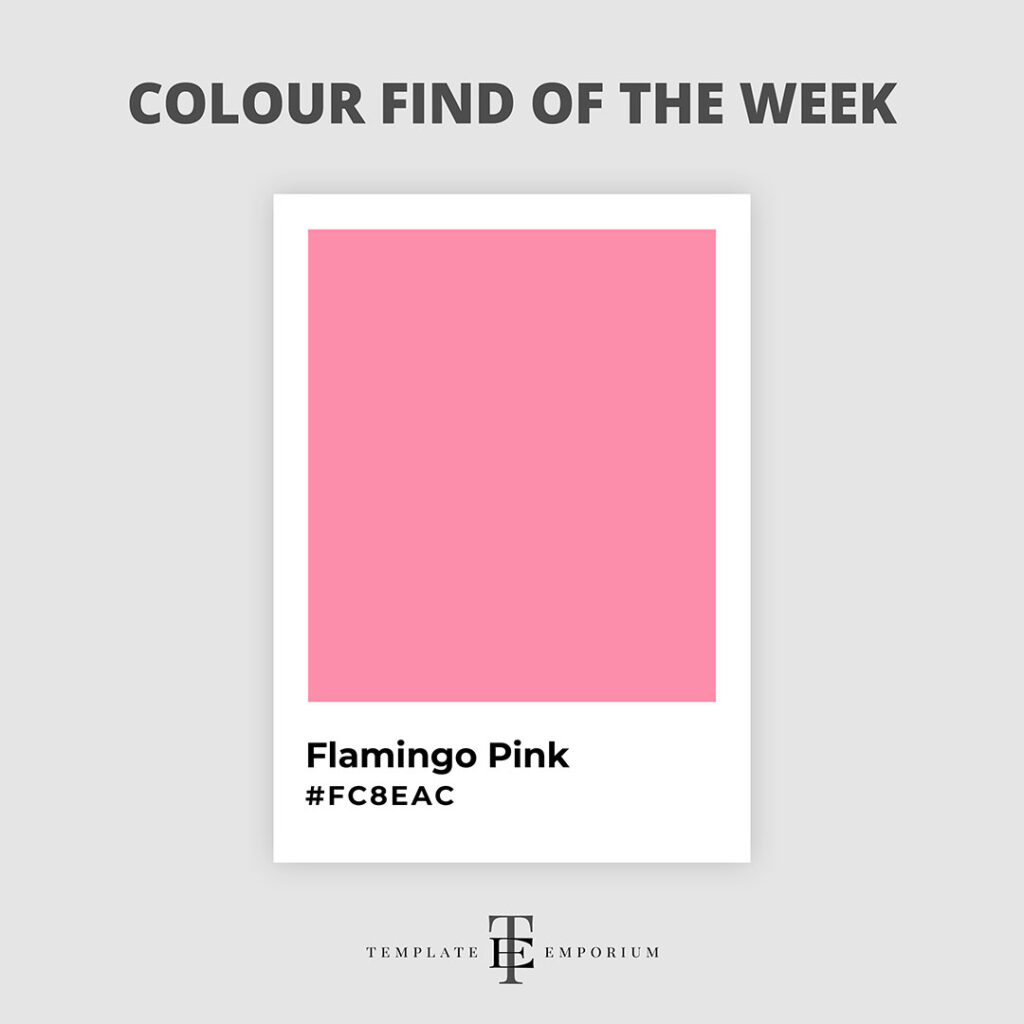
Colour Find of the Week – 27
Flamingo Pink- #FC8EAC
Colour Find of the Week – 29
Bluebell – #A2A2D0
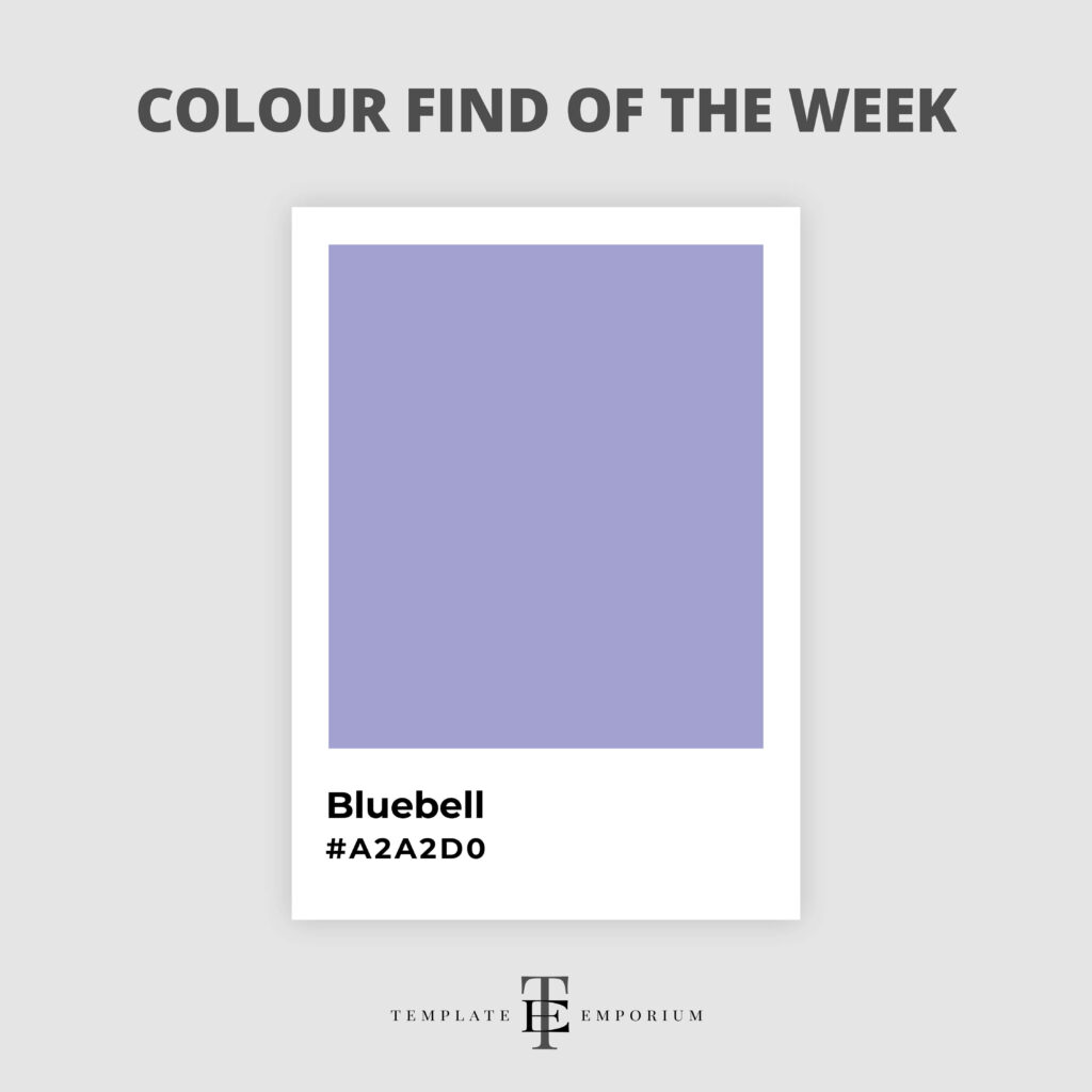
Ever stumbled upon a shade that instantly soothes your soul?
That’s how we feel over Bluebell – a mesmerising hue that evokes serenity and depth in design.
Soft pastels including dusky pinks and pastel yellows work beautifully with this colour.
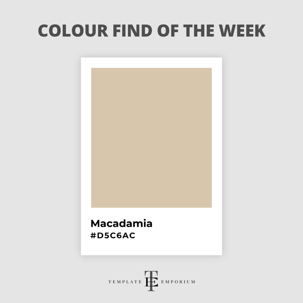
Colour Find of the Week – 30
Macadamia – #D5C6AC
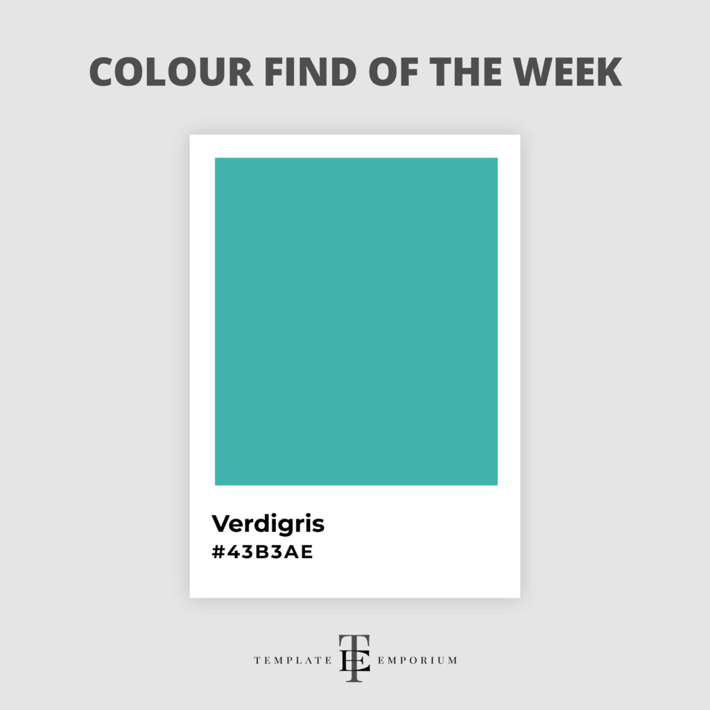
Colour Find of the Week – 31
Verdigris – #43B3AE
Colour Find of the Week – 32
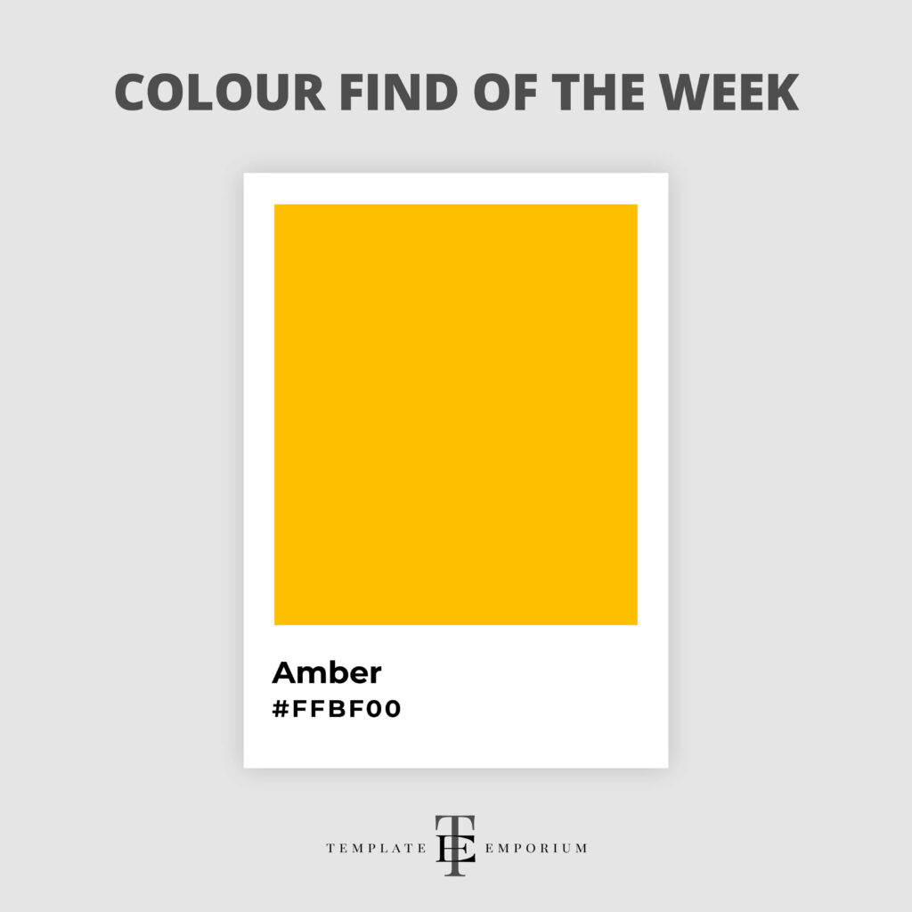
Amber – #FFBF00
Colour Find of the Week – 33
Scarlet – #FF2400
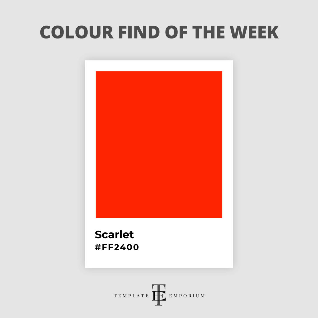
Scarlet is a hue that commands attention and sparks creativity.
Whether you’re designing a bold pattern, or crafting a captivating website, Scarlet has the power to elevate your work to new heights.
If you want to make a statement, try this fiery colour with Yellow or Orange hues. And for a more calming colour combination try it with Beige.
Colour Find of the Week – 34
Miami Blue – #00A3E0
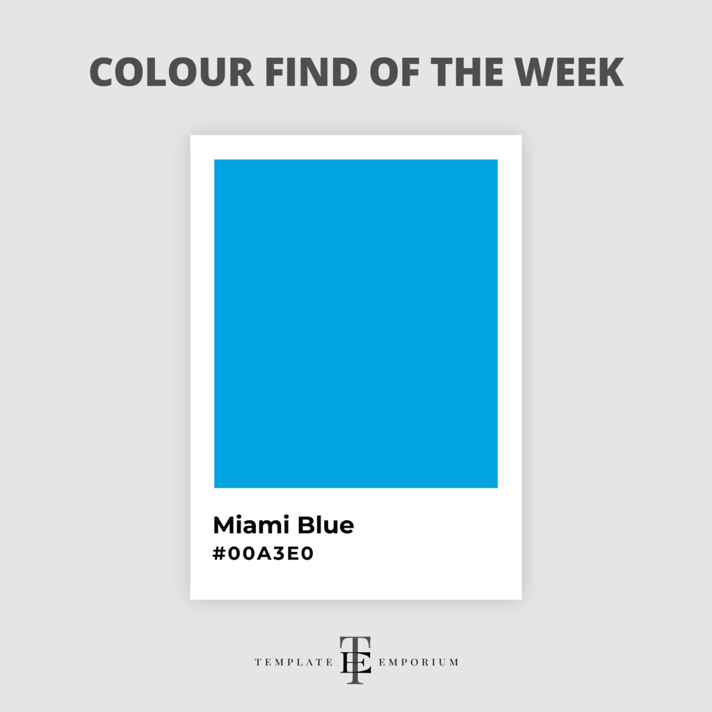
Miami Blue takes you on a nostalgic trip back to the 1980s of Miami Vice, where this cooling colour was the popular option for t-shirts under blazers!
Whether you want to add a splash of serenity to your surface patterns, infuse calm into your illustrations, or make your web designs feel like a breath of fresh air, Miami Blue is your go-to.
This tranquil yet vibrant shade looks amazing with Pink and Black.
Colour Find of the Week – 35
Viridian – #40826D

This deep, soothing shade of green is all about life, nature and earthy vibes.
Often referred to as Spring Green, it sits between Green and Teal.
Viridian offers a versatile palette and brings a sense of calm and composition to your work.
For a dynamic colour palette, try it with shades of Yellow, such as Mustard or deep Purple.
Colour Find of the Week – 36
Phoenician Yellow – #FCE9B1
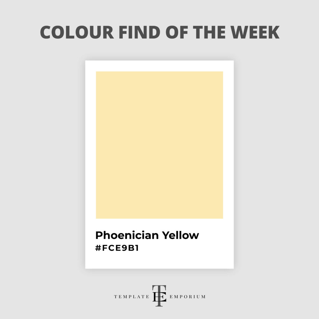
Let’s brighten up the week with a splash of Phoenician Yellow—a colour that brings the sunshine right on in!
This vibrant, uplifting hue captures the essence of creativity and joy, perfect for artists, illustrators, and designers seeking to infuse their work with warmth and brilliance.
The softness of Phoenician Yellow is a perfect match with Navy Blue.
Colour Find of the Week – 37
Puce – #CC8899
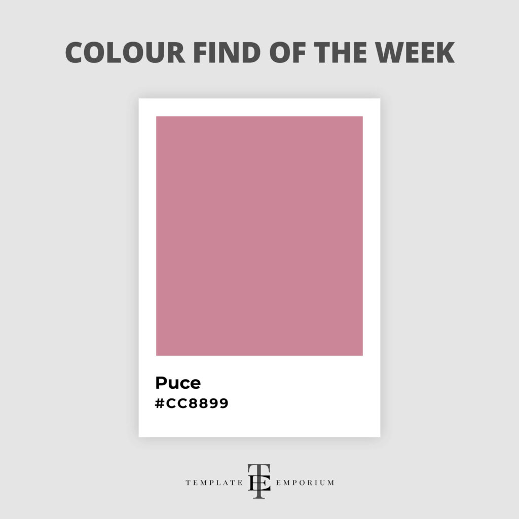
Colour Find of the Week – 38
Chestnut – #EAA221

As the leaves turn and the air chills, this warm, earthy hue invites us to embrace the comfort and simplicity of autumn.
Chestnut is the perfect companion for designs that speak of home, hearth, and heartfelt stories.
This classic rich shade strikes the perfect balance between sophistication and timeless charm.
Try it with other shades of Brown or neutrals such as Black or Beige.
Colour Find of the Week – 39
Coral – #FF7F50
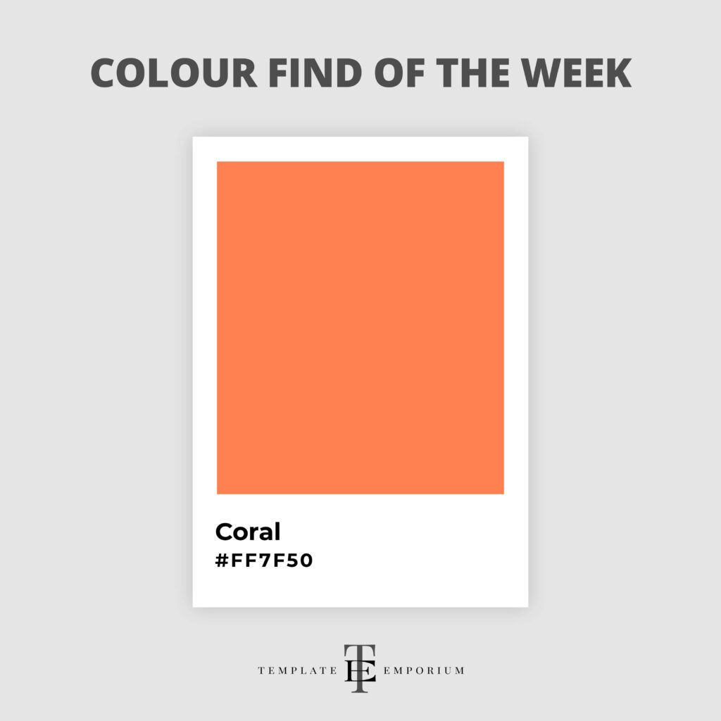
Hello sunshine and soft, sandy beaches, this week’s Colour Find is the ever-inviting Coral.
With its blend of pinkish-orange warmth, Coral has the unique ability to transport us to tropical paradises with a single glance.
Coral infuses design projects with a lively, yet gentle spirit.
Pair it with Blues, such as Navy and Tiffany. Or for a vibrant feel, try it with warm Yellows.
Colour Find of the Week – 40
Plum – #8E4585
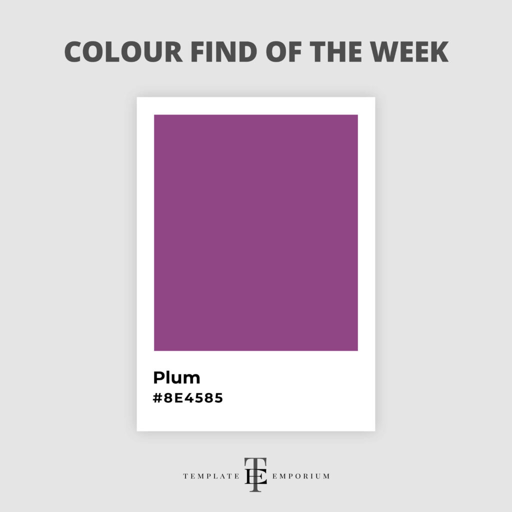
Submerge into the depths of elegance with Plum.
This rich, luxurious shade embodies the perfect blend of mystery and sophistication.
Plum promises to transform your creations with its decadent vibe.
Pair Plum with its opposite colour on the colour wheel – Green. We especially love it with Sage Green.
Colour Find of the Week – 41
Denim – #6F8FAF
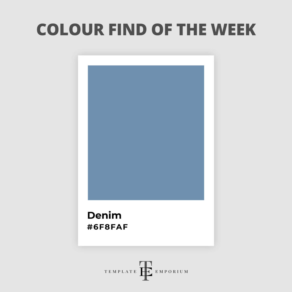
This deep, tranquil Blue brings a sense of calm and stability, reminiscent of our favourite pair of jeans.
Denim is a versatile, timeless hue and the perfect mixture of reliability and style, making it a fabulous addition to any artist’s, illustrator’s, or designer’s palette.
Pinks, Yellows, Greens and Whites all work well with this classic.
Colour Find of the Week – 42
Bubblegum Pink – #FFC1CC
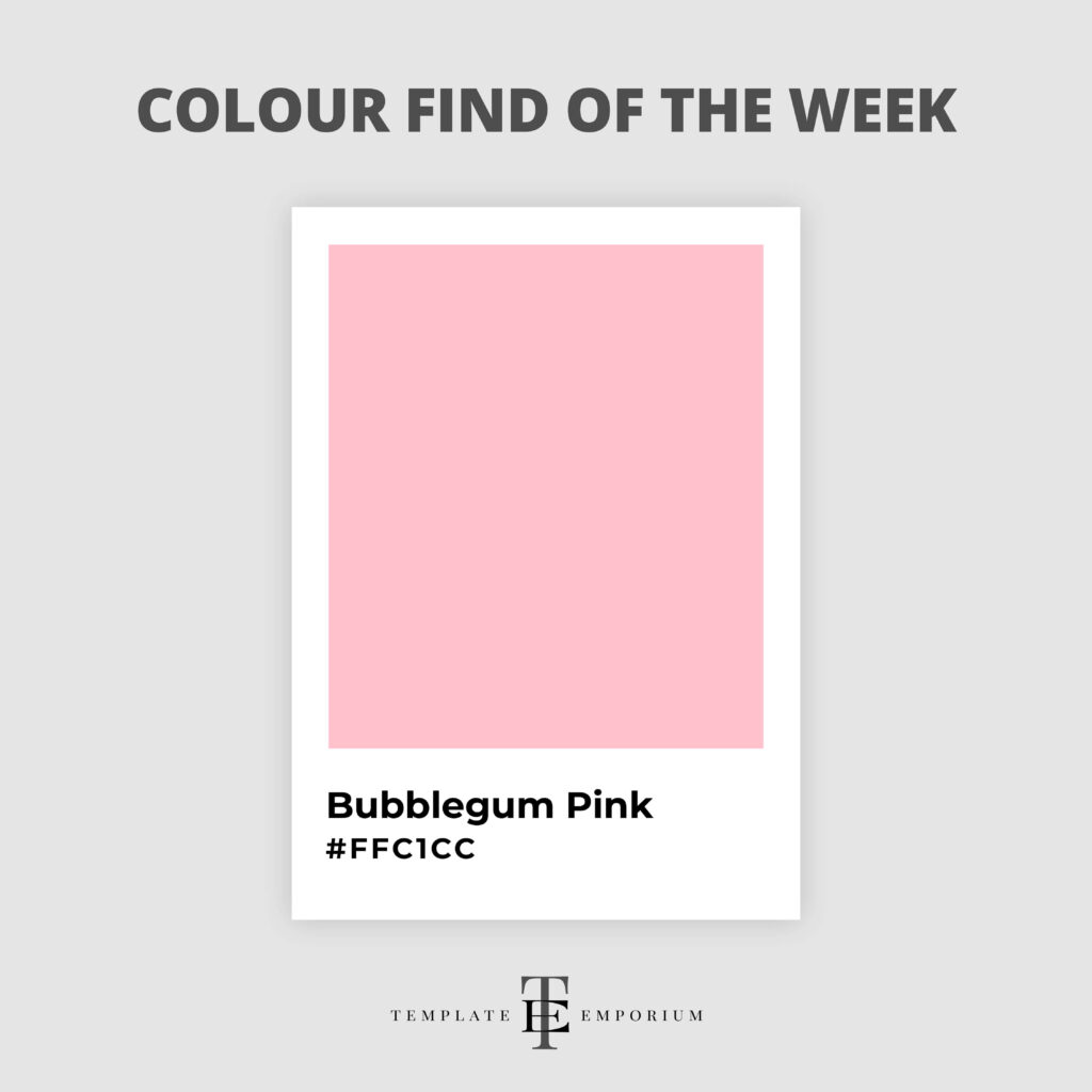
Pop into the week with a burst of fun—Bubblegum Pink is here to add a playful twist to your designs.
You can almost smell the sweetness of this adorable hue with its vibrant charm and lively spirit – it oozes personality.
Bubblegum Pink promises to bring a smile to your audience’s face.
And when you combine it with White, Turquoise or Lime Green it takes on a life of its own!
Colour Find of the Week – 43
Marigold – #EAA221
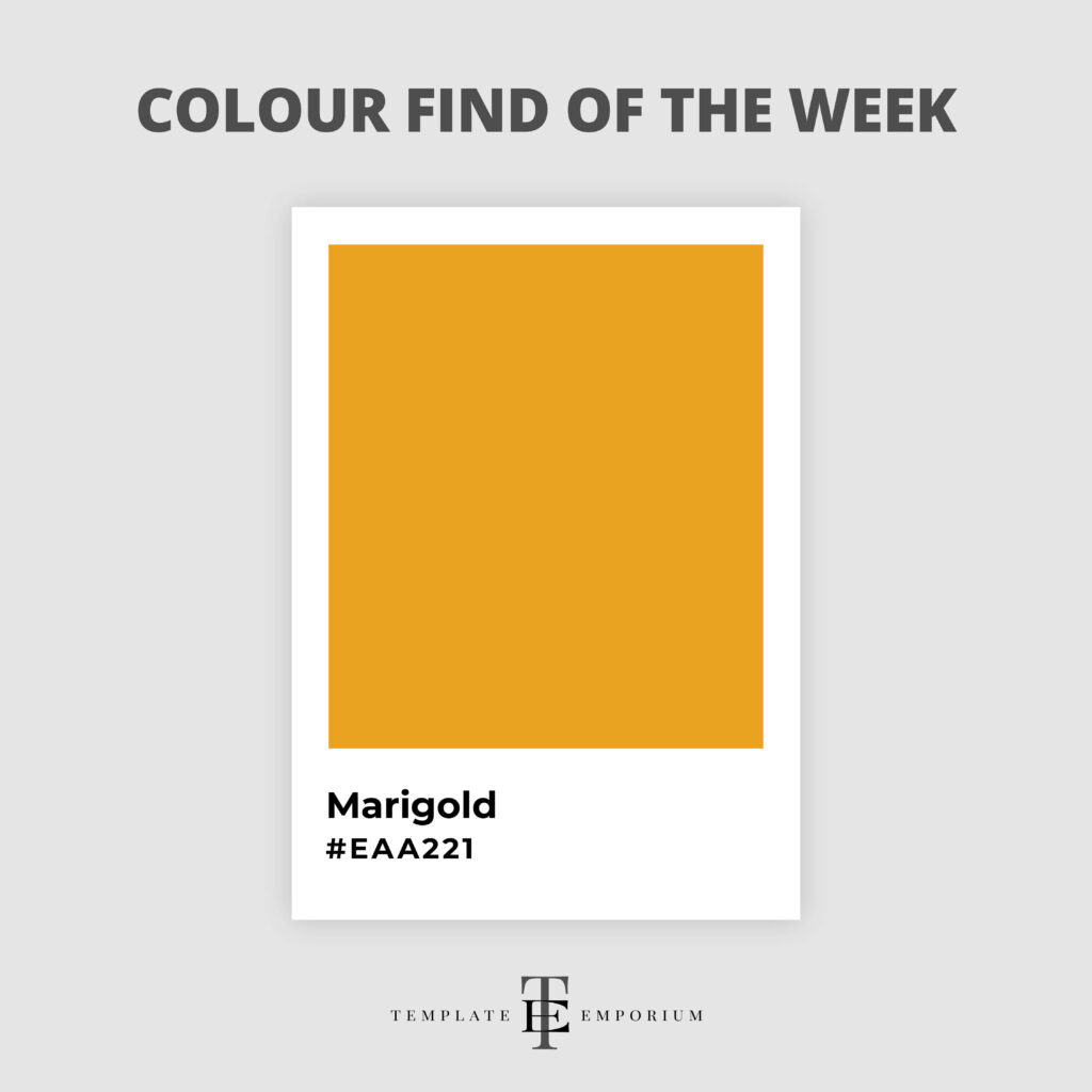
This week, we’re wrapping ourselves in the warmth of Marigold. A colour that captures the essence of golden sunsets and crisp autumn mornings.
Both vibrant and versatile, Marigold brings a burst of positivity and creativity to any project, making it a favourite among artists, illustrators, and designers.
Complimentary colours Blue, Green and Purple all work fabulously with this warm shade.
Colour Find of the Week – 44
Duck Egg Blue – #C3FBF4
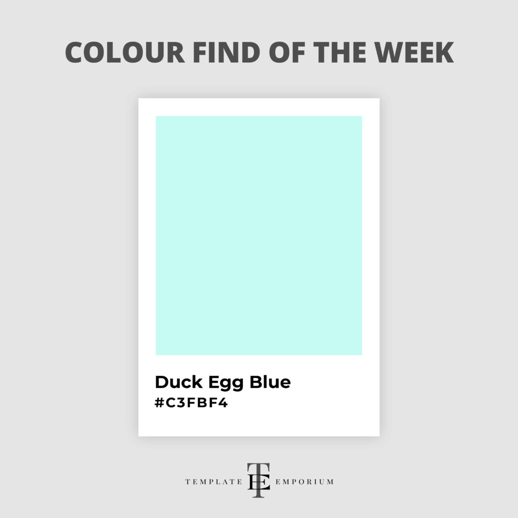
Embrace the serene beauty of Duck Egg Blue.
This calming, pastel hue combines the tranquillity of blue skies with the softness of early morning light.
A hue that’s chic and serene makes it the perfect colour to add tranquillity to your designs.
Warm Neutrals, Greys and Pastel Pinks make the perfect colour combination with Duck Egg Blue.
Colour Find of the Week – 45
Hot Ginger – #A36736

This hue is more than just another form of Brown, it’s a sizzling shade that’s both bold and inviting.
Hot Ginger adds a spicy kick to any project.
It’s the perfect hue for creatives looking to weave warmth and vitality into their designs.
For colour combos, try Hot Ginger with Forest and Bottle Green to spice it up try pairing it with Flame Orange.
Colour Find of the Week – 46
Naples Yellow – #FADA5E
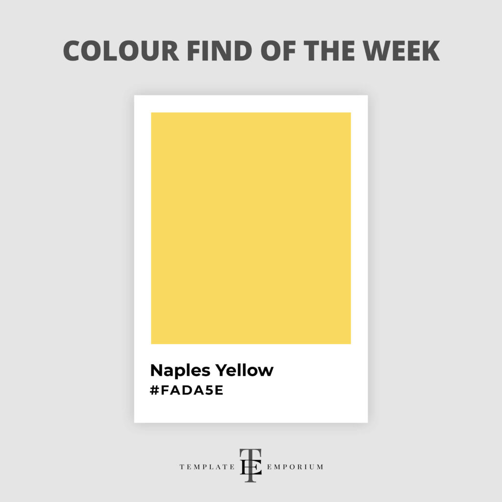
Originally cherished by the masters of the Renaissance, Naples Yellow brings a touch of timeless elegance and a whisper of history.
Its mellow, creamy hue is perfect for bringing your designs a gentle yet vibrant feel.
This ancient colour works well with Reds like Scarlet. For a more modern feel, pair Naples Yellow and Blue and watch them bring out the best in each other.
Colour Find of the Week – 47
Boxwood Green – #829C89
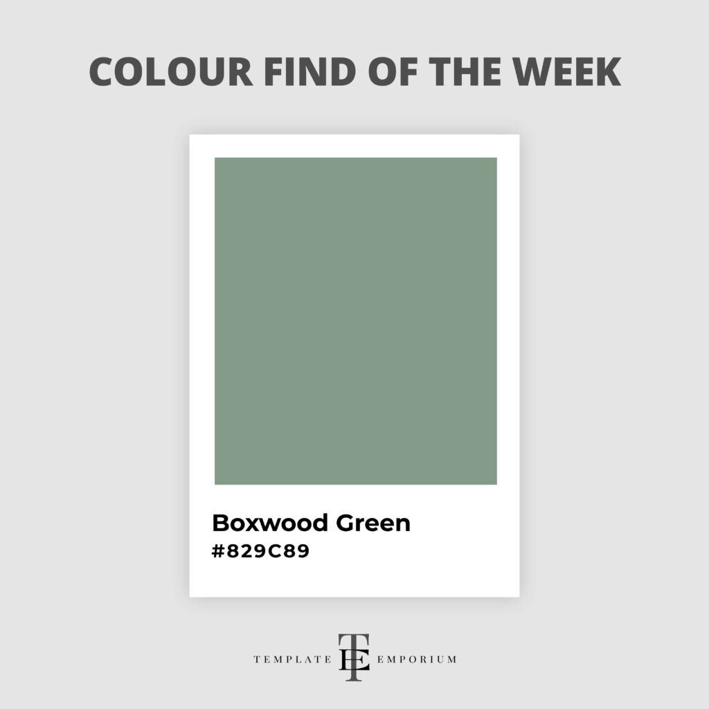
This soothing shade captures the essence of nature’s leafy beauty, reminding us of the timeless elegance of English gardens.
Sometimes referred to as Sage Green, it represents a statement of rejuvenation and growth.
Boxwood Green is a perfect match with deep Reds or Purples or Pinks such as Beetroot.
Colour Find of the Week – 48
Tangerine – #F28500
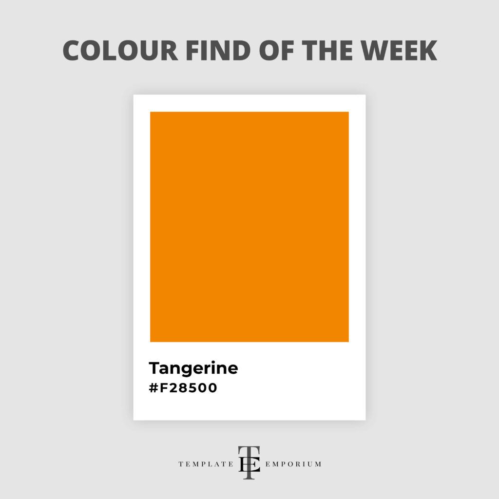
Bursting with life and creativity, this bold, playful hue embodies the joy and spontaneity of artistic expression.
Tangerine infuses warmth, exuberance and a touch of the unexpected.
The complimentary combo of Tangerine and Navy works so well together because the colours are opposites on the colour wheel.
Colour Find of the Week – 49
Mauve – #E0B0FF
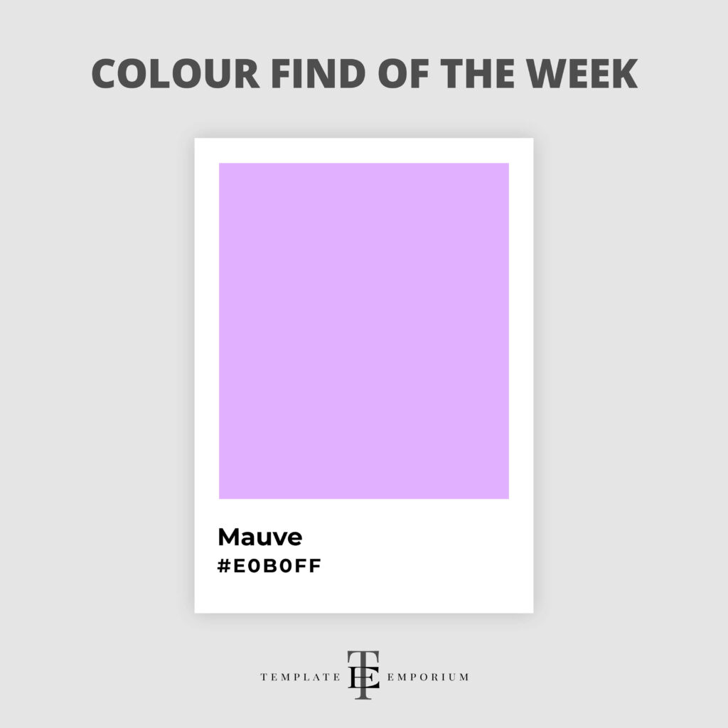
Mauve is a stunning blend of purple and pink that’s absolutely captivating.
This hue is the unsung hero of the colour world as it manages to convey both luxury and romance.
For a touch of nostalgia, try it with Yellow such as Lemon or for a monochromatic palette, it works well with other shades of Purple.
Colour Find of the Week – 50
Light Blush – #F5DED2
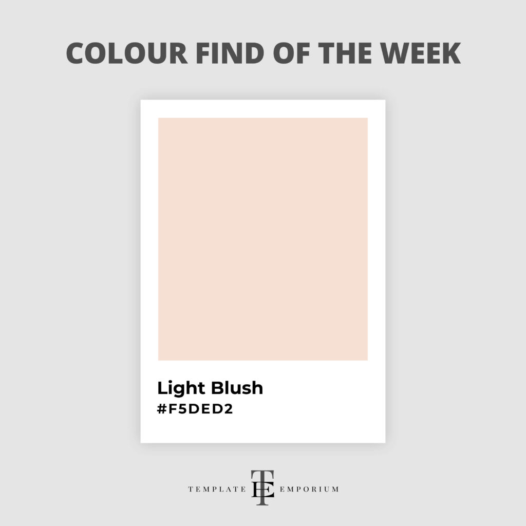
Light Blush is a soft, ethereal hue that brings a touch of romance and delicacy to any piece, perfect for those who embrace subtlety in their art.
Similar in colour to a ballerina shoe ribbon, it offers a sense of calm and serenity and adds a layer of gentle emotion.
Light Blush never takes centre stage instead it works alongside soft shades of Blush Pink, Greens and Greys.
Colour Find of the Week – 51
Chambray – #405580
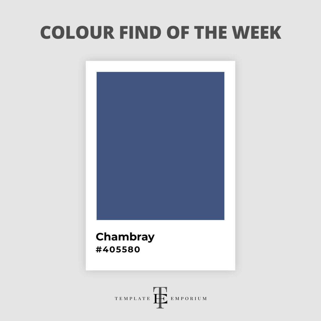
Chambray is a medium-dark shade of Sky Blue making it a cool colour.
This hue captures the essence of relaxation and ease, perfectly mirroring the comfort of your favourite chambray shirt.
Its soft, denim-like shade makes it versatile and universally appealing with its laid-back sophistication.
Colour Find of the Week – 52
Chocolate Brown – #411900
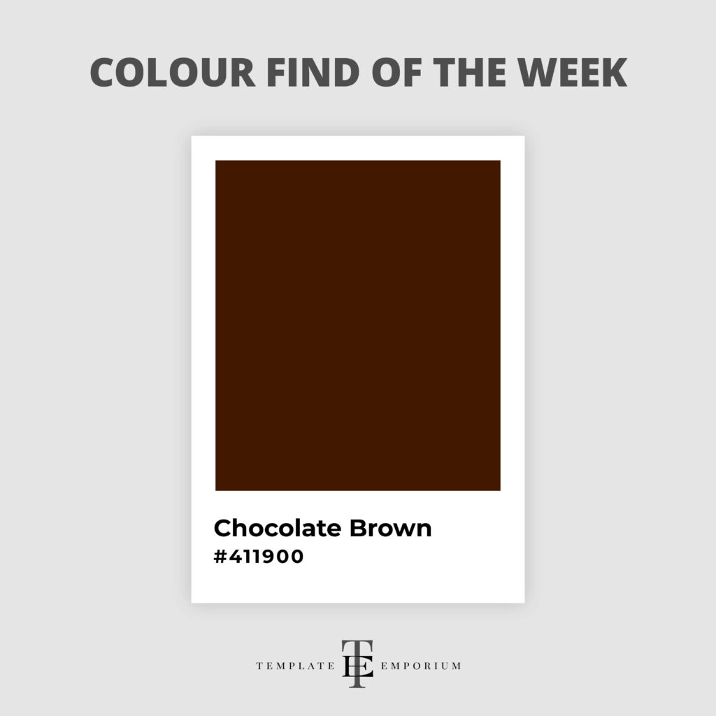
Chocolate Brown brings up memories of the Wonka bar in the nostalgic Willy Wonka & the Chocolate Factory.
It’s also an inviting, familiar and warming shade that wraps around us like a comforting blanket.
Chocolate Brown colour combinations work with Yellow – Marigold, Blue – Royal Blue, Green – Jade, Red – Aurora Red and Pink – Fuchsia.
You Did it!
That’s a wrap on A Year of Vibrant Discoveries: Explore 52 Colourful Weekly Finds! Which one was your favourite? Will you be experimenting with them in your Visual Branding or designs? Let us know if you do. In the meantime, Follow us on Pinterest for more blog posts like this.
Where to now?
Want more Insider Colour Tips? Check out the blogs below.
- Which Colour should you use for your Branding?
- Website Branding: How to use your Brand Colours to make your site Pop!
- Pastel Perfect: Infuse your Visual Branding with a touch of Pastel Magic
Want more Colour Tips?
Grab our FREE GUIDE – How (& where) to pick the perfect colours for your brand.
Do you struggle to pick a colour palette for your website? In this 2-Part Training Guide, you’ll learn three ways to use colour clues (already around you), to ensure you pick the perfect palette every time!

Like the Blog Post?
PIN IT FOR LATER. And for more helpful tips follow us on PINTEREST.
Search
Create & launch your website in a
few simple steps
FREE GUIDE
While you’re here,
grab our FREE
‘Do’s & Don’ts of what to add to your website’ Guide.
‘Do’s & Don’ts of what to add to your website’ Guide.
When you sign up, we’ll send you
emails with additional helpful content.
About Lavinia & Tom
Hi, we're so glad you found us.
We love helping creatives like you finally have the website you’ve always wanted.
Blog Categories
Follow us