grab our FREE
‘Do’s & Don’ts of what to add to your website’ Guide.
‘Do’s & Don’ts of what to add to your website’ Guide.
emails with additional helpful content.
Hi, we're so glad you found us.
We love helping creatives like you finally have the website you’ve always wanted.
few simple steps
Follow us
Brand Style Guides Explained (& why your business needs one now!)
Just like a map guides you to where you want to go, a Brand Style Guide is your visual map to help create consistency across your Visual Branding.
It also helps define the visual difference between a good and a great brand.
In this blog, we’ll cover the six topics that you’ll need to create your (own) Brand Style Guide. By the end, you’ll feel like you’ve had a professional makeover ready to attract your ideal clients.
Missed a part of our Branding your Business Series? Catch up below.
- What is a Call to Action + which CTAs should you use (& avoid)?
- How to Design your visual Branding with the Problem & Solution Method.
Want to get Started Now?
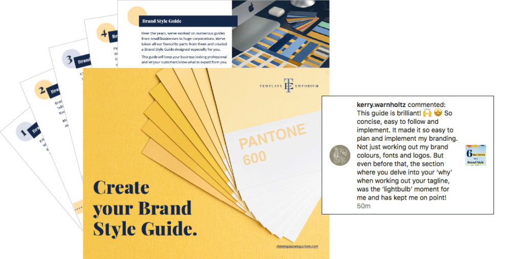
Download our FREE Create your Brand Style Guide
Here’s what Surface Pattern Designer – Kerry Warnholtz said about our style guide on Instagram.
Or PIN IT FOR LATER. And for more helpful tips follow us on PINTEREST.
Why you need a Brand Style Guide
How you describe yourself and your brand to potential customers is how they’ll perceive you.
And, we’ve often found the businesses that think of themselves as little, are so much more than that.
Start by looking at the details you’re showing online. As a new customer, would you trust your brand? Or do you cringe a little and think – oh it will do for now.
Give your Brand a Polished & Elevated Look
Even if you’re only just starting in business, it doesn’t mean you have to look that way.
And, after years of working with huge organisations, we know the details that matter on your website.
Some people brush them off and tell you to stop worrying so much about the little details. We disagree, it’s the little details that make you stand out from your competition. Are you ready for a professional brand makeover?
Brand Style Guides are for everyone
You’re either thinking – Is this just another thing I have to create? or BRAND STYLE GUIDE! I’m not a major corporation. I don’t need that.
The truth is, no matter what size you are, you need one.
So why not follow what every big (and successful) business does?
A Brand Style Guide helps you to be consistent in everything you do. They are a set of rules (that you create) around how you want your brand to be seen and perceived by your customers.
Index:
The 6 Sections of a Brand Style Guide:
1. Brand Logo Versions
2. Brand Details
3. Brand Colours
4. Brand Fonts
5. Brand Photography
6. Brand Copy
Sections of a Brand Style Guide
1. Brand Logo Versions
Primary Logo
When space permits, this is the logo you’ll use the most. Horizontal (wider than higher) logos work best on desktop websites.
Below is an example of our Primary logo.

Secondary Logo
When space is tight and limited, (on a phone or social media post) use this simplified version of your Primary logo. We use a monogram created using the initials of our business name.
Below is our secondary logo.

Mono Logo
If your Primary logo is coloured, create a mono version. Use this when the background clashes or takes away from your logo.
Below is our Mono Primary logo.

Reverse Logo
Use this white logo when it has to appear on a coloured or dark background.

Brand Style Guide Insider Tip:
Go to page 5 of our Free Brand Style Guide and fill-in your logo versions.
Brand Logo Elements
Clear space
Surround the logo, with clear space to protect it from distracting graphics or typography.
No matter what size the logo is, find half its height. This measurement will represent the amount of clear space needed on all sides.

Minimum Size
If your logo is shown too small, it will be illegible
to read. Use your secondary logo for more legibility.
Pick the size that’s right for you. We follow:
A. Online – Primary 180px
B. Online – Secondary 40px

C. Print – Primary logo 1.18” or 30mm
D. Print – Secondary 9/16” or 14mm

What not to do
1. Don’t stretch or expand.
2. Don’t change the brand colour or font.
3. Don’t place over busy photos.

Brand Style Guide Insider Tip:
Head to page 7 of our Free Brand Style Guide and follow the prompts.
Sections of a Brand Style Guide
2. Brand Details
Brand Tagline
This tells your potential clients what you do, sell or offer.
Keep it short and easy to understand.
Make a list of words that describe what you do.
Avoid complicated or industry jargon.
Brand Positioning
How would you want your current customers to describe your brand to potential customers?
Fun, Luxury, Classic, Preppy, Leader.

Brand Sign-Off (CTA)
How will you end your Call to Action (CTA) or social media posts or emails? This is a secondary line to the tagline and sits apart from it.
Brand Email Sign-Off
Apart from your business name, logo and details, this is a great place to let customers know the best way to contact you. Prefer not to be phoned? Leave that contact detail off.
Also, Include your working hours. Otherwise, some customers may expect you to be available 24/7.
For a personal touch, add a hand-written sign-off. Either use a script font or scan in your signature. This blog walks you step-by-step.
Brand Style Guide Insider Tip:
Go to pages 8 & 9 of our Free Brand Style Guide and insert your details.
Sections of a Brand Style Guide
3. Brand Colours
Visual Brand Colours – CMYK
CMYK stands for Cyan, Magenta, Yellow and Black.
This is required when you need to print any of your Visual Brandings such as your stationery or business card.
Using a CMYK version ensures what you print out, is the same as what you see on screen.
If you haven’t already, pick your CMYK Brand Colours. For an extra helping hand, we like to use the Adobe Color Wheel.
Insider Tip:
Page 10 of our Free Brand Style Guide, walks you through the exact steps.

Visual Brand Colours – Hex
For Hex colour breakdowns and how to pick your brand colour palette, refer to our free guide – Where (& how) to pick the perfect colours for your brand.
Don’t have it? Download it here.
MAIN – Visual Brand Colour
This colour is throughout your site.
SUPPORT – Visual Brand Colour
This colour compliments & creates harmony with the MAIN.
NEUTRAL – Visual Brand Colour
Pick a light and dark neutral for balance.
ACCENT – Visual Brand Colour
Used for emphasis (buttons & hyperlinks).
Brand Style Guide Insider Tip:
Page 11 of our Free Brand Style Guide gives you Brand Colour prompts.
Sections of a Brand Style Guide
4. Brand Fonts
We recommend using Google Fonts. Choose from the font categories of serif (classic) and sans serif (modern) and accent (personal).
If you use a serif in your heading, try mixing it with a sans serif in the body copy. This contrast helps create balance.
Below is an example of our Heading font – Playfair Display.

Create a Hierarchy with your Fonts
1. Heading
2. Sub-heading
3. Body copy
4. Accent
The largest size font will be the Heading. Sizing will decrease with your sub-heading and body copy, forming a visual hierarchy.
Using a script font with its hand-written style helps bring personality to your brand. Script fonts, usually, aren’t part of a font family and instead
sit as an individual font.
Layout Style for Headings and Sub-Headings
What type of aligned will your use, left-aligned or centred?
Will you use uppercase or lowercase?
Are the headings going to use italics?
Layout Style for Body Copy
Again consider the alignment and whether you’ll use bold, italics or put all the copy in lowercase.
Email communications
Not all fonts are available for email. In your email provider, pick a font similar to your brand fonts. Use this web-safe font across all your emails.
This consistency will keep your business looking professional, and your emails will be more recognisable to your subscribers.
Add your signature at the end for a personal touch.
Brand Style Guide Insider Tip:
Simply fill in page 13 of our Free Brand Style Guide to keep track of your fonts.
Sections of a Brand Style Guide
5. Brand Photography
Start with a picture in your head of how your ideal client looks. Pick images that she would be drawn to and also reflect your brand style. Try out Unsplash for some inspiration.
Style of Photos
Headshot
How do you want to be viewed? As relaxed, fun, professional or approachable. Find examples of photos or poses you like and keep a record of them.
Sourcing Photos
Will you hire a photographer or will you take them? And will you use Stock or subscription-based photos?
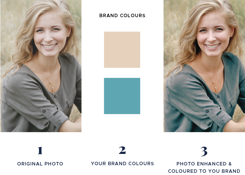
Colour Balance
Are they rich in your brand colours or soft and muted?
We offer Photo Enhancement & Colour Grading. (See the example below). This is changing the hue, saturation and levels to match your photos with your branding colours. Interested? Discover more here.
Emotion
What does your brand stand for? Is it fun, intelligent, relatable, sophisticated or contemporary?
Style
Are the photos colour or black & white, lifestyle shots, top-down, posed or relaxed customers happily using your product or your products on their own?
Shape
Will they sit in a square, rectangle or circle shape and does this match your brand style?
Products
Will they be styled, close-up shots, including backgrounds or deep-etched (no background)?
Social Posts
What do you want to show? You, behind-the-scenes, quotes, lifestyle, family or your products?
Brand Style Guide Insider Tip:
Page 15 of our Free Brand Style Guide is where you’ll record these details.
Sections of a Brand Style Guide
6. Brand Copy
Copywriting
Your photography and words should work together in communicating what you want to say to your audience. Both should complement each other and
be in a similar style.
Your Language Style
Tone
The way you tell your story and show your personality. Is your writing style and viewpoint conversational, fun, relaxed or sarcastic?
How will you communicate this?
Does this feel like a good match with your photography?
Copy Do’s
Make the copy sound like it’s you when you talk. Do you have any favourite phrases or sayings? Also, include your brand keywords for recognition and personalisation.
Copy Don’ts
What is a definite no-no to include? Any clique industry phrases you hear all the time and never want to use? Any sales terms you shouldn’t use as
it could jeopardise your brand reputation?

Formatting
Full stops
Will you include or leave them off for headings and subheadings?
Numbers
When will you use numbers and when will you spell out the word?
E.g. under ten- spell them out, anything above use numerals.
Abbreviations
Will you include acronyms and abbreviations such as John St or will it be spelt out in full as John Street?
Dates
Writing the date in long form can take on four styles:
1. DAY-MONTH- DATE-YEAR
Friday, March 27, 2020
2. DAY-MONTH-DATE
Friday, March 27
3. MONTH-DATE-YEAR
March 27, 2020
4. MONTH-YEAR
March 2020
In all of these styles, there is no comma between the month and the year.
Brand Style Guide Insider Tip:
Head to page 16 of our Free Brand Style Guide to fill in your Copy details.
You Did it!
Now you know (exactly) what to include in your Brand Style Guide.
Creating a guide from scratch, however, takes lots of time and effort. Instead, use our tried and tested fill-in-the-blanks interactive version.
Action Steps
- Download our Free Brand Style Guide.
- Personalise your Guide on page 3.
- Fill in your Brand Logo versions on page 5.
- Logo Element prompts can be filled in on page 7.
- Brand Details are next, fill them in on pages 8 & 9.
- Succeeding that is Brand Colours, follow the prompts on page 11.
- Brand Fonts can be filled in on page 13.
- Your Brand Photography details are next on page 15.
- Lastly, it’s Brand Copy, there’s lots of room to write this on page 17.
- Shoot us an email when you’re done, we’d love to see your new Guide!
Where to now?
- Should you use Blue as your Branding Colour? Find out here!
- Do you know these 15 Showit Shortcuts? Tell me now!
- Unsure of what to add to your website? Here are the Do’s & Don’ts
Don’t forget to download our FREE Brand Style Guide.
Like this Blog Post?
PIN IT FOR LATER. And for more helpful tips follow us on PINTEREST.
Search
Create & launch your website in a
few simple steps
FREE GUIDE
While you’re here,
grab our FREE
‘Do’s & Don’ts of what to add to your website’ Guide.
‘Do’s & Don’ts of what to add to your website’ Guide.
When you sign up, we’ll send you
emails with additional helpful content.
About Lavinia & Tom
Hi, we're so glad you found us.
We love helping creatives like you finally have the website you’ve always wanted.
Blog Categories
Follow us