grab our FREE
‘Do’s & Don’ts of what to add to your website’ Guide.
‘Do’s & Don’ts of what to add to your website’ Guide.
emails with additional helpful content.
Hi, we're so glad you found us.
We love helping creatives like you finally have the website you’ve always wanted.
few simple steps
Follow us
Before you pick your Brand Font, ensure it has these 3 features
Picking suitable Typefaces & Fonts can cause a lot of creatives to get stuck! We’re here to help with our Type Tip Series where we’ll take you from a beginner to a Pro! Let’s start with the three Type features your chosen brand font must have.
Before we start – missed a part of our Type Tips Series? Catch up below.
- Where did the term Uppercase and Lowercase come from?
- What are the different Typeface Categories?
- Type Crimes on your Website (are you committing any of these?)
Font Family
If you’re trying to decide on a typeface, choosing one that’s part of a Font Family is always best. Doing so allows all the elements of that family to work together to offer a variety of options.
A Font Family is made up of three Type Features:
- Type Weights.
- Type Widths.
- Type Slopes (Italics).
Type Features 1 – Type Weights
As a general rule and to make things easier:
- When choosing a typeface, look for a large selection of type weights.
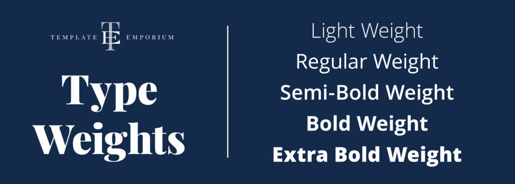
- Including – Light, Regular, Semi-Bold, Bold & Extra Bold.
- These different weights start with thin strokes to thick & chunky.
- Various weights allow you to create a hierarchy between headings, sub-headings and body copy.
Typeface Examples
- A tremendous free font option = Open Sans or Playfair Display from Google Fonts.
- Or a paid font option = ITC Franklin Gothic or Myriad. Or visit Adobe Fonts.
Type Features 2 – Type Widths
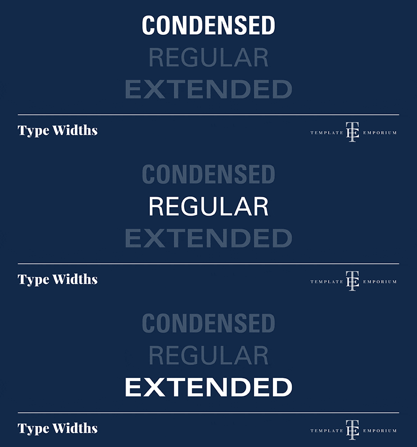
The “width” refers to the left-to-right space (also known as horizontal) a typeface letter takes up.
Widths can be:
– Narrow e.g. Condensed – takes up less space.
– Common e.g. Regular.
– Wide e.g. Extended. – takes up more space.
Insider Tip
Next time you want to stretch out your text, look for an “extended” type width of that font.
Typeface Examples
Univers and Chronicle have a large selection of Type widths.
Type Features 3 – Type Slopes
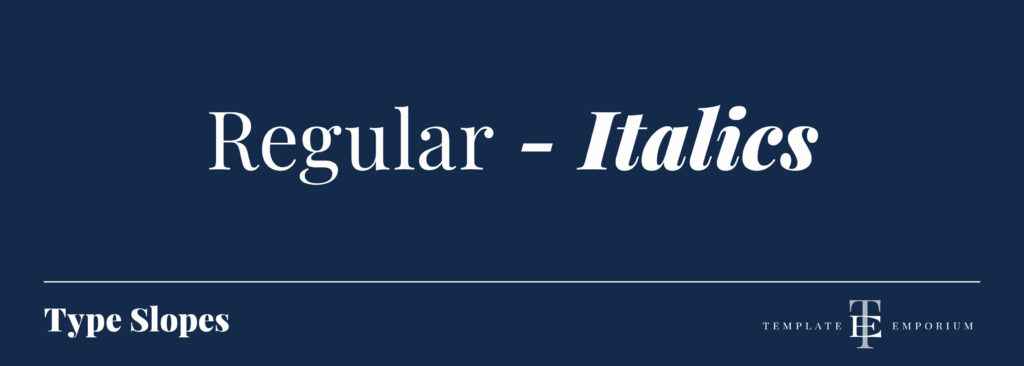
If you’re unaware of Type Slopes, you may be more familiar with its other name – Italics or Oblique.
Italic
- Italic letters appear angled to the right.
- Slightly more rounded than oblique.
- Italics can be found in Regular and Bold Weights.
- They are used for emphasis.
- Or to state the name of something, such as a concert, exhibition, movie, play, report, song, T.V. program, the title of a book or a work of art.
Italic Typeface Examples
- A tremendous free font option = Open Sans or Playfair Display from Google Fonts.
- Or a paid font option = ITC Franklin Gothic or Myriad. Or visit Adobe Fonts.
Oblique
- A slanted version of the Roman typeface.
- Popular options include – Baskerville, Times New Roman & Garamond.
You did it!
That’s a wrap on – Before you pick your Brand Font, ensure it has these three features!
Now you understand the importance of Type Weights, Widths and Slopes – you also know the secret recipe to picking the perfect font family. In the meantime, keep following along with our Type Tip series, where we’ll take you from a beginner to a pro in no time!
Where to Now?
Want more Font insider tips and techniques? Check out the below.
- What are the different Typeface Categories?
- Our 5 Favourite Google Font Pairings for your website.
- How to Update Master Fonts in Showit.
Like the Blog Post?
PIN IT FOR LATER. And for more helpful tips follow us on PINTEREST.
Search
Create & launch your website in a
few simple steps
FREE GUIDE
While you’re here,
grab our FREE
‘Do’s & Don’ts of what to add to your website’ Guide.
‘Do’s & Don’ts of what to add to your website’ Guide.
When you sign up, we’ll send you
emails with additional helpful content.
About Lavinia & Tom
Hi, we're so glad you found us.
We love helping creatives like you finally have the website you’ve always wanted.
Blog Categories
Follow us