Avoid These Typefaces: How Bad Fonts Can Ruin Your Website
While we usually help you discover what typefaces work best on your website, there is also a style of typefaces we want you to avoid, called Monospaced typefaces.
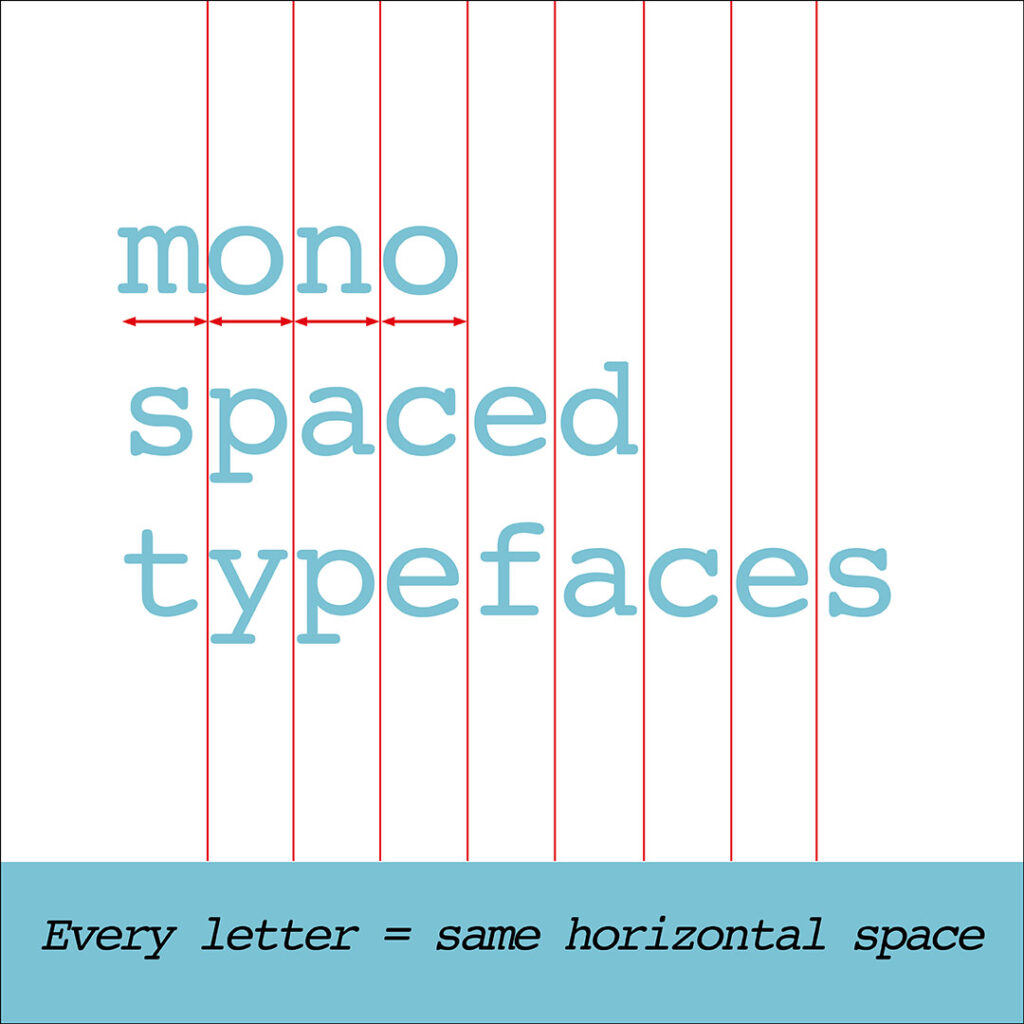
What are Monospaced Typefaces?
- Est.19th Century.
- Every letter takes up the same amount of horizontal space.
- Because of this, they are less readable than other typefaces.
- And the overall look can feel clunky and uncomfortable.
- They are best suited for use in typewriters or computer programming.
1. Monospaced Typeface – Courier
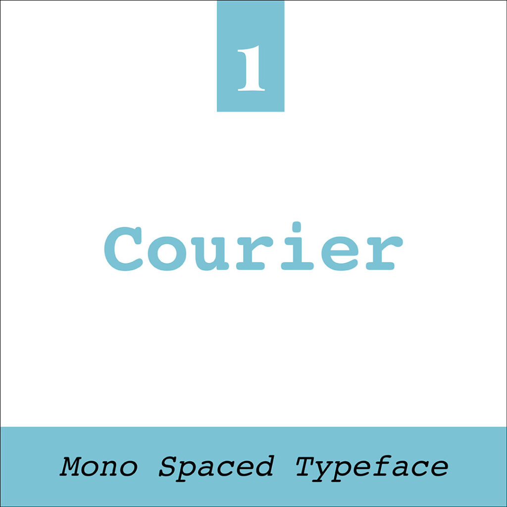
- Created by IBM in the mid-1950s.
- Designed by Howard Kettler.
- Commonly known as the “typewriter font”.
- It is a Monospaced slab serif typeface.
- From the 1960s to the early 2000s, it was the default typeface for official documents for government and medical departments.
- The standard font for screenwriters in the Film/TV industry.
2. Monospaced Typeface – Space Mono
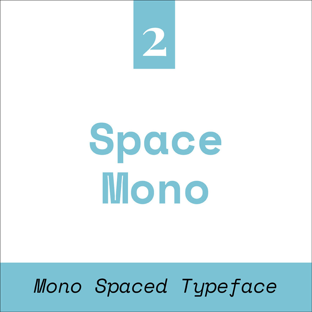
- Designed by Colophon Foundry for Google 2016.
- Often called a fixed-width, fixed-pitch, or non-proportional typeface.
- Available to use via an open-source license.
- Developed for editorial use for display and headline typography.
- Available in:
Regular, Italic, Bold & Bold Italic.
3. Monospaced Typeface – Apercu Mono

- Designed by Colophon in 2010.
- It is a grotesque sans-serif, monospaced typeface.
- Compared to other monospaced typefaces, it has more unique and unusual characteristics.
- It is an amalgamation of numerous fonts, including:
– ITC Johnston
– Gill Sans
– Neuzeit
– Franklin Gothic
Insider Tip – Other Typefaces to Avoid
Always avoid using typefaces on your website that are difficult to read, overly decorative, cliched or overused. A few examples of these include:
- Mistral & Vivaldi– too difficult to read
- Jokerman & Curlz MT – overly decorative
- Comic Sans, Papyrus, Brush Script & Algerian – cliched & overused
You Did it!
That’s a wrap on Typefaces we don’t recommend you use on your website. In this blog, we discussed a group of typefaces that fit into this category called Monospaced, meaning every letter has the same horizontal space. Check out the examples above to determine which ones to avoid when designing your website.
Where to now?
Want more Typeface and font insider tips?
- Typeface & Font: Are They Really the Same? Think Again!
- What are the different Typeface Categories?
- Serifs or sans-serifs: Which font style do you prefer?
Like the Blog Post?
PIN IT FOR LATER. And for more helpful tips follow us on PINTEREST.