grab our FREE
‘Do’s & Don’ts of what to add to your website’ Guide.
‘Do’s & Don’ts of what to add to your website’ Guide.
emails with additional helpful content.
Hi, we're so glad you found us.
We love helping creatives like you finally have the website you’ve always wanted.
few simple steps
Follow us
Are you using Number Styles (correctly) on your website?
If you’ve never heard of the term “Number Styles”, it refers to the different ways numbers can be formatted and displayed in text or design.
In this week’s Type Tip, we’re focussing on two types you would commonly use on your website. Plus, we’re sharing the differences and when to use one over the other.
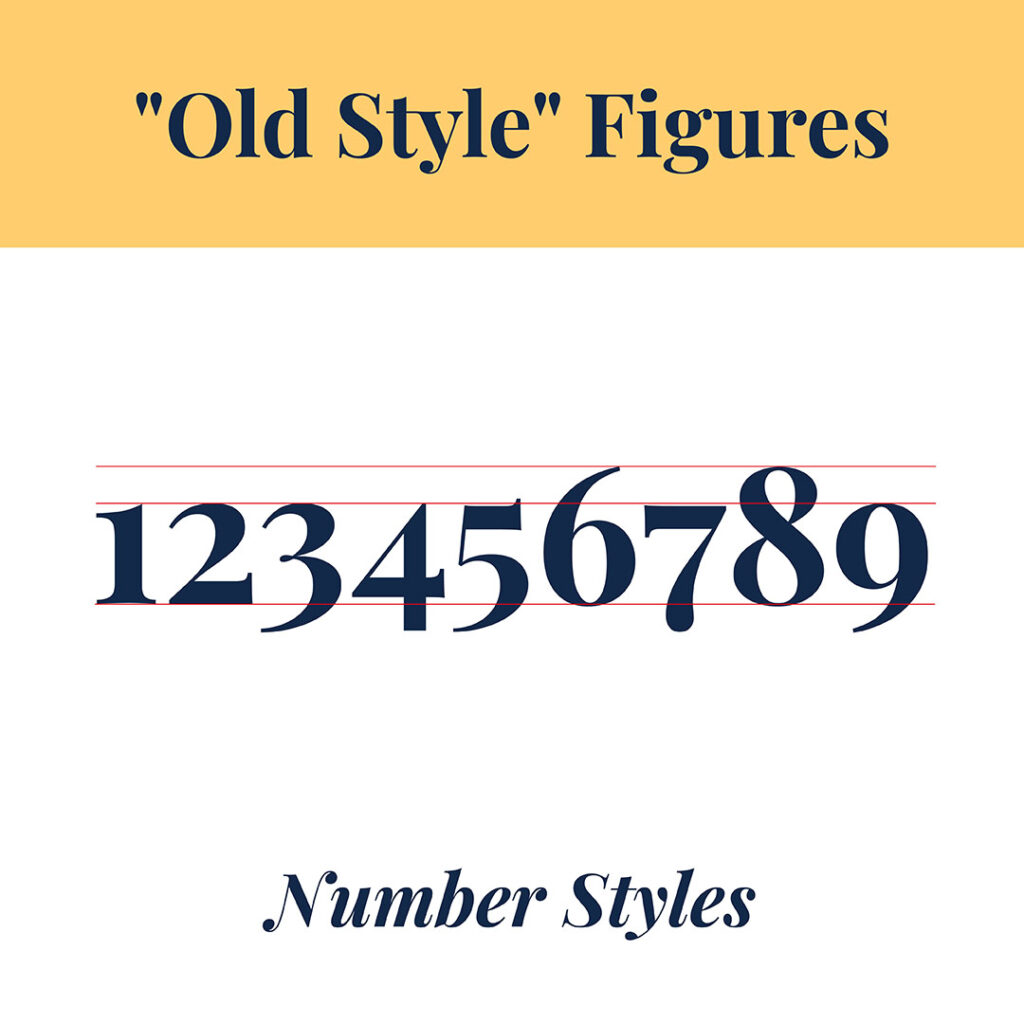
Old style Figures
Use this style in the body copy on your website when the text is lowercase. (See our example below).
The numbers look and flow naturally with the other letters.
And like letters, the ascender and descender height may differ.

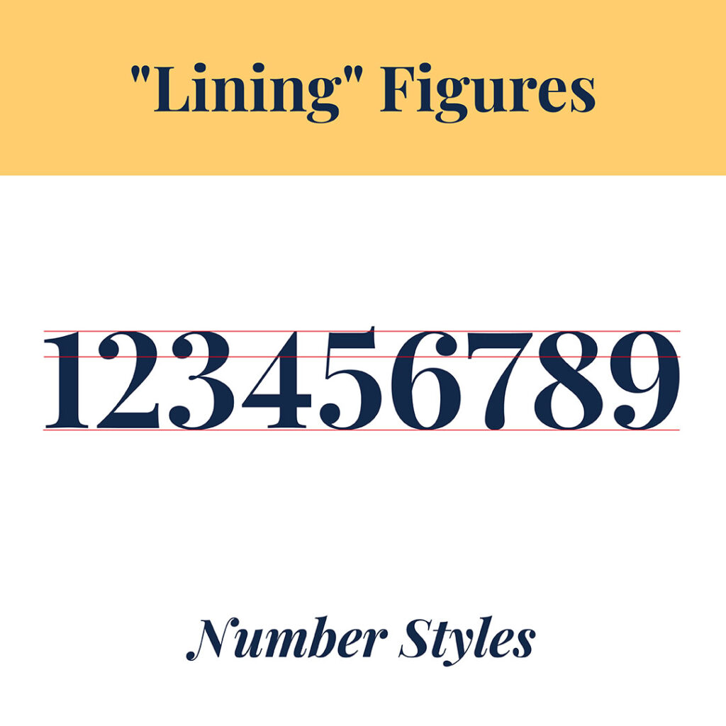
Lining Figures
These figures were introduced in the 18th Century.
They work best when used in equations or number-heavy sentences, such as in a phone or mobile number. (See our example below).
All the tops and bottoms of the numbers line up.

Insider Tip
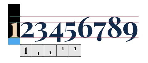
Here’s how to change an Old Style Figure to a Lining Figure using Indesign.
- Type the numbers you want to use.
- Highlight the number, and right-click or hold down CONTROL.
- Once you see the fly-out menu, click on the number-style version you want to use.
You Did it!
That’s a wrap on Are you using Number Styles (correctly) on your website? Now you know the differences between Old Style and Lining figures, go through your website and make any necessary updates. After that, Follow us on Pinterest for more blog posts like this.
Where to now?
For more website tips, check out the blog posts below.
- 4 Free Resources to help you pick the perfect photos for your website.
- Top Website Mistakes creative professionals make (& how to avoid them).
- Type Crimes on your Website (are you committing any of these?).
Like the Blog Post?
PIN IT FOR LATER. And for more helpful tips follow us on PINTEREST.
Search
Create & launch your website in a
few simple steps
FREE GUIDE
While you’re here,
grab our FREE
‘Do’s & Don’ts of what to add to your website’ Guide.
‘Do’s & Don’ts of what to add to your website’ Guide.
When you sign up, we’ll send you
emails with additional helpful content.
About Lavinia & Tom
Hi, we're so glad you found us.
We love helping creatives like you finally have the website you’ve always wanted.
Blog Categories
Follow us