grab our FREE
‘Do’s & Don’ts of what to add to your website’ Guide.
‘Do’s & Don’ts of what to add to your website’ Guide.
emails with additional helpful content.
Hi, we're so glad you found us.
We love helping creatives like you finally have the website you’ve always wanted.
few simple steps
Follow us
Are too many fonts making your website look bad?
Picking and choosing fonts for your website allows you to express what your brand is all about. However, adding too many can have the opposite effect and make your website feel disorganised and mismatched.
In this blog, we’re sharing how to create a perfect font balance while still expressing the style and personality of your brand.

The key to a perfect font balance on your website
Using the latest or most popular typefaces of the moment can make your website feel outdated once the trend is over.
The key to creating balance with the fonts on your website is not to use too many. We’ve found that three is the sweet spot. This odd number works beautifully in the design and layout of your site.
Insider Tip
We prefer to use classic fonts that will continue to look good over time. Using all Serif or Sans-serif fonts together will result in nothing standing out. Instead, combine a Serif, Sans-serif and an accent font.
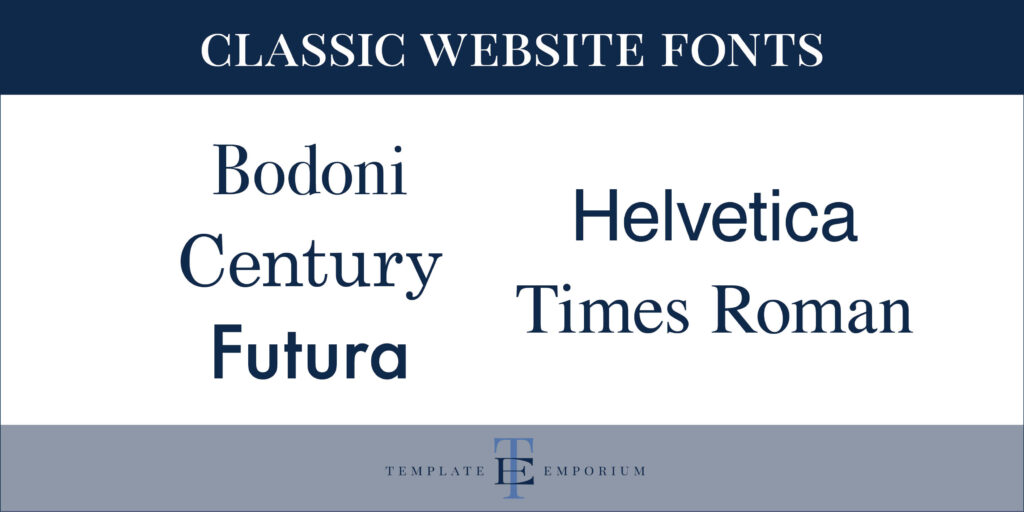
Here are a few classics that you could try out on your website. Bodoni, Century, Futura, Helvetica and Times Roman
And here’s what the Classic fonts look like.

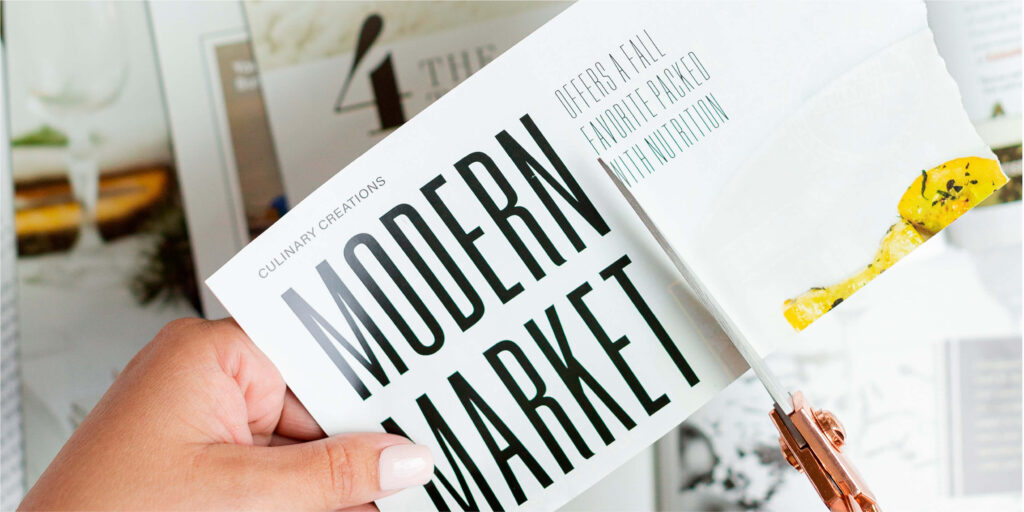
Want to express the style of your brand? Use these fonts.
Adding your brand fonts to your website suddenly takes it from blah to giving it the personal feel your customer wants.
Create a Hierarchy with your Fonts
Follow the order below to form a visual hierarchy.
- Heading – The largest size font will be the Heading.
- Sub-heading – Sizing will decrease with your sub-heading.
- Body copy – This will be the smallest of all the font sizes.
BONUS: Pull-out quotes are another way to add visual hierarchy. Learn all about them here.

Insider Tip
If you haven’t decided on your branding fonts? Google Fonts is a great place to start. We share our 5 favourite Google font pairings in this blog. And we always recommend your brand fonts have these 3 features. Does yours?
BONUS Showit Font Tip
In your Showit Template, you’ll want to update your Master Fonts using Site Styles. You can find them in the Design Settings. This method will allow you to make font changes across the entire template.
Here’s how to add personality to your website headings.
Using a script font with its hand-written style helps bring personality to your brand.
Script Fonts
Unlike other fonts we’ve discussed, script fonts, usually, aren’t part of a font family and instead sit as an individual font.
Script typefaces, also known as script fonts, mimic the style and fluidity of handwriting or calligraphy.
Handwritten Fonts
Handwritten fonts have a sense of beauty and add elegance and personality, giving new life to a standard heading or sub-heading.
Script typefaces come in various styles, including formal, casual, friendly, or elegant. Pick the style that best resonates with your audience.
Insider Tip
Even though the script font may look beautiful if it’s difficult to read, forget it and pick something else.
Avoid using script fonts in large amounts of text. Instead, use them purely for short headings or as an accent.
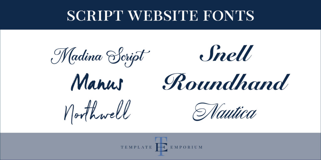
Here are a few Script Fonts to try. Madina Script, Manus, Northwell, Snell Roundhand and Nautica
And, here’s how the Script Fonts look.

You Did it!
That’s a wrap on Are too many fonts making your website look bad? Use our tips to create balance and add personality to your website. In the meantime, Follow us on Pinterest for more blog posts like this.
Where to now?
We’ve got lots of other insider tips on fonts, check out the below
- Your new favourite Font Finder
- The Four most common Font Styles
- Unsure of what to add to your website? Here are the Do’s & Don’ts
Use these font tips in your FREE Brand Style Guide
If you liked the tips in this blog post, you’ll love the tips we share in our Brand Style Guide. Think of this as your business blueprint. Plus, you’ll finally learn the secret to keep your Visual Branding look consistent. Click the image below.

Like the Blog Post?
PIN IT FOR LATER. And for more helpful tips follow us on PINTEREST.

Search
Create & launch your website in a
few simple steps
FREE GUIDE
While you’re here,
grab our FREE
‘Do’s & Don’ts of what to add to your website’ Guide.
‘Do’s & Don’ts of what to add to your website’ Guide.
When you sign up, we’ll send you
emails with additional helpful content.
About Lavinia & Tom
Hi, we're so glad you found us.
We love helping creatives like you finally have the website you’ve always wanted.
Blog Categories
Follow us