Design Jargon Decoded: Transform your expertise fast!
As a creative, you know that the world of design is filled with a rich vocabulary that can be both exciting and overwhelming.
Whether you’re presenting to clients, collaborating with other creatives, or sharing your expertise in workshops, understanding and using design jargon effectively can elevate your communication and impact.
Here’s a breakdown of essential design terms that can transform your expertise fast!
Design Jargon 1
Colour Theory: The foundation of visual design
Understanding colour theory is crucial for any designer.
For example, did you know that Blue can instill a sense of trust, while Red often represents passion? Mastering colour theory can help you convey the right message through your visuals.
From the Colour Wheel to Complementary and Analogous colours, this knowledge helps you create harmonious designs that evoke emotions.
Complementary Colours
Complementary colours are those that are located opposite each other on the colour wheel. For example: Blue & Orange, Yellow & Purple and Red & Green.
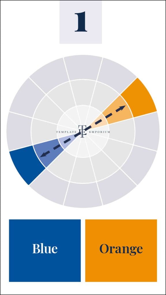
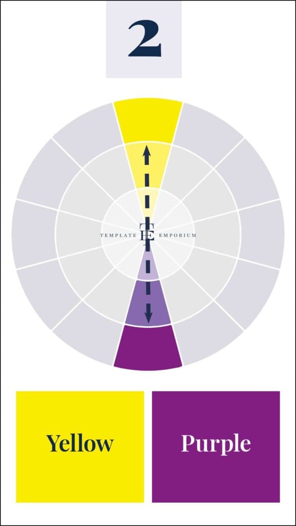
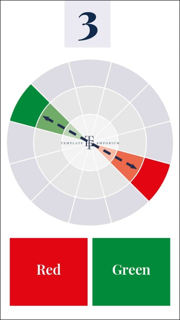
When used together, complementary colours enhance each other’s vibrancy. They create a sense of tension and energy because they do not share any common colours.
Analogous Colours
Analogous colours are three colors that are located side by side on the colour wheel, also referred to as adjacent colours. For example: Blue-Green, Blue and Blue-Violet.
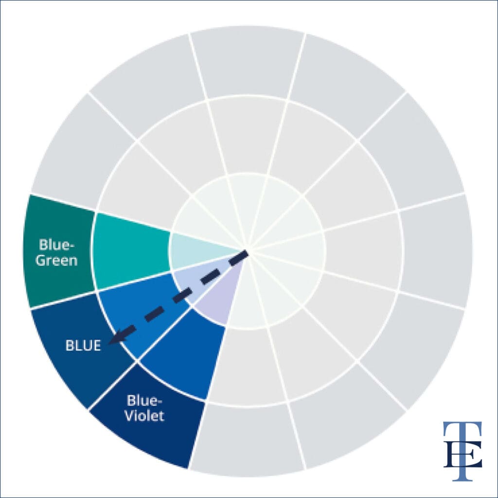
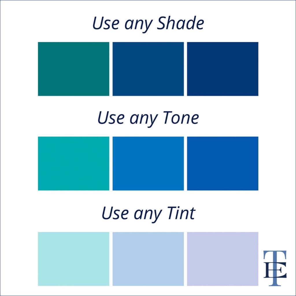
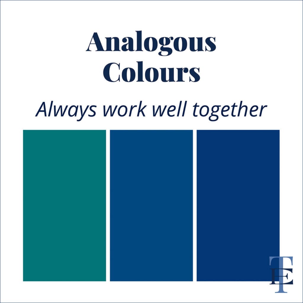
These colours always work well together because they share strong undertones, exhibit low-contrast harmony, and are visually pleasing.
Learn more about Colour Theory here.
Design Jargon 2
Typography: More than just fonts
Typography goes beyond simply choosing a pretty font; it’s about how text shapes your design’s personality.
Key terms like:
- Kerning – the space between letters
- Leading – the space between lines
- Hierarchy – importance of text in layout
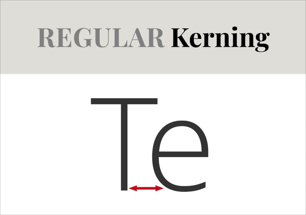
Kerning
There are three types of Kerning: Regular, Negative and Positive. If the space between letters doesn’t look right, consider using the following Kerning tips.
Regular Kerning = This is the automatic amount of space provided by your design program.
Negative Kerning = Involves reducing the space between the letters.
Positive Kerning = Is when you increase the space between the letters.


Proper kerning is essential for creating designs that are both readable and visually appealing. Experimenting with typography can have a significant impact on how your message is perceived.
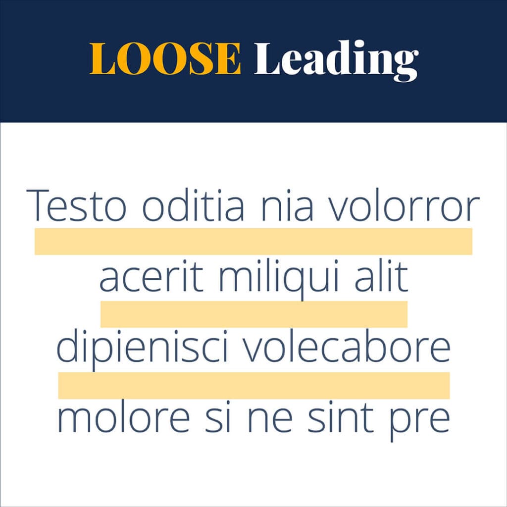
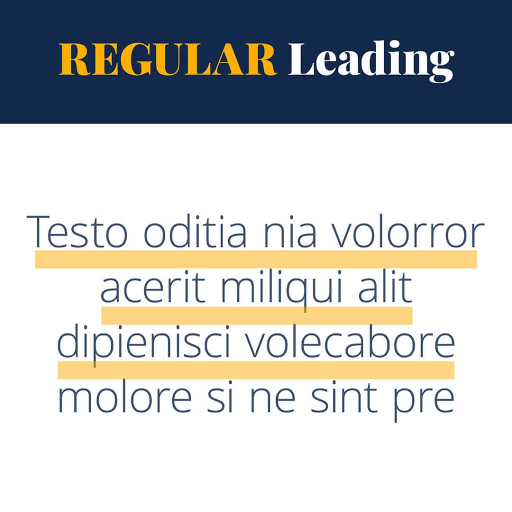
Leading
Leading refers to the vertical space between multiple lines of text.
Think of leading like the three bears in the story of Goldilocks. You want to find that “just right” amount (not too much and not too little).
Loose Leading = This occurs when there is too much space between lines, resulting in an awkward and unprofessional appearance.
Tight Leading = On the other hand, too little space makes the text difficult to read.
Regular Leading = This is the ideal amount of space, creating a relaxed and comfortable reading experience for the audience.
Want our tip for calculating the Ideal amount of space? Check out this blog.

Hierarchy
You can create a type hierarchy in your designs by using different sizes, weights, widths, typefaces and colours.
By following our three step type hierarchy order, your readers will know where to look to find the information they need.
Step 1: Heading
At the top of the hierarchy is the most important information, such as a heading or headline. Make this text large and bold to ensure it stands out and captures your reader’s attention.
Step 2: Subheading
Following the heading, include important information in the form of a subheading. This should be a different size and weight to clearly distinguish it from the heading.
Step 3: Body Copy
The hierarchy concludes with the essential details presented in the body copy. This text should be the smallest in size and weight, while still remaining legible.
Design Jargon 3
White Space: The power of negative space
White space, also known as negative space, is a crucial aspect of design that is often overlooked.
Have you ever encountered a design, advertisement, poster, or any other creative piece that felt too cramped, crowded, or difficult to read? This is often due to insufficient white space.

Incorporating adequate space around your design elements provides breathing room for your text, images, and overall design.
This allows viewers to read, see, and absorb the content much more easily.
During my time in media, I created newspaper and magazine ads, and some clients insisted that every bit of space needed to be filled!
They believed that this approach would help them get the most for their money, resulting in an overload of information in a small area. However, this actually has the opposite effect: nothing stands out, and the design feels suffocating.

Effectively utilizing white space offers several benefits:
- It helps create balance
- It highlights key elements
- It enhances readability
Understanding how to use white space can make your designs appear more polished and professional, so don’t hesitate to let your designs breathe!
Insider Tip
After finishing your design, try decreasing the size of each element by 10%. You’ll be surprised at how this additional white space enhances the overall appearance.
User Experience (UX): The heart of design
User experience is all about how someone interacts with a product or service.
Designers need to think about navigation, accessibility, and overall satisfaction.
Two essential concepts that play a crucial role in this process are User Journey and Personas.
User Journey
This is mapping the steps users take from their first interaction to their end goal, highlighting their needs and pain points.

The User Journey includes focusing on their emotions, decisions, and actions along the way.
Understanding user journeys in UX helps designers create more intuitive experiences that resonate with your audience.
Persona
Persona’s are detailed representations of target users based on research and data.
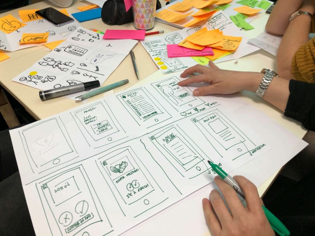
Persona’s capture goals, behaviors, and pain points to guide design choices toward real user needs.
By building these profiles, UX designers can create solutions that work for actual users, not just assumptions.
Brand Identity: The essence of your vision
Brand identity encapsulates the visual elements that represent a brand, including:
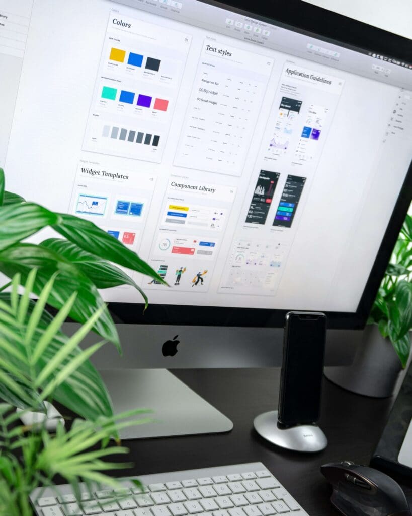
- Logos – Including your Primary, Secondary, Mono and Reverse versions.
- Colour Palettes – Pick brand colours by including a main, support, neutral and accent colour.
- Typography – These are your brand fonts. Pick fonts for your heading, sub-heading, body copy and accent.
- Imagery – Start with a picture in your head of how your ideal client looks. Pick images that she would be drawn to and also reflect your brand style.
- Learn more about Brand Identity at this blog.
A strong brand identity fosters recognition and loyalty. As a designer, mastering this jargon allows you to create cohesive and memorable designs that align with your clients’ visions.
You Did It!
Decoding design jargon doesn’t have to be daunting! By familiarising yourself with these essential terms, you can communicate your expertise more effectively and confidently collaborate with clients and peers.
As you continue to grow as a designer, remember that mastering the language of design is just as important as the skills you employ.
Like the Blog Post?
PIN IT FOR LATER. And for more helpful tips follow us on PINTEREST.