grab our FREE
‘Do’s & Don’ts of what to add to your website’ Guide.
‘Do’s & Don’ts of what to add to your website’ Guide.
emails with additional helpful content.
Hi, we're so glad you found us.
We love helping creatives like you finally have the website you’ve always wanted.
few simple steps
Follow us
Have you considered using these Colour Palettes for your Branding?
Picking your perfect brand colours can be tricky. But when you use the colour wheel as your guide, you’re suddenly introduced to lesser-known palettes such as Analogous and Monochromatic colours.
In this blog, we’re looking at these two often misunderstood colour palettes. Could these colour combinations be what your visual branding has been looking for? Let’s find out!
Want all our Monochromatic & Analogous Branding Colour Tips?
Download our FREE colour guide now!
Analogous Colours
Even if you have never heard of Analogous colours, don’t worry you’re not alone. Here’s a breakdown of what they are and how they work.
What are Analogous Colours?
Analogous colours are 3 colours side by side on the colour wheel also known as adjacent colours.

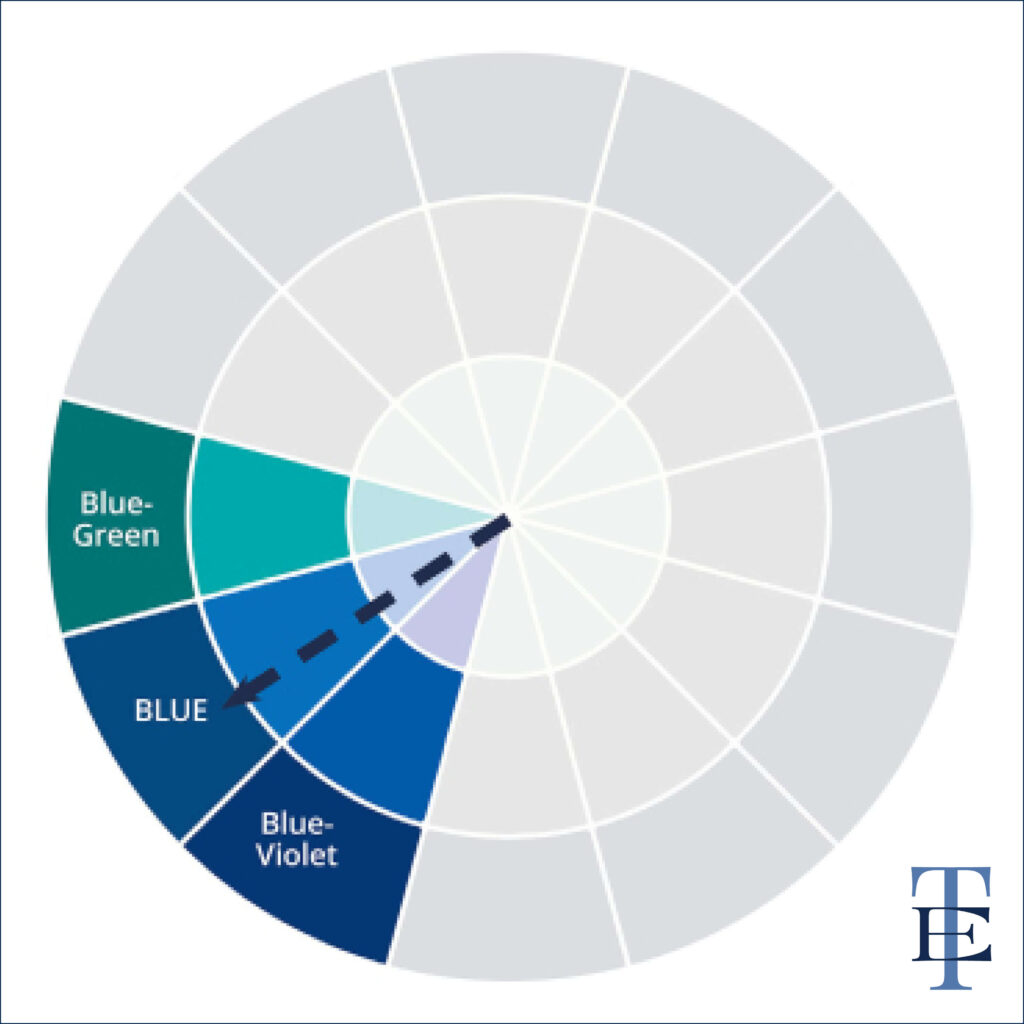
What Analogous Colours align with your brand’s personality and target audience? Firstly, pick your main colour and find the colour on either side.
For example, we picked Blue. The colours on each side are Blue-Green and Blue-Violet.
How to Create Your Analogous Palette
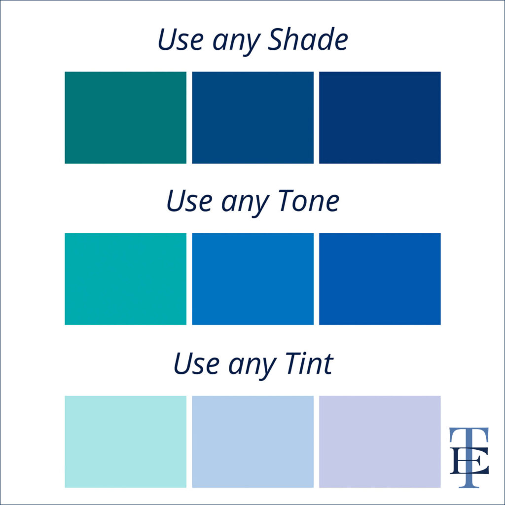
Use any shade, tone or tint of your chosen colours at a 90-degree angle on the colour wheel.
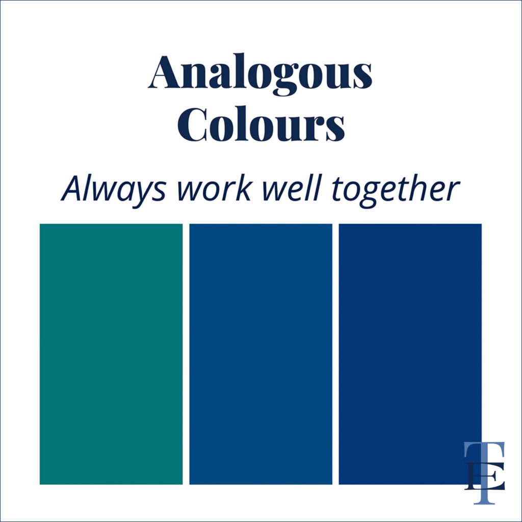
Why Analogous colours work well together
These colours share strong undertones, have low-contrast harmony, and are easy on the eye.
Check out the reel below to see the Analogous colours we created.
Monochromatic
Are you seeking simplicity, visual harmony & balance in your branding palette? (We can help!)
The Monochromatic colour palette is your answer.
But living in a world of monochrome doesn’t mean it’s boring.
It’s all about exploring the shades, tones and tints within a single hue.
What is a Monochromatic Colour Palette
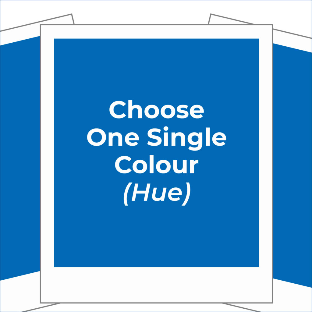
Choose one single colour (Hue).
Expand the use of this colour by using the different values of the hue.
These include the dark, medium and light values.
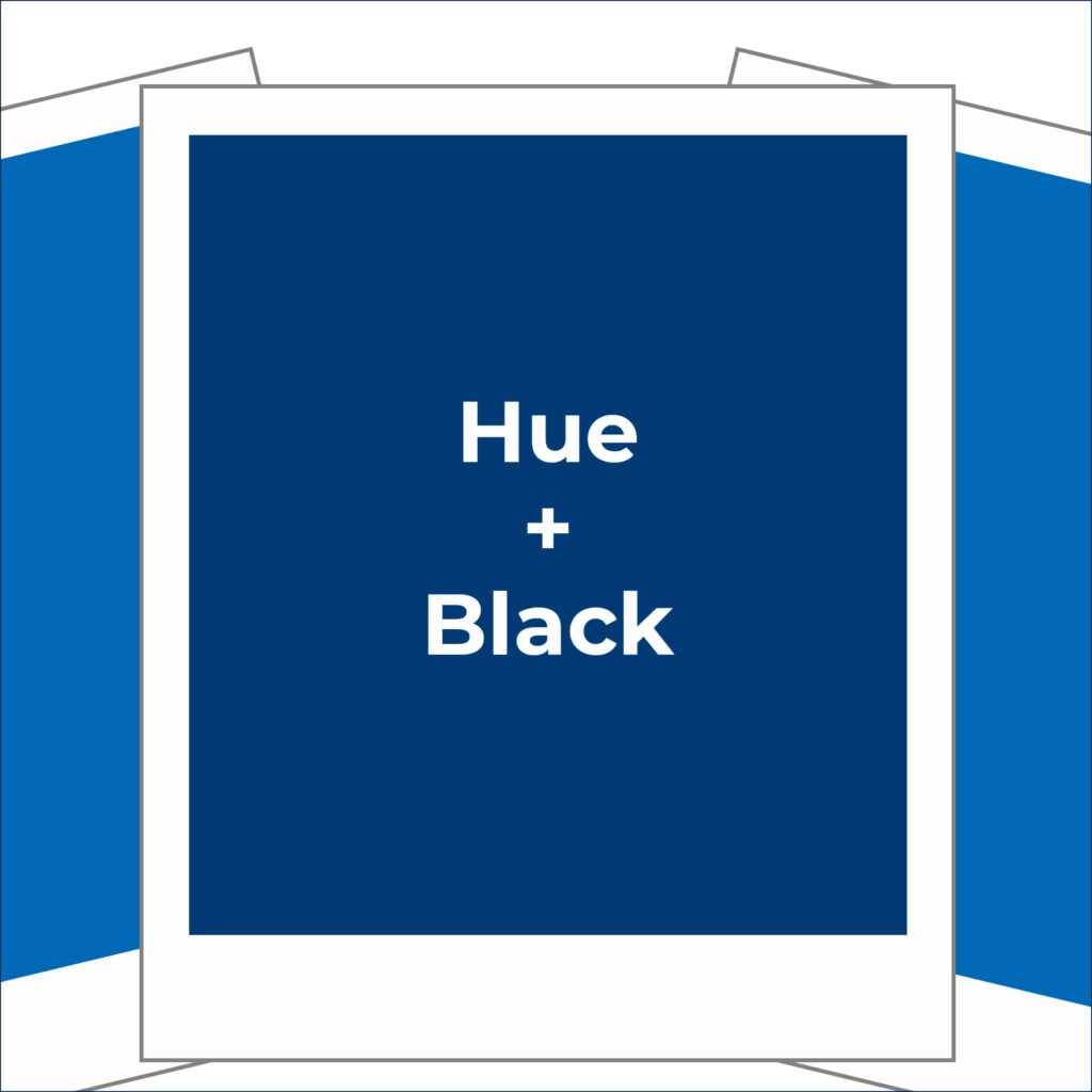
Dark Values – SHADES
Your Monochromatic Palette starts by creating the Shades of the hue. These are the darkest values.
This is achieved by:
Base Colour (hue) + different Shades (e.g. Black)
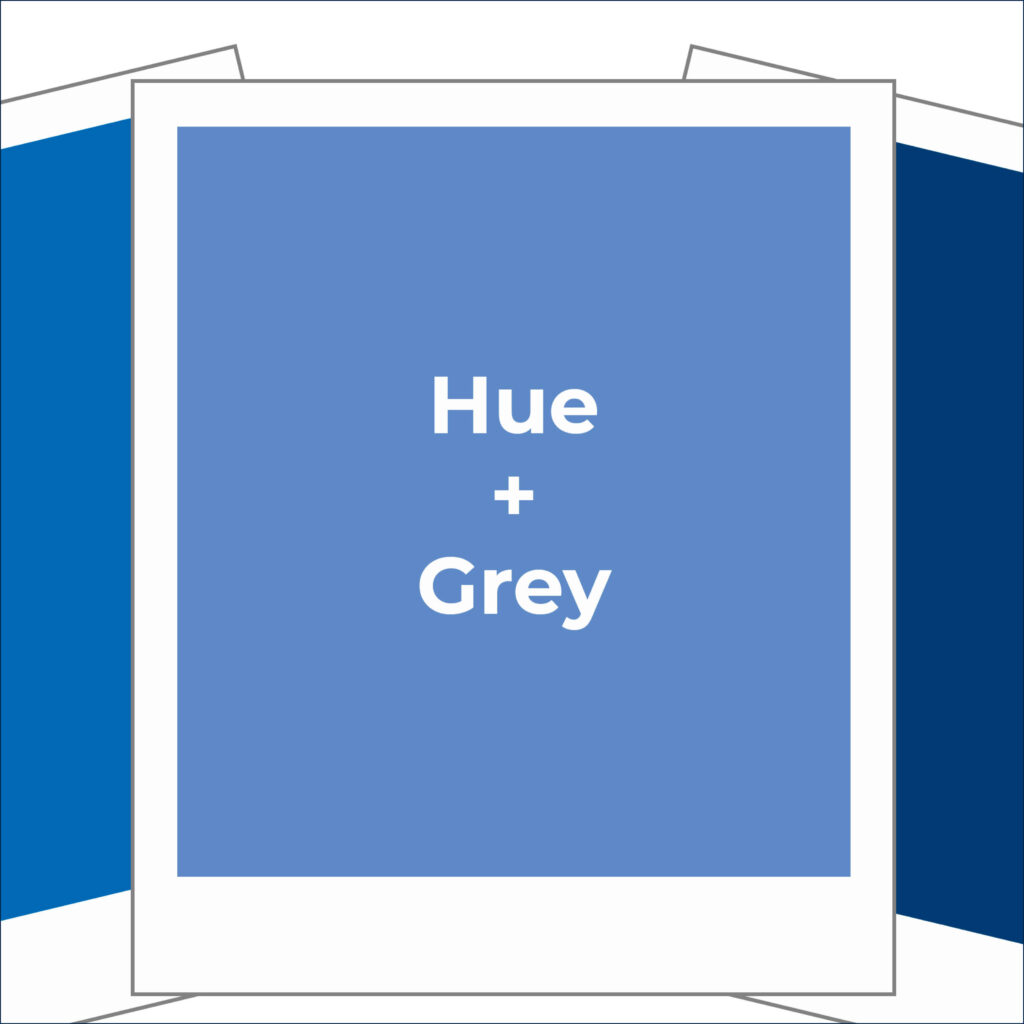
Medium Values – TONES
Next up we’ll create the tones of the hue. These are the medium values
This is achieved by:
Base Colour (hue) + different Tones (e.g. Grey)
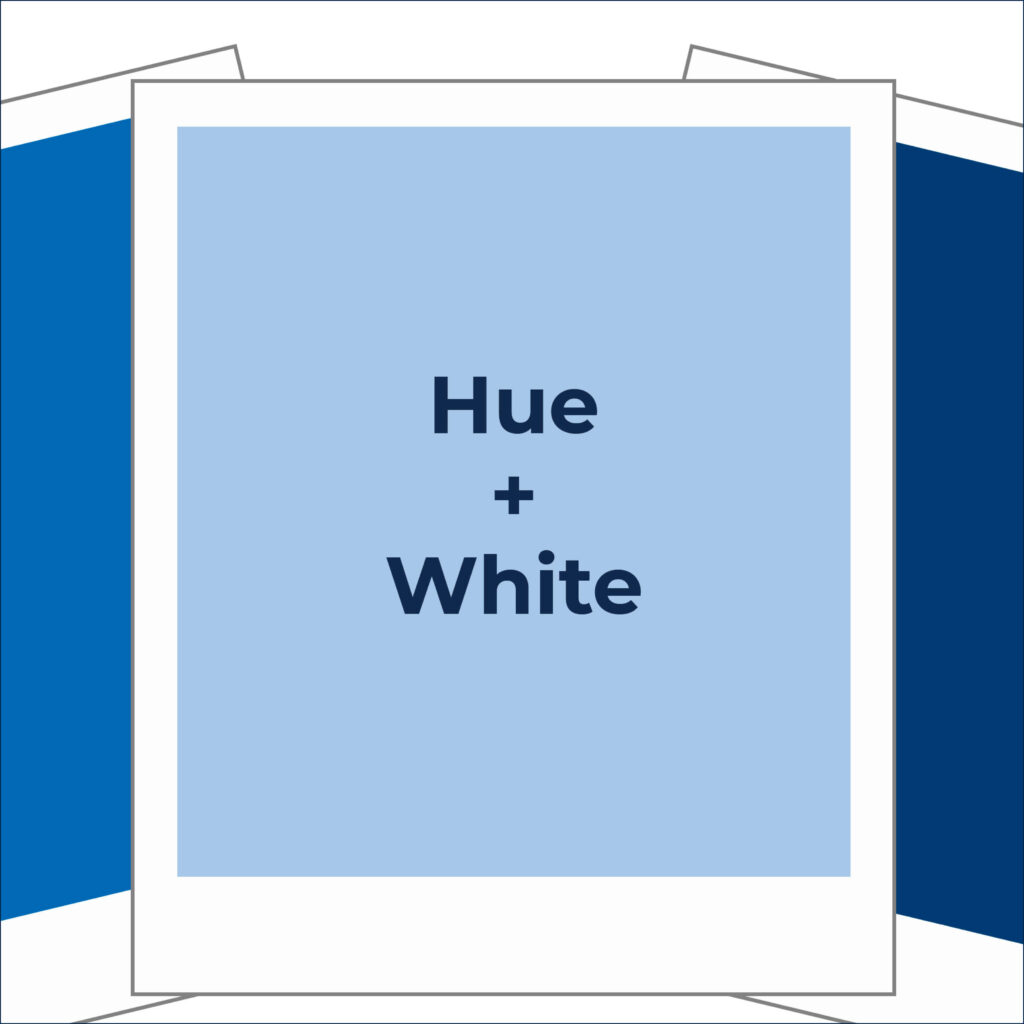
Light Values – TINTS
Finally, we’ll create the tints of the hue. These are the light values
This is achieved by:
Base Colour (hue) + different Tints (e.g. White)

The Final Monochromatic Palette
The result is a collection of shades, tones and tints of one colour (hue).
Check out the process below to see the Monochromatic Palette we created.
You Did it!
That’s a wrap on Have you considered using these Colour Palettes for your Branding? Would you consider a Monochromatic palette or a set of Analogous colours for your visual branding? Let us know here, and in the meantime, Follow us on Pinterest for more blog posts like this.
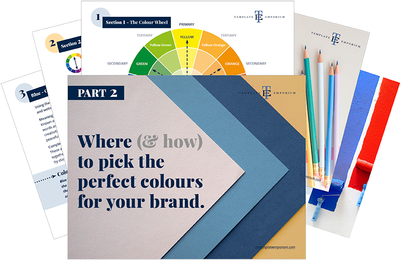
Ready to transform your brand with these stunning colour palettes?
Download our FREE Colour Guide now.
Where to now?
Want more insider tips on branding colours? Check out the blogs below.
- Have You Ever Experimented with Neon Colours in Your Branding?
- Should you use Blue as your Branding Colour?
- Which Colour should you use for your Branding?
Like this blog post?
Search
Create & launch your website in a
few simple steps
FREE GUIDE
While you’re here,
grab our FREE
‘Do’s & Don’ts of what to add to your website’ Guide.
‘Do’s & Don’ts of what to add to your website’ Guide.
When you sign up, we’ll send you
emails with additional helpful content.
About Lavinia & Tom
Hi, we're so glad you found us.
We love helping creatives like you finally have the website you’ve always wanted.
Blog Categories
Follow us