grab our FREE
‘Do’s & Don’ts of what to add to your website’ Guide.
‘Do’s & Don’ts of what to add to your website’ Guide.
emails with additional helpful content.
Hi, we're so glad you found us.
We love helping creatives like you finally have the website you’ve always wanted.
few simple steps
Follow us
Confusing Colour Terms explained clearly
In this blog, we’re looking at all the colour terms you’ve heard repeatedly. But you still might not be 100% sure what they are and how they work.
Are you tired of feeling lost when people discuss colour terms? It’s time to demystify the jargon and equip yourself with the essential knowledge you need.
Our comprehensive blog simplifies all the following confusing colour terms:
- CMYK vs RGB
- Warm & Cool Colours
- Primary & Secondary Colours
- Complementary & Split Complementary Colours
- Hues, Tints, Tones & Shades
- Monochromatic Colour Palette
CMYK vs RGB
These abbreviations are for two different types of colour modes. We’ll explain what each one stands for and when to use one over the other.
CMYK
This is the industry standard colour mode used in printing.
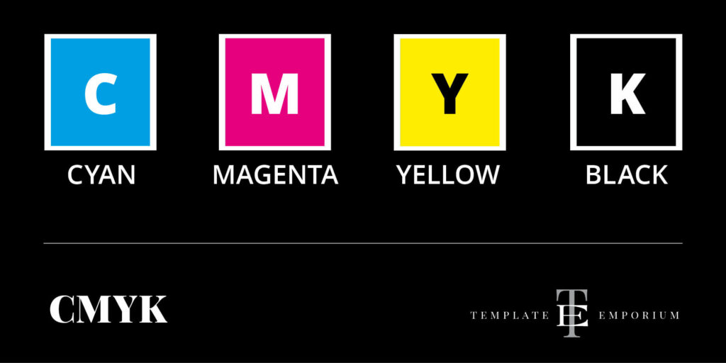
CMYK is referred to as a subtractive, four-colour printing process.
Broken down, CMYK stands for four colour modes.
C = Cyan | M = Magenta | Y = Yellow | K = Black
How it works
Each letter of CMYK represents a different ink colour plate.
During the printing process layers of Cyan, Magenta, Yellow and Black ink are laid down. When all the colours are combined, they can produce thousands of colours.
We refer to these colours as process colours.
Because it is a subtractive colour process, light is absorbed, which results in the final printed colours looking darker instead of brighter.
Insider Tip
If you’ve ever designed a beautiful piece, but once you printed it, your blacks look washed-out, flat and greyish check out this blog for all our printing tips.
RGB
This is the colour mode for digital screens.
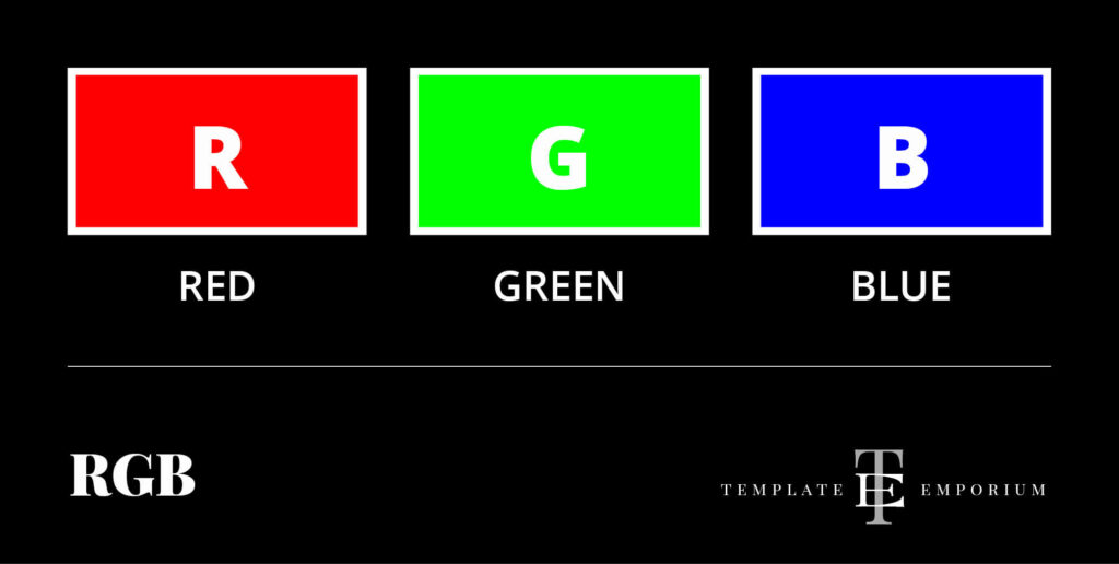
RGB stands for the following digital colour modes.
R = Red | G = Green | B = Blue
RGB is known as an additive colour system. It adds the Red, Green and Blue light in different combinations to create millions of other colours.
Because RGB is digital, the colours you see are made up of light, not ink. This means RGB colours are always more vibrant than CMYK.
Insider Tips
Only use RGB colours if you are designing non-print materials.
If you have an artwork created in RGB and get it printed, you’ll be disappointed with the final result. This is because the colours won’t look the same (or appear as vibrant).
RGB colours can’t be replicated in the printed world. Instead, convert the colours from RGB to CMYK.
Warm & Cool Colours
In discussing warm and cool colours, we are referring to the hue – the actual colour. In this colour guide section, let’s see which colours sit where and the similarities and differences between them.
1. Warm Colours
Warm colours are on one section of the colour wheel and give the feeling of warmth.
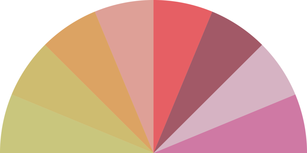
The three most well-known warm colours are Red, Yellow and Orange.
But it also includes the tints and shades of these colours:
- Gold
- Coral
- Burgundy
- Pink
- Magenta
- As well as the neutral colour Brown.
Warm colours remind us of sunlight, fire, summer and even lava because they are bright, striking and aggressive.
They stand out, and provoke our emotions, making us feel exuberant and cheerful.
Want more Warm Colours tips? Check out these blogs about Red, Yellow, Orange and Brown.
Insider Tip
Warm colours can heighten our motivation and memory. That’s why I always use yellow legal pads for taking notes. From helping you to remember to increasing creativity, whatever the reason or theory behind their warm colour choice they seem to work!
2. Cool Colours
On the opposite side of the colour wheel sit the cool colours giving the sense of cold.
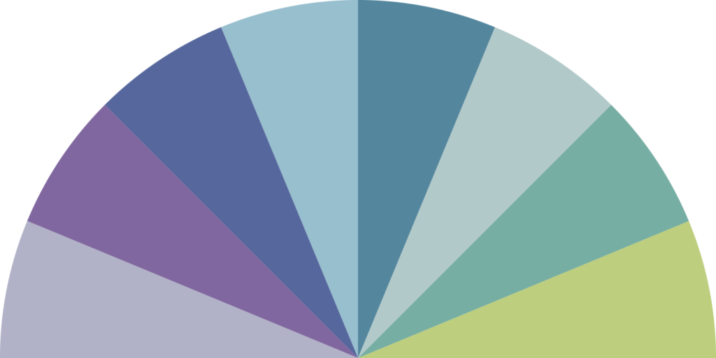
When we think of cool colours, Blue, Green and Purple are the top three that come to mind.
Tints and shades of these three colours are also considered warm colours such as:
- Lavender
- Violet
- Sapphire
- Sky Blue
- Teal
- Grass Green
- Lime
- And don’t forget about the neutral colour Grey
Cool colours have the opposite effect of warm colours instead they are calming, clean and inviting.
This group of colours recede in a picture. They make you think of cool things like snow, water, ice or snow.
Want more Cool Colour Tips? Check out these blogs about Blue, Green, Purple & Grey.
Insider Tip
Because cool colours slow down the body’s metabolism, they can appear oppressive or gloomy. When designing with them, use different tints and shades, and for balance, include a neutral cool colour such as Grey.
Primary & Secondary Colours
Whether the last time you discovered these colours was in art class in junior or elementary school, we’re here to revise and refresh your memory of these important colours.
When picking your brand colours, we always suggest going back to basics and rediscovering how colours are made and work together.
That starts with Primary and Secondary colours.
Press play on the video below to check out the differences between the two.
Primary Colours
These colours can’t be made from other colours.
Primary Colours = Red, Yellow & Blue.

Secondary Colours
They are made from two primary colours.
Secondary Colours = Orange, Purple & Green.
- Orange = Red + Yellow
- Purple = Blue + Red
- Green = Yellow + Blue

Want to know more about Primary & Secondary Colours – check out this blog.
Complementary & Split Complementary Colours
Understanding all the Colour terms can become overwhelming. Instead, let’s break it down into bite-sized pieces.
Press play on the video below to get started.
Complementary Colours
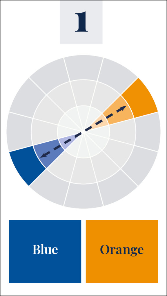
These are two colours opposite each other on the colour wheel.
For Example:
– Blue + Orange
– Yellow + Purple
– Red + Green
When used together, complementary colours bring out the best in each other.
Complementary Colours create tension and energy. This is due to them not sharing a common colour.
Split Complementary Colours
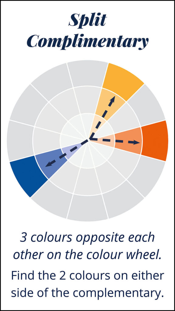
Now we have three colours opposite each other on the colour wheel.
The “split” occurs when you find the two colours on either side of the complementary one.
For example:
Blue + Yellow-Orange + Red-Orange
Learn more about Complementary and Split Complementary Colours here.
Hues, Tints, Tones & Shades
When using Primary, Secondary, Complementary and Split Complementary colours, the secret is to create interesting contrasts.
To do that, we use tints, tones, and shades.
Understanding these terms is essential for creating captivating and harmonious designs.
Here’s a simple way to remember.
- Hue = the actual colour.
- Tints = Hue mixed with white.
- Tones = Hue mixed with grey.
- Shades = Hue mixed with black.
Check out this blog post for a deep dive into Hues, Tints, Tones & Shades.
Press play on the video below to see the differences between Hue, Tints, Tones & Shades.
Monochromatic Colour Palette
Monochromatic is using a single hue (colour). But living in a world of monochrome doesn’t mean it’s boring.
Learn more about Monochromatic Palettes here.
The key is to explore different shades, tones and tints within that single hue.
If you are seeking simplicity, visual harmony and balance then a monochromatic palette could be the perfect choice for you.
Here’s how to create a Monochromatic Colour Palette
- Choose one single colour (Hue).
- Create Dark Values = Hue + Black.
- Create Medium Values = Hue + Grey.
- Create Light Values = Hue + White.
- The Final palette comprises Shades, Tints and Tones of one colour.
Press play on the video below to watch a Monochromatic Palette come to life.
You Did it!
That’s a wrap on Confusing Colour Terms explained clearly. From RGB vs CMYK to Hues, Tints and Tones. We broke down these definitions (& more) and gave you practical examples to grasp these concepts easily. If you enjoyed this blog, Follow us on Pinterest for more blog posts like this.
Want more Colour Tips?
Download our FREE colour guide.
Where to now?
Continue on this colour journey with us by checking out the following blogs.
- Which Colour should you use for your Branding?
- A Year of Holiday Colour Combinations
- How to Choose Your Brand Colours
Like this Blog Post?
PIN IT FOR LATER. And for more helpful tips follow us on PINTEREST.
Search
Create & launch your website in a
few simple steps
FREE GUIDE
While you’re here,
grab our FREE
‘Do’s & Don’ts of what to add to your website’ Guide.
‘Do’s & Don’ts of what to add to your website’ Guide.
When you sign up, we’ll send you
emails with additional helpful content.
About Lavinia & Tom
Hi, we're so glad you found us.
We love helping creatives like you finally have the website you’ve always wanted.
Blog Categories
Follow us