grab our FREE
‘Do’s & Don’ts of what to add to your website’ Guide.
‘Do’s & Don’ts of what to add to your website’ Guide.
emails with additional helpful content.
Hi, we're so glad you found us.
We love helping creatives like you finally have the website you’ve always wanted.
few simple steps
Follow us
Type Terms you have likely seen (but never knew what they were called).
Chances are, you’ve already come across the three Type Terms of Letter Storeys, Ligatures and Blackletter Typefaces we will be discussing in this blog.
Especially if you have ever seen a font that looks like a centuries-old manuscript written with an elegant quill pen, or an ornate typeface that loops and swoops to give the text a unique character.
With an estimated 42 million websites worldwide using around 900,000 unique font types, there is an overwhelming amount of typography out there. Still, these three terms are some of the oldest and most interesting.
In this blog, you will learn exactly what each of these Type Terms means, explore how they are used and uncover their beginnings and history.
You can also expect to find out why these fonts have been so enduring over centuries and why they continue to be popular today.
So if you have ever been curious about these classic type forms, you have come to the right place.
Type Terms Part 1
Letter Storeys
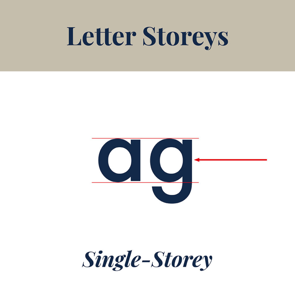
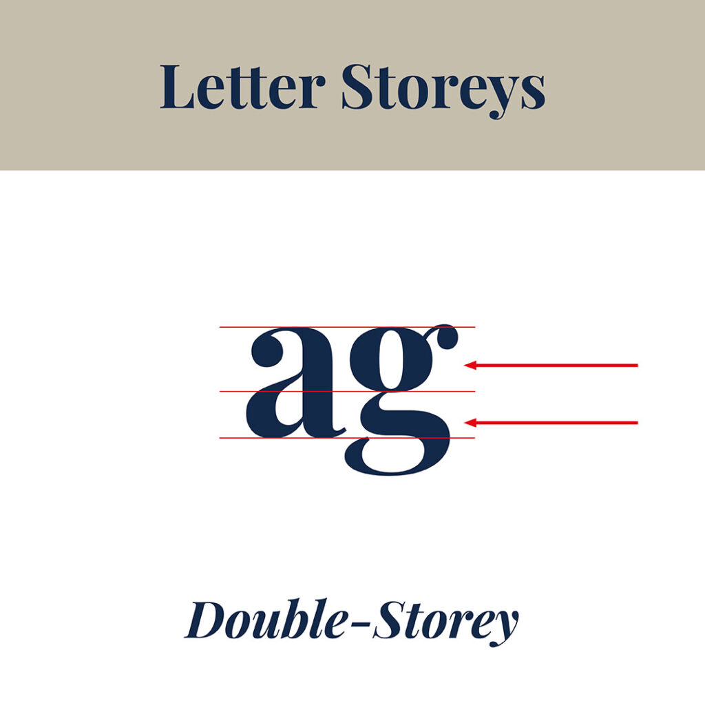
Have you ever noticed how the lowercase letters ‘a’ and ‘g’ can look different depending on the typeface? This is due to a Type Term called “Letter Storeys”. In this blog, I’ll explain the two types and how to use them to your design advantage.
There are two types of letter storey formats – Single and Double.
Single-storey
Single-storey – has one counter.
It is used mostly in:
- Script Typefaces.
- Italics.
- Geometric sans serifs.
Double-storey
Single-storey – has two counters.
It is used mostly in:
- Serif Typefaces.
- Some sans serifs Typefaces
- Printed material such as books.
Type Terms Part 2
What is a Ligature used for?
In typography, a Ligature is created when two letters join together to form a single character.
Some examples include fi, Th, oe, ae, ij and ff.
Doing this helps avoid uncomfortable overlapping.
Instead, the ligature creates a smooth transition between the two, resulting in a neat and clean single combination also known as a glyph.
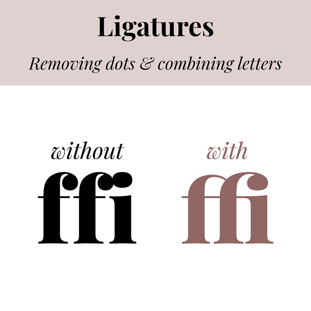
A ligature may be created by removing dots over i’s or combining letters.
Doing so decreases the space between the letters and changes the shape of the combined letters to make them easier to read.
Check out the examples below.
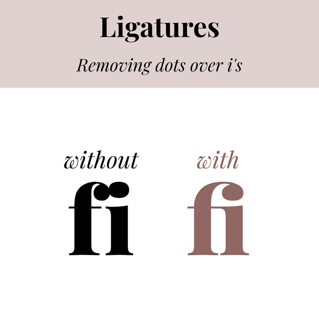
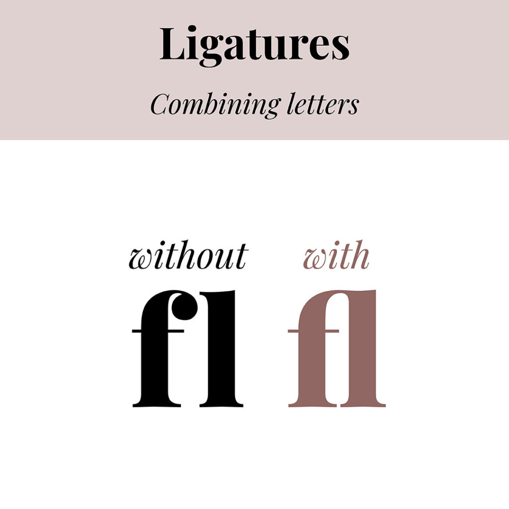
In this example, by removing the dots and combining the letters, the awkward spacing is gone.
Even though the letters are joined, each one is still legible enough to be identified.
Insider Tip
Not all fonts contain ligatures. However, the glyphs section will tell you whether ligatures are available with Google Fonts.
Type Terms Part 3
Have you ever used the firstly created typeface?
With so many typefaces available, it’s hard to imagine a time when there was only one.
The first typeface is one you have most likely seen before but didn’t realise the importance or history behind it.
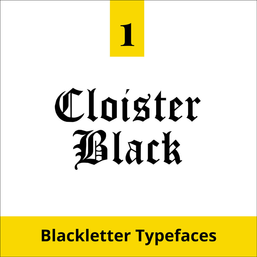
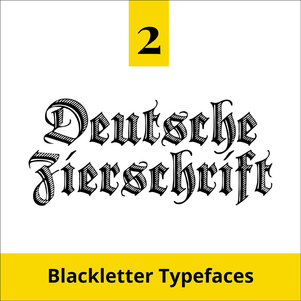
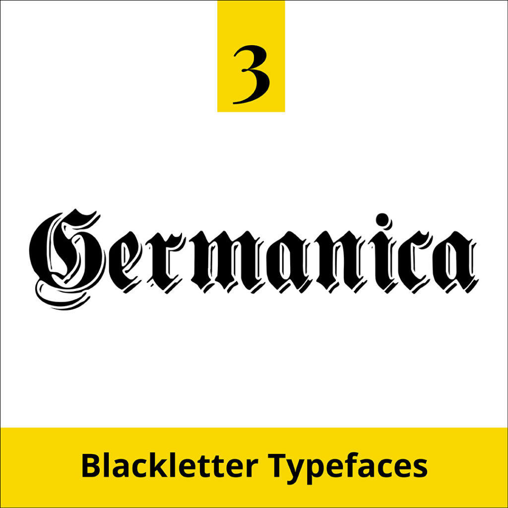
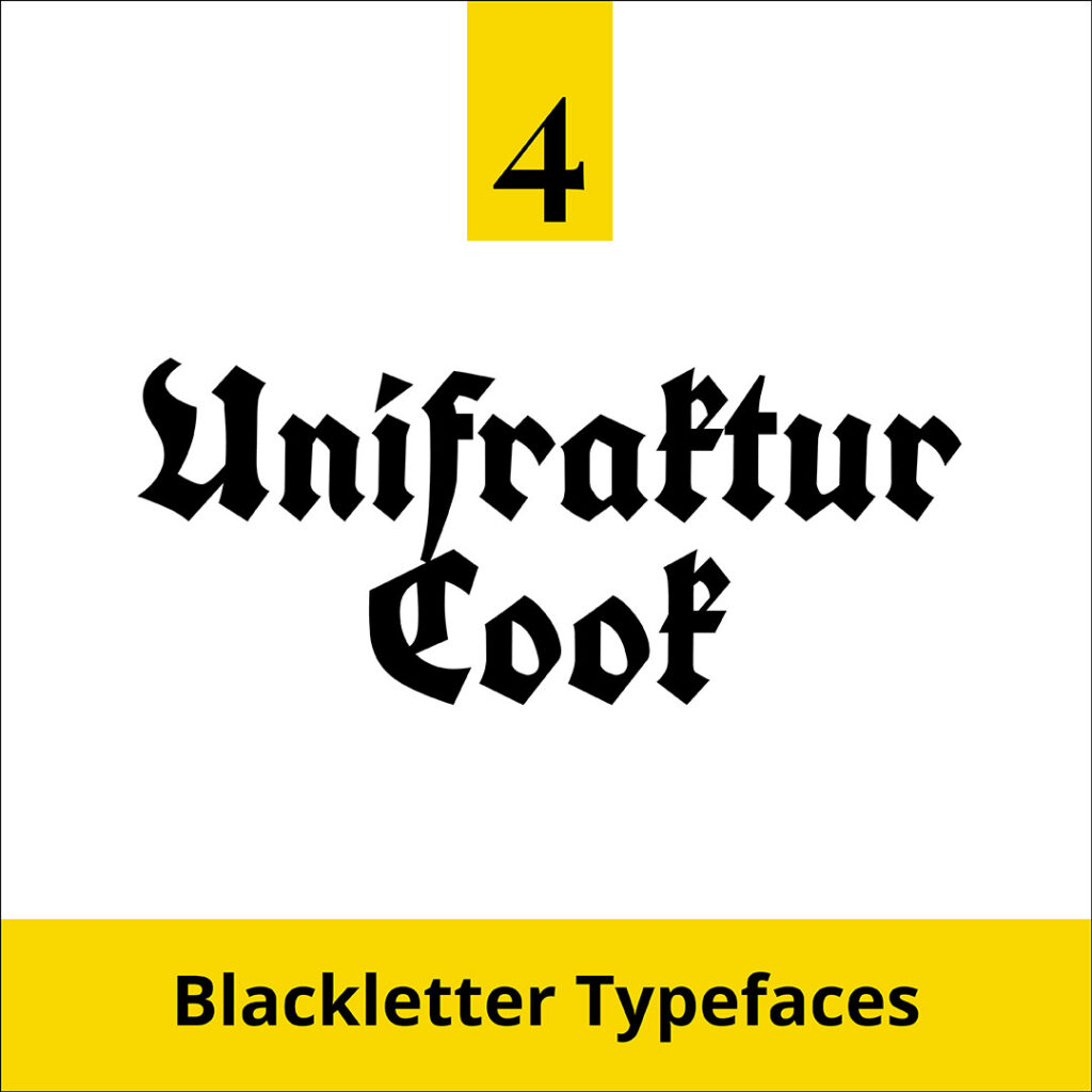
It’s the Blackletter Typeface.
- Est.15th Century.
- Also known as Gothic or Old English.
- Influenced by the Medieval European scribes.
- Its letter style is thick and thin dark strokes.
- Over time they fitted into four families Fraktur, Rotunda, Schwabacher and Textur.
- Can be hard to read, so avoid using them in body text and save them for headings.
Below are four examples of our favourite Blackletter Typefaces.
Insider Tip
Blackletter Typefaces are popular on certificates and often used in respected newspaper mastheads such as The New York Times, Los Angeles Times and The Sydney Morning Herald. And look out for it on the Disneyland entrance sign!
Where to now?
Want more font tips? Check out the below.
- Serifs or sans-serifs: Which font style do you prefer?
- Typeface & Font: Are They Really the Same? Think Again!
- The Four most common Font Styles
Like the Blog Post?
PIN IT FOR LATER. And for more helpful tips follow us on PINTEREST.
Search
Create & launch your website in a
few simple steps
FREE GUIDE
While you’re here,
grab our FREE
‘Do’s & Don’ts of what to add to your website’ Guide.
‘Do’s & Don’ts of what to add to your website’ Guide.
When you sign up, we’ll send you
emails with additional helpful content.
About Lavinia & Tom
Hi, we're so glad you found us.
We love helping creatives like you finally have the website you’ve always wanted.
Blog Categories
Follow us