grab our FREE
‘Do’s & Don’ts of what to add to your website’ Guide.
‘Do’s & Don’ts of what to add to your website’ Guide.
emails with additional helpful content.
Hi, we're so glad you found us.
We love helping creatives like you finally have the website you’ve always wanted.
few simple steps
Follow us
Display Typefaces: The secret ingredient for eye-catching visuals that captivate your audience.
In this bonus blog, we’ve taken all the typefaces we discussed in The Ultimate Typeface Series and grouped them into one of our favourite design elements: Display Typefaces.
Whether you’re working on a logo, poster, or social media graphic, using the right Display Typeface can make a statement. So, let’s dive into the world of typography and unlock endless possibilities for your designs!
Display Typefaces
These bold and decorative fonts are like hidden gems in the world of typography, as they can instantly elevate your creations and make them stand out from the crowd.
And with their unique and decorative styles, they can add that extra touch of personality and flair to your designs.
Insider Tip
Because they have thick and complex letterforms, however, only use them in large sizes.
Due to the boldness of Display typefaces, they’re not suitable for body text.
Serif Display
Need a refresher on what a Serif font is? Check out this blog post!
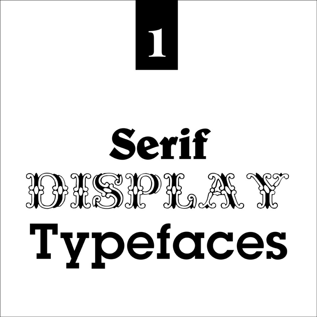
Because there are numerous Serif Display typefaces, we’ve decided to stick to three of our favourites shown in the example below.
In our first image example, the word Serif is in Belwe font.
Next, we have written Display in Fontanesi font, commonly known for its ornate detail.
And finally, the heading Typefaces is written in Lubalin Demi.
Slab Serif Display
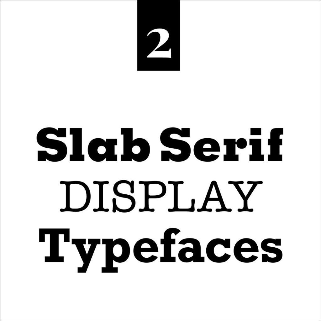
Next up, are Slab Serif display typefaces. Check out the image below for our three favourites.
The first Slab Serif heading below is in the bold Memphis font.
This time, Display is written in the classic American Typewriter font.
And we finish up with the popular Rockwell font.
Sans serif Display
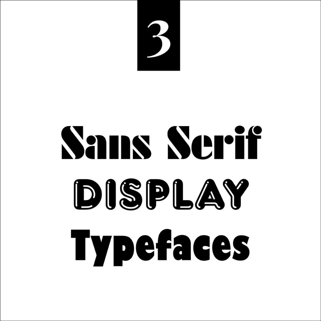
Display Typefaces also include sans-serif varieties shown in the example below.
The first Sans Serif heading is shown in Futura Black font in this example.
Secondly, the ever-playful Frankfurter Highlight is shown in the Display heading.
And we complete the set with Gill Kayo shown in the Typefaces heading.
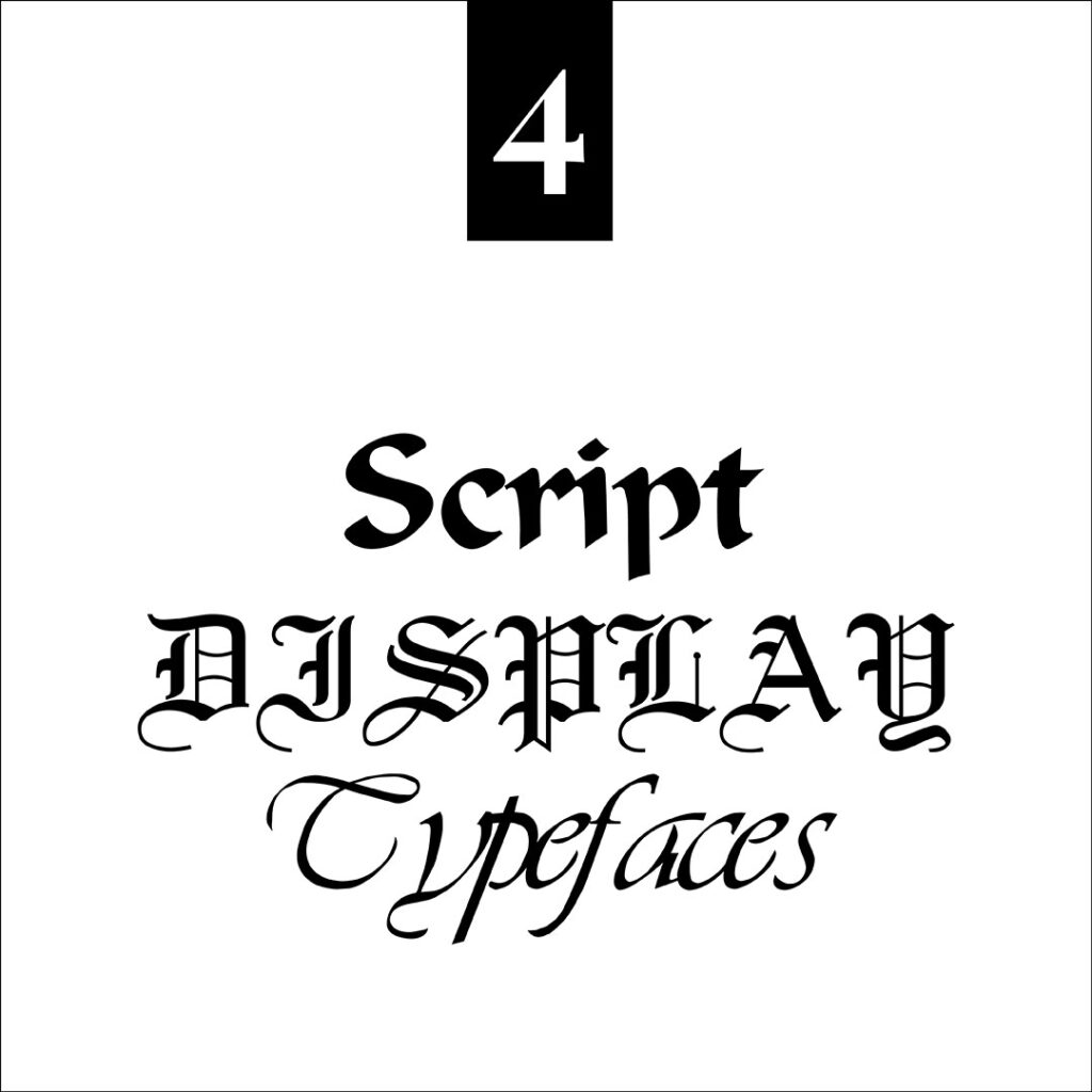
Script Display
Lastly, we have Script Display.
The first heading Script is in the ever-popular Old English font.
Below that, the medieval feel of Calligraphic font is in the heading Display.
And finally, the flowing font LDS Script is saved for the heading Typefaces.
Insider Tip
But how do you choose the perfect display typeface? It all comes down to understanding the message and emotions you want to convey.
Each typeface carries its own vibe, whether it’s elegant, playful, retro, or futuristic. By aligning the font with your overall design concept and target audience, you’ll create a harmonious visual experience that resonates with viewers.
You Did it!
That’s a wrap on The secret typeface ingredient for eye-catching visuals that captivate your audience. In this bonus section to The Ultimate Typeface Series, we introduced you to the four Display Typefaces. Which one was your favourite?
Where to now?
Want more Insider Type Tips? Check out the blogs below.
- The Ultimate Typeface Series (you didn’t know you needed)!
- What are the different Typeface Categories?
- Type Crimes on your Website (are you committing any of these?)
Like the Blog Post?
PIN IT FOR LATER. And for more helpful tips follow us on PINTEREST.
Search
Create & launch your website in a
few simple steps
FREE GUIDE
While you’re here,
grab our FREE
‘Do’s & Don’ts of what to add to your website’ Guide.
‘Do’s & Don’ts of what to add to your website’ Guide.
When you sign up, we’ll send you
emails with additional helpful content.
About Lavinia & Tom
Hi, we're so glad you found us.
We love helping creatives like you finally have the website you’ve always wanted.
Blog Categories
Follow us