grab our FREE
‘Do’s & Don’ts of what to add to your website’ Guide.
‘Do’s & Don’ts of what to add to your website’ Guide.
emails with additional helpful content.
Hi, we're so glad you found us.
We love helping creatives like you finally have the website you’ve always wanted.
few simple steps
Follow us
The Ultimate Typeface Series (you didn’t know you needed)!
Just like movies follow a classification guide, Typefaces are the same. In this Ultimate Typeface Series, we share how to distinguish serif and sans-serif typefaces from each other.
In this 3-part series, we’ll cover Serif Typefaces focussing on Old Style, Modern, Transitional and Slab. Then we’ll move on to Sans-serif Typefaces including Grotesque, Humanist and Geometric.
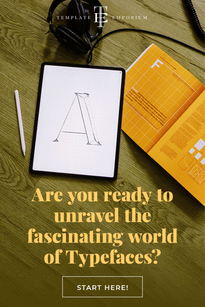
Are you ready to unravel the fascinating world of Typefaces and discover which one suits your artistic style the best? Let’s go.
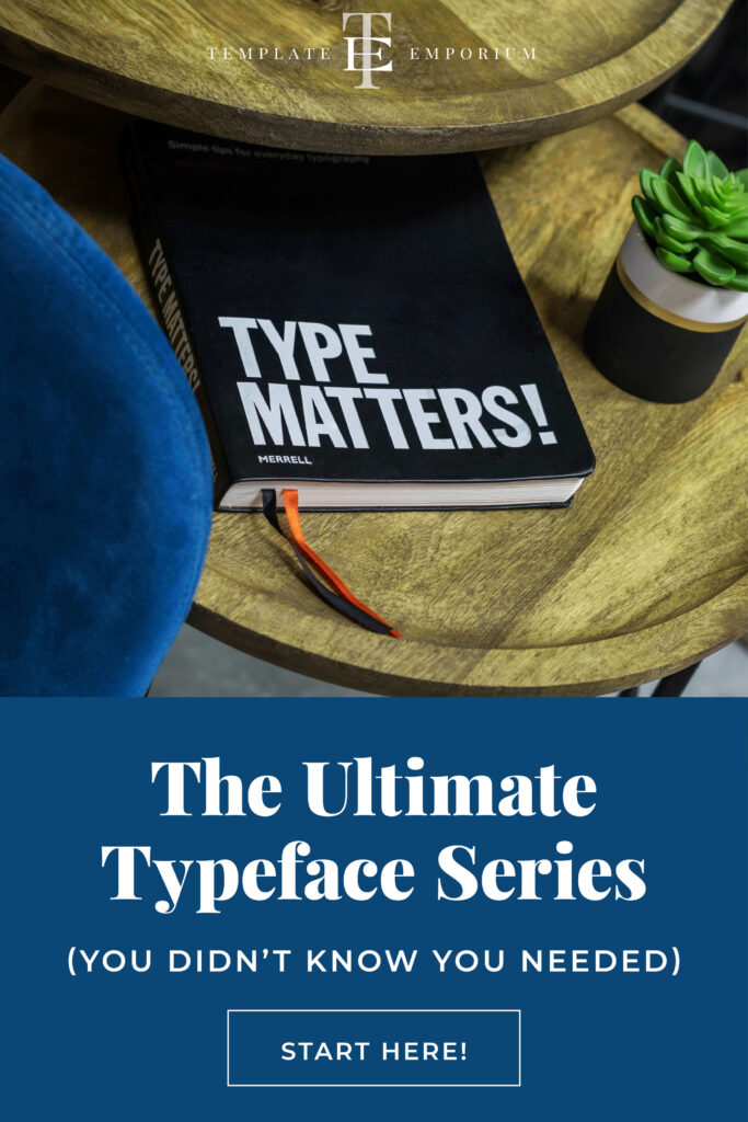
Part 1 – Old Style Serif vs. Modern Serif Typefaces
Old Style Serif Typefaces
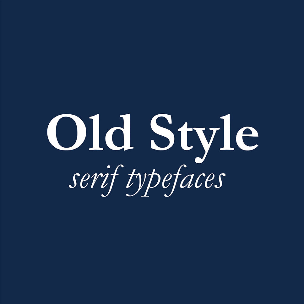
- Developed in the 15th Century.
- Old-style serifs replicate the look of classical calligraphy.
- They are inspired by the irregularities of the human hand.
- The difference between thick and thin strokes is very minimal.
- And if you look closely at their serifs (tiny feet), they appear thick and resemble how a calligraphy nib would create them.
Modern Serif Typefaces
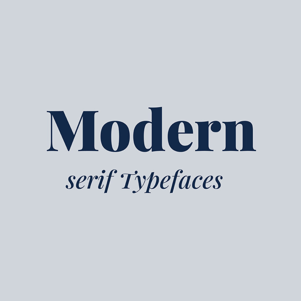
- Developed late 18th Century.
- These are the opposite of Old Style (and do not replicate the irregularities of the human hand).
- The focus instead is on creating regularity, with an emphasis on keeping everything geometric.
- The Serifs are straight and thin.
- And there is a noticeable difference between the thick and thin strokes.
Part 2 – Transitional Serif vs. Slab Serif Typefaces
Transitional Serif Typefaces
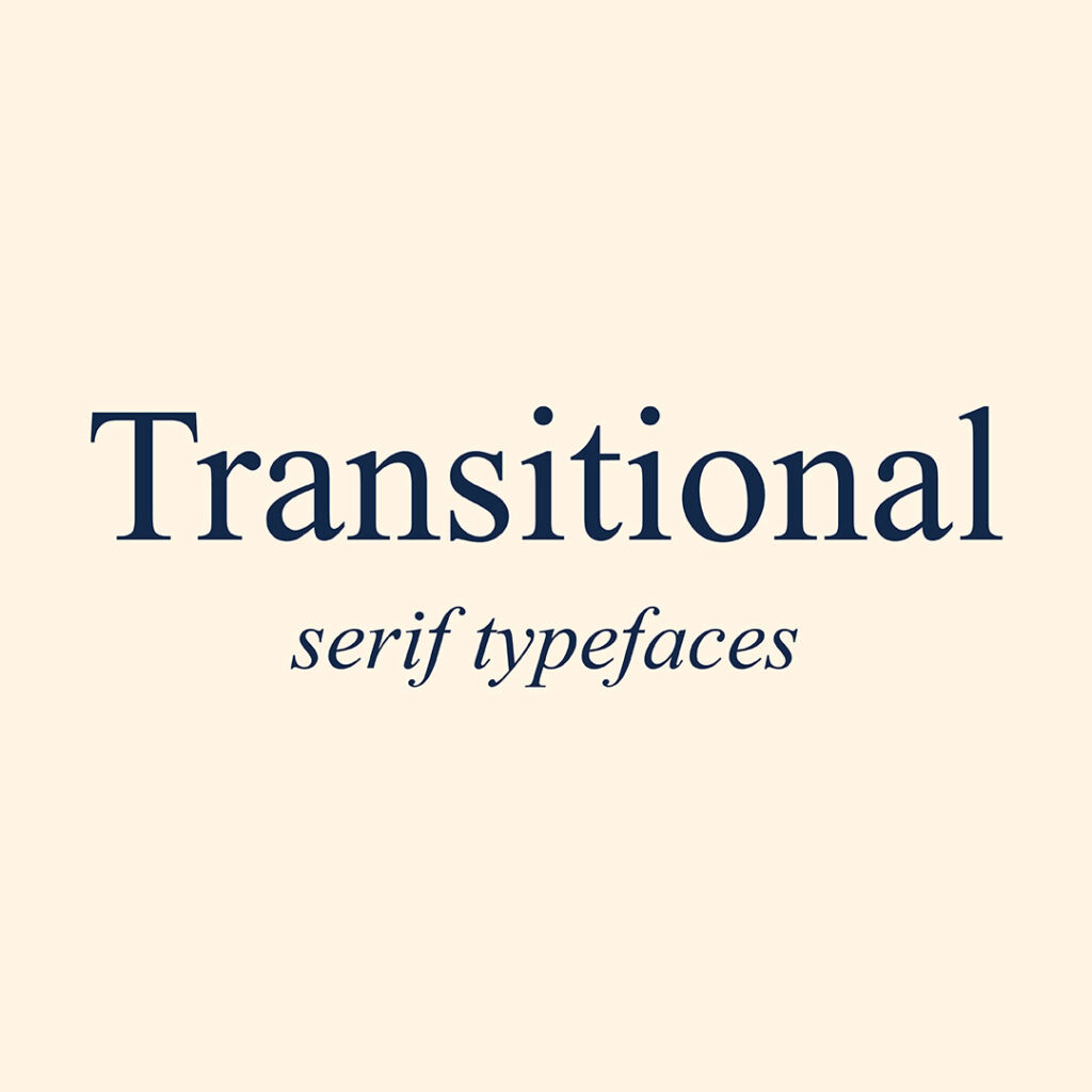
- Developed mid-18th Century.
- Took a new direction away from hand-scribed lettering.
- This typeface has greater differences between thick and thin strokes.
- Used sharper serifs which are completely out of character for this era.
- The look and style of this typeface, sit halfway between an Old Style & Modern Style typefaces
Slab Serif Typefaces
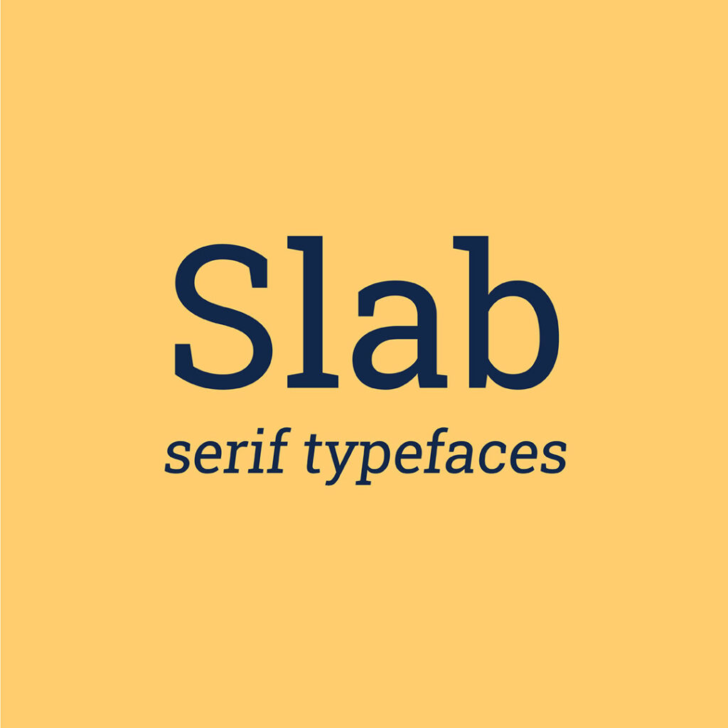
- Developed 19th Century.
- Also known as Egyptian Typeface or its nickname ‘slab’.
- Consists of thick, heavy and block-like serifs.
- The boldness of this typeface makes it easy to read.
- Popular in early advertising for billboards and posters.
Part 3 – Sans Serif Typeface
In part 3 of our Ultimate Typeface Guide, we’re going to look at 3 Sans Serif varieties and help you decide which one is best for you.
Grotesque sans-serif Typefaces
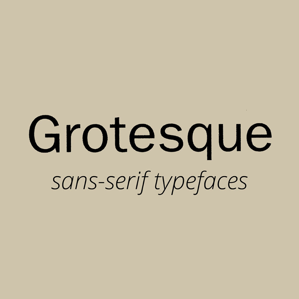
- Developed Early 19th Century.
- This is the first form of sans-serif variety.
- Unlike the serif typefaces mentioned above, it does not resemble handwriting.
- The Grotesque typeface has varying stroke thickness.
Humanist sans-serif Typefaces
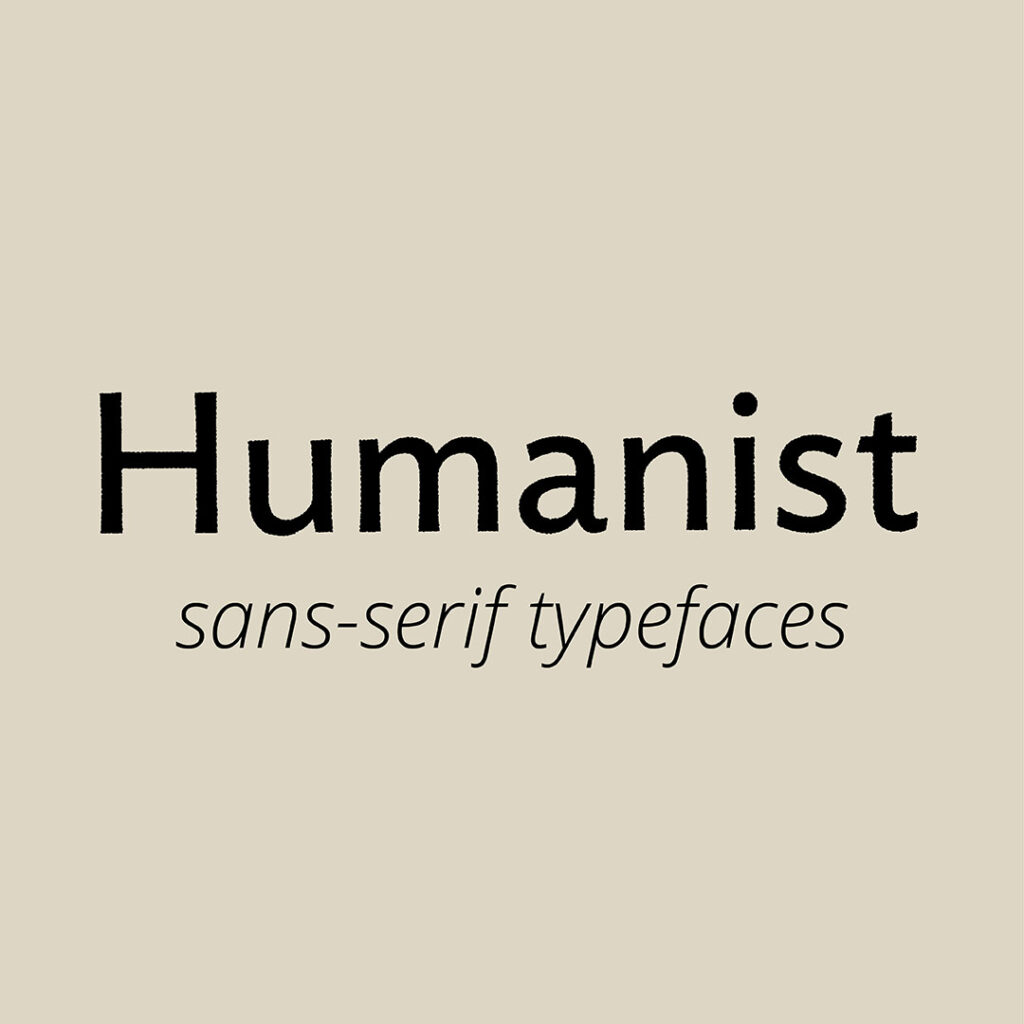
- Developed Early 19th Century.
- As its name suggests, this typeface has a human look and resembles handwriting.
- It also stems back to calligraphy due to its various stroke thicknesses.
- Humanist is the easiest to read out of the three sans-serif varieties in this blog.
Geometric sans-serif Typefaces
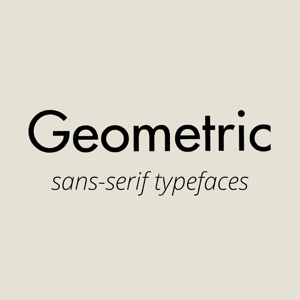
- The Geometric typeface developed from perfect circles and right angles.
- It has minimal stroke contrast.
- Geometric Typefaces are the hardest to read out of the three varieties discussed in this blog.
You Did it!
That’s a wrap on The Ultimate Typeface Series (you didn’t know you needed)! In this 3-part series, we discussed Serif Typefaces including Old Style, Modern, Transitional and Slab. Then we looked at Sans-serif Typefaces including Grotesque, Humanist and Geometric.
But it doesn’t have to stop here! Check out our Bonus section that takes all these typefaces and groups them into what is known as Display Typefaces.
Where to now?
- Type Terms you have likely seen (but never knew what they were called).
- Typeface & Font: Are They Really the Same? Think Again!
- What are the different Typeface Categories?
Want more insider tips?
Grab our FREE Essential Guide for Creatives. “Do’s & Don’ts of what to add to your website”. We give you a simple plan to follow so you’ll never have to question what to show online again.

Like the Blog Post?
PIN IT FOR LATER. And for more helpful tips follow us on PINTEREST.
Search
Create & launch your website in a
few simple steps
FREE GUIDE
While you’re here,
grab our FREE
‘Do’s & Don’ts of what to add to your website’ Guide.
‘Do’s & Don’ts of what to add to your website’ Guide.
When you sign up, we’ll send you
emails with additional helpful content.
About Lavinia & Tom
Hi, we're so glad you found us.
We love helping creatives like you finally have the website you’ve always wanted.
Blog Categories
Follow us