grab our FREE
‘Do’s & Don’ts of what to add to your website’ Guide.
‘Do’s & Don’ts of what to add to your website’ Guide.
emails with additional helpful content.
Hi, we're so glad you found us.
We love helping creatives like you finally have the website you’ve always wanted.
few simple steps
Follow us
Three Type Terms that you need to know (& want to avoid using)
In this blog, we’re sharing three Insider Type Terms to avoid. You may have never heard of them, but once you understand what they are and how they work, your design and layout skills will elevate. We usually share Type Tips for you to use, but these are best to avoid to ensure your text has a professional look and is easier to read. Ready to discover what they are?
1. Type Terms to avoid – Widow
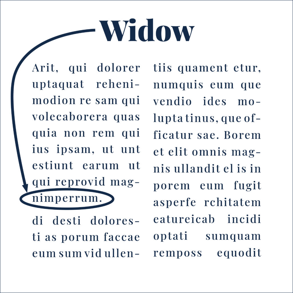
Sometimes, in a paragraph, not all the words will fit neatly on each line.
A widow is created when one word sits alone in a line of text.
This creates a visual imbalance and interrupts the reader’s flow, leaving a sense of incompleteness.
Insider Tip
To avoid Widows, adjust the formatting of the paragraph so the word/s can fit on the previous line. This can be achieved by changing the paragraph spacing, font size, or even rephrasing sentences to ensure a harmonious layout.
2. Type Terms to avoid – Orphan
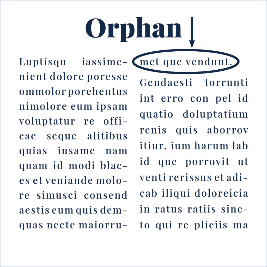
An “orphan” is a widow’s counterpart.
When laying out text in columns, sometimes an entire phrase will not fit within the paragraph.
This single word or short line appears alone, separated from the rest of the paragraph creating an awkward space.
Orphans disrupt the reader’s journey, making your text look disjointed
Insider Tip
Fixing orphans may involve tweaking font settings, paragraph layout, or the text itself to create a visually cohesive piece.
3. Type Terms to avoid – Rivers in Text
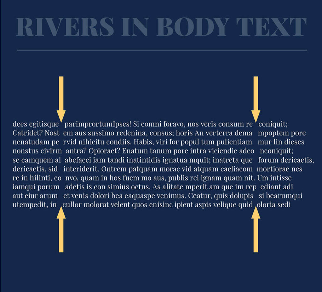
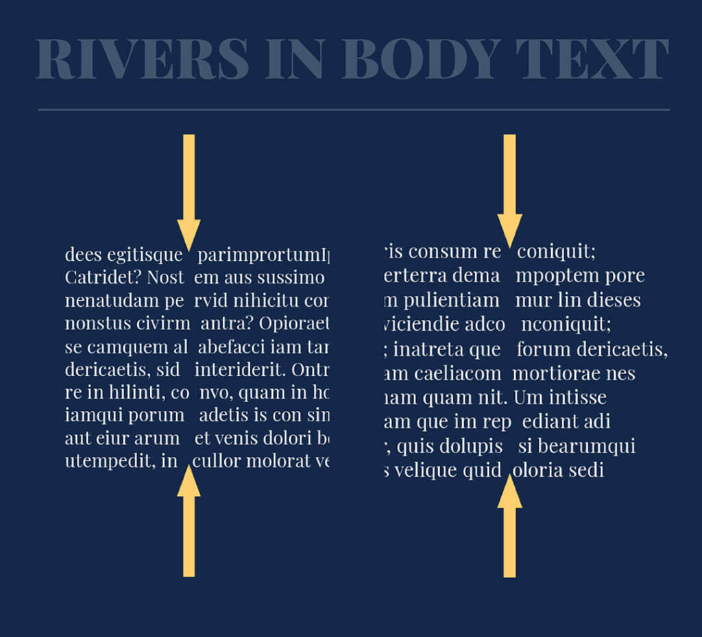
When laying out text in a block, sometimes the gaps between the words line up, creating uneven spaces.
These meandering gaps resemble a river. And instead of concentrating on the text, your eye is drawn to the distracting “river”.
Rivers can distract readers, making the text difficult to follow.
How to Avoid Rivers in Text
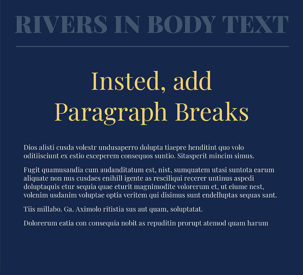
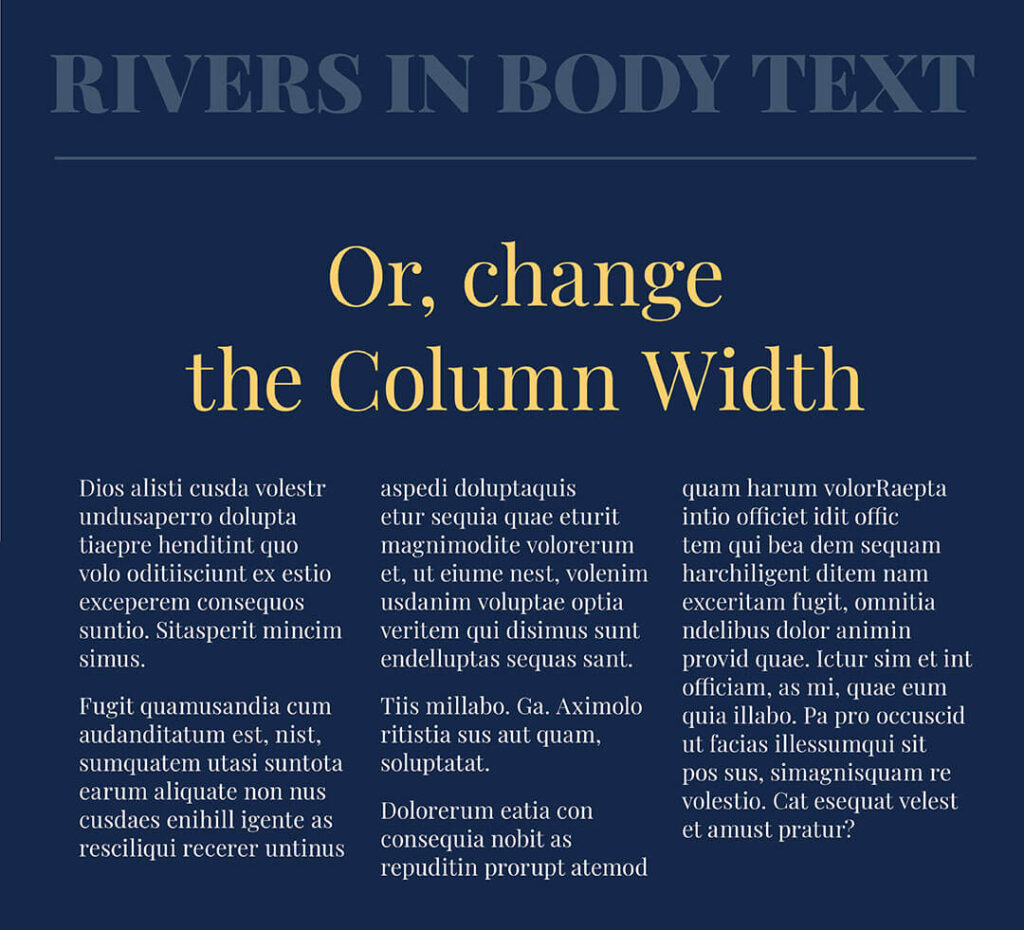
To avoid this, try adding some paragraph breaks or changing the column width from one to three.
Consider using left-aligned text or adjusting letter and word spacing for a more uniform appearance.
That’s a wrap
Typography is more than just selecting beautiful fonts; it’s about creating a seamless reading experience.
By understanding and avoiding widows, orphans, and rivers, you can elevate the clarity and aesthetics of your design.
Remember, the goal is to guide your audience through your creation effortlessly, allowing them to absorb the beauty of your words without stumbling over these typographic hurdles.
Have you ever encountered a widow, orphan or river when laying out text? Use our tips above so you know what to do instead. And in the meantime, Follow us on Pinterest for more blog posts like this.
Where to now?
Want more Insider Type Tips? Check out the blogs below.
- Typeface & Font: Are They Really the Same? Think Again!
- Type Lingo to make you feel like a Pro!
- The Ultimate Typeface Series (you didn’t know you needed)!
Like the Blog Post?
PIN IT FOR LATER. And for more helpful tips follow us on PINTEREST.
Search
Create & launch your website in a
few simple steps
FREE GUIDE
While you’re here,
grab our FREE
‘Do’s & Don’ts of what to add to your website’ Guide.
‘Do’s & Don’ts of what to add to your website’ Guide.
When you sign up, we’ll send you
emails with additional helpful content.
About Lavinia & Tom
Hi, we're so glad you found us.
We love helping creatives like you finally have the website you’ve always wanted.
Blog Categories
Follow us