grab our FREE
‘Do’s & Don’ts of what to add to your website’ Guide.
‘Do’s & Don’ts of what to add to your website’ Guide.
emails with additional helpful content.
Hi, we're so glad you found us.
We love helping creatives like you finally have the website you’ve always wanted.
few simple steps
Follow us
The number one Printing Tip you need to know
You’ve designed a beautiful piece, but, once printed, your blacks look washed-out, flat and greyish. Don’t worry we’ve got a solution for you. The secret is using a Rich Black CMYK, and in this blog, we share all our insider tips on how to create it.
Before we start – missed a part of our Colour Tips Series? Catchup up below.
- How to Use Harmonious Colour Combinations in Your Designs
- Hues, Tints, Tones & Shades – What’s the difference?
- Our Top Four Free Colour Generator Sites
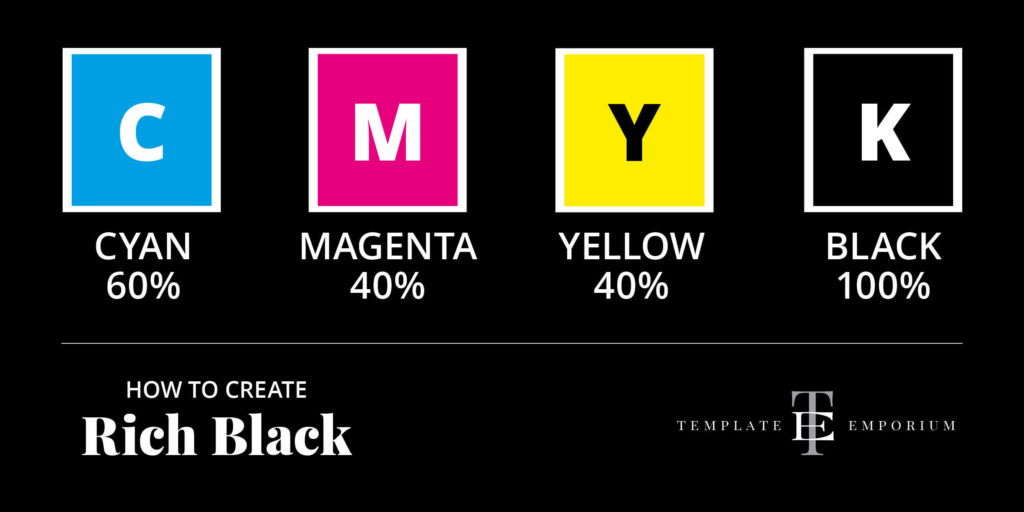
How to create a CMYK Rich Black
CMYK is a colour printing term and stands for Cyan, Magenta, Yellow and Black.
If you’re designing a printed piece you would send this to a professional printer who would use the Offest Printing and are sending it to a professional offset printer, they would use an would use CMYK colours in your finished piece.
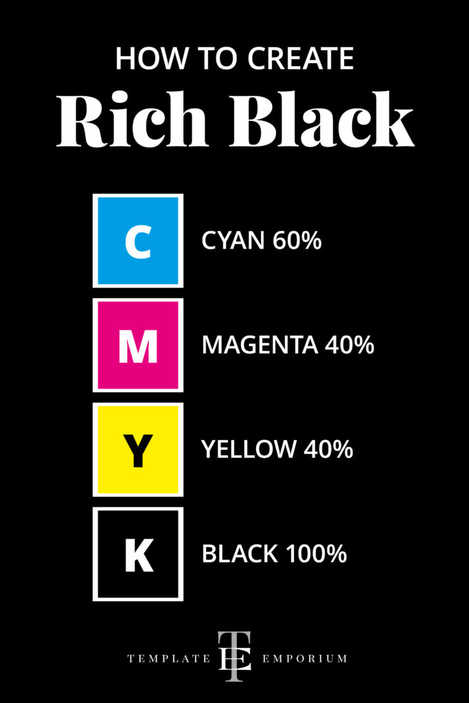
The secret insider formula to a Rich Black is Cyan 60%, Magenta 40%, Yellow 40% and Black 100%.
Standard Black Vs Rich Black
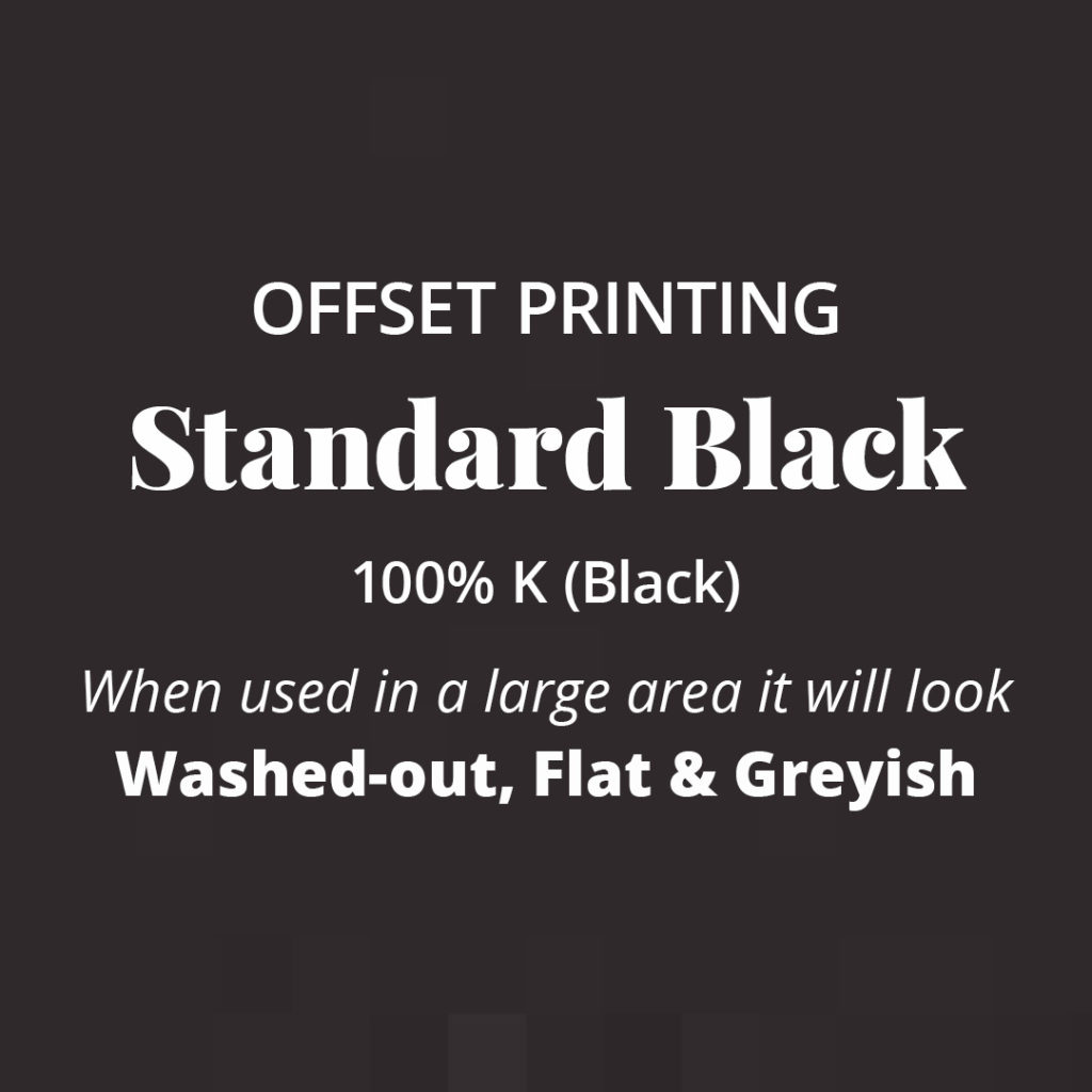
When you use Standard Black (100% K) in Offset Printing, (professional printer), especially in large areas, it will look washed-out, flat and greyish.
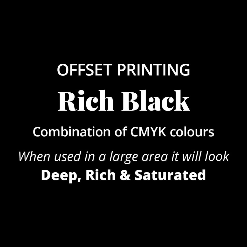
Instead, try our Rich Black combination of CMYK colours. When used in a large area it will look deep, rich and saturated.
See our examples below for a comparison.
That’s a wrap on The number one Printing Tip you need to know. Save this handy printing tip and try it out on your next design.
Where to now?
- Should you use Black as your Branding Colour?
- Are Business Cards still Necessary?
- Brand Style Guides Explained (& why your business needs one now!)
Like the Blog Post?
PIN IT FOR LATER. And for more helpful tips follow us on PINTEREST.
Search
Create & launch your website in a
few simple steps
FREE GUIDE
While you’re here,
grab our FREE
‘Do’s & Don’ts of what to add to your website’ Guide.
‘Do’s & Don’ts of what to add to your website’ Guide.
When you sign up, we’ll send you
emails with additional helpful content.
About Lavinia & Tom
Hi, we're so glad you found us.
We love helping creatives like you finally have the website you’ve always wanted.
Blog Categories
Follow us